CRO Glossary
Scroll Map
Definition
A scroll map is a visual analytics tool that tracks how far visitors scroll down a webpage, providing insights into user engagement and content effectiveness. By highlighting where users pause, engage, or drop off, scroll maps help businesses identify optimal content placement, detect engagement gaps, and refine page structure for better performance.
This heatmap-based tool allows marketers and UX designers to see which sections of a webpage capture attention and which go unnoticed, making it easier to optimize layouts, calls-to-action, and content distribution. By leveraging scroll maps, businesses can enhance user experience, boost engagement, and improve conversion rates through data-driven design decisions.
Understanding Scroll Maps
As we delve deeper into understanding scroll maps, picture them as comprehensive maps detailing user behavior.
A scroll map is the tool you use to decode users’ preferences, identify popular web sections, and spot potential roadblocks in the user journey. Here’s how all these happen:
User Behavior Analysis
Scroll maps provide a complete view of user engagement, showcasing how visitors interact with your website content as they scroll down.
It’s a visual distinction between areas that capture users’ attention and those that may be overlooked.
For example, hotspots on the scroll map indicate sections where users linger, providing insights into the effectiveness of your content and design.
What’s more, scroll maps don’t just showcase where users scroll but also how far they go when browsing your website.
This information gives insights for understanding user engagement depth and can guide decisions on content placement and length.
Finally, a scroll map shows you where users tend to drop off – thus revealing friction points or content fatigue.
This insight is fundamental for optimizing the user experience and maximizing conversions.
Scroll Maps vs. Other Heatmaps
Before we move on, let’s quickly see how we can differentiate between the many types of scroll maps available today.
Scroll Maps vs. Click Maps
While click maps focus on where users click, scroll maps provide a broader perspective, revealing the entire journey through a page.
Click maps show interaction points, but scroll maps show the flow of engagement from top to bottom.
Scroll Maps vs. Move Maps
Move maps track mouse movements, indicating areas of interest.
In contrast, scroll maps concentrate on vertical movement, showing the progression of user attention as they scroll down the page.
Both are complementary but offer distinct insights.
Technology Behind Scroll Maps
We won’t linger so much in this section, as tech language can become confusing.
Suffice to say, generating scroll maps involves utilizing tracking tools and analytics software that record user behavior in real-time.
JavaScript and tracking pixels are commonly employed to capture scrolling data without impacting page performance.
Advanced analytics platforms integrate this data into user-friendly scroll maps, making it accessible for marketers and website owners.
The Importance of Scroll Maps in User Experience (UX) Design
So, how can you incorporate all this knowledge about users’ interactions in your UX design?
Picture scroll maps as a starting point – they reveal points of interest, and drop-off sections, giving you all the information you need to create a more streamlined experience.
Understanding User Engagement
Scroll maps show you how users engage with your website, thus revealing patterns, popular sections, and the depth of user interaction.
This understanding allows you to orchestrate the user experience to align with audience preferences.
For example, analyzing scroll maps helps UX designers optimize content placement and enhance overall engagement.
Speaking of content…
Its effective placement is fundamental to a seamless user experience.
Scroll maps tell you which sections of a page receive the most attention and which ones might be overlooked. With this knowledge, you can (re)organize your content, so key elements are positioned in plain sight, ensuring users don’t overlook critical information.
Essentially, scroll maps guide you in refining layout and content positioning for optimal impact.
Finally, think about the main two criteria for website navigation: a website must be intuitive and user-friendly.
Scroll maps help you meet these two criteria, by highlighting users’ drop-off points.
If you can see where users disengage or abandon a page, you can reorganize your website and prioritize content based on user preferences.
Analyzing Scroll Map Data
If you wanted to, you could compare heat map patterns interpretation with the interpretation of someone’s body language – and you wouldn’t be wrong.
However, simply getting a visual representation of users’ behavior isn’t enough – the main task is interpreting this visualization.
Here’s how you can read between the data lines:
Continuous Scroll
Seeing users continuously scrolling on the website, generally suggests a positive user experience and engagement on your website.
Users are navigating through your pages without encountering any significant barriers or distractions, suggesting an intuitive and user-friendly website design.
Finally, continuous scrolling may suggest that the length of your content aligns well with user preferences. Users are willing to scroll through the entire content without losing interest, indicating a good balance between information depth and user attention span.
Sticky Sections
Sticky sections reveal certain website sections that act as magnetic hotspots. If these areas consistently capture user attention even after scrolling, they’re your digital sweet spots.
Users are evidently finding something captivating there. Usually, after identifying sticky sections, UX designers will use design elements to highlight those sections – or even move them higher in the page.
Abrupt Drop-Offs
Did you spot a sudden drop in engagement?
Unfortunately, that’s a point where users seem to take a leap of disinterest.
However, identifying these drop-off zones isn’t bad news; instead it’s an opportunity for you to do better.
Usually, drop-off points require a content makeover or a smoother user journey.
Common Findings
While we already covered the main insights, the story can go even further.
How many users reach the bottom of your pages?
If it’s lower than expected, this is your signal to improve your content or add a compelling finale to keep users scrolling.
Scroll maps usually reveal the need for content adjustments.
Redistribute information strategically to maintain an engaging rhythm throughout the page. You can also place CTAs where the audience lingers, to nudge them into continuing the journey.
Don’t forget to tune into the mobile performance.
Ensure that your content adapts gracefully on smaller screens, delivering the same captivating experience as on the desktop.
Unveiling actionable insights through scroll maps is an ongoing task.
Your website is a living, breathing entity; let the insights guide its evolution.
Possible Case Study
To illustrate what we’ve just discussed, let’s consider a fictional clothing retailer, struggling to improve its website’s user experience and conversion rates.
Their team is keen on maximizing the visibility of critical elements, such as featured products and promotional offers, above the fold to capture user attention immediately upon landing.
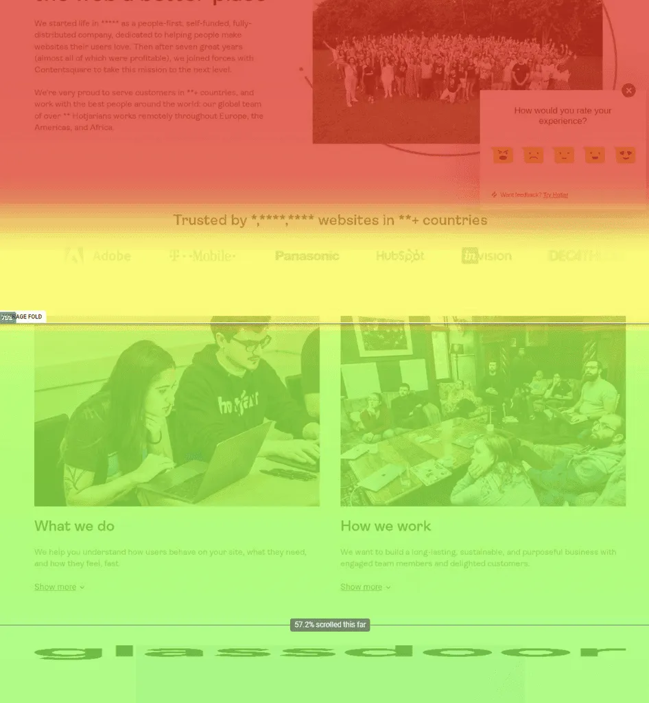
The first idea is using scroll maps to determine if their key elements were indeed positioned effectively above the average fold.
The scroll map analysis would provide insights into how users engaged with content and whether crucial elements were within the immediate view upon landing.
Upon analyzing the scroll map’s data, our retailer identified areas where user attention peaked and, conversely, where it dropped.
In our case, users would engage and scroll through the page, followed by a sudden drop off in the 1/4 mark. This meant users couldn’t see current promotions, as they were placed in the lower half of the landing page.
This insight prompted the design team to create a main banner featuring current promotions and bestselling products.
This banner was prominently visible above the fold on both desktop and mobile views.
This strategic positioning led to increased user interaction and click-through rates.
Users were more likely to initiate shopping actions without the need to scroll down, contributing to a seamless and efficient user journey.
This case study highlights the actionable insights that scroll maps can provide in optimizing the ‘above the fold’ area for improved user engagement.
Leveraging this data, the team successfully tailored their website layout to align with user preferences, creating a more captivating and conversion-friendly digital storefront.
Scroll Maps and Content Strategy
Even if, at a first glance, scroll maps seem mostly useful for organizing your website’s structure, we can also leverage them when planning our content strategy.
As you saw earlier, understanding user engagement becomes seamless with the help of scroll maps.
These tools act as a compass, providing content strategists with insights to strategically place key elements based on observed patterns.
By decoding the scroll map data, strategists pinpoint areas of user focus, facilitating an optimized user experience through well-placed, high-impact content.
The ‘above the fold’ space on a webpage is a critical area for capturing attention.
Here, scroll maps empower content strategists to make informed decisions about the prominence of specific content elements.
Analyzing user behavior reveals which elements should take center stage above the fold – whether it’s a captivating headline, an image, or a persuasive CTA.
This approach influences user engagement from the outset and extends the narrative strategically below the fold for a cohesive user journey.
Where attention is fleeting, concise content fits seamlessly; where users linger, more detailed information finds its place.
Scroll maps provide dynamic data for strategists to refine content approaches, ensuring a seamless alignment with user behavior and expectations.
Improving Conversion Rates with Scroll Maps
We all strive towards higher conversion rates, more revenue, more profits.
But it’s one thing to try out tactic after tactic, demanding teams to come up with ideas out of thin air, and a whole different feat to make data-based decisions.
Scroll maps offer some data you can base your tactics on.
For example, conversion optimization begins with identifying and optimizing key conversion points. To that end, you can look at scroll map data to uncover sections of heightened engagement – areas where users lingers and are more likely to convert.
Once you’ve identified these areas, you can make the most of them by placing compelling offers, product highlights, or persuasive messaging to further encourage conversions.
This approach ensures that the most impactful content aligns with conversion points, creating a seamless path for users to take desired actions.
Strategies for CTAs Based on User Scrolling Behavior
CTAs used strategically are another crucial component of conversion-focused design.
And, since scroll maps show user scrolling behavior, you can use their insights for optimal CTA placement to capture attention and drive conversions.
For example, you can analyze the scroll map to discover where users frequently pause or scroll more slowly.
Strategically place CTAs in these zones to nurture interest, making it more likely for users to take the desired actions.
In this case, you’re creating an environment where calls-to-action seamlessly integrate with the natural flow of engagement.
A/B Testing Changes Based on Scroll Map Findings
The beauty of scroll map insights lies in their ability to inform iterative changes.
A/B testing becomes a dynamic tool when guided by scroll map findings, allowing you to refine strategies based on real user behavior.
Implement incremental changes based on scroll map insights and conduct A/B testing. Test variations in content placement, CTA design, or messaging to observe their impact on conversion rates.
Iterate and refine strategies based on A/B test results.
This data-driven A/B testing approach ensures that changes are informed by observed user behavior, leading to continuous improvements in conversion rates.
Best Practices for Using Scroll Maps
An important disclaimer – scroll map data opens doors to rich insights, but mere surface-level observations won’t cut it.
Dive deep into the patterns, examine drop-off points, and linger in areas of sustained engagement. The more comprehensive your analysis, the more strategic and effective your decisions will be.
Explore beyond the general landscape by segmenting data based on demographics, traffic sources, or devices.
This granular approach unveils nuanced insights, giving space for various improvements that resonate with specific audience segments.
Integrate direct user feedback into your scroll map insights.
While quantitative data paints a vivid picture, qualitative insights add the brush strokes that capture the true essence of user preferences and challenges.
Combining Scroll Maps and Other Analytics Tools
Correlate your scroll map findings with other analytics tools, like heatmaps, session recordings, or conversion tracking. This combination of data provides a richer context for decision-making, turning insights into a powerful strategy.
Overlay scroll map insights onto your user journey maps.
This integration aligns scroll behavior with specific touchpoints in the customer journey, offering a more cohesive strategy that resonates with the user experience.
For eCommerce enthusiasts, align your scroll map findings with the eComm funnel.
Understand how scroll behavior correlates with each stage of the purchasing journey, from product discovery to checkout, for targeted optimizations.
Integrate scroll map data into your broader conversion funnel analysis. This unified approach ensures that scroll behavior aligns seamlessly with the overarching goal of driving conversions, providing a comprehensive view of the conversion landscape.
Avoiding Scroll Maps’ Traps
Resist the temptation to treat scroll maps as static documents.
The digital landscape evolves, and so should your analysis. Regularly revisit and reanalyze scroll map data to stay ahead of the curve and adapt to changing user behaviors.
While clicks are the applause, they aren’t the entire performance. Don’t overemphasize clicks at the expense of other user behaviors. A holistic approach, considering scrolling patterns, time spent, and engagement depth, paints a more accurate picture of user interactions.
Scroll behavior alone doesn’t always indicate intent.
Combine scroll map data with other metrics to gain a more nuanced understanding of user motivations and goals.
Keep in mind that users may scroll rapidly without truly engaging with content.
To distinguish between passive scrolling and genuine engagement, combine scroll data with additional metrics for a more nuanced interpretation.
Wrap Up
So – are scroll maps the universal cure for all your conversion issues?
Not in the slightest.
However, they provide an excellent starting point, revealing both points of interest, and sections that drive people away from your website.
It’s a start.
When combined with other heatmap tools and the qualitative side of data, scroll maps can become a blueprint for future website improvements.
Good luck!
Theory is nice, data is better.
Don't just read about A/B testing, try it. Omniconvert Explore offers free A/B tests for 50,000 website visitors giving you a risk-free way to experiment with real traffic.