3 Elements to Test on Your eCommerce Product Page

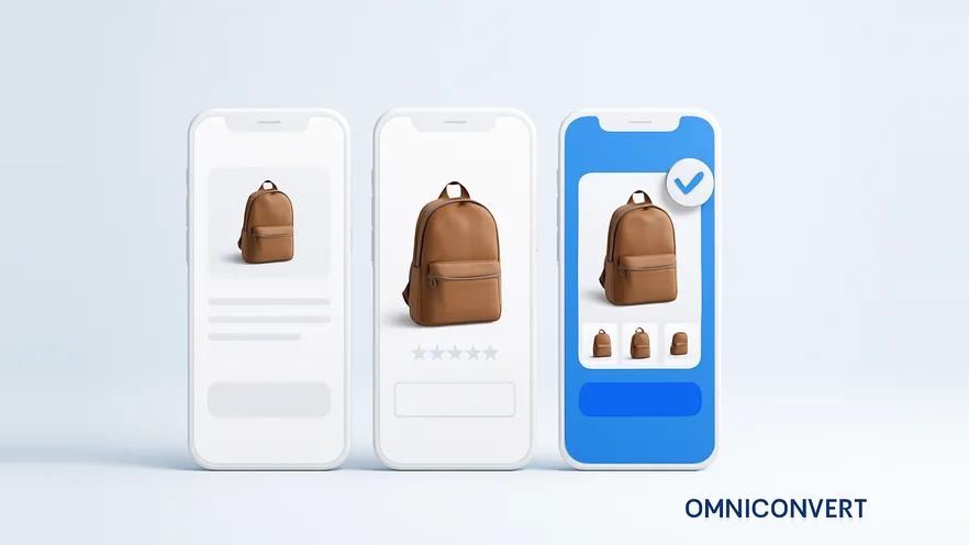
- The product showcase is the highest-value thing to test on a product page: Baymard Institute found that 42% of users try to judge a product's size from its images, while 28% of sites offer no in-scale image at all.
- Add-to-cart feedback comes in three patterns, on-page notification, overlay and confirmation page, and all three work only if they confirm the action before they try to sell anything else.
- Duplicate items in your cart data are a measurable symptom of add-to-cart feedback that shoppers did not notice.
- A call to action passes three checks: it stands out, the copy matches the action, and it visually beats every competing button on the page.
- Test the product page template rather than one product, so every product using the layout contributes traffic to the same experiment.
The product page is your last chance to wow a customer before they decide to buy an individual product. If it does not showcase the actual product, does not hone in on the details that matter, or does not have a crystal clear call to action, your conversion rates will be abysmal.
Three elements carry most of that weight, and they are the three to test before anything else: the product showcase, the add-to-bag notification, and call-to-action clarity. They map onto the three things the page has to do, which is help someone decide, confirm what they did, and make the next step obvious. Everything else on a product page, from badges to cross-sells to the reviews layout, is a refinement of those three.
1. The product showcase: images, options and description
When I say showcase, I am talking about the product shot, the options and the description. All of these can and should be optimized. The shot itself needs to be front and center, because people want to see what they are about to purchase. Give it to them. The large-image-plus-thumbnails pattern that Amazon made standard is standard for a reason: the product takes up real estate, several variations of the shot are one click away, and a closer look never costs a page load.
The count of images matters less than the jobs they do. A single cut-out shot on white answers one question and leaves the rest open. Cover the set instead:
- The plain shot. Product on a clean background, so the shape and finish are unambiguous. This is the thumbnail everywhere else on the site, so it has to read at small sizes too.
- The in-scale shot. The product next to something familiar, or in a hand, or in a room. This is the one most stores skip, and it is the one that quietly drives returns when it is missing.
- The detail shot. Material, stitching, port, texture, weave. Whatever the thing is made of that a buyer would check in a physical store.
- The in-use shot. The product doing its job, or worn, or installed. This one carries the context that a description takes three paragraphs to fail at.
- The objection shot. A photograph that answers the question your support team keeps getting. Does the lid fit the old model? Is the cable included? Photograph the answer.
I have seen different opinions on how far to take this. Still photography works and is industry standard. But I have also seen successful tests where the lead image was a preview to a product video, and other big wins using interactive 360-degree product photography. Since then, 3D and augmented-reality views have joined the list, and the same rule decides all three: rich media earns its place when fit, scale, movement or assembly is what the shopper cannot judge from a still. Furniture, apparel, footwear, tools. For a familiar, simple product, video mostly adds weight to a page a phone has to download.
The options and the description belong to the showcase, and they get tested far less often than the images. Variant selectors are a common failure point: colors shown as words instead of swatches, sizes that do not say which are out of stock, and, worst, a variant change that does not update the image so the shopper is looking at the wrong product. For the description, the useful test is rarely "longer or shorter". It is what goes first. Rewriting the product page messaging so the reason to buy comes before the specification list is one of the changes that has produced some of the largest lifts we see, and it costs nothing but an afternoon of writing.
2. Add-to-bag notifications: tell people the action worked
Sometimes customers get confused when they click a button and cannot tell whether anything happened. When someone adds to bag, you should notify them that the action is complete. What you can test is how you notify them.
The failure mode is easy to spot and embarrassing to have. A poorly executed overlay opens with cross-sells and service plans and never makes it absolutely clear that the item is in the cart. It looks like the store is trying to sell you three more things before it will admit you bought the first one. A good overlay does the opposite: it states what you did, uses color and hierarchy to highlight the primary next step, and only then offers the accessory or the protection plan. Same component, opposite outcome. Baymard's library of added-to-cart confirmation examples is a useful place to see how differently stores handle the same moment.
Here is how the three patterns compare.
| Pattern | What it is | Best for | How it fails |
|---|---|---|---|
| On-page notification | A message or mini-cart that appears in place, often dropping down from the bag icon in the navigation | Stores where shoppers routinely buy several items and browsing should not be interrupted | Too subtle to notice, especially on a phone, so shoppers click add again and end up with duplicates |
| Overlay | A modal over the product page confirming the addition, with routes to checkout and back to shopping | Higher-consideration products, and stores with a genuinely relevant accessory or warranty to offer | Leads with cross-sells, hides the confirmation, or is hard to dismiss on mobile |
| Confirmation page | A full page load that confirms the item and pushes related offers | Single-item purchases and stores that need a heavy recommendation block without slowing the product page | Costs a page load and a click back, and every extra click adds abandonment risk |
I would still love to see clean data comparing on-page confirmations against a dedicated confirmation page across a large sample. From a technical perspective a new page load is easier than weighing down the product page with more JavaScript. But we all know that the more clicks it takes to finish an action, the higher the risk of abandonment. That tension is exactly why this is a test and not a best practice.
One diagnostic before you test anything: look in your cart data for duplicate quantities of the same item. Shoppers do not usually want two. They wanted one, did not see the confirmation, and clicked again. That number is a direct measurement of how well your current notification works, and it is sitting in your database already.
Watch session recordings of the add-to-cart moment, then test the pattern that fixes it.
See how Explore combines research and testing →3. Call-to-action clarity
When you evaluate the CTA buttons on your product page, ask:
-
Does the CTA stand out?Not "is it a nice color" but "can you find it in half a second". The squint test still works: blur the page and see what survives. Check contrast against its background as well, because a low-contrast button is invisible to more people than you think, and on a phone it is invisible in sunlight to everyone.
-
Does the copy reflect the action?"Add to cart" adds to the cart. "Buy now" should take payment. "Continue" tells the shopper nothing about what happens next, which is why it produces hesitation and back-button traffic. If a shopper cannot predict the outcome of the click, the label is wrong regardless of how good it looks.
-
Does the main CTA take visual precedence over competing CTAs?Count the buttons in the buy box. Add to cart, buy now, subscribe and save, add to wishlist, a financing widget, a size guide, a share row. Every one of them is competing for the same attention, and giving them all equal weight is the same as having no primary action at all. Promote one, demote the rest, and test whether removing any of them helps.
-
Is it reachable where the decision is made?On a long product page, the decision often happens after the description, the specs or the reviews, and the button is thousands of pixels away by then. A sticky or repeated add-to-cart is one of the cheapest tests available, and on mobile it is close to table stakes. Test whether it earns its screen space rather than assuming it does.
If you answer no to any of these, tweak the CTA and test it. If you answer yes to all four, the CTA is not your problem, and you should go back to the showcase.
The phone is the product page now
When this article was first written, the product page was designed on a desktop and then squeezed onto a phone. That order is now backwards. The practical consequences are specific:
- No hover. Hover zoom, hover thumbnails and hover-revealed detail simply do not exist for most of your traffic. Zoom needs a tap target and a pinch gesture that works, and the gallery needs a swipe that does not fight the page scroll.
- The fold is brutal. On a phone, the image, the title, the price and the button cannot all live above the fold at a comfortable size. Deciding what goes first is a real test, not a layout preference.
- Weight is a conversion cost. Eight high-resolution images and a hero video are free on a desk and expensive on a train. Lazy-load everything below the first shot and measure the page against a real device on a real connection.
- Fingers, not cursors. Variant swatches, quantity steppers and the add-to-cart button need to be comfortably tappable and far enough apart that a thumb cannot hit the wrong one.
The measurement discipline matters as much as the design. Run every product page experiment with a device segment on the report. A desktop win with a mobile loss is common enough that treating a blended result as the answer will eventually cost you money.
How to test these three elements without wasting traffic
-
Find the problem before you pick the fixScroll and click heatmaps show whether the gallery, the options or the description get attention at all. Session recordings show the hesitation. An on-site survey on the product page, asking what nearly stopped someone from buying, gives you the objection in the shopper's own words. That sentence usually names the element to test.
-
Test the template, not one productA single product page rarely has the traffic to reach significance in a sensible time. Run the experiment on the layout so every product using it contributes visitors. Exclude out-of-stock and heavily discounted products, which behave differently and add noise.
-
Change one element per testShowcase, notification and CTA in separate experiments, in that order of priority. If you must move several things at once, use a multivariate test so you can still tell which change did the work. A five-change redesign that wins teaches you nothing you can reuse.
-
Pick the metric set before you launchConversion rate and revenue per visitor as the primary pair. Add-to-cart rate as the diagnostic that separates a page problem from a checkout problem. Return rate as the guardrail, because imagery and description changes can lift orders and lift returns at the same time.
-
Run for full weeks and segment the resultStop at a planned sample size, not on the first good morning, and always run whole weeks so weekday and weekend shoppers are both in the data. Then split by device, by new versus returning, and by traffic source before you write it up.
-
Write down what you learned about the customerRecord the belief the result confirmed or killed, not only the percentage. A losing showcase test that proves shoppers were never confused about size has still narrowed your next hypothesis. That is how a test backlog gets smarter instead of longer.
What product page tests actually move
| Element | What Explore tested | Result |
|---|---|---|
| Showcase (description and messaging) | Rewrote the product page messaging so the reason to buy came first (O'Donnell Moonshine) | +49.61% conversion rate, +6.67% revenue per visitor |
| Showcase (context and use cases) | Added use-case content to the product page so shoppers could match the product to their situation (Nextbase) | +26.16% conversion rate, +23.7% revenue per visitor |
| Showcase (readability) | Larger, more legible product-description typography (Pelagic) | +13.05% conversion rate, +10.05% revenue |
| Cart step clarity | Made the order summary clearly visible after the item was added | +7.41% conversion rate, +20.94% revenue per user |
| Mobile navigation and filtering | Simplified product filtering for non-technical shoppers on mobile (CLX Gaming) | +123.4% mobile conversion rate |
Read those as a range of what is possible, not as a forecast. The pattern worth taking from them is that the winners are clarity changes, saying the right thing sooner, showing the right thing bigger, removing a competing element, rather than pressure tactics bolted onto the buy box.
Frequently Asked Questions
Test the product showcase first, because it carries the most weight in the buying decision and it is where shoppers answer the questions your copy cannot. After that, test what happens when someone clicks add to cart, then the clarity of the call to action itself. Those three cover the decision, the confirmation and the action, which is the whole job of the page. Anything else, badges, cross-sells, reviews layout, comes after those three work.
There is no universal number, but one clean cut-out shot is never enough. Baymard Institute research found that 42% of users try to judge a product's size from its images, and 28% of sites do not provide a single in-scale image. Cover the jobs rather than a count: what it looks like on a plain background, how big it is, what the material and details are like up close, and how it looks in use. Add a shot for every question your support team keeps answering.
It depends on the product and the objection. Video and 360-degree or 3D views earn their cost for products where fit, scale, movement or assembly is the thing people cannot judge from a still: furniture, apparel, footwear, tools, anything with moving parts. For a simple, familiar product they add page weight and little else. Treat rich media as a test, not a redesign: add it to your top ten products, measure conversion rate and return rate against the control, and roll out only where both improve.
There are three patterns: an on-page notification, an overlay, and a dedicated confirmation page. All three work when they clearly acknowledge the action first, show the item and quantity that were added, and give an obvious route both to checkout and back to shopping. All three fail the same way, by leading with cross-sells before confirming what the shopper just did. Which one wins for your store depends on whether shoppers usually buy one item or several, so test it.
Almost always because the confirmation was too quiet to notice. If the only feedback is a cart-count digit changing in the header, a shopper who was looking at the product will not see it, so they click again. Duplicate quantities in your cart data are one of the cleanest signals that your add-to-cart feedback has failed, and they cost you support tickets and returns as well as trust.
Ask three questions. Does the CTA stand out from everything around it? Does the copy describe the action that will actually happen? Does the main CTA take visual precedence over competing buttons? A no to any of them is a test. The most common failure is not a weak button but a crowded one, where add to cart, buy now, save for later, and a financing widget all compete for the same attention.
Yes. Most retail site visits now arrive on a phone, so the phone layout is the product page and the desktop version is the variant. That changes the advice: the gallery has to work with a thumb and no hover zoom, the description competes with a sticky add-to-cart bar, and every extra image is a load-time cost on a mobile connection. Judge every product page change on mobile numbers separately, because a desktop win can hide a mobile loss.
Conversion rate and revenue per visitor as the primary pair, add-to-cart rate as the diagnostic that tells you whether the page or the checkout moved, and return rate as the guardrail. A change to imagery or description can lift orders and lift returns at the same time, which is a loss written up as a win. Segment the result by device before you call it.
Show the product properly, tell people clearly when they have added it to the bag, and make the call to action impossible to misread. Three elements, in that order, and each one is a stack of testable questions rather than a single change. Start with the showcase, because it is where the decision is made, and work down. Test the template rather than one product so you actually reach significance, split every result by device before you celebrate it, and keep an eye on returns as well as orders. Happy testing.
Test your product page on real traffic
Omniconvert Explore combines heatmaps, session recordings and on-site surveys with an A/B and multivariate testing engine, so the research that finds the product page problem and the experiment that fixes it sit in one platform. Explore has been used across 7,000+ websites and 70,000+ experiments, with a 23.2% average uplift.