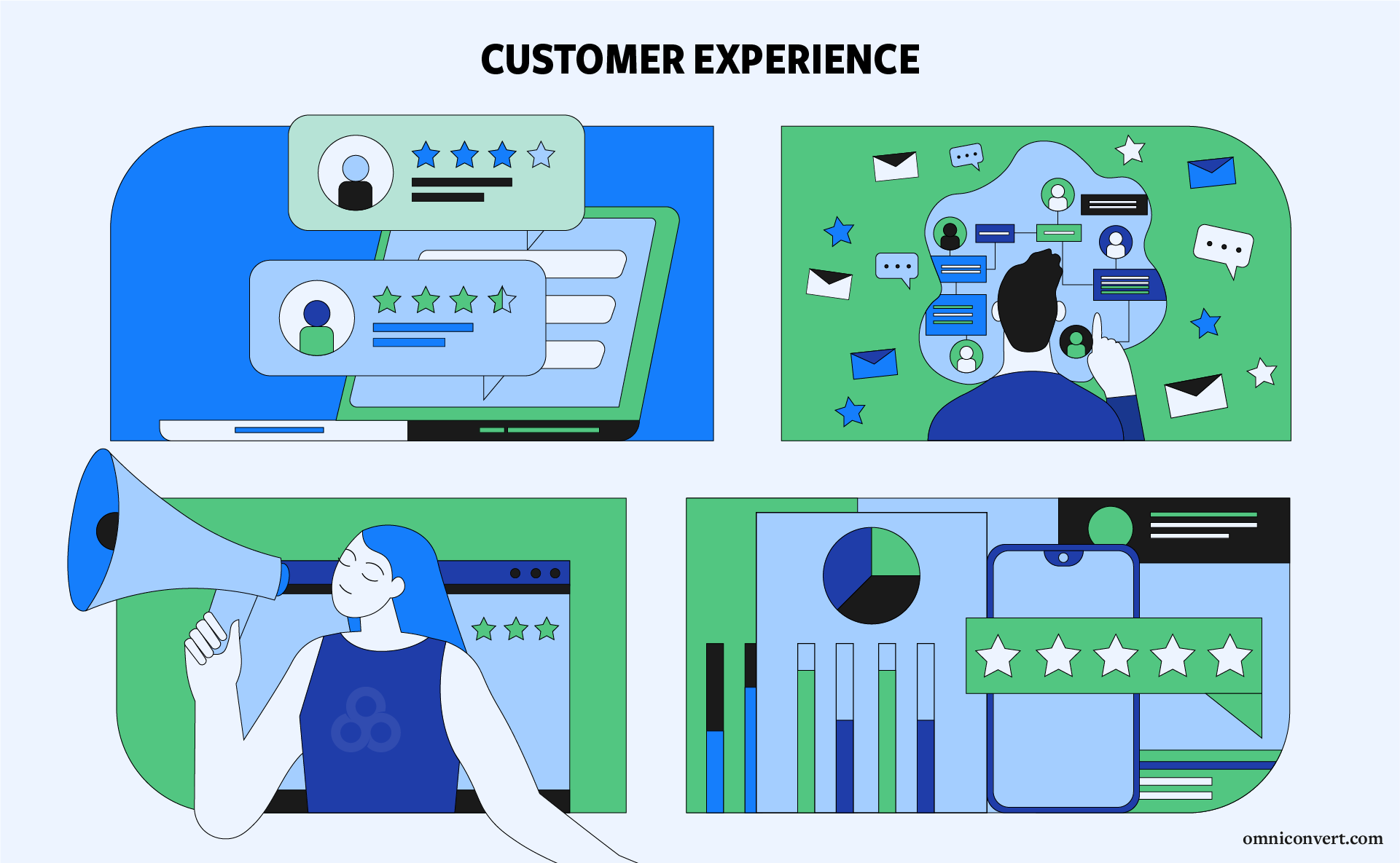
12 Best Companies for Customer Experience
Article last updated:
Article first published:
Which companies provide the best customer experience? We gathered 12 examples and peeked into their customer experience strategies. Read on!
In today's market, a good customer experience (CX) is a basic expectation. Yet, an exceptional customer experience remains the strongest competitive edge a company can achieve.
In our previous articles, we offered an introduction to customer experience, we told you what to emphasize while developing a customer experience strategy and we also dived into the tricky world of digital CX.
In this article, we’ll provide companies with best customer service and will explain what sets them apart.
Top Best Customer Experience Companies
- Uber - Top Customer Convenience
- Netflix - Best Viewing Experience
- The Ritz-Carlton - Best Guest Service
- JetBlue - Top Passenger Care
- Disney - Best Magical Experience
- Buffer - Best User Engagement
- Hubspot - Top Customer Support
- IBM - Best Client Solutions
- FedEx - Best Reliable Shipping
- Amazon - Top Shopping Ease
- Ikea - Best Shopping Experience
- Le Bon Marché - Best Shopping Ambiance
Why Customer Experience Matters?
We know it’s extremely hard to compete on products, services, and prices these days. This is why the best-performing businesses took it up a notch by focusing more on their customers and the things that matter most to them.
Customer experience is positively correlated to the way people perceive the product or service you’re offering. In fact, most of the people value customer experience far more than the price. This virtually means that you can charge more if you know that you offer an unbeatable experience.
Moreover, customers remember the service, the product experience and the interaction a lot longer than they remember the price. So, when thinking about reducing customer churn, your go-to shouldn’t be lowering your prices – but elevating the experiences. This is why great businesses see service not as an additional cost but more as a sales opportunity.
Word-of-mouth is still one of the most powerful marketing channels so offering a positive experience results in happy customers that will be more inclined to turn into brand advocates in the future.
On the other hand, a poor customer experience is extremely costly for any business.
According to the latest CX stats, 51% of customers will never do business with a company again after only one negative experience.
Yet, any experiences that fall short of customer expectations can be turned to a company's advantage. If a company adapts quickly and turns things around, customers will be willing to give a second chance.
How We Evaluated the Top Customer Experience Companies
In preparing our list, we conducted extensive research to ensure a comprehensive and accurate representation of the companies featured. Our methodology included:
- Key Features and Approaches: We investigated the unique aspects of each company that contribute to exceptional customer experiences. This includes the strategies they use to achieve high customer satisfaction.
- Data Collection: To ensure objectivity and reliability, we sourced real data: Statistical Data: We accessed statistical data from platforms like Statista to verify that the companies maintain a positive customer experience.
- Real-World Reviews: For the companies in the list, we examined feedback on G2, Trustpilot and, we looked also at TripAdvisor. This allowed us to understand general public opinion about their services.
- Customer Loyalty Score: All companies on our list have a customer satisfaction score of over 74%, indicating strong customer loyalty.
- Customer Experience/Satisfaction Awards: We noted which companies have been recognized with awards for their outstanding customer satisfaction.
This multi-faceted approach ensures that our list is well-rounded, reflecting not only popular opinion but also industry recognition and statistical validity.

Like what you're reading?
Join the informed eCommerce crowd!
Stay connected to what’s hot in eCommerce. We will never bug you with irrelevant info.
By clicking the Button, you confirm that you agree with our Terms and Conditions.Top 5 B2C Companies with Great Customer Experiences
Uber
According to Statista, Uber demonstrates strong customer experience in the U.S., evidenced by its high brand awareness at 92% and popularity, with 63% of mobility service users liking the brand. Additionally, 75% of users are likely to use Uber again, indicating significant customer loyalty.
People at Uber have identified all the pain points people faced while hailing a cab- and they eliminated them one by one. No more painstaking anticipation while waiting for your cab because you know exactly where your ride is at any time and how much it takes until it’s there.
Moreover, enabling ratings for both users and drivers is a way of ensuring that their services will always meet their clients’ and their partners’ expectations. Drivers only talk to you if you’re in the mood for conversations and some of them even offer you something sweet along the way. In-app credit card payment is also an advantage, given that fewer and fewer people carry cash on them.
Netflix

Netflix is another example of a company disrupting an entire industry with amazing customer experience.
They went from 21.5 million paid subscribers in 2011 to over 158 million paid memberships worldwide in 2019. In the first quarter of 2024 alone, the streaming giant added more than 9 million new paid subscribers worldwide. If you also count the non-paying guests of those who have premium accounts, the number of people enjoying their streaming service, is much larger. Netflix's customer loyalty score is reported to be 88% according to the Comparably platform.
Personalization is the key feature of their movie and series selection – and probably a pillar of their customer journey map.
When you register, you are able to use the platform for free during the first month. After that time, you can choose one of the three membership plans (basic, standard or premium) or you can cancel your membership. The main advantage of video streaming platforms is that you can watch your favorite shows without being interrupted by commercial breaks. The possibility to download movies or episodes from your favorite series to watch later, when there is no internet connection is also a big plus.
The other advantage is related to the much wider range of productions they offer. Furthermore, when you create a profile on their platform you can choose the titles you like most so that their algorithm figures out what suggestions are the best fit. Suggestions improve as you watch and you will find yourself hooked on Netflix in no time. This is the real meaning behind their tagline: “See what’s next”.
Their online communication is also one of the reasons people are so fond of Netflix. They have dedicated Facebook and Twitter pages for each genre, as well as Instagram accounts for each Netflix original series. Bojack Horseman’s account, for example, is managed from the perspective of the main character, making it seem like you’re really interacting with him. They know how to create anticipation around their productions and they have built strong communities around them, communities that everyone wants to be a part of so that they don’t miss out on interesting, trending topics.
The Ritz-Carlton

Notorious for its incredibly high standards, this hotel chain is the epitome of excellent customer experience. As they mention on their website, their highest mission is the genuine care and comfort of their guests.
They received a 5-star rating on TripAdvisor based on 3,845 reviews, with 2,939 of these specifically praising the excellent service. One customer commented, “Service all around was outstanding - everyone had a smile on their face and was friendly and helpful, from housekeeping to pool and beach staff, restaurant staff, bellmen, etc. A true pleasure.”
Furthermore, the customer loyalty score stands at 81%.
Notably, it is the first and only hotel company to be twice honored with the Malcolm Baldrige National Quality Award by the United States Department of Commerce, reflecting its unparalleled commitment to customer experience excellence.
Their motto is “Ladies and Gentlemen serving Ladies and Gentlemen”. They always offer a warm and sincere greeting upon their guests’ arrival. Furthermore, they use each guest’s name and they aim to anticipate and fulfill each of their needs. So the emphasis is on the personal part, obviously.
A story about their staff’s dedication has become viral. It is about a family staying in the Ritz-Carlton hotel in Bali, who brought special milk and eggs for their child who had numerous food allergies.
After they arrived, they noticed that the food had gone bad, so the Ritz-Carlton customer experience manager and dining staff searched the whole town for the appropriate items but without any positive results. Fortunately, the executive chef at the resort remembered a store in Singapore that sold them. He personally called his mother-in-law and asked her to buy them and bring them over by plane, which she did gladly, saving the situation and offering their guests an unforgettable experience. Sure, their services aren’t cheap but people know exactly what they are paying for.
JetBlue

Airline companies are notorious for their generally bad services. Yet this is an inspiring story of a real people person. He can be seen handing out water and donuts to people waiting in line at the check-in counter, along with the other crew members. Then they went on to host trivia games during a flight and gave away free tickets to any of their 60 BlueCities to the winners.
The JetBlue team apparently goes above and beyond in order to satisfy their customers. As of March 2022, the airline achieved the second-highest ranking in customer satisfaction among North American airlines within the economy and basic economy segment.
It has a dedicated customer service plan, which emphasizes creating the best possible travel experience, even when circumstances are less than ideal.
Like when they did everything they could to return a simple pair of sunglasses to a client who left them on the plane. Empathy and cooperation are core values that trigger positive customer reactions. Something as simple as a glass of water may have been exactly what tired people in the queue were longing for. JetBlue's customer loyalty score stands at 74%. Additionally, it has received a rating of 4.56 out of 5 based on 34,524 reviews on the Influenster platform. One customer review highlights, "JetBlue is the best airline company! Their planes are spacious, clean, and comfortable. The staff is friendly and professional. I have never had a bad experience flying JetBlue!" The thoughtfulness of the JetBlue staff clearly left a lasting impression on those pleasantly surprised clients.
Disney

In 2022, based on Statista data, over 17 million people visited the United States' Magic Kingdom at Walt Disney World, making it the most visited amusement park globally. However, attendance still fell short of pre-pandemic levels, when over 20 million visited the park in the year before the health crisis.Additionally, the customer loyalty score is 83%, which is an impressive achievement.
It takes a lot to deliver the best customer experience to their guests. Young women who played Disney princesses at Disneyland revealed everything they went through in order to fulfill their dream of becoming their favorite characters.
When they audition, they don’t get to choose which princess they will play. If they want to play Cinderella but they are a better fit for Ariel or Belle, they will be cast as one of the latter. They have to be the right shape and the right size and they go through an extensive training period during which they learn everything about their character. They need to act like that specific princess at all times in order to offer children the most authentic experience.
Before being allowed to play their character, they spend some time as a “fur character”, such as Mickey, Minnie, or Pluto just to get accustomed to the atmosphere. During their time as princesses, they should personally greet no less than 172 guests per hour and entertain them accordingly because this is what children want after all: to spend some quality time with the characters they love the most.
It's no secret why Disney received a rating of 4.5 out of 5 based on 28,071 reviews on TripAdvisor. One customer highlighted the immersive aspect of Disney, noting, "The fact that many characters walk around makes it very immersive and many of them gave me experiences I will remember forever."
Apart from this, Disney's use of data, including innovative methods like scanning guests' shoes, allows for highly personalized experiences that cater to individual guest preferences and behaviors. Also, the My Disney Experience app and MagicBands provide guests with real-time information and convenience, integrating technology into the experience without intrusiveness.
Top 4 B2B Companies with Great Customer Service
Buffer
Buffer is a social media management tool for marketing teams and companies. But they don’t want to limit themselves to offering a super-useful tool for those who need it. They also want to earn a reputation for their customer-centric approach. This is why their customer support team is also called the “Happiness Team”. In their own words:
“We view every interaction that comes our way—every email, tweet, question, review, mention and more—as a true privilege. We know that it means someone took special time out of their day to think about us or get in touch with us. It’s a chance for us to have a conversation, to learn something we didn’t know before, to think about what we could do differently or better.”
Their main goal is to keep each and every one of these interactions special and as unique as possible.
They have a reactive team (the Heroes and Warriors) as well as a proactive one, with the Community Champion sending out love to their customers all day long. They aim to build a real community around their service and they are actually pretty good at it. With quick responses, thoughtful messages and genuine interactions, they make sure they always do “the right thing”, which is staying true to their company’s DNA.
The platform received a rating of 4.3 out of 5 stars on G2, based on 1005 reviews. One customer highlighted, "The best part of the software is its fluency and ease of navigation and understanding. They also offer responsive customer support, which enhances the user experience. I use this platform daily to manage all my social media accounts and schedule multiple posts at different times for optimal results. It integrates effortlessly with all other social media accounts of our organization in seconds." By the way the customer loyalty score measures at 79%, which is really noteworthy.
It’s obvious that, in the debate between customer experience vs. anything else, experience is always the Champion for Buffer.
Hubspot

Hubspot is a sales, services, and inbound marketing software provider. Its customer service team knows it takes a lot to convince people to choose you over anyone else in the industry. Their solution is providing potential customers or any interested parties with useful reports and information from the industry.
HubSpot received a rating of 4.4 out of 5 stars on G2. One customer commented, "I was also pleasantly surprised that their customer service and product teams are extremely hands-on and are heavily focused on the customer/user experience."
They use content marketing to keep people as much as they can on their website and they always try to answer the most frequently asked questions from their field.
They always publish fresh content and adapt the old one for it to respond to the ever-changing realities within their field. They repurpose their content by transforming it into useful all-in-one guides, available for download. They do so because they understand that their audience only wants to make well-informed decisions.
Therefore, they offer to educate this specific audience, thus establishing credibility and nurturing the bonds with each and every visitor. Their chatbot is also there, available at any time to help people better find what they are looking for.
They also offer free certification courses, which are especially interesting and useful for marketing professionals. What is more, they built an entire community on Facebook, counting over 200,000 people who visit the group regularly in order to find out more about various trends and have their questions asked by other trusted professionals.
IBM

IBM started off as a company designing and producing personal computers. Nowadays, it does much more than just that. It offers cloud services, AI tools, business analytics, and data management software, and much more. It also publishes the prestigious, award-winning Industrious quarterly publication, both in print and digitally. It features top content from the IBM Industries blog, as well as insights from various industry experts. The best thing about it is that it is available online for free at a time when most people still try to monetize their precious content. What’s more- they offer video trailers of every issue’s content, a feature particularly relevant for those who prefer other formats than the written one.
IBM's commitment to prioritizing clients is a key factor in its ongoing success, as evidenced by its recognition in industry awards such as the G2 2024 Best Software Awards. These awards rank the world’s top software companies and products, based on authentic and timely reviews from real users.
IBM senior vice president of digital sales and chief marketing officer Michelle Peluso explained where this approach originated from:
“Client and customer needs are changing at a very rapid pace. We want to make sure IBM is interacting with the people who use our systems, software, and services—not just the person making the purchase decisions.”
This shows that awareness is not enough on its own, you have to constantly educate and delight your customers for them to keep doing business with you. By offering this type of content, not only do they keep their clients engaged but they also establish credibility and reinforce their position on the market.
They also assign a team of specialists to new customers to help them integrate IBM Cloud Storage into their existing processes. These experts train them by showing the best applications of the tool depending on the industry they’re in. They understood that informed customers are the most engaged ones and also the most likely to use their services in the future.
FedEx
FedEx is the second most trusted American B2B company. They take pride in connecting people and possibilities through their service. This cannot happen without an open, streamlined communication. They recently moved to a single customer-focused newsletter instead of multiple emails from various departments. They did so for multiple reasons, one of them being the need for more accurate and instantaneous information.
FedEx was honored with the Best Customer Support of the Year Award by the Japan Institute of Information Technology, selected from among nine companies for its high-quality customer support. In assessing the company's initiatives, the Japan Institute of Information Technology praised FedEx for its advanced approach. They noted FedEx's high-level objectives, such as enhancing customer engagement through a heightened focus on quality, a more sensitive response to customers' feelings, and evaluating customer feedback by recording conversations.Apart that, It has has a customer loyalty score of 74% based on data from the Comparably platform.
FedEx teams also work closely with all the external collaborators, keeping them updated and solving their issues as soon as they arise. They also partner with different eCommerce shipping service providers like PluginHive, and provide a seamless FedEx shipping experience to the online store owners. They value customer feedback and are always open to suggestions, in a continuous attempt to set and improve customer experience best practices.
FedEx also took on social responsibility, pledging to help 50 million people by their 50th anniversary. This journey is showcased on social media, through the hashtag #fedexcares. Among others, they are using their global network to deliver resources where they are needed most in times of disaster and for special shipments. This may not directly impact their customers but they are a positive indicator of the value FedEx places on people. A brand that respects its mission and values is a brand that will satisfy customers’ needs.
3 Retail Companies With Best Customer Service
Amazon

Many things can be said about Amazon, but one thing is certain: it’s one of the most customer-centric companies ever. It started off as an online bookstore, aiming to enhance the process of discovery by offering a personalized experience.
Now it is the biggest online retailers in the world and this shift wouldn’t have been possible without a genuine focus on customers’ interests and behavior. The more its portfolio expanded, the more integrated the business model had to become. Its customer success lays in the way its founder and engineers managed to remove friction from the online buying process while offering exceptional value in pricing and item choice.
In 2023, Amazon was crowned the king of Black Friday, becoming the preferred shopping destination for U.S. shoppers and even outpacing in-store purchases. Nearly 60% of consumers identified Amazon as their top choice for securing the best Black Friday deals. This trend was mirrored in the United Kingdom, where Amazon also ranked as the favored destination for Black Friday shopping. In 2023, the customer satisfaction score of the online retailer was 83 out of 100 ASCI points, and its customer loyalty score was 89%.
Amazon is definitely a leader, a trendsetter, not a follower. When people feared the books would become obsolete, Amazon came up with Kindle, which is now credited with helping the digital book format to explode in popularity. When the business conquered new markets, Amazon streamlined the process by offering shoppers the possibility to browse the marketplace in their own language and pay in their own currency.
They launched Alexa, their own AI virtual assistant in 2014 and the volume of vocal search queries has boomed ever since. They launched Amazon Key, a smart, keyless solution for home security, then tied it to their famous delivery process, which now offers users the option of in-home delivery.
The latest innovation proposed by Amazon is the launch of Amazon Go, a new kind of store, with no checkout required. Users can simply walk into the store, check in with their app, and then start taking items from the shelves as they go, without needing to stand in line at the checkout counter at the end. Ultimately, they will be charged through the app and their Amazon account.
Their powerful algorithm which predicts what each customer wants and then brings it up upfront is one of the most appealing elements of its strategy, mostly because it fuels customers’ wish to buy more. Personalized recommendations based on shoppers’ previous purchase decisions are a big plus when you’re operating in the retail segment. One-click purchase options, fast worldwide delivery, an advanced package tracking system, an easy return policy, and 24/7 customer service tools are other elements that keep users hooked and coming back on the website to shop for their favorite products.
Their premium membership program, Amazon Prime, is another customer success story, offering users free delivery within two days or even same-day delivery for customers in select areas. Premium members also receive exclusive deals and have access to Amazon’s entertainment platforms, offering audio and video streaming services, as well as options for gamers and Kindle readers. As of July 2019, 82% of US households have a Prime membership.
Ikea

In a world where business leaders and marketing specialists rack their brains to eliminate all points of friction and tension from the customers’ experience, Ikea chooses to build on them instead.
It may seem counterintuitive but it’s part of the Swedish company’s brand DNA. The fact that you have to go through all the labyrinthine store to find what you need, then to assemble the furniture pieces by yourself, at home, can both be important pain points but the way Ikea addresses them is the way that makes the difference.
According to Statista, the number of visits to IKEA stores worldwide has been tracked from 2010 to 2023. In the fiscal year of 2023, IKEA experienced approximately 860 million visits globally, marking an increase from the previous year. Additionally, its customer loyalty score stands at 76%, indicating a commendable level of customer satisfaction and retention.
Visiting Ikea requires customers to take an entire afternoon off in order to patiently wander around the store. The smart design of the aisles, showcasing exactly how the furniture would look in your home, is particularly appealing to customers, it’s the exact kind of experience they are seeking.
A visit to Ikea is not a thing to check off your list but rather a long-awaited experience, a calm afternoon culminating with a delicious meal at their famous restaurant. It sells more than high-value goods with a smart design: it sells the Swedish lifestyle. They place a high emphasis on functionality, bright colors, natural materials, light and the clever way of harmonizing them in order to make the most out of the available space. In turn, all these elements lead to a peaceful, quiet life, free of stress and anxiety- an ideal most of us aspire to.
Yet this doesn’t mean that Ikea doesn’t take into account its clients and their problems. The company’s mobile app allows users to browse through the online catalog, check for prices and availability of the desired products and make a shopping list to help them better orient through the stores. This is an extension of their already existing system, which offers customers shopping lists and pencils at the entrance for them to complete along the way and keep track of the desired objects.
The Ikea Place app uses AR technology to help users figure out how the products would fit into their rooms before they even visit the stores, thus significantly decreasing the risk of buying objects that do not match their home environment and improving user experience.
From the standpoint of experiential retail, Ikea listens to its customers. In response to an online initiative demanding sleepovers at Ikea, “pajama parties” have been organized in Ikea stores worldwide since 2011. Selected participants received goody bags packed with sleep essentials and enjoyed the in-store sleepover with a yoga and meditation corner, breakfast in bed, and massages.
Le Bon Marché

Department stores are at risk all around Europe with the rise of online shopping. The best way to fight off this tendency is to reinvent the way these stores are doing business and it has a lot to do with experiential retail.
Le Bon Marché received a rating of 4.5 out of 5 stars on TripAdvisor based on 1,313 reviews. One customer highlighted the exceptional experience, noting, "I toured the entire Gourmet Department and the Housewares Department and found the displays, merchandise, and service to be top-notch. The salespeople in the store were bi- and trilingual, providing excellent service to someone who did not speak French very well."
As Patrice Wagner, chairman and CEO of Le Bon Marché Group, stated: “You have to give customers another reason beyond shopping to come to the store, such as an exhibition or collaboration.”
In 2018, they did just that by giving one of their stores in Paris a West Coast makeover with the opening of an LA-themed in-store exhibition. Celebrating the American lifestyle, they installed a skateboarding ramp, suspending from the ceiling, where skateboarders performed their best tricks. Following the trend of pop-up stores, they transformed their place into one of their own, showcasing American brands in food, fashion, beauty and home. They even opened their very first yoga studio and a temporary tattoo parlor.
In 2019, they inaugurated the “Greek Mais Chic” exhibition, which allowed customers to embark on unique 3D journeys, personalize their T-shirts with the sound of their own voices, design their own trainers or even a fragrance. Incorporating both AR and VR technologies, Le Bon Marché offered visitors the opportunity to interact with the brands from their portfolio in an unprecedented, multi-sensorial way. All that in an attempt to revitalize a concept that has inspired French shoppers from the 19th century.
How to measure customer experience
No matter what industry you belong in, or the zeitgeist you’re operating into, measuring customer experience is the one step you can never skip. After all, you can’t improve what you don’t track.
While there is no formula set in stone for customer experience, you can still measure related metrics and use them to grasp the quality of experiences you’re delivering:
- Customer Satisfaction Score (CSAT)
CSAT (Customer Satisfaction Score) is a widely used metric in customer experience to gauge the satisfaction level of customers with a company's products or services. It is determined through customer feedback surveys and is expressed as a percentage, with scores ranging from 0% to 100%.
- Net Promoter Score (NPS)
The Net Promoter Score (NPS) gauges the loyalty of customers to a company, assigning a score between -100 and +100. This score is derived from customer responses to the question, "How likely are you to recommend this company to a friend or colleague?"
- Customer Effort Score (CES)
Customer Effort Score (CES) is a metric used to assess how easily customers can interact with a product or service, resolve support issues, or access necessary information. It is measured by asking customers to rate their effort on a scale of 1 to 7 through a CES survey.
- Customer Lifetime Value (CLV)
Customer Lifetime Value (CLV or CLTV) is a metric that represents the total amount of revenue a business can expect from a single customer account over the duration of their relationship. This figure is calculated by comparing the revenue value generated by a customer to their anticipated lifespan with the company.
- Customer Churn Rate
Customer Churn Rate is the percentage of customers who cease their business relationship with a company within a specific period. This metric can be assessed on an annual, monthly, weekly, or daily basis. If customers feel they are not receiving the best service or value, they may choose to take their business elsewhere.
- Customer Retention Rate
The customer retention rate indicates the percentage of customers a company retains compared to those it loses. It's crucial to monitor this metric closely for any business aiming for sustainable growth. For most organizations, maintaining a focus on customers is essential. Attracting and retaining customers is integral to their success.
- Customer Journey Analytics
Customer Journey Analytics is a method used to gather, analyze, and interpret data about the entire customer journey to understand and improve customer interactions across all touchpoints and channels. It helps businesses see how customers move through the sales funnel, from initial awareness to the final purchase decision and beyond, including post-purchase engagement and potential repeat business.
- Customer Support Tickets
Customer Support Tickets are a formal way of tracking interactions between customers and a company's support team. Whenever a customer encounters an issue or has a question regarding a product or service, they can submit a ticket through various channels such as email, phone, or a dedicated support portal.
If you’re looking for practical insights into using metrics to analyze your customer experience data, check out our introductory article.
What is a good customer experience?
Our friends at Hubspot summed things up pretty clearly: the way you think about customer experience has probably had a profound impact on how you look at your business as a whole. The impression you leave at the end of any kind of interaction with your prospects and clients leaves an important mark on how they perceive you and your products.
- Evolving Customer Expectations: To truly satisfy customers, it's essential to understand and cater to their deeper desires. This might involve: Recreating specific feelings or crafting unique interactions.
- Integrating new technologies to simplify and enhance processes.
Understanding Your Audience: The key to delivering memorable experiences lies in knowing your customers well—understanding their lifestyles, shopping habits, and preferences. Innovation and Creativity: The foundation for exceptional customer experiences is set; the rest depends on your creativity and imagination. Utilize insights and examples from B2C, B2B, and retail sectors, which we've gathered, for further guidance and industry best practices. Empathy and Understanding: Good customer service representatives show genuine empathy and understanding towards customers' situations. Handling interactions with care can significantly impact customer satisfaction. Personalization: Customers appreciate a personalized experience that caters to their specific needs and preferences. This can range from personalized emails to tailored product recommendations. Simplicity and Convenience: The processes customers need to go through, whether it’s purchasing a product, getting support, or returning an item, should be straightforward and easy. Reducing friction at every step is crucial. Quick and Efficient Service: Responsiveness plays a significant role in customer satisfaction. A good customer experience often involves minimal wait times, prompt service, and quick resolutions of any issues.
While fast delivery, convenience, impeccable customer support, and seamless communication are critical, they alone are not sufficient. They represent pieces of a larger puzzle that demands completion. A good customer experience is the feeling that a customer is valued and respected throughout their whole experience with a company so that they not only return, but recommend the company to others.
How to make a great customer experience
So, here are some ways to improve your customers' experience and provide more than just a shopping task. Learn to deliver intimate, sophisticated experiences that make your customers return. Also, understand what constitutes a great customer experience.
- Solving for customers and designing the online and offline experiences according to their specific needs makes for great customer experience.
- Understanding why people feel the way they do about your business is crucial when you define and refine your strategy. It helps you deliver better customer experience and leave a more durable mark on them.
- Taking some time to write personal e-mails to your most important clients, crafting stories and engaging campaigns for your brand, improving the interaction across all the touchpoints and offering personalized discounts on special occasions are just a few examples. For the latter, Hubspot tells us the story of a pizza place in Boston which ran a special promo on Pi Day (March 14th, or 3.14): $3.14 pizzas for everybody. This must have been fun and attractive for math geeks around.
- Convenience, irreproachable customer support, fast delivery, which are essential pieces of the puzzle but not enough on their own.
- Flawless communication and an omnichannel approach, in order to delight more customers, regardless of their preferred channel or of their customer journey.
- Last but not least, giving people exactly what they want, right when they want it.
Business models may change but customers must remain the top priority of a company for it to stay profitable. As their priorities change, as newer trends and smarter technologies emerge, businesses need to accommodate these transformations faster than ever. Positive customer service experience is no longer enough: you need to be innovative in order to remain competitive, as the case studies above illustrate.
Frequently Asked Questions about Great Customer Experiences
What is meant by Customer Experience?
Customer experience (CX) represents the overall perception a customer has about a brand based on their interaction throughout the customer journey. The ways customers perceive the experiences created around your brand, products, and services dictate how the relationship will evolve.
What is a good customer experience?
Fast delivery, convenience, irreproachable customer support and seamless communication are some of the aspects of a good customer experience. However, you should always research your customer base and identify other elements specific to your brand even industry. Customers always expect more and in order to deliver that, you need to always be mindful of what they really want.
What are the 3 main components of Customer Experience?
All components rely to customers' place in the Customer Journey. The first step is Discovery - how the new customer found you. Then comes engagement - before they buy, customers research. This step relates to answering customers' questions or providing further info about your products. Then comes the Delivery - your goal here is to deliver the orders on time and in good condition.


Sign up to our bi-monthly newsletter!
Actionable eCommerce insights only.

Master what matters most in eCommerce
✅ Get more loyal customers
✅ Improve Customer Lifetime Value
✅ Maximize profits
Discover all features30-day free trial, no credit card necessary.
If you liked this article, make it shine on your page :)