Top 20 Ecommerce Reports for Successful Business Optimization
Article last updated:
Article first published:
Ecommerce reporting involves the collection and analysis of data related to an online store's performance. Ecommerce reports help monitor key performance indicators (KPIs), understand customer behavior, and make informed decisions to optimize performance. Key reports include:
- Finance Reports: Track revenue, expenses, and profitability.
- Product Analytics: Analyze product performance and sales trends.
- Acquisition Reports: Monitor how customers find and reach your store.
- Behavior Reports: Understand customer interactions and behavior on your site.
- Marketing Reports: Evaluate the effectiveness of marketing campaigns.
- Etc: For the full list, explore our article.
Properly set up e-commerce reports reveal all the important aspects of your shop. Every eCommerce platform offers its own analytics reports. Platforms like Shopify, Magento, and WooCommerce provide a variety of reports, from standard overview dashboards to more detailed ones, depending on the subscription level.
In this guide, we focus on Shopify and Reveal by Omniconvert. We will first present the reports included in the Basic Shopify plan and then explore the reports offered by Reveal, showing how to unlock and leverage your eCommerce store data fully.
KPIs to Track in Your Ecommerce Reports
An effective e-commerce report should include key performance indicators (KPIs) that provide valuable insights into various aspects of your online store's performance. Here are the essential KPIs to track
- Sales Metrics: Monitor total sales, average order value (AOV), and sales growth over time.
- Customer Acquisition Cost (CAC): Measure the cost of acquiring new customers through different marketing channels.
- Conversion Rate: Track the percentage of visitors who complete a purchase.
- Customer Lifetime Value (CLV): Estimate the total revenue a customer will generate over their lifetime.
- Cart Abandonment Rate: Measure the percentage of shoppers who add items to their cart but do not complete the purchase.
- Customer Retention Rate: Monitor the percentage of repeat customers over a specific period.
- Website Traffic: Track the number of visitors to your site, their sources, and their behavior.
- Visits or Sessions: Monitor the start and end of user visits to create engaging experiences and increase conversions.
- Bounce Rate: Measure the percentage of visitors who leave your site after viewing only one page.
- Product Performance: Analyze sales, returns, and customer reviews for individual products.
- Refund and Return Rates: Measure the percentage of orders that are returned or refunded.
- Revenue: Track the total money collected from customers over a given time frame.
- Customer Satisfaction Scores: Collect and analyze feedback to gauge customer satisfaction and identify areas for improvement.
Basic Shopify Reports
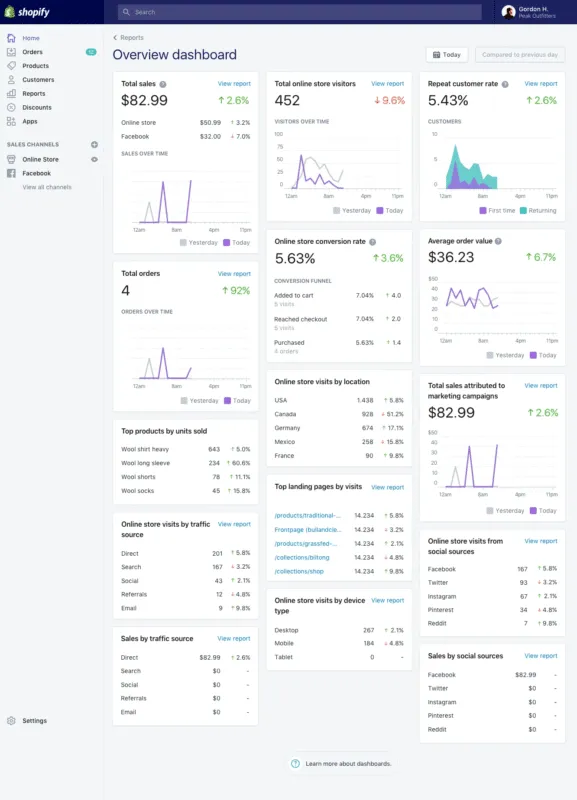
1. Overview Dashboard
The Overview Dashboard report helps users compare data and spot trends in one place. You can compare data to a specific period or the same date range from the previous year using the “Compare to previous dates” option. If you have point-of-sale locations, you can also see the number of sales in each location and the sales handled by each staff member.
Key Metrics:
- Total Sales: Tracks the total revenue generated, showing overall store performance. If total sales are low, consider running promotions and optimizing product listings.
- Total Online Store Visitors: Counts the number of people visiting your store. You can increase your traffic by enhancing SEO, running marketing campaigns, and leveraging social media.
- Total Orders: Measures the total number of orders placed. Boost order numbers by offering incentives like free shipping, discounts on bulk purchases, and easy checkout processes.
- Conversion Rate: Measures the percentage of visitors who make a purchase. A low conversion rate may indicate issues with your website. Improve it by optimizing the site design, simplifying navigation, and ensuring a smooth checkout.
- Average Order Value (AOV): Measures how much customers spend on average per order. Increase AOV by offering product bundles, upselling, and providing discounts on higher purchase amounts.
- Traffic Source: Tracks where your visitors are coming from. Focus marketing efforts on the most effective sources.
- Device Type Visits: Tracks the types of devices visitors use. Ensure your website is mobile-friendly and optimized for the devices most commonly used by your visitors.
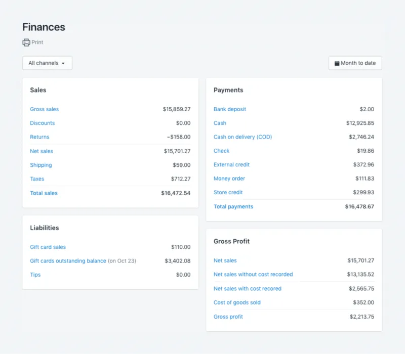
2. Finance reports
Finance reports show your sales, payments, liabilities, and gross profit. They organize your sales and returns, as well as the taxes you need to pay, making bookkeeping easier. You can select the timeframe that interests you and get the data for that month or quarter ready to export as a spreadsheet or print for accounting purposes.
You can add or remove metrics, dimensions, and filters to customize the reports to better fit your needs. If an order contains more than one product, each product shows in the report as a separate sale or return, including shipping charges. Clicking on an order number reveals the details of the order.
Key Metrics:
- Sales: Total revenue generated from sales. If sales are low, consider running promotions, improving product descriptions, and optimizing your website.
- Payments: Details of payments received and pending.
- Liabilities: Amounts owed, including taxes and other obligations.
- Gross Profit: Revenue minus the cost of goods sold, showing profitability.
- Sales and Returns: Tracks the number of sales and returns for accurate record-keeping. Reduce returns by improving product quality and providing clear, detailed product descriptions.
- Taxes: Shows the amount of tax collected and owed.
3. Product Analytics
Product analytics reports show how various products from your portfolio have been performing over the last 90 days. They help you identify who is buying what, which sources drive the most sales for specific products, and provide details about historical performance.
Key Metrics:
- Net Sales: The total revenue from a product after subtracting discounts and returns. If net sales are low, consider optimizing pricing strategie and improving product visibility.
- Sales Breakdown: A detailed list of all factors that add up to the net sales. Analyze which factors contribute most to sales and focus on enhancing those areas.
- Net Sales by Channel: Shows which sales channels (like your website, social media, or email campaigns) are bringing in the most revenue for each product.
- Net Units Sold by Traffic Source: Tracks which sources (like search engines, social media, or direct visits) are driving the most sales for each product. Negative values mean there were more returns than sales.
- Customers: Compares the number of first-time customers to those who have made repeat purchases. Implement retention strategies to convert first-time buyers into repeat customers.

Like what you're reading?
Join the informed eCommerce crowd!
Stay connected to what’s hot in eCommerce. We will never bug you with irrelevant info.
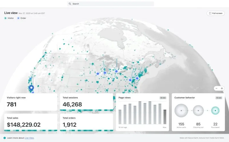
4. Live view
Live View lets you see what's happening on your eCommerce store's website in real-time. You can watch a map that shows two types of dots: white for recent sessions and orange for recent sales. These dots pulsate and fade over time, providing a dynamic view of visitor activity. Every 10 minutes, Live View updates to show how customers are moving through the checkout process. This is especially useful during busy times like the holiday season or Black Friday.
Key Metrics:
- Visitors Right Now: Shows how many visitors have been active on your online store in the past 5 minutes. Active visitors are those who engage with your website by viewing pages, clicking buttons, or adding items to their cart.
- Today’s Totals: Displays all sessions, orders, and sales for the day, restarting at midnight. Total sales are calculated as gross sales minus discounts and returns, plus shipping and taxes.
- Active Carts: Number of visitors who added one or more products to their carts in the last 10 minutes.
- Checking Out: Number of visitors who added items to their carts and proceeded to checkout in the last 10 minutes.
- Completed Purchases: Number of visitors who completed a purchase in the last 10 minutes.
- Real-Time Page Views: Number of pages viewed by visitors over the past 10 minutes, with each bar representing page views per minute.
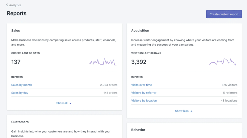
5. Acquisition reports
Acquisition reports track how visitors find your store, monitoring sessions over time, sessions by referrer, and sessions by location. Unlike the Sales by Traffic Referrer Source report, which focuses on converted sales, acquisition reports provide insights into visitor behavior before they make a purchase.
Key Metrics:
- Sessions Over Time: Tracks the number of sessions (visits) to your store over a specific period. Helps you understand trends in visitor activity and evaluate the overall performance of your store.
- Sessions by Referrer: Shows how users come to your store (directly, from search engines, or referrals). Focus marketing efforts on the most effective referrer sources and optimize underperforming channels.
- Sessions by Location: Indicates the geographic locations of your visitors. Tailor marketing campaigns to target regions with high visitor numbers and explore new markets based on visitor data.
6. Inventory reports
Inventory reports help you track your stock levels and sales performance. These reports are useful at the end of the month to get an overview of your inventory and monitor the quantity and percentage of stock units sold each day.
Key Metrics:
- Month-End Inventory Snapshot: Shows the quantity of each product variant in stock at the end of each month. Includes product title, variant title, variant SKU, and ending quantity (trackable inventory quantity at the end of the period; negative if oversold).
- Average Inventory Sold per Day: Tracks the average number of items sold per day during the selected period. Includes product title, variant title, variant SKU, and quantity sold per day (average).
- Percent of Inventory Sold: Measures the percentage of each product variant sold during the selected period. Includes product title, variant title, variant SKU, quantity sold, starting quantity, and percent sold .
- ABC Analysis by Product: Categorizes products based on their contribution to revenue. A-grade products are top-sellers representing 80% of revenue, B-grade products contribute the next 15% of revenue, and C-grade products are the least popular, making up the last 5% of revenue.
7. Behavior reports
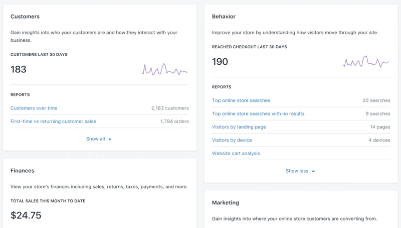
Behavior reports provide insights into your customers' actions on your website, helping you optimize strategies, improve retention, and refine marketing tactics.
Key metrics:
- Conversion Over Time: Tracks the percentage of visitors who made a purchase, showing sessions that led to adding products to carts, reaching checkout, and completing purchases.
- Speed: Measures website loading speed, crucial for customer experience and Google ranking. Improve site speed by optimizing images, using faster hosting, and minimizing code.
- Product Recommendation Conversions Over Time: Tracks the performance of product recommendations, showing clicks, additions to carts, and purchases, with a "Clicked to Purchased" conversion rate.
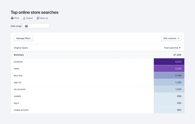
- Top Searches: Displays the most frequent search terms, helping you optimize product names and descriptions for better SEO. Use popular search terms to refine product titles and descriptions, making products easier to find.
- Sessions by Landing Page: Shows which pages visitors land on when they start their session. Optimize landing pages to improve user engagement and conversion rates.
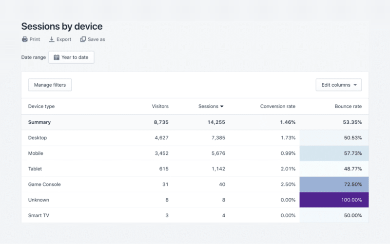
- Sessions by Device: Indicates the types of devices used to access your website, ensuring optimization for the most common devices.
8. Marketing Reports
Marketing reports track the effectiveness of your marketing efforts by showing the number of visits to your store from various campaigns. Only the Sessions Attributed to Marketing report is available under the Shopify Basic plan. This report shows you the number of visits to your store that come from your marketing efforts, such as UTM campaigns, social media ads, or Google Shopping ads.
Key Metrics:
- Sessions Attributed to Marketing: Tracks visits from marketing efforts such as UTM campaigns, social media ads, and Google Shopping ads. If sessions from marketing are low, increase investment in high-performing channels and optimize your marketing content.
- Conversion by First Interaction: Measures conversions based on the customer's first interaction with your marketing efforts. Enhance first-touch marketing efforts with compelling content and strong calls to action.
- Conversion by Last Interaction: Measures conversions based on the customer's last interaction with your marketing efforts. Ensure that final touchpoints, such as retargeting ads and checkout reminders, are optimized for conversions.
- Sales Attributed to Marketing: Tracks the total sales generated from your marketing campaigns.
- Campaign Impressions: Shows the number of times your marketing campaigns were seen.
- Campaign Performance: Evaluates the overall performance of your marketing campaigns.
How to Create Analytical Reports Fast: Reveal Reports
Reveal is the eCommerce Analytics platform from Omniconvert, providing an in-depth overview of essential eCommerce KPIs to generate valuable customers. Reveal helps you understand, monitor, and nurture your best customers with enhanced eCommerce reports. Reveal focuses on metrics that matter, showing total revenue sources and uncovering hidden patterns in customer data. This helps you create smarter and more effective marketing strategies.
With Reveal’s powerful features, you can grow your loyal customer base, boost customer lifetime value, and increase profits using automated RFM segmentation and actionable insights. Ready to see the power of Reveal in action? Let's dive into the reports you can create with this amazing tool:
1. Business Overview Dashboard
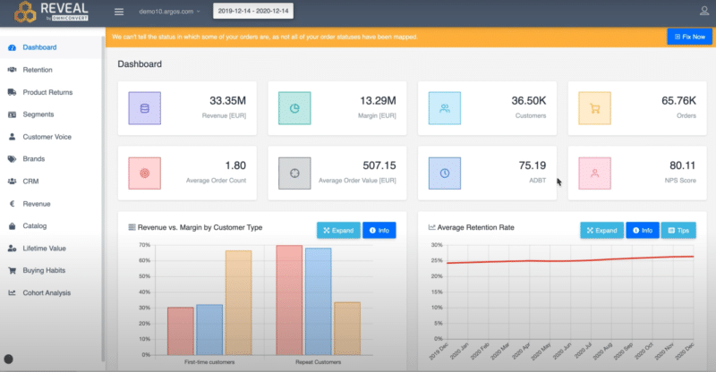
The Business Overview Dashboard gives you a quick snapshot of your eCommerce business's key metrics. This dashboard makes it easy to visualize and interpret your store's performance at a glance.
Key Metrics:
- Revenue: Total income generated from sales.
- Margin: Difference between revenue and cost of goods sold.
- All-Time Customers: Total number of customers who have made a purchase.
- All-Time Orders: Total number of orders placed.
- Average Order Count per Customer: Average number of orders each customer places.
- Average Order Value (AOV): Average amount spent per order.
- Average Number of Days Between First and Last Order: Indicates customer retention and engagement over time.
- NPS Score: Measures customer satisfaction and loyalty.
Below, you can find a short walk through the Overview dashboard:

2. Average Retention Rate and Revenue vs. Margin by Customer Type
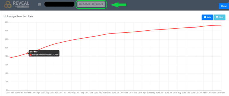
The Average Retention Rate card calculates the percentage of customers with more than one order, out of your total customer base, based on your selected timeline. By default, it is set to show a month-to-month comparison over a year, but you can select a monthly timeframe to see your daily retention rate or a period of over two years to see your yearly retention rate.
You can place your cursor on any point of the red curve to see the retention rate at that given moment. Understanding your retention rate helps you identify trends in customer behavior and take action to increase loyalty and repeat purchases
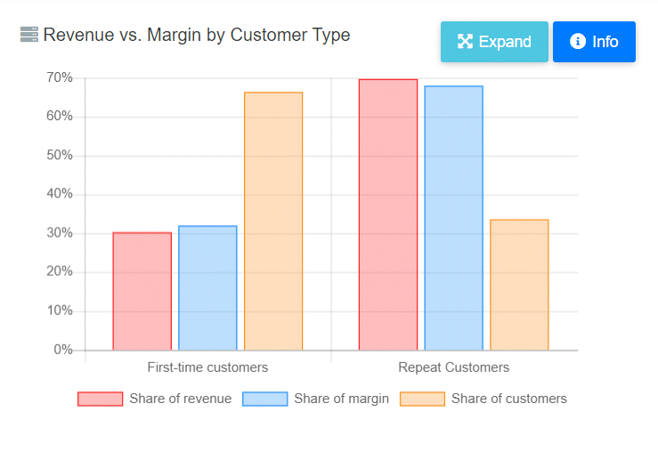
The Revenue vs. Margin by Customer Type card calculates the revenue and profit margin distributed between your first-time customers and your repeat customers. It displays the results in a simple visual format, helping you understand which type of customers are more valuable to your business.
3. Calculation of Retention curve and Chances to buy again
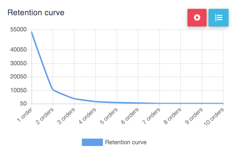
The retention curve graphically displays the distribution of customers by the number of orders placed. Out of the total number of customers, you can see how many have come back to your store to place a second, third, fourth order, and so on. It helps visualize customer loyalty and provides insights into how to improve repeat purchase rates.
The Chances to Buy Again card displays the likelihood of a customer placing another order. Predicting the likelihood of repeat purchases helps in planning marketing efforts and inventory management, ensuring you cater effectively to returning customers.
4. RFM segmentation
The RFM Segmentation report is one of the most special and useful eCommerce reports, offering a simple and personalized way to categorize your customers based on their behavior. Reveal segments your customer base into distinct groups, helping you understand their shopping behavior and value.
Reveal evaluates your customers based on the recency, frequency, and monetary value of their orders. Each customer is given a score on these three dimensions, creating clusters of customers with similar behaviors. That helps you better understand your customers, prioritize them based on business goals, and tailor their experiences to encourage long-term retention.
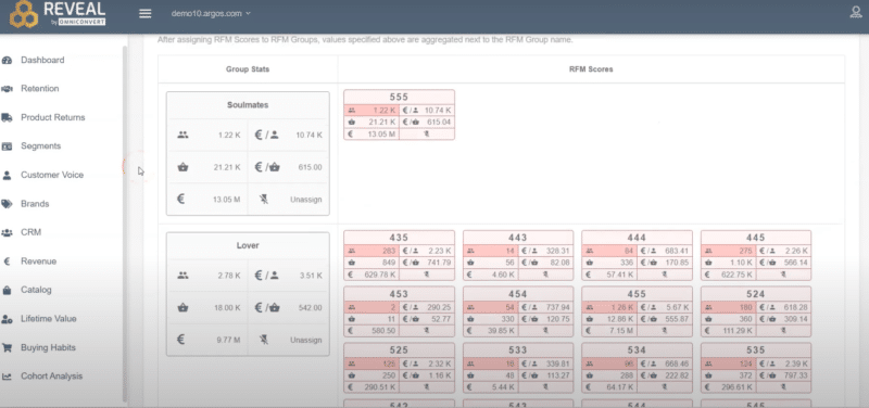
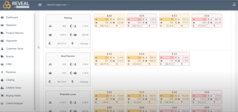
Next, let's explore the specific RFM segmentation reports that Reveal offers:
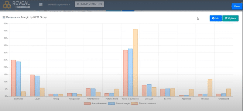
Revenue vs. Margin by RFM group
The Revenue vs. Margin report helps you see how much of your revenue and profit come from each RFM group. This information guides you in choosing the right communication strategy for each group. You can reward loyal customers who significantly boost your revenue and reengage less active customers. These insights are presented clearly and simply, allowing you to make immediate, actionable decisions without navigating through complex spreadsheets or multiple reports.
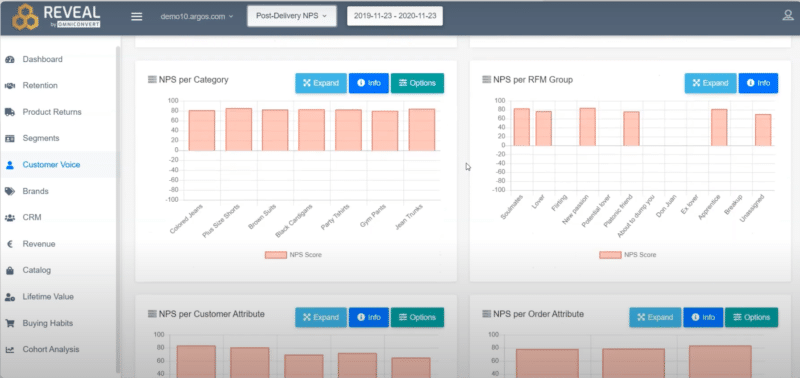
Customer Voice
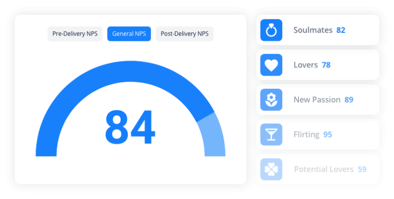
Net Promoter Score (NPS) provides insights into customer satisfaction and future behavior, indicating the likelihood of customers recommending your products or services to others. Reveal lets you calculate the NPS score at two key moments: before and after delivery. This helps you see if your service meets or exceeds customer expectations. By comparing NPS scores before and after delivery, you can understand how well your promises align with the actual customer experience.
You can track NPS across different dimensions, such as brands, categories, RFM groups, and various customer or order attributes. Reveal also provides recommendations on what actions to take based on this customer feedback.

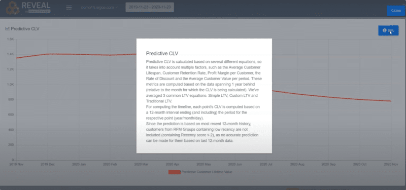
Lifetime Value
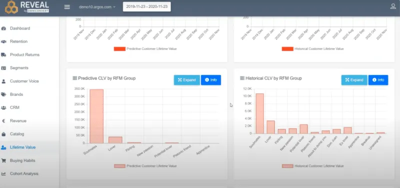
Lifetime Value (LTV) is a crucial metric that measures the total value a customer brings to your business over their entire relationship with you. Understanding LTV helps you focus on growing customer value and loyalty, which pays off more in the long run.
Sustainable growth can only be carried on if you focus on retention and loyalty. Using LTV insights, you can develop effective loyalty, referral, and word-of-mouth programs that resonate with your customers and enhance retention.
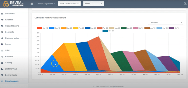
Cohort Analysis
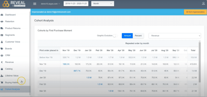
Cohort Analysis shows how effective your customer acquisition efforts are by tracking customers from their first purchase and seeing how many continue to engage with your store over the following months. You can monitor order count, customer count, revenue, and margin each month. This report helps identify your best customer groups, those with the highest “second-month stickiness,” so you can replicate successful strategies and attract more loyal customers.
By understanding how different groups of customers behave, you can see how their actions affect conversions, revenue, churn, and retention. This insight is crucial for optimizing your conversion funnel and improving your overall user experience.
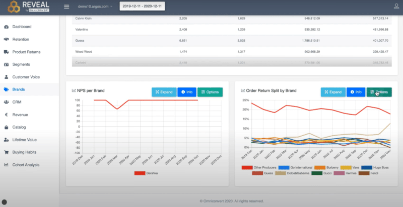
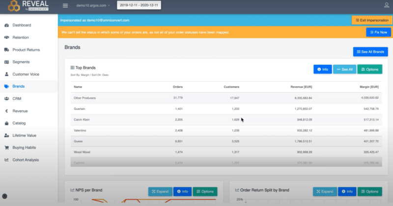
Brands report
The Brands Report shows which brands in your portfolio bring the highest profit margin, revenue, and volume of customers and orders. You can sort brands by order count, revenue, or margin. The report also includes the NPS score for each brand based on customer survey responses. Additionally, you can view the Order Return Split by Brand report to see which brands have the highest return rates and track these trends over time.
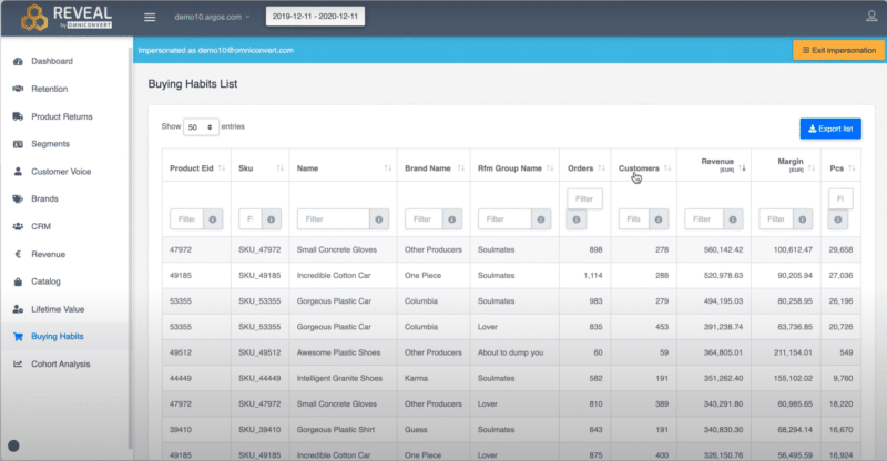
Buying Habits report
The Buying Habits Report highlights the revenue, brands, number of customers, number of orders, and margin for each product. Additionally, it shows how many orders, customers, revenue, and margin each RFM group brings for specific products. This report can be filtered by various criteria and exported for future use.
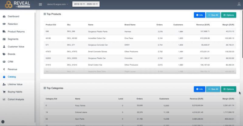
Catalog reports
The Catalog section includes these types of reports:
- Top Products and Categories: These reports show which products and categories perform best in terms of revenue, margin, customers, and orders. You can sort them by order count, revenue, or margin.
- NPS per Category: This report reveals how each category is rated by customers who answered the NPS surveys, highlighting which categories perform best and worst in customer satisfaction.
- Order Returns Split by Category: This report displays the number of order returns from each category and tracks the trend over time.
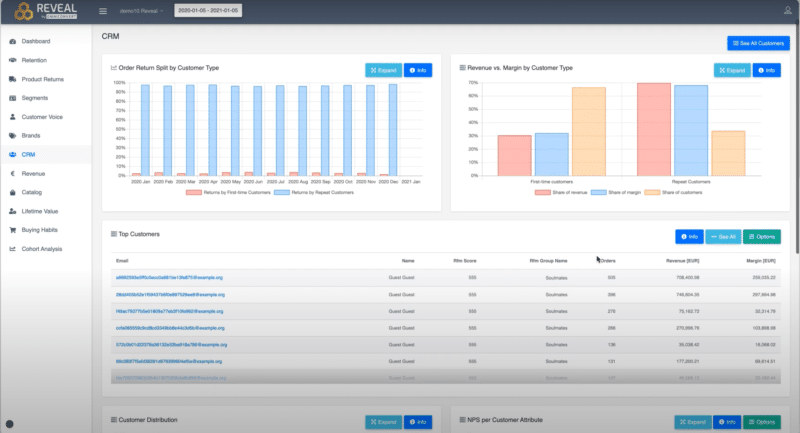
CRM report

Reveal’s CRM Report goes beyond regular customer data by grouping customers into RFM categories. It shows each customer's RFM score, number of orders placed, revenue, and margin. You can filter these lists by RFM groups and download them for further analysis.
To find out more about a specific customer, click on their email address to open an advanced view of their profile. This detailed profile includes transaction history, shipping information, order status, and a timeline of their orders.
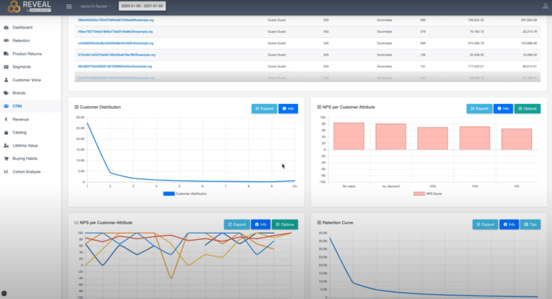
The Customer Distribution Report shows how many customers have placed a certain number of orders. The NPS per Customer Attribute Report lets you check the NPS for different customer attributes, provided you have already gathered data about your customers or their orders. This comprehensive view helps you better understand and manage your customer relationships.
Ecommerce Reporting: Best Practices
Here are some best practices to optimize your ecommerce reporting:
- Define Clear Objectives: Start by defining clear and measurable objectives for your e-commerce reporting. Whether it's improving conversion rates, increasing average order value, or optimizing inventory management, clarity in objectives helps focus your reporting efforts.
- Choose Relevant Metrics: Select metrics that directly align with your business goals. Key metrics often include sales performance (revenue, average order value), customer metrics (acquisition cost, retention rate), and operational metrics (inventory turnover, fulfillment efficiency).
- Segmentation and Cohort Analysis: Utilize segmentation to understand different customer groups and their behaviors. Cohort analysis helps track customer behavior over time from their first interaction with your store, providing insights into retention and lifetime value.
- Visualization and Interpretation: Present data in visually appealing and easy-to-understand formats such as graphs, charts, and dashboards. Effective visualization helps stakeholders quickly grasp trends and make data-driven decisions.
- Regular Review and Analysis: Schedule regular reviews of your eCommerce reports to analyze performance trends and identify areas for improvement. This ongoing analysis ensures you stay agile in responding to market dynamics.
- Benchmarking and Comparative Analysis: Compare your performance metrics against industry benchmarks or previous periods to gauge progress and identify areas where you may be underperforming or exceeding expectations.
- Actionable Insights and Recommendations: Reports should not just present data but also provide actionable insights and recommendations. This helps in devising strategies for customer acquisition, retention, pricing, and marketing campaigns.
Conclusions
Different platforms offer various functionalities and types of reports, but all rely on solid data. What sets them apart is how user-friendly they make the analytics for eCommerce business owners. To choose the best platform, thoroughly assess your business needs and find the one that aligns with your goals.
Fortunately, the two platforms discussed in this article, Shopify and Reveal, work hand in hand. By integrating Reveal with your Shopify store, you can access advanced reports from both platforms. You can install Reveal for free on Shopify or try it out for a month on other eCommerce platforms. This integration can transform how you manage your business and support sustainable growth for your store.


If you liked this article, make it shine on your page :)