User Flows: What They Are and How to Optimize Them

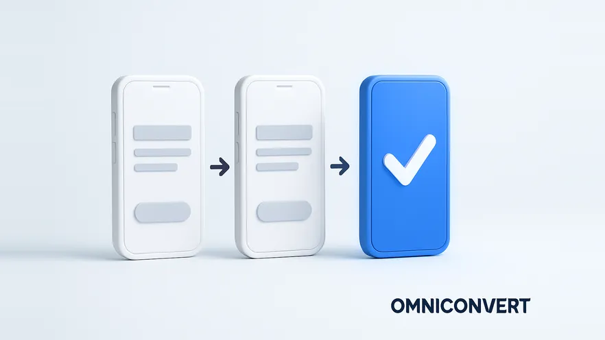
- A user flow is the sequence of steps a user takes through a website or app to reach a goal, from the entry point to the completed conversion.
- A user flow shows the whole path across many screens, while a task flow zooms in on one task inside that path, such as searching and filtering products.
- User flow diagrams give design, development and marketing teams an objective map for finding drop-off points and planning navigation.
- A flow drawn from assumptions must be validated with real behavior data, such as GA4 path and funnel explorations, heatmaps, session recordings and surveys.
- User flow optimization is ongoing: simplify steps, navigation, CTAs, content and the mobile experience, then test and monitor every change.
A user flow is the path, step by step, that a visitor takes through your website or app to reach a goal: making a purchase, signing up, or finding a piece of content. When you map that path, you can see where visitors hesitate or leave, and you can remove the friction that stops them from converting.
Without well-optimized user flows, websites become confusing and frustrating. The result is higher bounce rates, lost conversions and a poor user experience. A well-designed user flow anticipates what visitors need, removes unnecessary steps and gives clear navigation, much like a choreographed dance that moves people toward their goals without effort.
This guide explains what a user flow is, how it differs from a task flow, why it matters, how to create one, and an eleven-step plan to optimize the flows you already have.
What is a user flow?
In the eCommerce and retail world, the user flow (sometimes also called the user journey) represents the path a user takes on your website or app to complete a task. User flows help UX designers and developers understand how users interact with the platform and create intuitive, straightforward experiences that guide users through the journey.
A user flow is narrower than a customer journey map. A journey map follows the customer across every channel and touchpoint, online and offline, over weeks or months. A user flow zooms in on the screens and actions inside one digital product. If you want the wider view, read our guides on mapping customer journey touchpoints and customer journey optimization.
The components of a user flow
- Entry points: where users start, such as a landing page, a search result or an app screen.
- Actions: the interactions users perform, such as clicking, filtering or filling in a form.
- Decision points: where users make a choice, such as picking a size or choosing to continue shopping.
- Transitions: how users move from one step to the next.
- Exit points: where the flow ends, such as a confirmation or thank-you page, or where users abandon it.
A user flow example: an online fashion retailer
For clarity, we will look at a user flow for a website. Everything in this article also applies when you design a flow for an app or another digital system.
Suppose you work with a fashion retailer's eCommerce website and must create a flow diagram. The diagram contains these steps:
-
Landing pageThe user "lands" on a web page after clicking an ad or a search result.
-
BrowsingThe user explores the website, starting with the main product categories, such as "Winter Clothing," "Women's Shoes" or "Accessories." The categories depend on how you divide your products.
-
Product listingThe user selects a category, such as "Women's Shirts," and sees a grid of shirts with images, names, prices and filters.
-
Product detail pageA shirt catches the user's eye. They click it and go to the product detail page, where they see more images from different angles, read the description, check sizes and pick a color.
-
Add to cartThe user decides to buy and clicks "Add to Cart." The shirt is now in the virtual shopping cart.
-
CartIf the user does not look at more products, they go to the cart page. They review the product details, apply vouchers if they have any, and move on to checkout.
-
CheckoutThe user enters shipping and billing information, selects a shipping method and gives payment details (credit card, PayPal, cash on delivery and so on). Many shoppers leave before they finish: Hotjar (now part of Contentsquare) puts the average cart abandonment rate at about 70%, based on Baymard Institute data. Make this stage as clear and persuasive as possible.
-
Order confirmationThe user completes the purchase and sees an order confirmation page with a summary of the order, the estimated delivery date and any additional information.
That is the flow from the user's point of view. Your task is to analyze it and find the bottlenecks where prospects might abandon the process.
For instance, a large drop-off between the product detail page and the cart can indicate a lack of trust in the product. You address it with persuasive product information, benefit-oriented copy and positive product reviews.
What is the difference between a user flow and a task flow?
In your adventures through the realm of D2C businesses, you might have met the term "task flow." Is it a synonym for user flow, or a different kettle of fish?
The latter. The two concepts are related, but their focus and purpose differ.
A user flow is customer-centric. It focuses on the user's goals, actions and interactions with the website, with a strong emphasis on the sequence of steps. Designing a user flow usually means working across multiple tasks and screens, so it gives you a high-level view of the user's journey.
Task flows zoom in on specific tasks or activities that users perform inside the overall user flow. They break complex processes into smaller, manageable steps and show the interactions and decision points needed to complete one task. Because a task flow focuses on a single user objective, it gives a more granular view of the user's interactions.
Back to the fashion retailer:
- The user flow covers browsing, adding items to the cart and completing the checkout: the whole journey from landing on the website to the order confirmation page.
- A task flow covers one action, such as "Search and filter products": searching for a product, applying filters for size, color or price range, and viewing the results.
| Aspect | User flow | Task flow |
|---|---|---|
| Scope | The whole path to a goal, across many screens | One task inside that path |
| Level of detail | High-level overview | Granular: every interaction and decision point |
| Fashion retailer example | Landing page to order confirmation | Search and filter products |
| Best used for | Finding where users drop off and planning navigation and information hierarchy | Designing or fixing one interaction, such as filters or a form |
Why are user flows important?
You cannot discuss user flows without first looking at user experience. The user experience is how a user interacts with and perceives your website, product or service. It is also the lens through which the user judges your brand (utility, convenience, quality) and decides whether you deserve their loyalty.
UX is more than website design. It is a commitment to delivering exceptional value and delighting customers.
But even with the best intentions, it is difficult to see your own work from the outside. Designers are human, and they get attached to what they build. This is where user flows are essential. They give the design and development teams an objective map of the journey they must make easy for users.
This map, the user flow diagram, directly affects your conversion rates. The better the experience, the more prospects go through the purchase process. The weaker the experience, you guessed it, the lower your conversion rate. With a clear flow in front of you, you can find where users drop off and fix the hiccups. You give prospects no reason not to buy from you.
User flows also help you decide your website's navigation structure and information hierarchy, so that it matches your customer journey. Prospects should easily:
- find what they are looking for;
- understand how to navigate the website;
- get relevant information quickly.
With this level of clarity, you get better customer engagement, higher satisfaction and stronger brand awareness.
User flow diagrams are also a communication tool between designers, developers, product managers and stakeholders. Use them to build a shared vision of the user journey and to improve collaboration and alignment. As a visual representation of the UX, a diagram bridges different perspectives.
Last but not least, user flows are never finished. Because you keep refining them, they create the context for usability testing, feedback gathering and innovation inside your company.
Times are difficult for eCommerce and retail businesses, and the move to a digital-first, AI-powered economy raises the bar further. No matter how much we rely on technology, one thing stays the same: consumers expect flawless experiences. A good user flow cannot solve every growth problem on its own. But when you invest in it, you show a commitment to understanding and meeting your users' needs, and that commitment can set you apart from competitors and increase loyalty, retention and recommendations.
How do you create a user flow diagram?
You do not need special software to start. Paper, a whiteboard or any diagramming tool works. Most teams use a few common shapes:
- Rectangles for screens or pages;
- Diamonds for decision points (for example, "Is the user logged in?");
- Arrows for the direction users move in;
- Ovals or circles for the start and end of the flow.
-
Define the user and the goalWrite down who the flow is for and what they want to achieve, for example "a first-time visitor who wants to buy a shirt." One flow, one goal.
-
Choose the entry pointStart where real users start: a paid ad landing page, an organic search result, an email link or the homepage. Different entry points often need separate flows.
-
List the screens and actionsWrite every page the user sees and every action they take between the entry point and the goal.
-
Add decision points and alternative pathsMark where users choose (guest checkout or account, size in stock or not) and draw where each choice leads, including the exits.
-
Validate the diagram with dataCompare the drawn flow with how users really move, using analytics, recordings and user tests. Update the diagram where reality differs.
How do you improve your user flow?
You want to give prospects an intuitive, easy-to-navigate experience that guides them toward the desired actions. Here is a step-by-step action plan to optimize your user flow and reduce friction.
This plan is a scaffold based on industry best practices, and you must build on it. We do not know the details of your business, so we can only guide you through the process. The legwork is still yours.
-
Identify goals and key user tasksEstablish the purpose of your website or app. Conversion is the ultimate goal, but which conversion: lead generation, purchase or subscription? A clear objective helps you focus on the most critical parts when you design user flow diagrams.
-
Map the current user flowDo user research and document each step and interaction of the journey users take today. This shows you the current path and where it can improve.
-
Analyze user behaviorAdd real visitor behavior data to the diagram. Use analytics tools and user testing to see how users navigate your platform, and find the patterns and bottlenecks where they struggle or leave. The table below shows which data source answers which question.
-
Identify pain pointsList every place in the flow where visitors face challenges, confusion or frustration. Look for steps with high exit rates or where users abandon their sessions.
-
Simplify and streamlineNow that you know where users drop off, reduce the opportunities to abandon. Remove unnecessary steps and make the process more intuitive.
-
Optimize navigationVisitors should find what they want, move through the flow with minimal effort, and get answers without contacting customer service. Make navigation menus, buttons and links clear and intuitive.
-
Improve calls to action (CTAs)CTAs are the buttons that move visitors to the next step: add to cart, subscribe, buy. Make the design clear and prominent and the copy persuasive. See our guide to CTA button optimization.
-
Enhance content and informationReview the content at each step of the flow. It must be concise and relevant and help users make informed decisions. Do not overwhelm users with information, but give them product reviews and benefit-oriented copy that persuade them to buy. It is a fine line, and testing helps you find the right balance.
-
Optimize the mobile experienceDo not forget visitors on mobile devices. Go through the flow on a phone and a tablet to make sure it is responsive and works well on every screen size. Our mobile CRO guide covers the details.
-
Test and iterateTest the optimized flow with real users to gather feedback and insights, and A/B test the changes against the current version. Iterate based on the results and keep refining the experience.
-
Monitor and analyzeAs a final, ongoing step, monitor how every change affects your metrics. Make data-driven decisions and iterate further based on what you learn.
| Data source | What it shows about the flow | How to read it |
|---|---|---|
| GA4 funnel exploration | How many users complete each step you define, and where they leave | The step with the largest drop is the first candidate for a fix |
| GA4 path exploration | The real sequences of pages and events users follow from a starting or ending point | Paths you did not design, such as loops back to search, show where the flow confuses users |
| Heatmaps | Where users click, move and scroll on a single page | Clicks on non-clickable elements or a CTA below the scroll depth point to a design problem |
| Session recordings | How individual users behave on the steps where they drop off | Repeated hesitation, rage clicks or form errors explain why the numbers drop |
| On-site surveys and user tests | What users were trying to do and what stopped them | Recurring answers turn a drop-off into a testable hypothesis |
This is the complete user flow optimization process. It looks like a long journey, but it is a structure: you may need all the steps or only some of them, depending on your current user flow and your prospects' preferences.
When you reach the testing steps, Omniconvert Explore lets you A/B test changes to any step of the flow, personalize the experience for different segments, and run on-site surveys that ask visitors why they leave.
What are some examples of user flows?
This article focuses on user flows in UX and UI design, but you can create many other types, such as onboarding flows, login flows and content discovery flows. Here are two simplified website user flows from our work with clients. Your own flows will vary with your platform, your industry and your users' needs, so adapt and expand them.
Newsletter sign-up user flow
-
Landing pageThe user arrives on the squeeze page, where you collect email addresses.
-
Subscribe CTAThe user clicks the "Subscribe" button.
-
Registration formThe user enters their name, email and any other required information. Keep the form short: every extra field is one more reason to leave.
-
Welcome screenThe user is welcomed to the newsletter and introduced to what they will receive.
Online shopping checkout user flow
-
Shopping cartThe prospect views the selected items and proceeds to checkout.
-
Shipping informationThe prospect enters a shipping address and selects a shipping method.
-
Payment methodThe user selects a payment method (credit card, PayPal, cash on delivery and so on) and enters the payment details.
-
Order reviewThe user reviews the items, quantities, shipping address and payment information.
-
Place orderThe user confirms the order and clicks "Place Order."
-
Order confirmationThe user sees a summary of the purchase, the estimated delivery date and any additional instructions.
For checkout-specific fixes, see our eCommerce checkout optimization best practices. To measure each stage with numbers, see conversion funnel analysis.
Frequently Asked Questions
A user flow is the sequence of steps a user takes through a website or app to reach a goal, such as buying a product or signing up for a newsletter. It is usually drawn as a diagram that shows the entry point, the screens, the actions, the decision points and the exit points.
A good user flow is a clear, intuitive path that lets users reach their goal efficiently, without confusion or unnecessary steps. It anticipates what users need at each step, keeps navigation and calls to action obvious, and gives enough information for a confident decision.
A common example is buying a product online: the user lands on the homepage, browses product listings, opens a product page, adds the item to the cart, goes to checkout, enters payment details and sees the order confirmation page.
A user flow usually has entry points (such as landing pages or app screens), actions (the interactions users perform), decision points (where users make choices), transitions (how users move from one step to the next) and exit points (such as confirmation pages, or the places where users leave).
A user flow shows the whole path to a goal across many screens and tasks. A task flow zooms in on one task inside that path, such as searching and filtering products, and shows every interaction and decision point in detail.
A customer journey map follows the customer across every channel and touchpoint, online and offline, often over a long period. A user flow covers the screens and actions inside one website or app for one goal. Journey maps show the big picture; user flows show where the digital experience needs fixing.
Use GA4 funnel exploration to see how many users complete each step, and GA4 path exploration to see the real paths they take. Then use heatmaps, session recordings and on-site surveys on the weakest steps to understand why users leave.
You can draw a user flow on paper or a whiteboard, or in any diagramming or design tool. Most teams use rectangles for screens, diamonds for decisions and arrows for direction. The tool matters less than validating the diagram against real user behavior.
Your website's user flow is the architecture behind the customer journey, guiding visitors from landing to conversion. Start with one goal and one flow: map it, add real behavior data, and fix the step where most users leave. Then test the change and move to the next one. Keep your users at the heart of everything you do. When you step into their shoes and map their journeys, you turn ordinary interactions into a great customer experience. Happy designing!
Test every step of your user flow
Omniconvert Explore lets you A/B test changes to any step of your user flow, personalize the experience by segment, and run on-site surveys that ask visitors why they leave. Built on 70,000+ experiments across 7,000+ websites, with a 23.2% average uplift.