15 Impressive A/B Testing Examples To Inspire Your Optimization Strategy
Article last updated:
Article first published:
- Key Takeaways
- 15 A/B Tests From Various…
- 1. A Targeted Web Persona…
- 2. A SaaS Company Got a 2…
- 3. An E-commerce Increase…
- 4. An Online Academy Got…
- 5. A Medical Device Compa…
- 6. A Simple CTA Change Bo…
- 7. A Home Appliances Webs…
- 8. A SaaS Using the Clien…
- 9. An Online Pet Shop Inc…
- 10. In the B2C Industry,…
- 11. Social Proof Increase…
- 12. An Online Academy Inc…
- 13. Travel Website Increa…
- 14. A SaaS Increased Sign…
- 15. An E-commerce Got a 6…
- A/B Testing is About Coll…
- Frequently Asked Question…
A common misconception about A/B testing is that it’s simply about putting two variations of an element on your site and seeing which one performs better.
In reality, it goes much deeper. You need to understand what you’re testing, why you’re testing it, and how it will impact your users.
It’s about analyzing data to understand what’s happening on your page and uncovering your users' motivations, pain points, and barriers preventing them from converting.
In this process, looking at what other companies and industries are doing with A/B testing is also helpful. This can provide inspiration and insights for your future experiments.
In this post, I’ll share 15 A/B tests from various industries, so you can see what works for other businesses and learn how to apply these techniques to your site.
Key Takeaways
- Deep Understanding Required: A/B testing involves analyzing user behavior and motivations, not just comparing variations.
- Impact of Personalization: Targeted personalization can significantly boost conversions, as shown by Avon’s 96% increase.
- Clarity Boosts Sales: Clear pricing and messaging, like Wistia’s pricing page adjustments, can double sales.
- Value of Storytelling: Highlighting a brand’s unique value proposition through storytelling can increase engagement and sales.
- Address User Concerns: Simplifying navigation and addressing user doubts, as demonstrated by Shaw Academy, can lead to higher conversion rates.
15 A/B Tests From Various Industries
A/B testing has emerged as a powerful strategy for optimizing online performance and enhancing user experience. By experimenting with different variations of website elements, businesses can gain valuable insights into user behavior, preferences, and motivations. This article presents 15 compelling case studies from various industries that demonstrate how strategic A/B testing led to significant improvements in conversion rates.
From personalized experiences to clear pricing strategies, these examples illustrate the transformative impact of data-driven decision-making in digital marketing. Discover how these companies leveraged A/B testing to not only boost sales but also create more engaging and user-centric online environments.
1. A Targeted Web Personalization Increased the Conversion Rate by 96% on Avon’s Product Category Page
Avon is a multinational company selling cosmetics, skincare, perfume, and personal care products.
The Problem They Were Facing
They aimed to replicate the same real and personal experience that people enjoy in physical stores on their website.
To achieve this, the online shopping experience needed to be both personalized and exceptional. That’s why personalization experiments can have a greater impact on online shoppers who are ready to purchase.
After thorough research, they decided to focus on the makeup category, which had been underperforming in sales.
In addition to quantitative analysis, a survey was conducted to understand the issue. The findings revealed that the primary micro-conversion for this category was the use of the "eye colors" filter.
Hypothesis
Applying a “real-world treatment” principle to the online shopping journey will result in a better user experience and an increment in conversions. This will be done by personalizing the makeup category page, replicating a person asking some users details and further questions about the products.
Here is the process that was implemented in the experiment:
STEP 1
A widget was launched and placed in the bottom right of the screen. Also, to make it less intrusive, it was set to load with a 10-second delay on each page containing the word “makeup”.

STEP 2
Engaged users who clicked on the widget were asked a question about the color of their eyes to redirect users to a personalized page customized with a selection of products according to their choice.
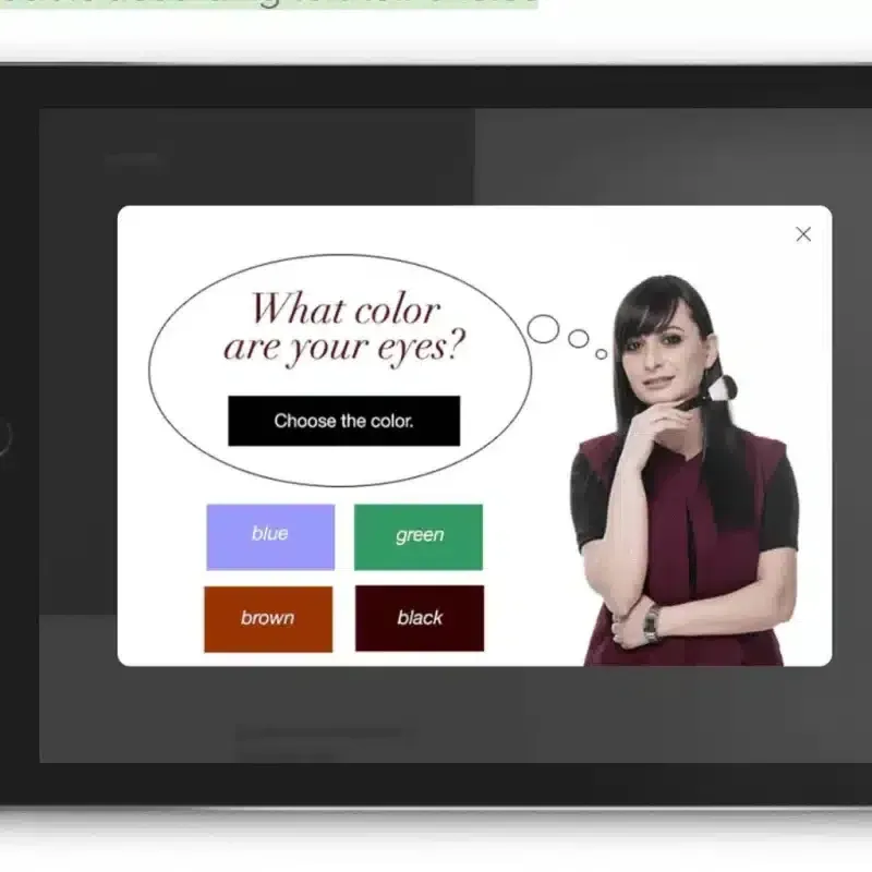
STEP 3
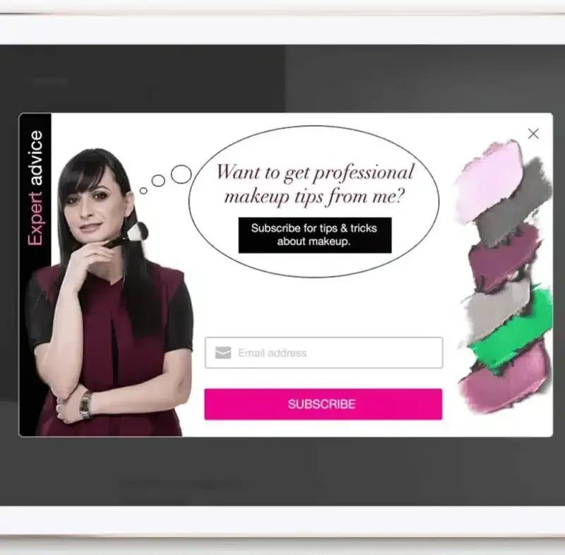
A final pop-up was shown in case the visitor didn’t convert to the page. The purpose of this banner was to gather user information for future personalization.
STEP 4
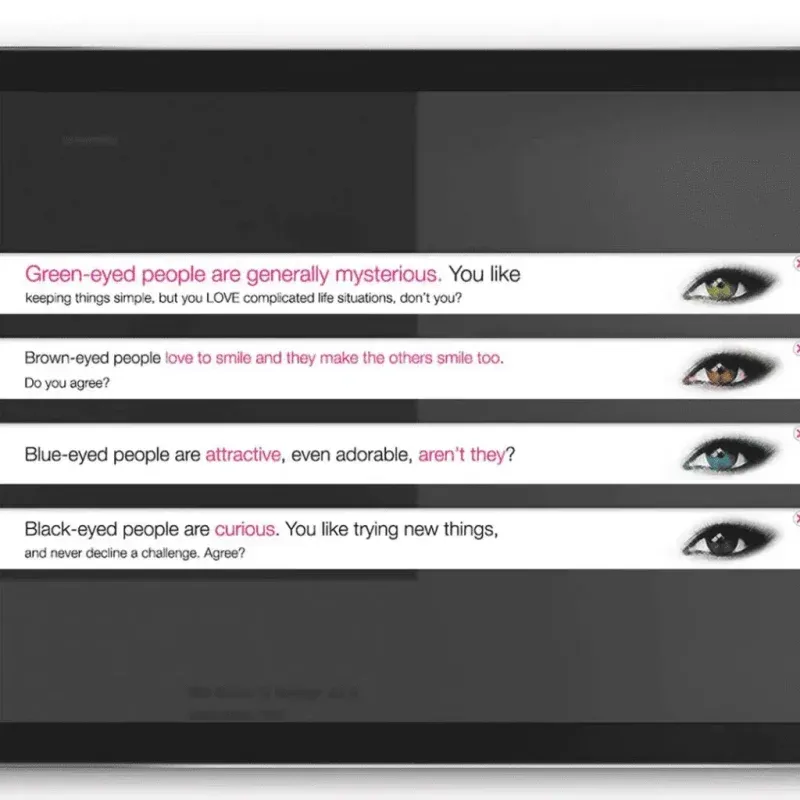
To engage even more users, smart ribbons were launched on the cart page with statements based on their eye color selection.
STEP 5
After purchase, Avon also launched a thank you message and a video with their brand ambassador. This was made to engage the user even more.

Conclusions And Results
The test was conducted over 10 days with a validation of 95-99%.
These were the results
- A 96.63% increase in conversion rate.
- 73X increase in checkout page views.
You can improve the whole customer journey and deliver an amazing experience without the need for an entire website redesign, just by adding relevant pop-ups, widgets, and ribbons.
To succeed in this experiment, Avon used various widgets from Omniconvert Explore.
2. A SaaS Company Got a 2X Increase in Sales by Modifying Their Pricing Page
Wistia is a video platform for businesses, competing with giants like YouTube and Vimeo.
The Problem They Were Facing
Wistia noticed issues throughout its sales funnel. Many potential customers were comparing Wistia to cheaper alternatives like YouTube and Vimeo, which affected decision-making. This problem was most apparent on their pricing page, which had a high bounce rate.
They also quickly discovered that many visitors had already seen the Wistia video player on another website, and wanted to take a free trial straight away – without knowing the product’s other features.
The problem was clear: users are aware of Wistia and its solution, and they want to take action, but the lack of clarity is holding them back from converting.
Hypothesis
Delivering clear and easy-to-compare plans will help users decide with more confidence.
Control
On Wistia’s original pricing page, the plans were aimed at the more the user paid, the more functionality they had access to.
Variation
The new pricing page: all plans came with access to all features, but more expensive plans allowed users to upload more videos each month.
Conclusions And Results
Within just a few months of testing, Wistia saw some incredible results:
- A 46% increase in revenue.
- A 2X increase in sales.
Clear and value-driven pricing can help you compete with even the biggest players in the market.
3. An E-commerce Increased Sales by 5% With Storytelling
Beckett Simonon is an online company selling handcrafted leather shoes.
The Problem They Were Facing
This e-commerce brand differentiates itself through its commitment to ethical business standards and sustainability. However, they struggled to communicate this Unique Value Proposition (UVP) on their website.
After analyzing the site, they discovered that product pages were not receiving the expected amount of traffic, which negatively affected their conversion rate.
They were confident in the quality of their products, as users who visited the product pages were more engaged and more likely to purchase. The challenge was ensuring that visitors could recognize the product’s value from the moment they arrived on the site.
Hypothesis
Adding a 'storytelling' panel to the online shoe store, highlighting messages of sustainability and craftsmanship, would increase sales.
Control
This was the original version
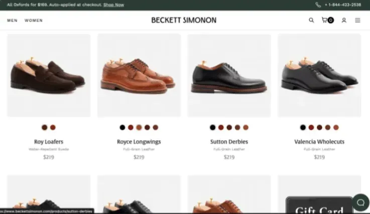
Variation
The updated page featured a storytelling message that aligned more closely with the brand's value proposition.
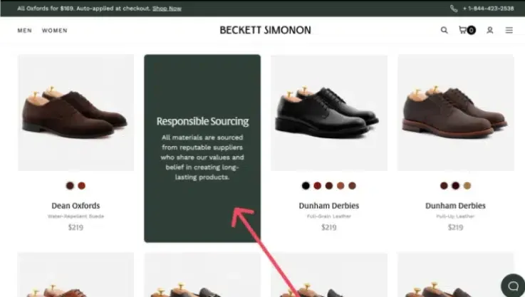
Conclusions And Results
The results were an increase in sales by 5%.
This demonstrates the power of storytelling and crafting a message that delivers value.
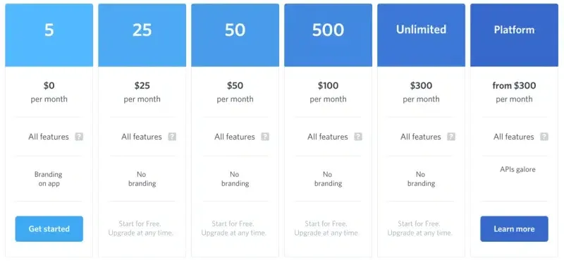
4. An Online Academy Got a 28% Increase in Their Annual Plan Subscriptions
Codecademy is an American online interactive platform that offers free coding classes.
The Problem They Were Facing
Codecademy offers free coding classes mainly aimed at beginners, while the pro plan is designed for those looking to dive deeper into coding beyond the basics.
While their free classes were performing well, they wanted to increase subscriptions to their annual pro plan.
Their goal was to encourage users to opt for the annual plan—not only because it was more beneficial for Codecademy, but also because customers could save significantly with annual billing.
After analyzing the data, they found that many visitors were considering upgrading their subscriptions because they had a lot of visits to the pricing page, but they weren’t converting.
Hypothesis
Showing the number of dollars that would be saved by their customers rather than the percentage would increase sign-ups to the annual plan.
Control
The original page showed a “popular” label in the 6-month billing and the money users could save in percentage.
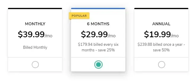
Variation
They reordered the pricing plans, placing the annual plan on the left side of the page with a "popular" label, making it the first option users would see.
They also applied the "Rule of 100" psychological principle, which suggests that amounts over $100 appear more valuable to customers when shown as a dollar amount rather than a percentage, even if the actual savings are the same.
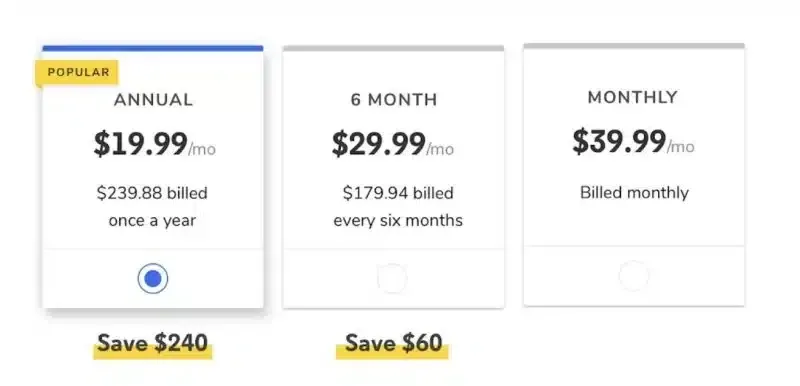
Conclusions And Results
This test resulted in an increase of 28% in annual pro plans and a small increase in overall page conversions.
Understanding user psychology and how they perceive value can significantly boost conversions.
5. A Medical Device Company Launched Successfully a New Product Without Hurting the General Sales Rates
AliveCor is a medical device and AI company that develops ECG hardware and software compatible with consumer mobile devices to enable remote heart rhythm monitoring.
The Problem They Were Facing
AliveCor just launched a new device -the KardiaMobile Card- and they wanted to promote it on their website while ensuring it didn’t overshadow the sales of their other devices.
The KardiaMobile Card represents an upgraded option compared to the beloved KardiaMobile, which initially captured the healthcare industry’s attention.
The challenge was that since it was newly launched, there wasn’t initial data available to base the experiments on. It was all about the intuition and experience of the specialist.
Website visitors tend to interact more frequently with highlighted elements and products, and that was the pillar of formulating the hypothesis.
Hypothesis
“By adding a “New” badge on the KardiaMobile Card product detail page and the product tile from the listing page it should be an increase in the Conversion rate across all devices.”
Control
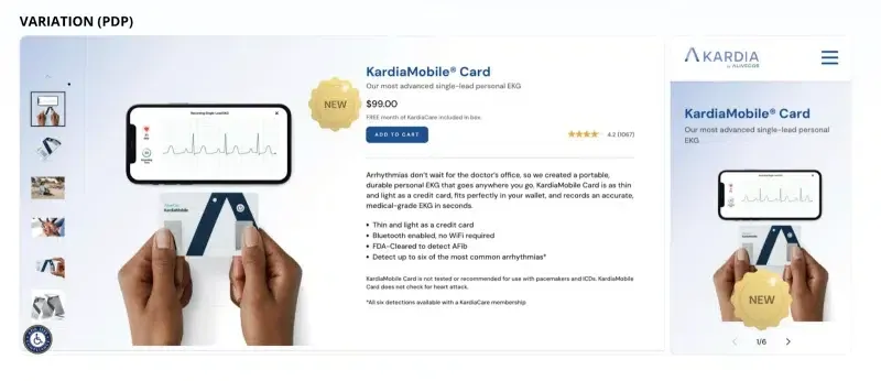
Variation
The “new” badge was added to both the Product Description Page (PDP) and the Product Listing Page (PLP).
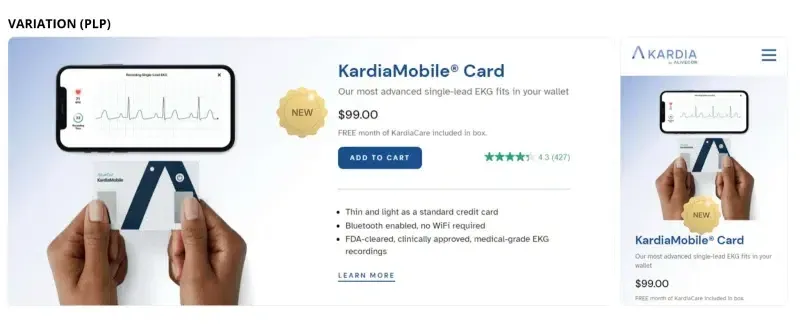
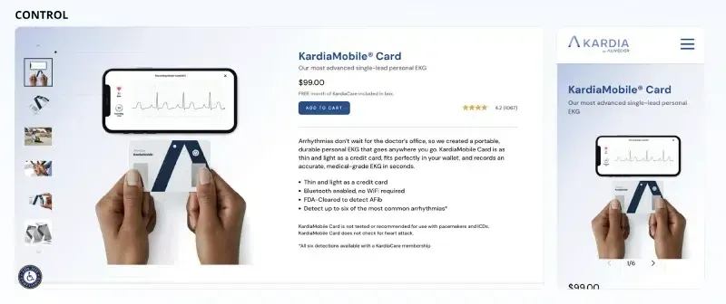
Conclusions And Results
It showed a notable increase in Conversion Rates and Revenue per User across both desktop and mobile devices.
These were the results:
- 25.17% increase in Conversion Rate.
- 29.58% increase in Revenue/user.
A simple highlighting badge on new products can significantly boost the conversion rate without negatively impacting the sales of existing products.
6. A Simple CTA Change Boosted Conversion Rate by 6% For This E-commerce Website
F64 is an online store specializing in photographic equipment, cameras, lenses, and accessories.
The Problem They Were Facing
Like many camera vendors, F64 needed to address the skepticism buyers felt during the purchasing journey. An analysis showed that while users browsed multiple models and product descriptions, the CTA to purchase wasn’t being clicked.
Hypothesis
“If we address a visual element on the product page, the conversion rate will increase and visitors will engage and act on these pages better.”
Control
The control CTA was focused on an immediate commitment to buy.

Variation
The design and copy of the CTA were changed to reduce the pressure on the user.

Conclusions And Results
With a validation of 99.21% in statistical relevance, the experiment delivered:
- A 6% increase in conversion rate.
- A 1.68% increase in revenue per visitor.
Sometimes small adjustments can make a big difference in e-commerce conversion rates and sales.
This test was implemented using Omniconvert Explore, our A/B testing tool that helps you run effective, data-driven experiments to increase conversions from your existing traffic.
Try Omniconvert Explore for FREE!
7. A Home Appliances Website Boosted its Conversion Rate by 22.26%
Ideall is an e-commerce company that sells a wide range of home appliances.
The Problem They Were Facing
The main issue was poor user experience. The site’s usability was causing problems, making it harder for visitors to convert.
Hypothesis
By simplifying the offer and making the user experience clearer, conversions would increase.
Control
The original category pages displayed many products in a single view, overwhelming visitors.
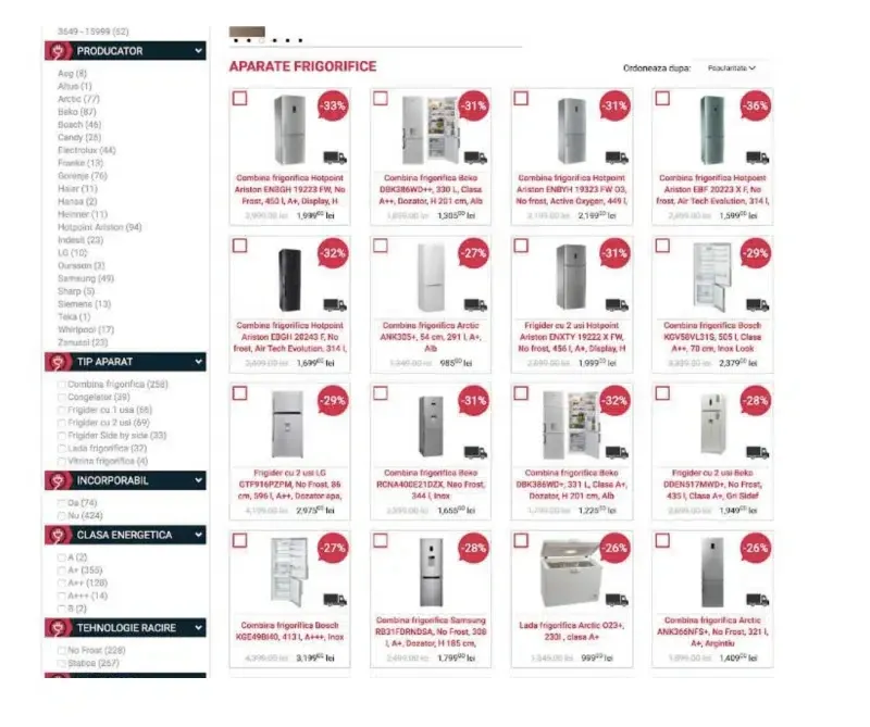
Variation
The new approach was about including:
- Left-side filters
- Buttons near product images
- Product Alignment
- Product information
- Functionality comparisons
- Discount implementations
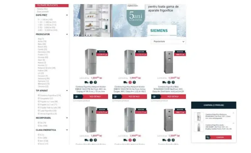
Conclusions And Results
After over 6 months of research and implementation, these were the results:
- A 22.26% increase in conversion rate.
- A 14.23% increase in revenue per visitor.
In some cases, you need to redefine the whole layout and copy to deliver a frictionless user experience.
8. A SaaS Using the Client’s Own Words Boost the Conversions by 100%
Groove is a helpdesk software that offers excellent customer support solutions.
The Problem They Were Facing
Thanks to its informational blog, the company was successfully driving awareness and meeting its page visit goals. However, despite attracting thousands of visitors, the conversion rate remained low at just 2.3%.
Further analyses and online surveys revealed an issue with the website’s messaging—it didn’t resonate with users or build trust effectively.
The company needed to better empathize with users and improve the trustworthiness of their messaging to increase conversions.
Hypothesis
Adding a customer testimonial video to the hero section would make the content more trustworthy and create a stronger connection with users.
Control
Although the original hero section included a testimonial, it didn’t effectively engage users.
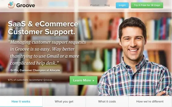
Variation
A video testimonial was added.
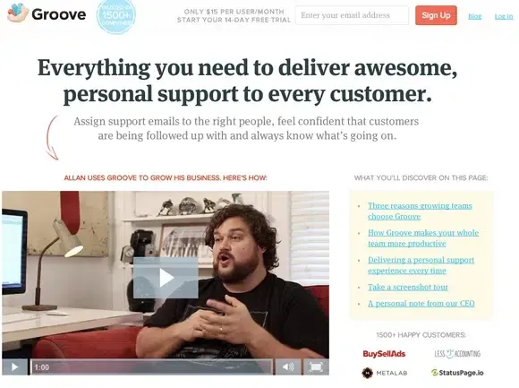
Conclusions And Results
The conversion rate increased from 2.3% to 4.3%.
Understanding user motivations and pain points, and emphasizing their needs through the website’s messaging, can lead to a significant increase in conversions. It's all about using the customer's voice and tone to build trust and drive engagement.
9. An Online Pet Shop Increased its Conversion Rate by 16.62% by Displaying a Banner on its Mobile Website
Perfect Paw Store sells products designed to improve the lives of dogs and their owners.
The Problem They Were Facing
They struggled with conversion rates due to a lack of clarity in their value proposition.
Hypothesis
Adding a top-selling product high-light at the top of the homepage shall help increase user’s awareness of the range of products available on the website.
Control
The original hero banner didn’t communicate what products were sold, leaving the offer unclear.

Variation
In the variation, a banner with top-selling products section was added to increase product page visits, add-to-cart actions, and conversions.

Conclusions And Results
With more than 10,000 visits and a confidence level of 98.66%, these were the results:
- A 16.62% increase in conversion rate.
- A 26.64% increase in add-to-cart.
10. In the B2C Industry, the Right Copy can Increase your Conversion by 30%
Telekom is a mobile network company with 3.5 million subscribers.
The Problem They Were Facing
Many visitors were leaving Telekom’s website without providing their email information—a simple yet valuable conversion for the company.
It was identified that their product and services pages had multiple distracting links and elements, which contributed to users bouncing from the site.
Additionally, the form copy was vague and didn’t provide value or address user concerns. In short, it was neither compelling nor useful.
Hypothesis
“Changing the Call-To-Action (CTA) button and the message copy in the contact form will generate more leads for the call center.”
Control
The form copy needed to focus on customer needs instead of simply informing them they'd be contacted within 60 minutes.
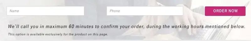
Variation
The new copy emphasized the value Telekom would provide by assisting users with tailored voice solutions while also reducing anxiety by stating when users could expect to be contacted.
Additionally, the CTA button copy was altered to “Yes, call me” instead of “Order Now”.

Conclusions And Results
The experiment ran for 18 days, with traffic split 50/50 between the control and the variation.
These were the results:
- A 38.89% increase in lead rate.
- A 30% increase in leads was collected with the new contact form.
Providing value at every step of the user journey can make all the difference. Testing copy variations helps you find the message that truly resonates.
11. Social Proof Increased the Conversion Rate by 34.67% on a Fitness E-commerce Website
Fine Fit sisters focus on helping individuals achieve their dream bodies and lives through sustainable lifestyle changes.
The Problem They Were Facing
They struggled with building trust and credibility, despite having strong offerings and a clear message.
This issue was most notable on mobile.
Hypothesis
“Adding a social proof on the 1st fold using reviews and icons will help build trust and credibility. When users land on the page, they will immediately see the product’s benefits, increasing their motivation.”
Control
The original copy and layout focused only on explaining the outcomes, but it didn’t instill enough trust.
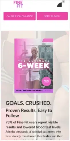
Variation
By including real customer photos, logos, and metrics that summarize the product’s popularity, we made the value proposition clearer and more compelling.
Conclusions And Results
The experiment ran on over 1500 users, with traffic split 50/50 between control and variation.
These were the results:
- A 34.67% increase in conversion rate.
- A 5.2% increase in revenue per visitor.
People trust products that have been tried and approved by others. Social proof is a key element for building credibility.
12. An Online Academy Increased its Sales 5X by Addressing Conversion-Critical User Doubts
Shaw Academy is a global online education institution that provides interactive classes, designed to allow students to learn at their own pace.
The Problem They Were Facing
Shaw Academy’s conversion rate from visitor to trial to paying customer was too low. They were only able to acquire the most qualified traffic, which limited growth.
A CRO audit revealed that many users were bouncing at a critical step: the billing page. The message on this page wasn’t clear enough to deliver confidence or address important objections.
Hypothesis
“By optimizing the messaging on the billing page and addressing key user objections, we can significantly increase the number of free trials.”
Control
Although the billing page answered important questions like "When will I be charged?" and "Will I be billed by providing my credit card details?" there was still something missing that held users back.
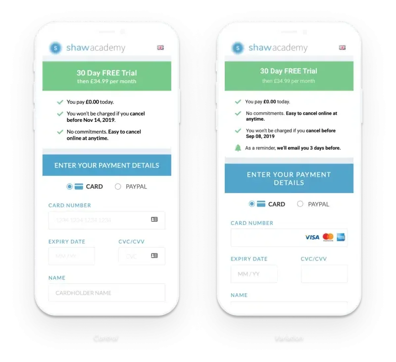
Variation
To reduce uncertainties, a message reassuring users was added: "As a reminder, we’ll email you 3 days before your trial ends."
Conclusions And Results
Although the experiment took six months, the results were well worth the effort.
These were the results:
- A 2X increase in conversion rate.
- A 5X increase in their sales.
It’s crucial to understand the doubts and concerns that hold users back from converting and to address these concerns clearly in your messaging. In critical steps like the billing page, the copy and layout must work together to reassure users and reduce anxiety.
13. Travel Website Increased its Conversion Rate by 25.8% by A/B Testing Their Copy
Tripsta provides transportation services, including airlines, ferry, and train services, through its websites.
The Problem They Were Facing
The travel industry is highly competitive, with users visiting multiple sites in search of the best offers and experiences. Many common user concerns were not addressed on Tripsta's page, resulting in high bounce rates.
Hypothesis
Incorporating a reassurance message at the “Passenger Information” step will encourage buyers to proceed to checkout and increase conversion rates.
Control
The original version did not reassure users they were making the best purchase. It functioned like any standard checkout page.
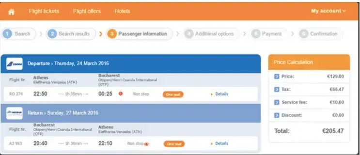
Variation
A message was added above the flight’s details; “Congratulations! This is one of the cheapest flights for this route! Book today to secure this price!”
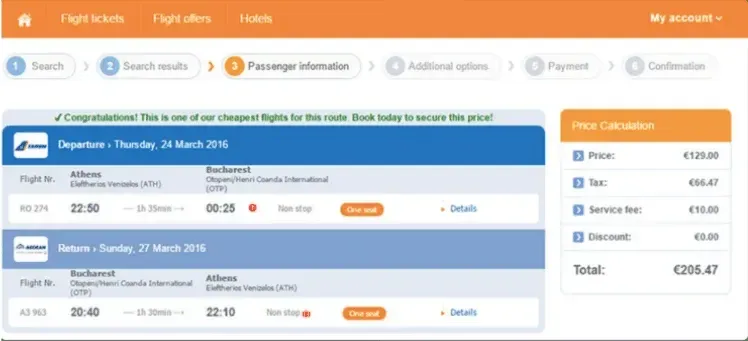
Conclusions And Results
These were the results:
- A 25.8% increase in conversion rate.
- A 26.55% increase in revenue.
A 26.55% increase in revenue.
Mitigating user anxiety at each step of the customer journey is crucial for delivering a smooth experience and boosting sales.
14. A SaaS Increased Sign-Ups by 6% by Being More Clear and Relevant
FreshBooks is a cloud accounting solution designed for small business owners.
The Problem They Were Facing
Visitors were actively exploring the Product Tour and Features pages but were not proceeding to the next step to move down the sales funnel.
Hypothesis
By simplifying choices and highlighting the most relevant features, users will be more likely to subscribe.
Control
In the original version, users were bouncing from page to page, seemingly lost.
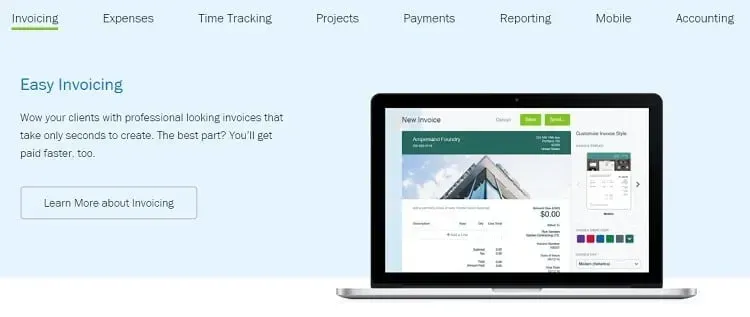
Variation
The team identified the top 5 FreshBooks features for their audience and limited the list that was shown on these pages.
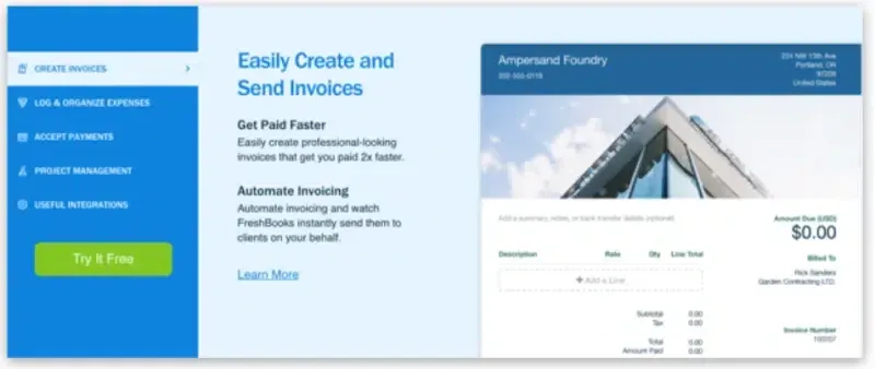
Conclusions and results
These were the results:
- A 4% increase in sign-ups.
When information is presented clearly and is relevant to the user, it reduces friction and enhances the experience.
15. An E-commerce Got a 6.8% Increase in Conversion Rate by A/B Testing its Navigation Menu
Soul of Adventure is an outdoor lifestyle apparel e-commerce that sells a wide range of protective gear.
The Problem They Were Facing
Session recordings and heatmaps revealed that users were getting lost in the site's navigation, which led to low conversions and sales.
Hypothesis
Organizing the menu and sorting categories more clearly will drive more visits to product pages and increase conversions.
Control
The original menu wasn’t intuitive and took up too much space.

Variation
The new version reorganized product categories and included an image to make navigation clearer for users.
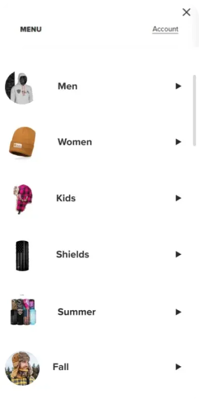
Conclusions And Results
With over 60,000 visits and a confidence level of 98%, these were the results:
- A 9.6% increase in conversion rate.
- A 9.8% increase in add-to-cart
A/B Testing is About Collecting the Right Data and Understanding the User
These examples show that even small changes—a CTA or a copy adjustment—can lead to significant results.
But remember, it’s always about collecting the right data and using it to form a solid hypothesis, which will guide you to the most effective tests.
We built Omniconvert Explore out of our own need to do A/B testing. An easy-to-use tool that helps you back experiments with data by running A/B tests, personalization, and overlays to increase your conversions.
Ty it for free or book a walkthrough with our specialist here.
Frequently Asked Questions
What is the optimal sample size for conducting A/B tests?
A sufficient sample size is essential to ensure that your test results are statistically significant and not just due to chance.
How long should an A/B test run for accurate results?
The duration of an A/B test depends on the traffic and goals, but typically it should run long enough to capture meaningful data from all user segments.
Can A/B testing negatively impact my website’s user experience?
If not carefully planned, A/B tests can introduce disruptions, so it’s crucial to prioritize tests that enhance rather than degrade the user experience.
What are common mistakes to avoid during A/B testing?
Some common mistakes include running tests for too short a period, testing too many variables at once, and not segmenting your audience correctly.
How do I decide which elements to test on my website?
Focus on testing elements that directly affect user engagement and conversion, such as CTAs, product pages, or checkout processes.


If you liked this article, make it shine on your page :)