Best Practices for Optimizing Call To Action Buttons (w. Examples)
Article first published:
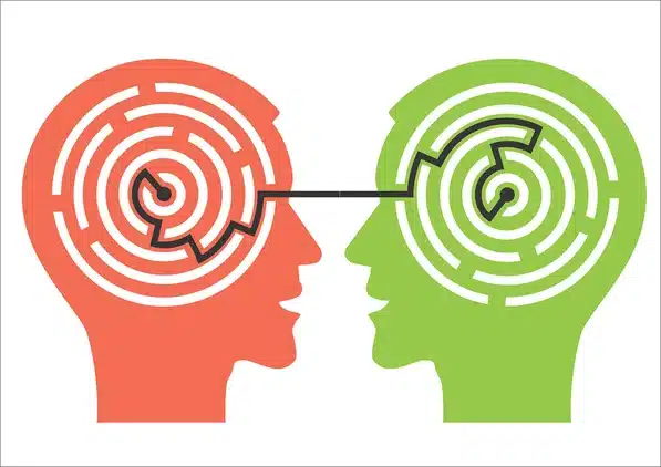
In e-commerce, Call-to-Action (CTA) buttons are not just prompts on a page; they are crucial marketing tools designed to guide users toward making a purchase. Effective CTAs go beyond standard design and copywriting—they incorporate elements of online persuasion and psychology to significantly boost conversions. However, their effectiveness hinges on more than just visibility; it requires strategic placement, compelling language, and a seamless link to a satisfactory landing page. Failure in any of these aspects can lead to lost sales and diminished customer return rates. This article explores how to master call-to-action optimization to enhance user experience and maximize conversion rates in your online store.
Key Takeaways
- Strategic Sizing: Adjust the call-to-action button size for optimal visibility and user interaction.
- Color Contrast: Use high-contrast colors to make CTAs stand out and capture attention.
- Placement Optimization: Strategically position CTAs for maximum impact across all devices.
- Whitespace Utilization: Employ whitespace to highlight CTAs & minimize distractions.
- Urgency Creation: Implement time-sensitive language to provoke immediate user actions.
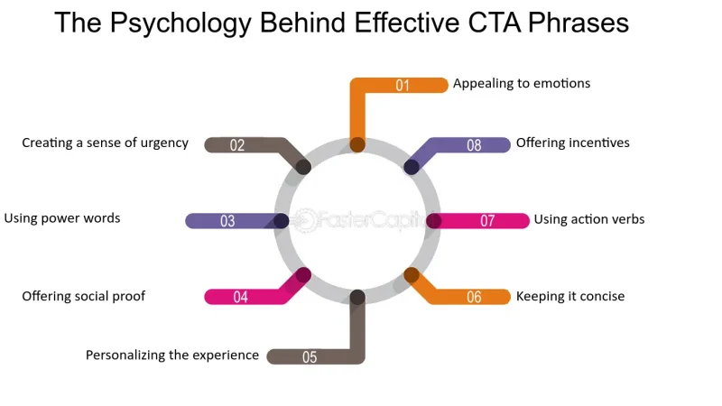
- Power Words: Integrate emotionally charged words to enhance call-to-action effectiveness.
- Continuous Testing: Conduct A/B testing to refine and perfect CTA strategies.
- Multiple CTAs: Use multiple CTAs on long pages to ensure visibility and engagement.
The Best Ways To Make Call-To-Action Buttons Effective
Enhance Visibility with Strategic Sizing
When it comes to optimizing CTA Buttons for better conversion rates, one of the key elements to consider is their size. Strategic sizing is not just about making a button large enough to be noticed; it’s about integrating the button seamlessly into the overall design while ensuring it stands out enough to prompt action. This approach is a cornerstone of CTA Best Practices and plays a crucial role in CTA Marketing strategies.
Importance of Proportional Sizing
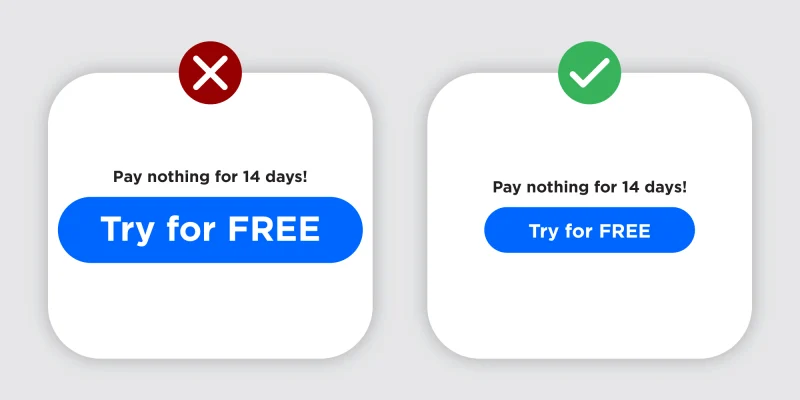
The size of a CTA button should be proportional to its surrounding elements to maintain design harmony and usability. A button that is too large may overwhelm the user and detract from other important content, whereas a button that is too small may get overlooked, failing to prompt the necessary action. The goal is to make the call-to-action button significantly noticeable without disrupting the user's natural browsing flow.
Balancing Button Size and Page Hierarchy
Ineffective CTA design, the size of the button can reflect its importance relative to other page elements. For example, a primary CTA like "Buy Now" should be larger and more prominent compared to a secondary call-to-action like "Learn More." This hierarchical approach guides the user's eye through the content toward the desired action, enhancing the user journey on an e-commerce site.
Using Size to Command Attention
A well-sized CTA button commands attention without shouting for it. It's about using size wisely to make sure the call-to-action stands out due to its importance. The strategic use of size helps in drawing attention to the button while keeping in mind the overall aesthetics of the page. This strategy is crucial in areas where multiple actions are available but one needs to dominate, a common scenario in call-to-action Marketing.
Testing for Optimal Size

The effectiveness of CTA button sizing can vary widely across different designs and user bases. Employing A/B testing to experiment with different button sizes can provide actionable data that informs the optimal button size for your specific audience. This testing helps in understanding how different sizes perform in terms of user engagement and conversion rates, making it a best practice in refining call-to-action Marketing strategies.
Utilize High-Contrast Colors for Better Visibility
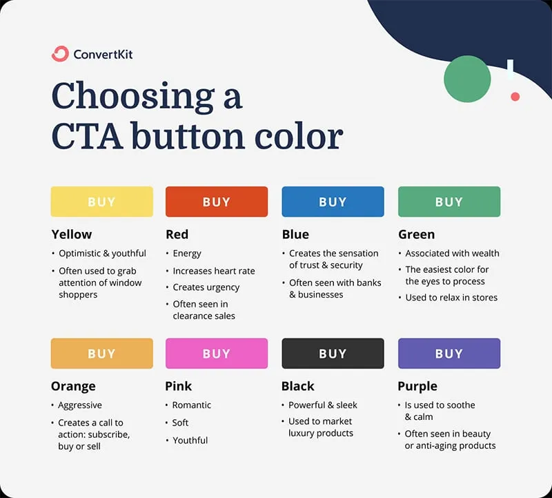
In the realm of CTA Best Practices, the use of high-contrast colors in CTA Buttons is a critical strategy for enhancing visibility and drawing user attention. Choosing the right color palette can significantly impact the effectiveness of your calls to action, making them stand out on the page and prompting higher user engagement. This approach is particularly important in CTA Marketing, where the goal is to convert visitors into leads or customers.
Significance of Color Contrast
Color contrast is vital in how quickly and easily a user can spot a CTA button. A button that blends too closely with the background decreases visibility and the likelihood of action. In contrast, a button with high-contrast colors compared to its surroundings can capture attention quickly, even for users skimming the page. This visual prominence ensures that the call-to-action stands out, making it a focal point on your webpage.
Choosing the Right Colors
Selecting the right colors for a call-to-action involves more than just choosing bright hues; it requires understanding the psychology of colors and how they interact with other elements on the page. For instance, a bright orange button may be highly effective on a dark blue background but could clash or get lost on a lighter or similarly warm palette. The key is to select colors that complement the overall design yet stand out enough to draw attention.
Impact on User Actions
The strategic use of contrasting colors in CTA buttons can directly influence user actions. Studies have shown that CTAs with higher color contrast can improve conversion rates by making the action steps more obvious and enticing. It’s not just about visibility; it’s about creating a visual cue that compels users to take the next step. Effective color use in CTA Marketing can lead to more clicks, higher engagement, and ultimately, better conversion rates.
Testing and Optimization
To maximize the effectiveness of your CTA buttons, continuous testing and optimization are essential. A/B testing different color contrasts can help determine which combinations capture the most attention and drive action. This data-driven approach allows marketers to refine their strategies based on real user responses, ensuring that their CTA Buttons are optimized for the best possible performance.
Optimize Button Placement for Maximum Impact
Effective placement of CTA Buttons is crucial for maximizing visibility and enhancing user interaction. In the world of call-to-action Marketing, where every click potentially leads to a conversion, the strategic positioning of your call-to-action buttons can significantly impact their effectiveness. Following call-to-action Best Practices for button placement ensures that your CTAs are both noticeable and enticing, encouraging more users to take the desired action.
Strategic Positioning on the Page
The location of your CTA on a webpage plays a pivotal role in how users interact with it. Placing a call-to-action in a prominent spot where users naturally focus their attention—such as the center of the screen or within the direct line of sight in the content flow—can increase its effectiveness. For instance, embedding a CTA button directly above the fold ensures it is seen without scrolling, which is crucial for capturing quick conversions from users who may not spend a long time on the page.
Visibility Across Different Devices
In today’s multi-device world, it is essential to consider how your CTA buttons appear on various screens, including desktops, tablets, and smartphones. A button that is perfectly positioned on a desktop view might be less effective on a mobile screen if it requires users to scroll too far to find it. Responsive design principles should be employed to adjust the placement and size of CTAs based on the device being used, ensuring optimal visibility and interaction across all platforms.
Psychological Impact of Placement
The placement of a call-to-action can also leverage certain psychological triggers. For example, placing a CTA button at the end of a compelling piece of content can capitalize on the moment of maximum engagement, where a user is most likely to make a decision. Similarly, the isolation effect, which involves placing the call-to-action away from other elements to make it stand out more, can be used to draw attention directly to the button, increasing the likelihood of a click.
Testing for Optimal Placement
As with any other aspect of CTA Marketing, testing different placements for your CTA buttons is key to determining what works best for your audience. A/B testing can reveal valuable insights into how different positions affect user behavior and conversion rates. This empirical approach allows you to optimize button placement based on actual user data, rather than assumptions.
Consistency and Familiarity
Maintaining consistency in the placement of CTAs across your site can also help condition users to expect a certain action at a certain point, which can be particularly effective for returning visitors. Familiarity breeds ease of use, and users who find comfort in knowing where to expect actionable elements are more likely to engage.
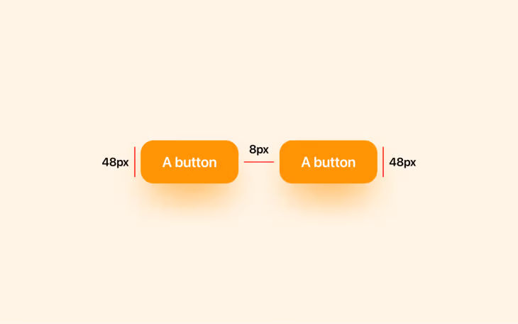
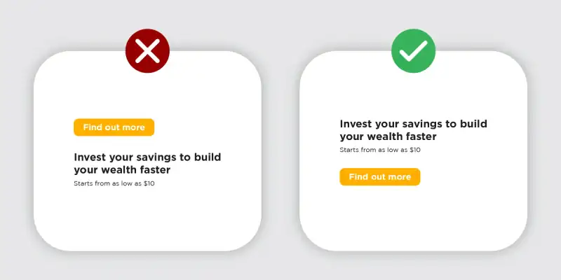
Employ Whitespace to Focus Attention
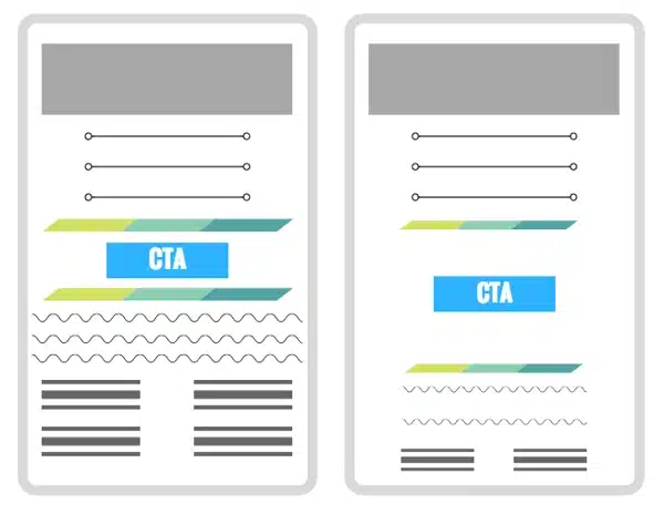
In the context of CTA Best Practices, effectively employing whitespace around CTA Buttons is crucial for directing user attention and enhancing the overall user experience. Whitespace, or negative space, is not just space — it's a powerful design element that helps to create a cleaner, more readable interface that can significantly improve how CTA Buttons are perceived and interacted with in CTA Marketing strategies.
Importance of Whitespace in Design
Whitespace is essential for creating a layout that allows users to comfortably digest information on a page without feeling overwhelmed. By strategically using whitespace around CTA buttons, you can help to focus user attention on the most important actions. This is not merely about aesthetics; it’s about creating a visual hierarchy that guides the user's eyes toward primary conversion points effortlessly.
Enhancing Button Prominence with Whitespace
A common technique in CTA Marketing is to isolate the CTA button with ample whitespace, which makes it stand out from other page elements. This isolation effect reduces visual clutter and competes less with other content, making the CTA more noticeable and likely to be clicked. The more whitespace around a button, the more attention is drawn to it, highlighting its importance and increasing user engagement.
Balancing Whitespace for Clarity and Action
While it's beneficial to have significant whitespace around a CTA, it’s crucial to balance it carefully. Too much whitespace can detach the call-to-action from relevant content, possibly causing the user to miss it entirely. The key is to use just enough whitespace to make the call-to-action stand out but still keep it contextually connected to the content that justifies the action, such as a product description or an enticing offer.
Psychological Effects of Whitespace
From a psychological perspective, the use of whitespace can convey a sense of elegance, luxury, and value. Users often interpret designs with more whitespace as being higher quality and more deliberate. When applied to CTA Marketing, this perception can enhance the user's view of the brand or product, making them more likely to engage with the call-to-action because they perceive it as part of a superior user experience.
Testing Whitespace Impact
As with all elements of web design, it's essential to test how different amounts and arrangements of whitespace affect user behavior. A/B testing can be an effective way to find the optimal use of whitespace around CTA buttons that maximize conversions. By comparing different designs, you can gather data on how variations in whitespace impact the effectiveness of CTAs.
Implementing Whitespace Intelligently
To implement whitespace effectively, consider the overall design of your webpage. Ensure that the whitespace not only emphasizes the call-to-action but also maintains overall balance and harmony within the design. Use grid systems and alignment principles to manage whitespace evenly and predictably across different screen sizes, enhancing responsiveness and consistency in user experience.
Create Urgency with Time-Sensitive Language

In CTA Marketing, creating a sense of urgency can significantly increase the likelihood of immediate user action. Using time-sensitive language in CTA Buttons is an effective way to motivate users by conveying the importance of promptness. This tactic aligns with CTA Best Practices by encouraging users not to delay their decisions, which can be especially powerful in e-commerce settings where decision fatigue often leads to abandoned carts.
The Power of Urgency in Calls to Action
Urgency compels action because it taps into the human instinct to avoid missing out. When users perceive that an offer is limited by time, they are more likely to act quickly to take advantage of it before it disappears. This psychological trigger, known as the fear of missing out (FOMO), is why time-sensitive language can transform a standard CTA into a more compelling, action-driven button.
Implementing Time-Sensitive Phrases
Phrases like "Limited Offer," "Hurry, ends soon!" or "Only a few left!" are direct and impactful. They communicate that the window of opportunity is closing, which can accelerate decision-making processes. Integrating these phrases into your CTA Buttons can dramatically enhance the effectiveness of your campaigns by making them feel immediate and pressing.
Examples of Effective Time-Sensitive CTAs
- Flash Sale CTAs: For promotions or sales, CTAs like "Sale ends at midnight!" can create a strong incentive for users to act immediately rather than later.
- Last Chance Offers: For sign-ups or seasonal offers, using phrases such as "Last chance to sign up!" emphasizes the urgency and can push users from contemplation to action.
- Early Bird Specials: Encouraging users to act quickly to get the best deal with CTAs like "Early bird discount ends soon!" can be very effective, especially for event registrations or new product launches.
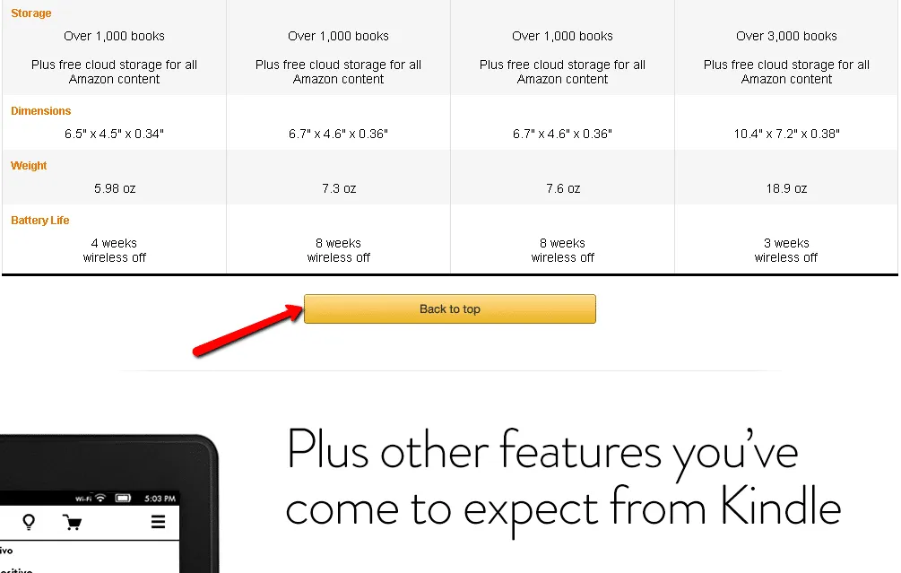
The Number of Call-to-action Buttons
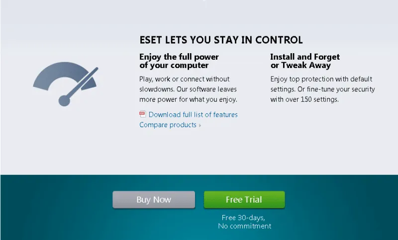
There is no magical number of buttons that can work for everybody. However, Econsultancy experts recommend multiple buttons for long pages. Amazon uses long product pages to give all the possible details about the product, reviews, video tutorials, testimonials from other customers, and recommendations. The customer may forget the reason why he landed on the product page. Multiple calls to action will take him back to his first intention.
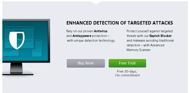
ESET is using multiple call-to-action buttons on the Nod32 Product page. More than that, they prioritize the most important button to achieve goals. In this case, it seems that a free trial works better for increasing the sales of Nod 32 Antivirus.
1st call to action
2nd call to action on the same product page
An outstanding design does bring value to a website. For e-commerce websites, it's more important to create design elements optimized for conversions. A persuasive website on which visitors are addressed with a personalized approach is more likely to sell. Test any design ideas on your e-commerce website and find out which variation suits your business goals the best...then implement it.
51 Power Words Tailored for Your CTA Buttons
Immediate Action
- Now
- Instant
- Hurry
- Rush
- Quick
- Flash
- Limited
- Today
- Direct
- Urgent
Exclusive Access
- Exclusive
- Elite
- Secret
- Rare
- Unique
- Special
- Hidden
- VIP
- Insider
- Limited-Edition
Value and Savings
- Free
- Bonus
- Save
- Discount
- Bargain
- Cheap
- Deal
- Prize
- Gift
- Reward
Emotional Appeal
- Discover
- Love
- Dream
- Enjoy
- Thrill
- Delight
- Surprise
- Pleasure
- Crave
- Desire
Trust and Credibility
- Proven
- Guaranteed
- No-Risk
- Secure
- Safe
- Trusted
- Reliable
- Authentic
- Certified
- Official
These power words are designed to be incorporated into your CTA Buttons to effectively resonate with your audience, driving them towards taking immediate, excited, and confident actions. Whether your goal is to elicit a quick response, convey exclusivity, demonstrate undeniable value, invoke deep emotional engagement, or establish trust, these words can be strategically used in various combinations to enhance your call-to-action impact.
Frequently Asked Questions
What is the best practice for CTA text?
The best practice for call-to-action text is to keep it clear, concise, and action-oriented. Use strong, active verbs that compel users to take immediate action, such as "Buy Now," "Sign Up," "Discover," or "Get Started." Ensure the text creates a sense of urgency or benefit, making it irresistible for users not to click.
What is a strong CTA?
A strong call-to-action effectively encourages users to take a specific action that aligns with the marketer's goals. It is visually striking, uses persuasive language, and stands out on the page. A strong CTA is also tailored to its target audience, addressing their needs or pain points with a clear value proposition.
What is a CTA format?
CTA format refers to the design and structural elements of a call-to-action button or link. This includes the size, color, font, placement, and surrounding whitespace. Effective call-to-actions are designed to catch the user's eye and guide them smoothly from interest to action. They should be easy to find, read, and click, regardless of the device being used.
What do CTAs mean in marketing?
In marketing, CTAs (Calls to Action) are instructions to the audience designed to provoke an immediate response, usually using an imperative verb such as "call now," "find out more," or "visit a store today." CTAs are used to convert prospects into leads and customers, guiding them through the sales funnel with clear steps.
What is the difference between a button and a CTA?
A button is a design element that users can click on to perform a specific function. In contrast, a CTA is a broader marketing concept that encompasses any request or prompt for action, which can be presented as a button, link, image, or some other interactive element. While all CTA buttons are interactive, not all interactive buttons are call-to-actions; some might simply serve functional or navigational purposes without directly contributing to conversion goals.


If you liked this article, make it shine on your page :)