25+ Ecommerce CRO (Conversion Rate Optimization) Tips & Best Practices
Article last updated:
Article first published:
- 25+ Ecommerce CRO (Conver…
- 1. Show Personalized Deal…
- 2. Display Product Recomm…
- 3. Experiment with Limite…
- 4. List All Costs Upfront…
- 5. Clearly Display Produc…
- 6. Use High-Quality Image…
- 7. Help with Choosing Pro…
- 8. Use User-Generated Con…
- 9. Encourage Account Crea…
- 10. Start a Customer Loya…
- 11. Use Upsells or Cross-…
- 12. Make Exit Offers
- 13. Showcase Trust Signal…
- 14. Optimize Your Product…
- 15. Try Different Hero Se…
- 16. Use Shopping Cart Aba…
- 17. Provide Free Shipping…
- 18. Collect Visitor Data…
- 19. Discover Where Your V…
- 20. Add a Live Chat and O…
- 21. Use Heatmaps to Under…
- 22. Always Show Shopping…
- 23. Include Explanations…
- 24. A/B Test Your Pages a…
- 25. Add an FAQ Page
- 26. Use Microcopy to Buil…
- Why E-Commerce CRO Is Imp…
- Conclusion
- Learn more about Ecommerc…
- FAQs
When it comes to eCommerce, more traffic doesn't always mean more revenue.
You might be spending a fortune on ads, SEO, or influencer campaigns, only to watch visitors land on your site, browse around, and leave without buying. That’s where Conversion Rate Optimization (CRO) comes in.
CRO is the art (and science) of turning browsers into buyers. Small tweaks to your product pages, checkout flows, and trust elements can unlock massive gains, without increasing your ad spend.
In this guide, we’ll cover these pro tips and best practices:
- Show personalized deals to regular customers
- Display product recommendations
- Experiment with limited-time offers
- List all costs upfront in the checkout
- Clearly display product reviews
- Use high-quality images and video on your product pages
- Help with choosing products with a quiz
- Use user-generated content
- Encourage account creation at the right time
- Start a customer loyalty program
- Use upsells or cross-sells to increase average order value
- Make exit offers
- Showcase trust signals
- Optimize your product descriptions
- Try different hero sections
- Use shopping cart abandonment software
- Provide free shipping to higher-ticket orders
- Collect visitor data with surveys
- Discover where your visitors leave
- Add a live chat and other contact options
- Use heatmaps to understand visitor behavior
- Always show shopping cart contents
- Include explanations for important conditions
- A/B test your pages and forms
- Add an FAQ page
- Use microcopy to build trust
Let’s dive in.
25+ Ecommerce CRO (Conversion Rate Optimization) Tips & Best Practices
Small changes can lead to big wins in ecommerce.
That’s the promise of Conversion Rate Optimization (CRO), the process of refining your online store to turn more visitors into buyers. Whether it’s adjusting your product pages, improving the checkout flow, or showing more relevant offers, every tweak has the potential to boost revenue without increasing ad spend.
In this section, you’ll find over 25 ecommerce-specific CRO strategies designed to improve performance across the entire customer journey, from the homepage to post-purchase.
These tips are tailored for ecommerce businesses and backed by real-world examples, use cases, and expert tools.
1. Show Personalized Deals to Regular Customers
Personalized deals for repeat visitors or loyal customers can significantly improve conversion rates by making your offers more relevant and rewarding. When customers feel recognized and valued, they are more likely to complete a purchase, and return again.
By identifying visitors through login sessions, loyalty program data, or cookies, you can tailor exclusive promotions like loyalty discounts, early access to new products, or personalized bundle offers. This tactic not only boosts immediate sales but also strengthens brand loyalty and increases customer lifetime value (CLV).
Example of Personalized Offers and Benefits

Nike’s website recognizes logged-in members and offers exclusive “Member Only” promotions. These deals are visible only to customers who are part of Nike’s loyalty program, encouraging users to join and stay engaged.
Best Tool to Personalize Deals for Regular Customers
Reveal by Omniconvert allows ecommerce brands to track buying behavior and segment customers based on CLV, RFM scores, and purchase history. Using Reveal’s Shopify integration, you can easily create and display personalized deals for your most valuable segments, automating loyalty-based incentives at scale.
2. Display Product Recommendations
Personalized product recommendations increase the likelihood of purchase by helping customers discover items that match their preferences or complement what they’ve already viewed or added to their cart.
Recommendation widgets can be powered by browsing behavior, purchase history, or affinity modeling. You can place these strategically on product pages, the homepage, cart pages, or even post-purchase screens to boost cross-sell and upsell opportunities.
Example of Related Product Recommendations

Amazon uses product recommendation blocks such as “Frequently bought together” and “Customers who bought this also bought” across its entire ecommerce experience. These modules contribute a significant portion of their sales and are continually tested for performance.
Best Tool to Include Product Recommendations
Clerk.io is a popular AI-powered tool for ecommerce personalization. It integrates with platforms like Shopify, WooCommerce, and Magento to automatically generate dynamic product recommendations based on real-time customer behavior.
3. Experiment with Limited-Time Offers
Time-sensitive promotions are a classic CRO tactic that leverages urgency and scarcity to accelerate purchase decisions. Flash sales, countdown timers, “deal of the hour,” or “buy now, save X%” campaigns drive action by creating fear of missing out (FOMO).
This technique is especially effective when used sparingly, as it triggers impulse buying while making your store feel active and exciting. These offers should be visible and clear, preferably accompanied by a countdown or deadline.
Example Of a Limited-Time Offer

ASOS regularly runs flash sales like “25% Off for 24 Hours” with prominent timers across the site and in their email campaigns. These drive surges in conversions and site traffic, especially when promoted through social media.
Best Tool to Implement Limited-Time Offers
Wisepops lets you easily create and manage popups, countdown timers, and promotional banners tailored to user behavior. You can trigger time-limited offers based on exit intent, time on site, or specific page visits, making it a powerful tool for urgency-based campaigns.
Triggerbee makes it easy to run limited time offers using personalized onsite campaigns, countdown based messaging, and incentive control tied to real user behavior. Offers can be targeted by audience, context, and engagement level, with built in safeguards like unique codes and anti abuse logic to ensure urgency campaigns stay effective and measurable.
4. List All Costs Upfront in the Checkout
Unexpected costs, such as shipping fees, taxes, and service charges, are one of the most common reasons for checkout abandonment. Customers expect transparency when making a purchase, and when additional fees appear late in the checkout process, it can create frustration and immediate drop-off.
To prevent this, all costs should be clearly displayed before customers proceed to checkout. Many successful ecommerce brands provide real-time cost calculations, showing shipping costs, taxes, and any additional fees directly on the product page or cart summary. This eliminates last-minute surprises, giving customers full confidence in the total price before they commit to payment.
In addition to listing all costs upfront, businesses can also offer shipping calculators, which allow users to enter their location and see estimated fees before proceeding. A smooth pricing experience ensures that shoppers remain engaged and don’t feel misled at the last step.
Example of a Clear Cost List

Jet.com both display shipping and estimated tax calculations directly on the cart page before checkout begins. This transparency helps reduce abandonment and builds trust.
Best Tool To Display Real-time Shipping Rates
Shopify Advanced Checkout Settings or apps like Zonos and ShipperHQ let you display real-time shipping rates, import duties, and taxes based on user location. These tools improve checkout clarity and decrease surprises at the final step.
5. Clearly Display Product Reviews
Product reviews act as social proof, reassuring visitors about the quality, reliability, and popularity of the item they’re considering. Featuring genuine, easy-to-read reviews directly on your product pages boosts confidence and helps overcome objections.
Show average star ratings alongside detailed feedback, ideally with the ability to filter by rating or keyword. Consider including photo reviews and verified buyer labels to increase authenticity and trust.
Example of Reviews Implemented in the Product Page

Sephora includes detailed product reviews, complete with filters for skin type, age, and concerns, along with verified purchase badges and customer-submitted images. This level of detail helps customers make confident decisions.
Best Tool for Display Product Reviews
Yotpo is one of the leading platforms for collecting and displaying ecommerce reviews. It integrates with most platforms and supports user-generated content, Q&A, and visual reviews.
6. Use High-Quality Images and Video on Your Product Pages
Images and videos are central to the ecommerce experience. Shoppers can’t touch or try the product, so your visual presentation must do all the heavy lifting.
Use high-resolution images that offer multiple angles and zoom capabilities. Adding product videos, whether it’s a model demonstrating clothing or a customer review, adds context and improves understanding. Lifestyle photos help customers imagine the product in real life.
Make sure visuals load fast and are optimized for mobile. Poor imagery is one of the fastest ways to lose trust and conversions.
Example of High-Quality Images on a Product Page

Allbirds offers clear, consistent imagery with multiple views, close-ups, lifestyle shots, and even movement videos of their footwear. The visual experience is a strong driver of confidence and conversions.
Best Tool to Optimize your Images and Video Quality
Cloudinary is a media optimization platform that allows ecommerce sites to manage, compress, and serve high-quality images and videos at fast speeds, tailored for different devices and bandwidth conditions.
7. Help with Choosing Products with a Quiz
When customers feel overwhelmed by options or aren’t sure what product best suits their needs, interactive product quizzes can guide them through the decision-making process. These quizzes ask a series of targeted questions, about preferences, needs, or lifestyle, to narrow down options and recommend a tailored product. This not only reduces choice paralysis but also builds engagement and trust, increasing the likelihood of conversion.
By helping visitors feel like the brand understands them, quizzes replicate the consultative sales approach of an in-store experience. They also provide zero-party data that can be used for future personalization and segmentation.
Example of a Correct Quiz Implementation in Avon's Website

Avon engaged users who clicked on the widget were asked a question about the color of their eyes to redirect users to a personalized page customized with a selection of products according to their choice.
Best Tool for Implementing Quizzes in Your Page
Omniconvert Explore is the ideal tool to create and implement quizzes and surveys that guide users through product selection.
The example shown above was implemented using Omniconvert, demonstrating how real-time customer feedback and behavior can inform campaign strategies and drive sales.
8. Use User-Generated Content (UGC)
User-generated content, such as photos, videos, or reviews shared by real customers, adds authenticity and social proof to your product pages. Seeing others use and enjoy a product builds confidence and creates a community feel, especially among first-time buyers.
UGC can be displayed in galleries, carousels, or integrated into product pages. It not only boosts trust but also expands your content assets without additional production costs. When curated effectively, it reflects how products look and perform in real life, which increases conversion potential.
Example of a Successful User-Generated Content Strategy

Glossier incorporates user-submitted photos and reviews directly into their product pages and social feeds. Their “Top Looks” section features real customers wearing products, creating a relatable and trustworthy shopping experience.
Best Tool to Implement User-Generated Content
Loox is an ecommerce-focused UGC platform that helps you collect and display photo and video reviews from verified customers. It works seamlessly with Shopify and helps brands showcase authentic experiences.
9. Encourage Account Creation at the Right Time
While accounts are valuable for loyalty, order tracking, and personalization, forcing users to register too early in the purchase process can hurt conversions. Instead, prompt users to create an account after the purchase or at a natural point, like saving cart items or tracking an order.
This timing feels less intrusive and more aligned with the shopper’s goals. When presented as a benefit (e.g., faster checkout next time, reward points, easier returns), account creation becomes a value add rather than a barrier.
Example of a Well Implemented Account Creation Request

Everlane, the ethical clothing brand, allows shoppers to browse and add items to their cart without requiring an account. When users reach the checkout stage, they’re gently prompted to create an account by highlighting benefits like order tracking, faster future purchases, and access to exclusive drops.
Importantly, they also offer a “guest checkout” option, which removes friction for first-time buyers while still nudging them toward registration. This balance between convenience and value creates a smoother experience and increases the likelihood of account creation after the first purchase.
Best Tool to Implement Visitor's Account Creation Correctly
Shopify Plus or apps like User.com can help you customize when and how account creation prompts appear, ensuring they’re aligned with behavior triggers and conversion goals.
10. Start a Customer Loyalty Program
Loyalty programs are one of the most effective ways to increase repeat purchases, boost customer lifetime value, and build long-term brand relationships. By rewarding customers for actions like purchases, referrals, or social shares, you give them a reason to come back, while also gathering valuable behavioral data.
Loyalty members tend to spend more, shop more frequently, and refer others. To be effective, your program should be easy to understand, provide meaningful rewards, and offer a clear path to earning benefits. Consider offering early access to new products, exclusive discounts, or free shipping tiers to make loyalty feel exclusive and worthwhile.
Example of a Customer Loyalty Program

Ulta Beauty has a highly successful loyalty program called Ultamate Rewards, which offers points for every dollar spent, exclusive birthday gifts, and early access to new products or sales.
Shoppers can redeem points for discounts on future purchases, and the tiered system rewards high spenders with extra perks like free shipping and bonus point events.
Best Tool to Implement a Customer Loyalty Program
LoyaltyLion integrates with major ecommerce platforms and allows you to build customized rewards programs based on purchases, referrals, reviews, and more. It also supports personalized campaigns for top customer segments.
11. Use Upsells or Cross-Sells to Increase Average Order Value
One of the simplest yet most effective CRO tactics is increasing the average order value (AOV) through upselling and cross-selling. Upsells encourage customers to purchase a more premium version of a product, while cross-sells suggest complementary items that enhance their purchase.
These techniques work best when they’re helpful, not pushy. Display cross-sell offers on product pages, in the cart, or post-purchase. For upsells, offer easy comparisons (“upgrade to premium for just $10 more”) and highlight added benefits.
Example of an Upselling Implementation

Apple masterfully implements product upselling on its iPad Pro product page. When a user begins the purchase process, they’re guided through a series of configuration steps, starting with screen size (11-inch vs. 13-inch), followed by storage capacity options (256GB, 512GB, 1TB, or 2TB).
Each option visibly increases the price, encouraging customers to consider higher-value alternatives based on their needs. spend.
Best Tool for Upselling and Cross-Selling Strategies
ReConvert is a powerful Shopify app for post-purchase upsells, thank-you page customization, and checkout optimization. It enables you to present targeted offers based on cart content or behavior.
12. Make Exit Offers
Exit offers help capture value from visitors who are about to leave your site without converting. These offers typically appear when the system detects exit intent, like moving the cursor toward the browser’s close button or back arrow.
Exit-intent popups can present time-sensitive discounts, free shipping offers, lead magnets, or ask for feedback. When done correctly, they can recover abandoned carts, capture leads, or trigger impulse purchases.
Example of a Well Implemented Exit-Intent Offer

Wall-Street.ro, the most-read Romanian business newspaper, used exit-intent personalization to improve lead generation. Two variations of exit messages, each with custom persuasive copy and related imagery, were A/B tested over two weeks.
Results:
- +279% increase in signup rate for the best-performing variation
- Over 50% reduction in bounce rate
- 99% statistical relevance across both tested variants
This strategy helped turn bouncing visitors into loyal subscribers, proving that even on a content-driven website, exit offers can drive conversion-critical outcomes.
Best Tool to Make Exit Intent Pop-Ups
Omniconvert Explore is the ideal tool for creating high-converting exit-intent popups that dynamically respond to user behavior. With its advanced segmentation, A/B testing capabilities, and visual editor, you can craft personalized offers that trigger just before a visitor leaves your site, whether to collect emails, recover carts, or promote time-sensitive deals.
The example shown above, from Wall-Street.ro, was implemented using Omniconvert. Through tailored exit overlays and real-time testing, the campaign achieved a 279% increase in signups and a 50% drop in bounce rate, showcasing the power of data-backed exit personalization.
13. Showcase Trust Signals
Trust is a critical factor in conversion, especially for first-time visitors. Without the ability to touch or try products, online shoppers rely heavily on signs that your store is legitimate, secure, and customer-friendly. That’s where trust signals come in.
These can include:
- Secure payment badges (SSL, Visa, Mastercard, PayPal)
- Third-party endorsements or press mentions
- Clear return and refund policies
- Customer reviews and testimonials
- Certifications (e.g., organic, cruelty-free)
- “Free returns” or “Money-back guarantee” messaging
Position these signals prominently across the user journey, especially on product pages, checkout pages, and near CTAs, to reassure and reduce friction.
Example of Trust Signals in Booking.com

Booking.com provides a strong example of how to effectively showcase trust signals. On their property pages, like the one shown, they prominently display aggregated review scores, the number of reviews (e.g., 4,543 comments), and highlighted quotes from past guests.
Additionally, they surface specific sub-scores, such as location ratings (9.4 in this case), to build credibility around what people value most.
Best Tool to Showcase Trust Signals
Trustpilot allows ecommerce businesses to collect and display verified customer reviews, badges, and star ratings on-site and in SERPs. It integrates with Shopify, Magento, and WooCommerce, making it easy to build credibility.
14. Optimize Your Product Descriptions
A well-crafted product description does more than list features, it connects emotionally, answers objections, and communicates the benefits that matter most to your audience.
Effective descriptions stem from user research. Use surveys, heatmaps, customer interviews, and reviews to identify what customers care about. What pain points does your product solve? What results or feelings are they seeking? Highlight benefits over specs, and match the tone of your audience.
Use formatting to improve scannability, short paragraphs, bullet points, and headings. And don’t forget to optimize for SEO by naturally including relevant keywords.
Example of a Product Description Optimized

Dollar Shave Club’s product descriptions are witty, benefit-driven, and aligned with their brand voice. Instead of listing the accessories right away, they write the benefits and connect with the user outcomes.
Best Tool to Optimize Your Product Descriptions
Hotjar enables you to gather real insights from heatmaps, session recordings, and surveys.
The goal is to understand if the copy truly resonates with your audience.
15. Try Different Hero Sections
The hero section is the first impression of any ecommerce page, it’s where visitors decide whether to stay or bounce. This area should clearly communicate your main value proposition, highlight one product or offer, and direct users toward an action.
But many ecommerce stores treat it as decorative rather than strategic. Testing different hero setups (e.g., static vs. video background, lifestyle photo vs. product image, different headline framing, or single CTA vs. multiple options) can lead to huge CRO wins.
Each variation should be tested for clarity, emotional impact, and ease of understanding. Tools that allow fast A/B testing are key to identifying what resonates best with your audience.
Example of a Hero Section That Keeps on Testing and Improving

Warby Parker’s homepage often tests different hero setups, sometimes leading with new arrivals, sometimes promoting virtual try-on. Each layout emphasizes simplicity, clear CTA, and strong visual focus.
Best Tool to Test Different Hero Sections
Explore is a popular A/B testing platform that lets you create and compare variations of hero sections without coding. You can track metrics like bounce rate, click-throughs, and conversions to find the best-performing layout.
16. Use Shopping Cart Abandonment Software
Cart abandonment is one of the biggest obstacles in ecommerce, with average rates hovering around 70%. Abandonment software helps you re-engage shoppers who leave before completing their purchase by triggering automated emails, popups, or on-site reminders.
These tools detect when a visitor adds a product to their cart but leaves the site without checking out. You can then send a well-timed email (often within 1–3 hours) reminding them of the item, offering a discount, or answering common objections (e.g., “Still thinking it over? Here’s free shipping.”).
You can also use exit-intent popups to recover users before they even leave, offering a small incentive like 10% off or a shipping calculator to reduce hesitation.
Example of a Cart Abandonment Strategy
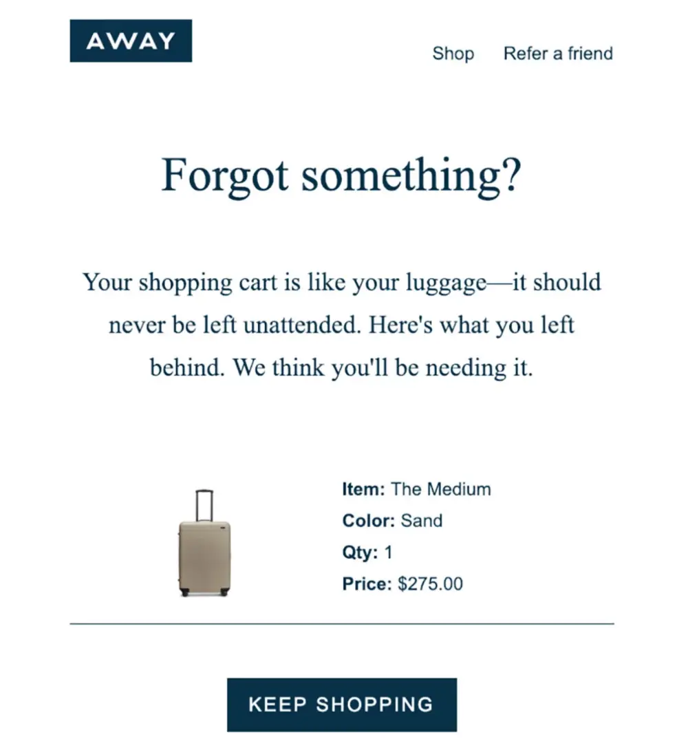
Away, the travel brand, offers a clever example of cart abandonment recovery. When a customer leaves without completing a purchase, they send a personalized email with the subject line “Forgot something?” and use on-brand copy, “Your shopping cart is like your luggage—it should never be left unattended”, to recapture attention.
Best Software to Implement Cart Abandonment Recovery
Klaviyo is one of the top email marketing tools for ecommerce and includes advanced cart abandonment flows with personalized messaging, product images, and predictive timing.
17. Provide Free Shipping to Higher Ticket Orders
Free shipping is one of the strongest motivators for completing a purchase. But instead of offering it to everyone, use it as an incentive to increase Average Order Value (AOV) by setting a minimum threshold (e.g., “Free shipping on orders over $75”).
This tactic encourages shoppers to add more items to their cart to unlock the benefit, turning a $40 sale into a $75+ one. Display a dynamic cart progress bar that shows how close they are to the free shipping threshold to reinforce the incentive.
You can even personalize the threshold by customer segment or location, using average order data to find the sweet spot between margin and motivation.
Example of a Free Shipping Well Placed

Nordstrom offers free standard shipping on orders over a certain threshold, clearly stating this on product and cart pages. This tactic incentivizes shoppers to add more to their cart to qualify, effectively increasing average order value (AOV).
Best Tool to Provide Free Shipping Benefits
Free Shipping Bar by Hextom (Shopify app) displays dynamic messages that update as users add items to their cart. It’s customizable, location-aware, and integrates well with Shopify and WooCommerce stores.
18. Collect Visitor Data with Surveys
Surveys are an underrated CRO tactic that can help you deeply understand your audience, improve product messaging, and reduce friction points in the shopping experience.
By asking the right questions at key moments, on exit, post-purchase, or after a scroll threshold, you can learn:
- What’s stopping them from buying
- What information is missing
- How they discovered your store
- What products they want next
This qualitative insight helps you tweak everything from product descriptions to homepage messaging. Just keep surveys short, specific, and timely.
Example of a Successful On-site Survey

Romanian household appliance retailer Ideall used on-site surveys to uncover deep insights about customer behavior and motivations. The brand already had strong pricing and customer support, but needed to better compete with marketplaces offering wider product ranges.
Through targeted post-purchase surveys, they discovered that a significant portion of purchases occurred when customers were furnishing new homes, particularly during certain times of the year. These insights went beyond standard analytics, revealing emotional and situational triggers behind buying decisions.
Armed with this information, Ideall launched a tailored Facebook campaign around the “new home” theme. The result? One of their top-performing campaigns of the year, driven by real, qualitative customer feedback.
Best Tool to Collect Visitor Data with Surveys
Omniconvert Explore allows you to run on-site surveys triggered by behavior, like exit intent or scroll depth, without development work. It’s ideal for gathering voice-of-customer insights directly tied to conversion behaviors.
19. Discover Where Your Visitors Leave
Understanding the exact point where users drop off is key to fixing friction in your conversion funnel. It could be on a product page, during the shipping info step, or at the payment stage. Each of these abandonment points tells a different story, and signals a different kind of issue.
To identify these, use funnel analysis tools that track user paths and pinpoint drop-off stages. Once you know where most users exit, you can test solutions like reducing form fields, clarifying policies, or improving page speed. Don’t rely on guesswork, back it with data.
Example in GA4
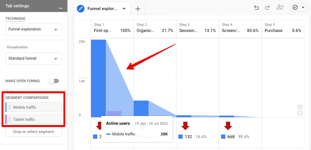
A retailer can use funnel reports and found where users dropped off on the shipping info page.
Wherever they find the page visitors drop off the most, they know where to start optimizing.
Best Tool to Discover Where Your Visitors Leave
Google Analytics 4 (GA4) can help visualize your funnel performance. With GA4, you can build custom funnels and segment by source, behavior, or device to isolate the real pain points in your conversion journey.
20. Add a Live Chat and Other Contact Options
When shoppers have doubts or get stuck, having someone (or something) available to help in real-time can dramatically reduce bounce rates and cart abandonment. Live chat provides instant assistance, removes hesitation, and builds trust.
It’s especially powerful for higher-ticket items or complex products where people have questions before committing. Beyond chat, offer visible contact options like a support email, or chatbot. The goal: reduce friction and build buyer confidence.
Example of a Useful Live Chat

Chicago Music Exchange, a specialty music store, incorporates a sleek, responsive live-chat widget on every page. The chat icon matches the site’s branding and invites users with a friendly greeting like “Need help finding the right guitar?” when agents are online.
Best Tool to Add a Live Chat in Your Site
Gorgias is a helpdesk platform tailored for ecommerce. It integrates live chat, email, and social media support in one place and allows automation based on order status, customer tags, and more.
21. Use Heatmaps to Understand Visitor Behavior
Heatmaps give you a visual representation of how visitors interact with your website, what they click, scroll, hover over, and ignore. This insight is crucial for identifying UX issues, dead zones, or misplaced CTAs that hurt conversions.
For instance, you might discover that users never scroll past a certain point, or that a CTA button isn’t being clicked because it’s placed too low or looks like plain text.
Pair heatmaps with session recordings to see individual user journeys in real time, spotting rage clicks or hesitation patterns that indicate friction.
Example of a Heatmap Implementation

An ecommerce brand selling kitchenware found through heatmaps that visitors rarely scrolled to the product bundles section. After moving the bundles higher up on the page and improving the design, upsells increased by 18%.
Best Heatmaps Tool
Hotjar is a go-to for heatmaps and session recordings. It helps you visualize what users are doing and combine that with on-site feedback for even deeper insights. Omniconvert Explore also provides similar heatmap functionality with added survey capabilities for testing hypotheses.
22. Always Show Shopping Cart Contents
Shoppers should always have clear, easy access to what’s in their cart, regardless of what page they’re on. A persistent cart icon, often in the top navigation, helps reinforce purchase intent and prevents confusion.
It acts as a visual cue that keeps the shopping journey top of mind and makes it easier for customers to check out when they’re ready. Bonus: displaying a mini-cart preview (on hover or click) can allow customers to verify and adjust items without leaving their current page.
This small UX improvement reduces friction, especially on mobile, and helps avoid abandonment caused by doubt or forgetfulness.
Example of a Clear Shopping Cart

Nordstrom, a leading fashion retailer, keeps the shopping cart icon persistent and interactive across all pages of the site. When users hover or click on the cart icon, a dropdown instantly displays the cart contents, including product images, sizes, prices, and quantities, without needing to navigate away from the current page.
Best Tool to Optimize Your Shopping Cart
Shopify and BigCommerce offer built-in persistent cart features, but if you're looking for more advanced cart customization (like sticky carts or floating buttons), Rebuy and SideCart are excellent add-ons.
23. Include Explanations for Important Conditions
If your product has conditions, like return limits, warranty coverage, subscription terms, or additional fees, explain them clearly and close to the point of action. Burying important info in terms and conditions leads to frustration and mistrust.
Instead, add concise tooltips, short blurbs, or collapsible sections that summarize key details near the relevant input field or CTA. This reduces hesitation and preempts objections that might otherwise cause abandonment.
Example of a Clear Display of Terms and Conditions From Airbnb
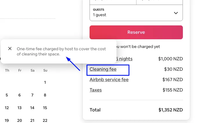
Airbnb provides clear, tooltip-style explanations for additional fees during the booking process. For instance, when a user hovers over the "Cleaning fee" line item, a message pops up explaining that it’s “a one-time fee charged by host to cover the cost of cleaning their space.”
This transparency helps reduce confusion and builds trust, ensuring users understand what they’re paying for before completing a reservation, especially when unexpected fees could otherwise lead to abandonment.
Best Tool Customize Your Check-Out Terms
Shogun or PageFly (for Shopify) allow you to customize your PDPs and checkout flow with additional content blocks, tooltips, and contextual info—without coding.
24. A/B Test Your Pages and Forms
Testing is the backbone of Conversion Rate Optimization. What works for one brand might not work for another, and the only way to know is by testing variations. Whether it’s your homepage hero, product descriptions, or CTA buttons, test different versions to see what converts best.
Forms, in particular, are critical to test. Try reducing fields, changing the copy on buttons, or adjusting the layout. Even subtle changes can yield surprising results.
Example of a Successful A/B Test

Marketview Liquor, a well-established ecommerce brand in the wine and spirits industry, faced a conversion bottleneck at the product page level—an all-too-common challenge for online retailers.
To identify what would encourage more visitors to add products to their cart, they ran an A/B test with two different product page variations. Each version introduced layout and content adjustments aimed at improving clarity, urgency, and user motivation.
The results were strong for both variations:
- Variation 1 achieved an 18.2% lift in add-to-cart rate
- Variation 2 delivered a 16.9% lift in add-to-cart rate
- Both reached 99% statistical relevance
Best Platform for A/B Testing
Omniconvert Explore is a powerful tool specifically designed for ecommerce A/B testing, including product pages, checkout flows, and messaging experiments. It also supports advanced segmentation, so you can test for specific customer cohorts.
25. Add an FAQ Page
A well-crafted FAQ page addresses common questions, reduces support load, and eliminates doubt during the buyer’s journey. It’s especially valuable for first-time customers who need reassurance before making a purchase.
FAQs can cover topics like shipping times, return policies, payment methods, product care, sizing, and more. They’re also helpful for SEO if structured correctly with schema markup.
Pro tip: link to specific FAQs directly from product pages when relevant (e.g., sizing questions or international shipping).
Example of a FAQ Page That Addresses the Correct Questions

Allbirds has a beautiful, searchable FAQ hub that answers everything from product materials to order issues. Their clean UX and conversational tone make the content easy to digest.
Best Tool to Add a FAQ Page
HelpDocs and Zendesk Guide let you build FAQ hubs that are organized, searchable, and optimized for mobile. You can also use Accordion elements in tools like Shogun or Elementor to embed FAQs directly on product pages.
26. Use Microcopy to Build Trust
Microcopy refers to small bits of text that guide users and reduce friction, button labels, form instructions, error messages, etc. These seemingly minor details can have a major impact on user confidence and clarity.
Good microcopy answers questions before they’re asked. For example, explaining why you need someone’s phone number (“We’ll only use this to update you about your delivery”) can boost form completions. Reassuring messages near CTAs (“You can cancel anytime”) can overcome hesitation.
Use language that’s friendly, clear, and aligned with your brand voice, but prioritize helpfulness over cleverness.
Example of a Microcopy that Builds Trust

ASICS, the athletic footwear and apparel brand, uses thoughtful microcopy across its product and checkout pages to reduce friction and build confidence. For example, near the size selector, they include subtle reassurance like:
“Not sure about the fit? Free returns within 60 days.”
And during checkout, a tooltip next to the CVV field explains:
Best Tool to Optimize your Page With Microcopy
UX Writing Tools like Ditto or Frontitude help teams collaborate on microcopy and test versions in context. If you’re working directly in Shopify or WooCommerce, theme customizers usually allow inline microcopy editing.
Why E-Commerce CRO Is Important
In the competitive world of online shopping, generating traffic is only half the battle. The real growth comes from turning visitors into buyers, and that’s where Conversion Rate Optimization (CRO) proves its value.
Let’s break down why eCommerce CRO is a game-changer:
Boosts Revenue Without Increasing Ad Spend
Many eCommerce brands hit a ceiling with their paid traffic. You can pour more budget into Facebook, Google Ads, or influencer campaigns, but if your store only converts 1 out of 100 visitors, your growth is bottlenecked by inefficiency.
CRO solves this by improving the percentage of visitors who convert, which means:
- Every ad click becomes more valuable.
- Your cost per acquisition (CPA) drops and the ROAS increases.
- You can scale more profitably.
Improves Customer Experience
Good CRO isn’t about adding flashy pop-ups or manipulative urgency. It’s about creating a seamless, trustworthy, and intuitive shopping experience. That includes:
- Making navigation easy and intuitive.
- Clarifying product value with sharp messaging and visuals.
- Addressing questions or doubts before they become objections.
- Offering smooth checkout experiences across all devices.
When people feel confident and comfortable, they convert, and they come back.
Increases Customer Lifetime Value (CLV)
The conversion doesn’t stop at checkout. CRO-optimized experiences can also improve:
- Onboarding after first purchase (e.g., clear confirmation, welcome emails).
- Upsell/cross-sell effectiveness.
- Repeat purchase flows, like replenishment reminders or loyalty programs.
By focusing on post-purchase experiences and minimizing friction, you turn one-time buyers into repeat customers, increasing the CLV and profitability of each customer over time.
Reduces Cart Abandonment and Bounce Rates
Abandoned carts and high bounce rates are silent killers of eCommerce revenue. CRO helps you diagnose and fix common drop-off points like:
- Unexpected shipping fees at checkout.
- Too many steps in the purchase funnel.
- Poor mobile UX.
- Lack of trust elements like reviews or guarantees.
Through A/B testing and analytics, CRO lets you remove friction where people usually give up.
📊 Data shows that nearly 70% of carts are abandoned. Reducing that even slightly can yield massive gains.
Improves ROI Across All Marketing Channels
Every marketing effort, from SEO to influencer campaigns, ultimately leads people to your website. If that destination underperforms, all the upstream investment suffers.
CRO acts as a performance multiplier for all your acquisition channels:
- SEO traffic sticks around longer.
- Ad clicks convert better.
- Email subscribers buy more frequently.
Your whole funnel becomes more efficient when your site works smarter, not harder.
Conclusion
Improving your ecommerce conversion rate isn’t about chasing hacks, it’s about understanding your customers and continuously optimizing their journey from discovery to purchase.
From personalizing offers and showcasing trust signals to simplifying checkout and testing messaging, every improvement, big or small, adds up to better performance and higher revenue. The best ecommerce brands don’t guess what works; they test, listen, and evolve.
Learn more about Ecommerce CRO:
25 eCommerce Checkout Optimization Best Practices That Convert
10 Sales-Boosting Ecommerce Copywriting Tips and Examples
How to Increase E-commerce Revenue via Average Order Value (AOV) Optimization
FAQs
What is a good ecommerce conversion rate?
A good ecommerce conversion rate typically falls between 2% and 4%, depending on your industry, traffic source, and product category. Niche brands with loyal audiences may see rates above 5%, while broad-market stores may average lower. Always benchmark against your own historical data to identify progress.
How do I calculate ecommerce conversion rate?
Your ecommerce conversion rate is calculated by dividing the number of completed purchases by the total number of website visitors, then multiplying by 100.
Formula:(Transactions / Total Visitors) × 100 = Conversion Rate (%)
For example, if you had 200 purchases and 5,000 visitors in a month, your conversion rate would be 4%.
What are some common CRO mistakes in ecommerce?
Even with a great product, ecommerce stores can lose conversions due to avoidable missteps in their customer experience. Here are some of the most common CRO (Conversion Rate Optimization) mistakes that can quietly hurt your bottom line:
- Ignoring mobile optimization
- Adding surprise costs at checkout
- Using vague product descriptions
- Failing to personalize offers
- Not leveraging social proof
- Relying on assumptions instead of data


If you liked this article, make it shine on your page :)