The History Of Landing Pages
Article last updated:
Article first published:
In the past, the majority of the landing pages look awful and boring.
Ever wish you could understand the evolution of landing pages?
If yes, then I’ll walk you through the transition phases in this article.
Truly, we can’t talk about lead generation and conversion optimization without taking a deep dive into the world of landing pages. It’s impossible.
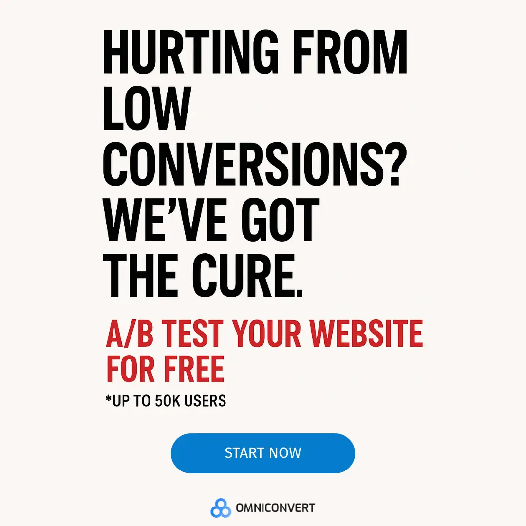
In today’s competitive digital marketplace, you need high-converting landing pages to increase sales.
Marketers sometimes misunderstand the role of a landing page plays. Hence, only 48% of marketers build a new landing page for each marketing campaign.
Where are the remaining 52%?
Smart marketers not only create new landing pages, but they also optimize for performance.
Through these landing pages, they study buyer behavior, split test form lengths and positions, test page load times, and do more to improve conversion rates.
As you read further, your perspective about landing pages, the most popular methods to generate leads and sales to your business, will change.
But first, a quick definition.
What is a Landing Page?
Sounds like a common question, right?
Yes, I know. But seriously, can you clearly define it? Don’t skip the essential aspect of your business - all in the name of looking for advanced techniques.
It’s possible that 75% of the things you’ve been told about landing pages aren’t true. So, my question remains:
Do you even know what a landing page is, in relation to your goal?
For better clarity, here’s how Brian Massey, founder of ConversionSciences.com defined it:
If you look at the definition closely, you’ll find three key phrases:
- "Single-minded page"
- "Keeping the promise"
- "Take action"
When you’re looking to improve conversions, you need to ensure that your landing page adheres to these 3 rules.
However, you may not find all three rules in the past landing pages. At the time, it was easy to see several multi-purpose marketing pages that didn’t keep the promise made.
The Origin of Landing Pages
Website design has come a long way. And standalone web pages have been used by direct response marketers to sell products.
However, the idea of landing pages originated in late 2003 when Microsoft's IT departments sought a way to remedy poor online sales of their core product, Office.
In 2005, Dave Chaffey shared exclusive insights on the principles of building a landing page. The article remains relevant today because the principles remain the same.
Because of the tools available online, it’s easy to launch a new product now and generate sales as quickly as possible.
Prior to 2003, the process was time-consuming, boring, and ineffective. To give you a clearer picture, here’s how landing pages looked like in 2005.
Funny enough, in the same 2005, you would have seen CTA buttons like these ones:
The traditional landing pages were truly standalone in every aspect. I mean, they didn’t require third-party software to function optimally.
However the modern landing pages are designed to easily integrate with other solutions such as email marketing tools, lead nurturing, and customer relationship management systems. More important is the fact that they have the "perfect elements".
Principles of a High-Converting Landing Page
Today, the landing pages that convert are designed based on certain principles. Let’s briefly examine 6 of them in a tactical manner:
1. Be relevant
People who visit a landing page have a definite purpose. If I visit Moz’s web page, for example, it’s obvious that I want to improve an aspect of my SEO campaign (e.g., local listings).
That being said, being relevant is the only way to prove your expertise, and build trust with your target audience.
Since the headline is the first element that stands out on the page, you should make it clear and relevant.
If it’s ideal, use power words (e.g., free, easy, generate) to draw people in - engage the visitor to scan down the page. See how relevant this headline is, in respect to the offer.
It’s your responsibility to show the visitor that your brand, product, information or expertise is what they have been looking for - a clear headline will truly help.
2. Message congruency
You’ve got to be consistent with the key message of your referral source.
In other words, make sure that you don’t send visitors to an irrelevant page - with a different message from where they came from.
You already know that your visitors are coming from somewhere. For example, if they came from Facebook, which topic did they engage with before viewing your page?
The practice of making your ad copy and landing page match each other should be observed here even if your visitors are coming from organic search or native advertising networks.
3. Get people to make decisions
Do you know your target audience very well? Do they have enough knowledge about your topic/product/offer to make quick decisions?
To clarify my point, I know it’s actually difficult to gauge the visitor’s experience. However, you can help them make smart decisions, by identifying the gap (pain points that led visitors to your page).
You should use bullet points to highlight the core benefits of your offer. That way, you’ll persuade visitors without sounding too pushy.
4. Use compelling visuals
If you’ve been marketing online for close to a decade, you’ll agree with me that the landing pages of the past don’t boast of great visuals.
Blurred-looking images would suffice.
On the other hand, compelling visuals are vital in modern landing pages. Though, you should make sure they’re consistent with your campaign and create empathy for users.
Stock graphics rarely work. Try to use real images of the offer. To be sure what type of visuals work for your business, test, test, test.
5. Get rid of menu options
If you want to increase your conversion rate, then eliminate distractions from your landing page.
You don’t want people to navigate away from your page.
Remove menu options - and put the headline, visuals, and, more importantly, the call to action on the spotlight. Here’s a typical landing page with zero menu options.
6. Have a clear call-to-action
One of the essential principles of a perfect landing page is the CTA. People will not respond to your offer, no matter how great it is - you’ve got to tell them what to do.
The wording of your Call To Action button is important. Don’t assume that “Add to cart” will outperform “Buy now.” When you split test, you’ll be amazed by the results.
The Evolution of Web Design for Landing Pages
A lot has happened in the web design world. In the past, web designers wanted to show off their creativity through animations and flashy illustrations.
Unfortunately, these web pages didn’t help the user. Eventually, new terms like UI and UX emerged and totally changed the way people consume content and use products on the web.
- UI - User interface
- UX - User experience
The focus on users, and designing web pages that truly help them gave rise to flat designs. Again, Microsoft was at the forefront of the flat design trend with Windows 8.
Modern Landing Pages
Landing pages as we know it today are beautiful.
They’re clean, simple, and have a friendly look. Most of them have very little text, lots of white spaces and irresistible images or videos. In many cases, a standalone page is used to promote a single offer.
In 2009, several American startups were formed to simplify and streamline the process of sales. The rise of cloud computing and eCommerce around 2009 provided ideal conditions for these startups to flourish.
However, when Unbounce launched in August 2009, landing pages were little more than a marketing buzzword.
Since that time, Unbounce has pushed landing pages into the mainstream by empowering marketers to quickly build and publish pages without the help of the IT department.
If you compare landing pages of the past and those of today, you’ll discover that the principles remain the same, but a few things have changed:
- Single-minded: The landing pages of today are designed to meet one purpose at a time (e.g., get people to download a free ebook, download a free product)
- Seamless integrations: Yes, you can integrate third-party solutions (e.g., Aweber, live chats) into your page to improve its functionality.
- Strong Call To Action: No more boring “submit” buttons that look ugly. You can now use clear and persuasive copy, like “Download now” , “Free instant access,” and also test their impact on your conversion rate.
Here are great examples of modern landing pages:
1) Unbounce
I could go on and on to highlight the amazing features of this landing page, but here are two that I love:
- The catchy headline that stands out on the page
- The call to action button's color is in contrast with the rest of the page
- The compelling and well-crafted information below the form
2) WebDAM
At a glance, you can see how the form’s background stands distinct from the hero image behind it.
To learn more, here are 16 professional landing pages designed for conversions.
Conclusion
Do you think that landing pages are static and boring?
Well, think again. Because, with the right tool, you can make your own landing page interactive and use personalization best practices to engage with your visitors.
The more you understand your audience, the better your landing page conversions will be because you’ll know which elements to optimize.
FAQs
When did landing pages first emerge?
When did landing pages first emerge?
The concept of landing pages emerged in the early 2000s with the rise of online advertising and the need for more effective ways to convert website visitors into leads or customers. Initially, landing pages were used primarily for pay-per-click (PPC) advertising campaigns to maximize the ROI by directing visitors to a page optimized for conversion.
How have landing pages evolved over time? Landing pages have evolved significantly over time. Initially, landing pages were often simple and static, with limited design options. However, as technology advanced and user expectations evolved, landing pages became more dynamic and interactive. Today, landing pages often feature multimedia elements, personalized content, and responsive designs to provide a better user experience and drive higher conversion rates.
How have landing pages evolved over time?
Landing pages have evolved significantly over time. Initially, landing pages were often simple and static, with limited design options. However, as technology advanced and user expectations evolved, landing pages became more dynamic and interactive. Today, landing pages often feature multimedia elements, personalized content, and responsive designs to provide a better user experience and drive higher conversion rates.
How have landing pages impacted digital marketing?
Landing pages have had a significant impact on digital marketing. They have provided a focused and targeted approach to capturing leads and driving conversions. By directing users to a dedicated page optimized for a specific campaign or offer, businesses can increase the effectiveness of their marketing efforts, improve conversion rates, and measure the success of their campaigns more accurately.
Landing pages have had a significant impact on digital marketing. They have provided a focused and targeted approach to capturing leads and driving conversions. By directing users to a dedicated page optimized for a specific campaign or offer, businesses can increase the effectiveness of their marketing efforts, improve conversion rates, and measure the success of their campaigns more accurately.


If you liked this article, make it shine on your page :)