CRO Glossary
Product Page: Designs and Examples
A product page represents a specific destination on an ecommerce site. The page presents detailed information about a single item. The layout highlights features (materials, dimensions, use cases) to guide shoppers toward a purchase. Product page design involves the deliberate arrangement of visual and textual elements. A structured layout ensures clarity for potential buyers. Effective interfaces use images (high-resolution photos, 360-degree views) and persuasive text. Examples include Amazon item listings or Apple product showcases. The digital spaces act as virtual sales representatives. The primary goal involves turning visitors into customers. Professional layouts provide social proof (customer reviews, star ratings) to build trust. Shipping details and return policies reside within the boundaries. Clarity in price display remains a priority. Product pages serve the role of the final step before the checkout process. Well-structured pages simplify the buyer journey. Every element contributes to the final decision. Successful sites display clear calls to action. The interface focuses on answering consumer questions. Consistent branding appears across every page. Product pages and product page design define the online shopping experience.
What Is a Product Page
A product page is a dedicated webpage on an ecommerce website. The page presents comprehensive details about a specific item. Sellers use the page to inform potential customers about product features. Information includes descriptions (material, size, weight) and high-quality imagery. The layout aims to convert visitors into buyers. Every product webpage acts as a digital storefront. Buyers rely on the page for pricing and availability. The structure includes technical specifications and benefit-driven copy. Shipping information appears near the purchase button. Trust signals (reviews, ratings) occupy a prominent space. The page facilitates the transition from browsing to purchasing. Ecommerce businesses depend on the pages for revenue generation. A high-performing product page addresses potential objections. Detailed content clarifies the value proposition. The design focuses on user experience and clarity. Clear navigation keeps the shopper engaged. Comparison charts appear on the page. Direct links to the cart simplify the process. Detailed imagery shows the item from different angles. What is a product page involves understanding its role in the sales funnel. Business success hinges on the quality of every product page and product webpage.
What Type of Information Exists on a Product Page
Information on a product page includes diverse data points intended to educate the shopper. Detailed descriptions explain the primary functions of the item. Product images (stills, videos, interactive models) provide a visual representation. Pricing details appear clearly to avoid confusion. Specifications (dimensions, technical requirements, ingredients) offer deep insights. Availability status shows if the item remains in stock. Trust signals (customer reviews, expert testimonials, industry awards) build credibility. Shipping costs and delivery estimates reside on the page. Sizing guides help apparel shoppers choose the correct fit. Cross-sell suggestions recommend related items. Upsell opportunities highlight premium versions. Frequently asked questions (FAQs) resolve common doubts. Warranties and return policy links provide peace of mind. Social proof (user-generated content, social media mentions) validates the purchase. Comparison tables contrast the item against alternatives. Security badges reassure users about payment safety. Language options cater to global audiences. Color pickers allow for personalization. Weight and packaging details help calculate shipping. Product pages serve in the role of the central hub for consumer research. Every detail aims to eliminate friction in the buying process.
Is a Product Page Focused on a Single Product Only?
Yes, a product page focuses on a single product to maintain clarity. The narrow focus prevents user confusion during the selection process. One primary item takes center stage on the page. Variations (color, size, material) exist within the same interface. Options allow shoppers to customize the selection without leaving the page. Redirecting users to different pages per color variation creates friction. The single-product approach streamlines the path to purchase. Diversion to other items happens in the recommendation sections. Detailed content pertains strictly to the main item. The call to action targets the specific product displayed. Confusion arises when multiple unrelated items share a page. A focused layout improves the effectiveness of marketing campaigns. Analytics tracking becomes more accurate per one-to-one page-to-item ratio. Conversion rates remain higher when distractions are minimal. The user understands exactly what the purchase entails. Clarity in messaging supports the brand identity. Simplified navigation encourages the shopper to commit. Every visual element reinforces the value of the single item. The structure supports a clean and efficient checkout flow.
What Is Product Page Design
Product page design refers to the visual and functional arrangement of content on an item-specific webpage. The process involves creating a hierarchy that guides user attention. Designers prioritize elements (images, price, add-to-cart button) to facilitate quick decisions. Layout choices influence how a shopper perceives the brand. Visual hierarchy ensures the most important information remains visible. High-resolution photography captures the interest of the visitor immediately. Typography contributes to the readability of product descriptions. Whitespace reduces cognitive load by separating different sections. Interactive elements (zoom features, carousels) improve engagement. The design adapts to different screen sizes through responsive layouts. Performance speed remains a critical factor in the design process. Accessibility features ensure all users navigate the page easily. Color schemes reflect the brand personality. Consistency across the website maintains professional standards. Usability testing helps refine the placement of specific elements. Strategic design leads to higher conversion rates. The interface removes obstacles in the path to purchase. Every pixel serves a purpose in the shopping experience. Product page design and product page designs dictate the success of digital sales platforms.
Which Layout Elements Are Used in Product Page Design
Layout elements used in product page design are listed below.
- Hero Images: Large visuals showcase the product from the best angle. Photos provide an immediate understanding of the item. Quality pictures capture the attention of the shopper.
- Calls to Action: Buttons like "Add to Cart" or "Buy Now" occupy visible positions. Contrasting colors make these elements stand out. Direct placement near the price encourages immediate action.
- Product Descriptions: Text explains the features and benefits of the item clearly. Bullet points improve the scannability of information. Concise language keeps the user focused on the value.
- Pricing and Discounts: The cost appears in a large font for easy identification. Sale prices contrast original costs to highlight value. Currency symbols identify the local pricing structure.
- Reviews and Ratings: Social proof appears through star ratings and written feedback. Customers trust the experiences of other buyers. Ratings provide a quick metric for product quality.
- Trust Badges: Icons represent secure payments or satisfaction guarantees. Security logos reduce the perceived risk of online shopping. Symbols confirm the legitimacy of the ecommerce site's design product page.
- Shipping Details: Information regarding delivery times resides near the purchase button. Transparent costs prevent surprises during the checkout phase. Real-time updates provide clarity on arrival dates. Product page design best practices require the elements.
Does Product Page Design Affect User Decision-Making?
Yes, product page design affects user decision-making by shaping perception and trust. A professional layout instills confidence in the brand. Chaotic designs create doubt regarding the quality of the item. Visual clarity reduces the cognitive effort required to process information. Shoppers make split-second judgments based on the aesthetics of the page. High-quality imagery suggests a high-quality product. Clear navigation paths lead the user toward the checkout. Distractions (unnecessary pop-ups, clashing colors) drive visitors away. Proper alignment of elements creates a sense of order. The placement of social proof influences the perceived value. Design choices highlight the most persuasive benefits. Mobile-friendly interfaces cater to the habits of modern shoppers. Speed and responsiveness impact the emotional state of the user. Frustration leads to abandoned carts. Smooth transitions keep the buyer focused on the goal. Consistency in design elements reinforces brand reliability. The arrangement of information answers questions before the user asks them. Effective layouts guide the eye toward the primary call to action. Strategic design choices directly impact the financial success of the store.
What Is Ecommerce Product Page Design
Ecommerce product page design is the creation of web interfaces specifically for online sales. The design focuses on facilitating a transaction through clear steps. Performance optimization ensures the page loads quickly on all devices. Cart integration allows users to see their selections in real-time. Checkout actions remain accessible from the product view. The layout accommodates dynamic content (inventory levels, variable pricing). High-speed performance reduces the likelihood of user exit. Interactive media (video, 3D models) replaces the physical touch of a store. Search engine principles guide the structure for visibility. User experience remains the top priority for designers. Secure payment icons reassure the customer during the final stages. Cross-device compatibility ensures a uniform experience on mobile and desktop. The design incorporates tracking tools to analyze user behavior. Heatmaps reveal where shoppers spend the most time. Performance metrics drive the iterative design process. Strategic layouts minimize the steps to complete a purchase. Every element aims to provide a frictionless shopping journey. Ecommerce product page design and product page ecommerce focus on conversion and speed.
Which Ecommerce-Specific Features Exist on Product Pages
Ecommerce-specific features that existed on product pages are listed below.
- Inventory Indicators: Real-time stock levels show the availability of the item. Scarcity cues (low stock alerts) encourage faster decision-making. Status updates prevent the purchase of out-of-stock items.
- Add-to-Cart Buttons: Prominent buttons allow the user to select the item for purchase. Immediate feedback confirms the addition to the shopping cart. High-contrast colors ensure the button remains visible on the Ecommerce product page.
- Wishlist Options: Users save items for future consideration through a heart icon. Saving products keeps the brand on the mind of the shopper. Login requirements for wishlists help capture user data.
- Dynamic Pricing: Costs update automatically based on selected variations or quantities. Transparent price changes build trust with the consumer. Discounts apply instantly when specific criteria are met.
- Payment Icons: Logos of accepted credit cards and digital wallets appear on the page. Familiar symbols provide a sense of security. Payment variety caters to the preferences of a global audience.
- Shipping Calculators: Tools that estimate delivery costs based on the location of the user. Precise estimates remove the uncertainty of final totals. Free shipping thresholds encourage larger orders. Product page ecommerce depend on the tools.
Is Ecommerce Product Page Design Built Around Conversion Actions?
Yes, ecommerce product page design is built around conversion actions to drive revenue. Every element on the page leads the user toward the checkout. Calls to action (CTAs) receive the most prominent placement. Contrasting colors distinguish the purchase button from other content. The layout minimizes distractions that pull the user away. Primary information resides "above the fold" for immediate access. Streamlined paths reduce the time between discovery and purchase. Obstacles (complex forms, excessive links) are removed. The hierarchy emphasizes the benefits that trigger a sale. Trust signals reinforce the decision to buy. Performance speed prevents loss of interest during the process. Mobile-responsive buttons cater to touch-based navigation. Clarity in pricing eliminates hesitation. Redirects to the cart or checkout occur seamlessly. The entire structure prioritizes the final transaction. Data-driven choices inform the placement of every feature. Conversion optimization remains the central goal of the design. Successful pages turn passive browsers into active buyers. Unobstructed paths ensure the customer completes the intended action.
What Is Product Page Content
Product page content consists of the textual and visual elements that describe an item. The content communicates the value of the product to the visitor. High-quality copy explains the features and solutions provided. Images show the physical attributes from multiple perspectives. Videos demonstrate the product in use. Technical data (measurements, ingredients, compatibility) provides essential facts. User-generated content (reviews, photos) offers authentic perspectives. Frequently asked questions (FAQs) address common concerns. Marketing slogans highlight the brand identity. Social proof (testimonials, star ratings) builds confidence. Clear pricing and shipping details inform the financial decision. Media files (PDF manuals, size charts) offer supplementary information. Language translations reach a broader audience. Storytelling elements create an emotional connection with the shopper. Meta descriptions and titles improve search engine rankings. The content focuses on answering consumer questions directly. Consistency in tone maintains brand authority across the site. Product page content and product information website provide the foundation for a sale.
Which Content Elements Appear on High-Converting Product Pages
Content elements that appear on high-converting product pages are listed below.
- Compelling Descriptions: The persuasive text focuses on the benefits to the user. Clear language avoids jargon to ensure understanding. Bullet points highlight the most important features.
- High-Resolution Media: Photos and videos provide a detailed view of the item. Zoom capabilities allow the shopper to inspect small details. Visual variety shows the product in different environments.
- Social Proof: Customer reviews and star ratings provide external validation. Testimonials address specific use cases and results. Photos from real users demonstrate the product in real life, and the product webpage
- Detailed Specifications: Lists of technical details answer specific user questions. Accurate measurements prevent returns due to size issues. Compatibility notes ensure the item works for the user.
- Comparison Tables: Charts contrast the item against other models. Visual differences help the user choose the best option. Highlights show the advantages of the premium version.
- Instructional Guides: Text or video explains the setup and maintenance of the product. Helpful content reduces the perceived difficulty of use. Manuals provide deep technical support for the buyer. Product page content improves through these elements.
Does Product Page Content Reduce Purchase Uncertainty?
Yes, product page content reduces purchase uncertainty by providing comprehensive information. Detailed descriptions clarify what the buyer. High-quality images bridge the gap between digital and physical shopping. Accurate specifications prevent misunderstandings about size or function. Social proof (customer reviews, ratings) validates the claims of the brand. Answers to common questions remove the need for external research. Transparent pricing and shipping costs eliminate surprises. Clear return policies provide a safety net for the shopper. Trust signals (certifications, awards) prove the legitimacy of the item. Video demonstrations show the product in a real-world context. Clarity builds the confidence required to complete a transaction. Knowledgeable consumers feel less risk during the purchase. Information addresses the fears of the buyer directly. Consistency in messaging reinforces the reliability of the store. Fewer doubts lead to higher conversion rates. Detailed content acts as a virtual assistant for the user. Every piece of information serves to reassure the potential customer. Confidence in the product leads to a more satisfying shopping experience.
What Are Product Page Best Practices
Product page best practices are listed below.
- Mobile Optimization: The layout adapts to small screens and touch inputs. Buttons remain large enough for easy clicking. Text stays readable without zooming.
- Fast Loading Times: Pages display content within 3 seconds to prevent user exit. Compressed images maintain quality while reducing file size. Minimal code ensures a smooth browsing experience.
- Clear Value Proposition: Headlines explain the primary benefit of the product immediately. Users understand the problem the item solves. Persuasive copy keeps the visitor engaged.
- High-Quality Imagery: Multiple photos show the item from every angle. Lifestyle shots depict the product in actual use. Clear backgrounds remove distractions from the main object and are the best practice ecommerce product page.
- Intuitive Navigation: Simple menus help the user find related categories. Breadcrumbs show the path within the website structure. Search bars provide a direct way to find specific items.
- Prominent CTAs: The "Add to Cart" button stands out through color and size. Placement stays consistent across every product page. Action-oriented language encourages the user to proceed. Product page best practice guide site success.
Why Product Page Best Practices Improve Performance
Product page best practices improve performance by removing friction from the user journey. Standardized layouts align with the expectations of the shopper. Predictability in design allows for faster navigation. High-speed pages reduce the bounce rate by keeping users engaged. Mobile optimization captures the growing segment of smartphone shoppers. High-quality media reduces the rate of returns by setting accurate expectations. Persuasive content addresses the needs of the consumer directly. Strategic placement of calls to action increases the click-through rate. Trust signals lower the barrier to entry for new customers. Consistency in branding builds long-term loyalty. Data-driven improvements lead to a more efficient sales process. Optimization efforts directly result in higher conversion rates. Every best practice targets a specific pain point in the buyer journey. Businesses that follow the standards see more consistent results. The focus on user experience pays off through increased revenue. Efficiency in the design saves time for both the seller and the buyer. Professional standards reflect the quality of the brand.
Are Product Page Best Practices Universal Across Industries?
No, product page best practices are not universal across industries because audience intent varies. Luxury brands prioritize aesthetics and storytelling over dense technical specs. Business to Business (B2B) websites focus on deep documentation and bulk pricing options. Fast-moving consumer goods (FMCG) emphasize speed and convenience. Digital products highlight immediate access and licensing terms. SaaS pages focus on feature sets and subscription tiers. User behavior differs between a clothing shopper and a software buyer. Customization improves the relevance of the page for the specific niche. High-ticket items require more social proof and detailed explanations. Low-cost items benefit from a simpler and faster checkout. Visual industries (photography, fashion) rely more heavily on high-end imagery. Technical industries (electronics, tools) prioritize specifications and compatibility data. Regional differences also influence the effectiveness of certain designs. Adapting the approach to the target market ensures better results. One-size-fits-all strategies fail to meet specific user needs. The core principles of clarity remain, but the execution changes. Relevance to the audience remains the primary driver of success.
What Are Product Page Examples
The product page examples are listed below.
- Ecommerce Listings: Detailed pages for physical goods like shoes or electronics. Features include size pickers and customer reviews. High-resolution photos show the product clearly.
- Software Pages: Interfaces for digital tools and platforms. Sections highlight features (integrations, security, support). Pricing tables compare different service levels.
- Subscription Services: Pages for recurring deliveries or memberships. Options show the frequency of shipments. The benefits of the subscription model receive emphasis.
- Digital Goods: Sales pages for ebooks, courses, or music. Immediate download links appear after purchase. Sample content provides a preview of the product.
- Business-to-Business (B2B): Professional layouts for industrial equipment or wholesale. Quote request forms replace direct "Buy Now" buttons. Case studies demonstrate the ROI of the item.
- Landing Style Pages: Single-product pages with long-form sales copy. The layout follows a linear narrative toward a single goal. Minimalist navigation prevents the user from leaving.
1. eCommerce Product Pages
Ecommerce product pages provide a platform for selling physical goods directly to consumers. The layout showcases items (clothing, gadgets, home decor) through rich media. Detailed specifications help the buyer understand the physical properties. Customer feedback provides social proof to increase trust. High-quality imagery reduces the chance of returns. Benefits of Using Ecommerce Product Page include increased sales. Use occurs where shoppers browse items. The advantage of using Ecommerce Product Page involves direct conversion.
2. SaaS Product Pages
SaaS product pages describe software solutions and digital platforms. The content focuses on features (automation, analytics, storage) and benefits. Pricing tiers allow users to select the best plan. Testimonials from business clients build professional credibility. Interactive demos provide a taste of the user experience. The benefits of using SaaS Product Pages include high engagement. Use occurs where users evaluate software. The advantage of using SaaS Product Pages involves clear value communication.
3. Subscription Product Pages
Subscription product pages promote recurring services or periodic shipments. Users select the frequency of delivery (monthly, quarterly, yearly). Benefits like cost savings or convenience take priority in the copy. Clear terms regarding cancellation prevent future disputes. Gift options attract shoppers looking for long-term presents. Benefits of Using Subscription Product Pages include predictable revenue. Use occurs where members manage accounts. The advantage of using Subscription Product Pages involves recurring value.
4. Digital Product Pages
Digital product pages facilitate the sale of intangible items (ebooks, software licenses, online courses). Immediate access becomes a primary selling point. Preview clips or sample chapters allow for a risk-free evaluation. Simple checkout processes lead to instant downloads. Detailed licensing information clarifies how the user owns the content. Benefits of Using Digital Product Pages include low overhead. Use occurs when buyers download content. The advantage of using Digital Product Pages involves instant delivery.
5. B2B Product Pages
B2B product pages cater to professional buyers and organizations. Information focuses on bulk orders, technical support, and long-term contracts. Case studies demonstrate the return on investment for the company. Request-for-quote buttons replace traditional checkout flows. Deep documentation provides the specs needed for procurement. The benefits of Using B2B Product Pages include lead generation. Use occurs where businesses procure supplies. The advantage of using B2B Product Pages involves professional credibility.
6. Landing Style Product Pages
Landing style product pages use a single-column layout to drive a specific action. The focus remains on one product with long-form persuasive copy. Testimonials and benefits appear in a logical sequence. Minimalist navigation keeps the user on the page. Strong visual cues lead the eye toward the final call to action. Benefits of Using Landing Style Product Pages include high focus. Use occurs where ad traffic lands. The advantage of using Landing Style Product Pages involves focused conversion.
Can Product Page Examples Be Used as Structural References?
Yes, product page examples function as effective structural references. Product page examples demonstrate proven layouts for headings, information hierarchy, content flow, and conversion-focused elements. Teams use product page examples to guide section order, content density, and visual balance without copying wording or branding.
Evidence from ecommerce and CRO practice shows that structural referencing improves consistency and efficiency. Shared structures support faster page creation, clearer messaging, and predictable user behavior patterns. Product page examples help align layout decisions with usability standards while preserving originality in copy, visuals, and positioning.
What Are Ecommerce Product Page Examples
Ecommerce product page examples are listed below.
- Amazon – Conversion-Focused Product Pages: The layout prioritizes speed and social proof. Bullet points summarize features for quick reading. "Frequently bought together" sections drive higher order values.
- Apple – Minimalist & Visual Product Pages: Large images and whitespace create a premium feel. Scrolling animations tell a story about the product. Minimal text focuses on the hardware.
- Nike – Lifestyle-Oriented Product Pages: Action shots show the gear in use. User-generated content from social media provides authentic social proof. Detailed sizing guides help athletes choose the perfect fit.
- Warby Parker – User-Friendly & Trust-Building Pages: Virtual try-on features reduce the risk of buying eyewear online. Clear pricing for lenses and frames avoids confusion. Simple aesthetic highlights the design.
- Gymshark – Social Proof–Driven Product Pages: Community photos showcase the clothing on different body types. Stock alerts create a sense of urgency. Reviews focus on fit and performance.
- Shopify Store Examples: Clean designs focus on the brand identity of the small business. High-quality photography captures the uniqueness of the item. Integrated checkout provides a path to purchase.
How Ecommerce Product Page Examples Handle Pricing and CTAs
Ecommerce product page examples handle pricing and CTAs by placing them in high-visibility areas. The price appears in a bold font near the product title. Discounts show the savings in percentage or dollar amounts. Calls to action (CTAs) use contrasting colors to stand out from the background. Urgency cues (limited time offers, low stock) appear near the button. Transparent pricing includes information about taxes or shipping early in the process. Sticky buttons remain visible as the user scrolls down the page. Multiple payment options (credit cards, digital wallets) appear near the checkout link. Clarity in these elements reduces the hesitation of the buyer. High-performing sites avoid burying the price under long descriptions. Simple wording like "Add to Bag" or "Buy Now" clarifies the next step. Confidence builds when the user knows exactly what the cost entails. The arrangement prioritizes the final decision of the shopper. Strategic placement ensures the user never searches for the way to buy. Consistency in these elements across the site improves the user experience.
Do Ecommerce Product Page Examples Optimize for Checkout Flow?
Yes, ecommerce product page examples optimize for checkout flow by removing unnecessary steps. The transition from the page to the cart happens instantly. Mini-carts allow the user to see selections without leaving the current view. Guest checkout options prevent the friction of mandatory account creation. Progress bars show the remaining steps in the purchase process. Pre-filled information (for returning users) speeds up the transaction. Mobile-friendly forms cater to the habits of modern buyers. Security badges reassure the customer during the payment phase. Error messages appear in real-time to correct mistakes immediately. Clear confirmation pages provide peace of mind after the order. Streamlined designs minimize distractions that lead to abandoned carts. Fast loading speeds during checkout prevent user frustration. Simple navigation keeps the focus on completing the sale. Integrated payment methods simplify the final step. Optimization efforts aim for a seamless handoff between the product view and the receipt. Success in ecommerce depends on the efficiency of this flow. Every barrier removed increases the likelihood of a successful conversion.
How Do Product Pages Impact Conversion Rate Optimization for Ecommerce?
Product pages impact conversion rate optimization for ecommerce by serving as the primary decision point for shoppers. The clarity of the information directly influences the choice to buy. High-quality media (photos, videos) help the user visualize the item. Persuasive copy addresses the pain points of the consumer. Strategic layout choices guide the attention toward the call to action. Trust signals (reviews, security icons) reduce the perceived risk of the transaction. A/B testing allows for the refinement of specific elements. Speed and mobile responsiveness improve the user experience. Data-driven changes lead to incremental gains in revenue. Understanding user behavior through heatmaps helps optimize the placement of content. Consistent branding builds the credibility needed for a sale. Removing distractions keeps the shopper focused on the goal. High-performing pages act as the engine of the ecommerce business. Optimization efforts aim to turn every visitor into a customer. The structure of the page dictates the success of marketing campaigns. The Conversion Rate Optimization for Ecommerce depends on the effectiveness of every individual product page.
Which Product Page Elements Are Evaluated in a CRO Audit?
Product page elements evaluated in a CRO audit are listed below.
- Load Times: The speed of the page is measured to identify performance bottlenecks. Faster pages retain more visitors. Optimization of assets improves the user experience.
- CTA Visibility: Experts analyze the color, size, and placement of the "Add to Cart" button. The button must remain the most prominent element. Action-oriented text is tested for effectiveness.
- Image Quality: The resolution and relevance of product photos are reviewed. Zoom features and 3D models are evaluated for engagement. High-quality media increases the confidence of the buyer.
- Social Proof Placement: The location of reviews and ratings is assessed for maximum impact. Ratings should appear near the product title. Detailed feedback sections help resolve consumer doubts.
- Description Clarity: The readability and persuasiveness of the text are audited. Bullet points are checked for scannability. Benefits must outweigh the technical features in the copy.
- Mobile Usability: The page is tested on various screen sizes for functional errors. Navigation should remain intuitive for touch-based users. Responsive design is a core requirement of a CRO Audit.
Does A/B Testing Improve Product Page Design?
Yes, A/B testing improves product page design by providing empirical data on user preferences. Two versions of a page are compared to see which performs better. Testing variables (headline wording, button color, image selection) reveals what resonates with the audience. Data-driven decisions replace guesswork in the design process. Small changes lead to substantial improvements in conversion rates. Continuous testing allows for the refinement of the user experience over time. Winners of the test become the new baseline for future experiments. Insights gained from one product apply to the entire catalog. Testing reduces the risk of making broad changes that hurt sales. User behavior provides the ultimate guide for layout adjustments. Analytical tools track the impact of every modification. Improving the click-through rate on the primary CTA is a common goal. Design assumptions are validated through actual performance. The process ensures the website evolves with the changing habits of the shopper. The A/B Testing serves as a tool for digital growth.
What Product Page Metrics Matter for Bounce Rate and Scroll Depth?
Product page metrics matter for bounce rate and scroll depth include data points that reveal user engagement. The bounce rate signals whether the content meets the expectations of the visitor. High rates indicate a mismatch between the ad and the page. Scroll depth shows how far down the page the user travels. Deep scrolling suggests that the content remains interesting and relevant. Metrics help identify where users lose interest and exit the site. Analyzing the patterns allows for better placement of information. Low engagement might trigger a redesign of the hero section. Heatmaps complement these metrics by showing interaction points. Time on page indicates the level of research performed by the shopper. Interaction rates with media (videos, carousels) provide deeper insights. The data points guide the optimization of the buyer journey. Improving the relevance of the content reduces the exit rate. High-quality pages keep users active for 2 - 5 minutes. Data collection allows for the removal of low-value sections. Successful stores monitor the figures daily. The distribution of attention reveals the strengths of the layout. The Bounce Rate remains a key performance indicator.
How Does CTA Optimization Affect Ecommerce Product Pages?
CTA optimization affects ecommerce product pages by increasing the chance of a purchase. The "Add to Cart" button serves as the gateway to the checkout process. Changing the color of the button makes it more noticeable to the user. Clear and urgent wording (Buy Now, Get Yours) motivates immediate action. Placement "above the fold" ensures the user sees the CTA without scrolling. Removing competing links prevents the user from getting distracted. Consistency in CTA style across the site builds familiarity. Testing different sizes helps find the most effective balance. Optimization efforts focus on reducing the friction of the click. A well-designed CTA provides a clear path forward for the shopper. Direct and simple instructions lead to higher conversion rates. The success of the ecommerce store depends on the performance of these buttons. Strategic improvements turn passive viewers into active buyers. Buttons should range from 44 - 60 pixels in height. Visibility ensures the customer finds the purchase path immediately. The Call-to-Action (CTA) Optimization (Revision) remains a priority for every online retailer.
Can Product Pages Support Retargeting Campaigns?
Yes, product pages support retargeting campaigns by acting as data sources for user behavior. Tracking pixels record which items a visitor views. Information about abandoned carts allows for personalized ad messaging. Retargeting ads remind the user of the products they previously inspected. Relevance improves when the ad matches the specific page visited. Dynamic ads show the exact item to the potential customer. Data from the page informs the timing and frequency of the ads. Segmenting audiences based on page interaction leads to better results. Reminding the shopper of the benefits brings them back to the site. High-intent visitors receive targeted offers to encourage a return. The page provides the foundation for the entire remarketing strategy. Success in retargeting depends on the quality of the initial page experience. Linking the ad directly back to the product page simplifies the return journey. Conversion rates for retargeting remain higher than for cold traffic. The synergy between the page and the ad improves the return on investment. Every visit to the page creates an opportunity for future engagement.
What’s the Difference Between Product Pages and High-Converting Landing Pages?
The difference between product pages and high-converting landing pages lies in their intent and structure. A product page provides comprehensive details for research and selection. The page remains part of a larger catalog with navigation to other sections. High-converting landing pages focus on a single objective or offer. Landing pages remove standard navigation to keep the user on the page. The content on a landing page follows a linear narrative designed for immediate conversion. Product pages cater to users at various stages of the funnel. Landing pages target specific traffic from ads or campaigns. Structure on a product page includes cross-sells and reviews for the entire brand. A landing page minimizes distractions to prevent exits. One focuses on a deep dive into an item and the other focuses on a specific action. Product page and high-converting landing page aim for sales but use different psychological triggers. Understanding the distinction helps in choosing the right tool for the marketing goal. Product pages build long-term value within the site architecture. Landing pages deliver results for specific promotions $10 - $500 ranges. Each serves a unique role in the digital sales strategy.
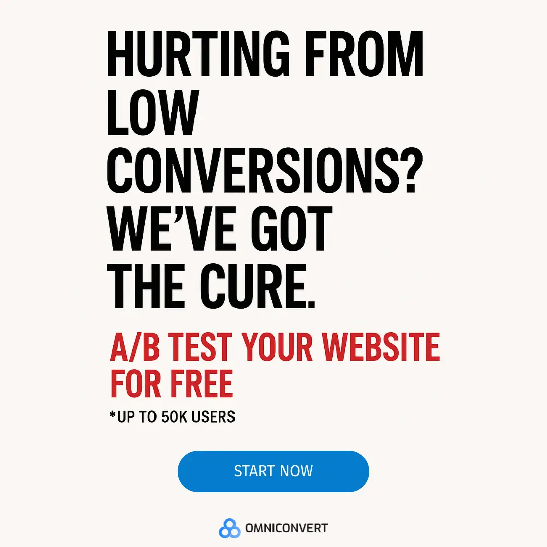
Theory is nice, data is better.
Don't just read about A/B testing, try it. Omniconvert Explore offers free A/B tests for 50,000 website visitors giving you a risk-free way to experiment with real traffic.