9 A/B Testing Case Studies From Our Agency
Article last updated:
Article first published:
Get inspired by these successful A/B testing examples and replicate the winning ideas in your own business.
It’s ok to be a tad confused in your experimentation journey.
However, it’s not ok to get stuck in analysis paralysis and be too afraid to try.
Our talented CRO team is always on fire with their A/B testing game. We’ve asked them to compile a list of their best experiments and share it with you.
Ready to get inspired?
A/B Testing in a Nutshell
An A/B test, also known as split testing, is an experiment where you compare two or more variants of a webpage against each other to determine which one performs better.
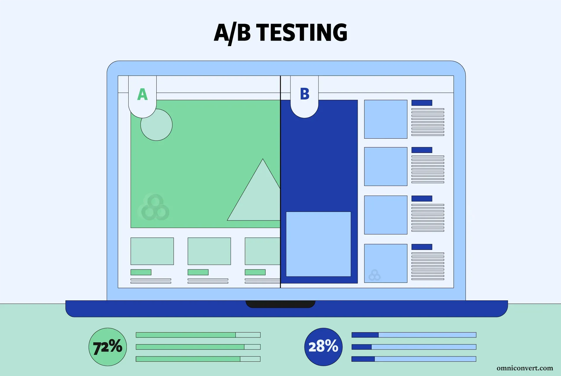
In an A/B test, users are randomly divided into groups, with each group being shown a different variant.
The goal is to identify which variant leads to a desired outcome, such as more clicks, higher conversion rates, longer time spent on a page, or increased purchases.
AliveCor Successfully Launched a New Product without Hurting the General Sales Rates
Image Source
The Challenge
The challenge we faced in this experiment was effectively promoting AliveCor's newly launched single lead device, KardiaMobile Card, on their website while ensuring it didn't overshadow the sales of their other devices.
The KardiaMobile Card represents an upgraded option compared to the beloved KardiaMobile, which initially captured the healthcare industry's attention.
Particularly challenging in this case was the novelty of the product; since it was newly launched, we didn’t really have initial data available to base our experiments on.
In this case, we had to rely on our experience, and findings from previous experiments.
The Experiment
We knew from other experiments that website visitors tend to interact more frequently with highlighted elements and products.
So we tested the following hypothesis:
“By adding a “New” badge on the KardiaMobile Card product detail page and the product tile from the listing page we should see an increase the Conversion rate across all devices.”
We proposed implementing a simple badge, visible on the listing & product pages, on top of the image with the new device, the KardiaMobile Card.
This idea was easy to implement and held a significant potential impact.
Control
Variation
Results & Conclusions
The version featuring the "New" badge showed a notable increase in Conversion Rates and Revenue per user across both desktop and mobile devices.
- 25.17% increase in Conversion Rate
- 29.58% increase in Revenue/user
- 99.4% chance to win
Encouraged by these outcomes, AliveCor opted to keep the "New" badge on the website during the initial months following the product launch.
This straightforward addition grabs users' attention while also highlighting the introduction of the new device.
Consequently, users were more inclined to explore the PDP, while the resulting sense of excitement contributed to higher sales.
This experiment shows that even a simple highlighting badge on new products can significantly boost the conversion rate without negatively impacting the sales of existing products.
106.29% Increase in Lead Collection Rate on Mobile for Orange®
The Challenge
Orange's mobile subscriptions are crucial to their business, so our primary goal was to improve the website's lead collection rate while also growing the number of active users.
Based on data from Orange, we found that the subscription page attracted most of the registered leads on the website.
Therefore, we decided to focus our testing efforts on improving this page to raise the overall rate of lead collection.
The Experiment
Orange had already set up an overlay that popped up when users tried to exit the page without leaving their details, but this feature was only available on the desktop version of the website.
Our solution involved creating an A/B test.
In this test, an overlay would appear after 15 seconds if the user hadn't provided their contact information.
We then compared this overlay version with the normal page, which didn't have the overlay.
This was our hypothesis for the mobile version:
“We can positively impact the lead collection rate of the page for mobile users by triggering an overlay that prompts the user to leave their contact information so they can be assisted in choosing their perfect plan, after they spend 15 seconds on the page without completing their contact information.”
Control
Variation
*The design showcased here is translated and adapted to English. The original test was done in Romanian.
Results & Conclusions
While we were expecting a positive result, the final numbers took even us by surprise:
- 106.29% increase in Lead Collection Rate
- 100% chance to win
The experiment proved that overlays with time-based triggers on mobile devices can be a great alternative to desktop exit triggers, leading to better overall website performance.
6% Increase in the Conversion Rate for F64
Image Source
The Challenge
In this case, we had to deal with the natural skepticism many online buyers have toward camera vendors.
Unfortunately, communication about what F64 were selling and how they engaged with visitors often missed the mark.
This was especially problematic given the diverse range of camera models available.
Our purpose was to find a way to inform and persuade buyers so they felt confident and justified in their purchase decisions.
The Experiment
As always, we started the experiment with a thorough analysis of visitor behavior data. This step revealed an opportunity to run a test aimed at optimizing visitor behavior.
Here’s the hypothesis:
“If we address a visual element on the product page, the conversion rate will increase and visitors will engage and act on these pages better.”
This was done by custom designing and changing the message copy for the CTA button.
Control
As you can see, in control the CTA button is displayed simply and with a strong emphasis on the commitment to purchase. The message copy 'Buy', was finite and implied the action of completing a purchase.
Variation
For the variation the message copy changed to 'Add to Cart', to weaken visitors’ commitment.
The design was also changed so visitors could now visibly see and engage in the action that the CTA button performed.
Results & Conclusions
With a validation with 99.21% in statistical relevance, the experiment delivered:
- An increase of 6% in conversion rate
- Uplift of 1.68% in revenue per visitor
Our work with F64 proves that even small changes can optimize the conversion effects and increase revenue, while leading visitors further through the sales funnel.
Often a simple or small change can make all the difference and trigger the response needed which influences the visitor into becoming a buyer.
+18.2% Increase in the Add-to-Cart Rate for MarketView Liquor
Image Source
The Challenge
The main goal was to prompt visitors to add products to their shopping carts.
Simplifying the product page layout and minimizing distractions aimed to facilitate quicker purchase decisions.
During the audit process, it became apparent that some products lacked reviews, resulting in too much empty space on the page.
This issue risked diverting attention from crucial areas.
The Experiment
To address the issues we found, we created three variations and conducted A/B tests alongside the original page.
The focus was mainly on tracking the performance of the 'Add To Cart' button.
We implemented various changes, testing them against the original page, including:
- relocating cross-selling panels
- featuring video highlights
- showcasing testimonials
Control
Variation
The cross selling panel was moved above the fold and showed visitors potential products they may also be interested in.
This variation also eliminated distractions such as the sharing buttons and the review section, with the sole purpose to communicate the essential information a visitor needs to place an order.
Video clips were added between the product description and cross-selling panel.
The video content was relevant to the selection and the videos had wine specialists discussing certain wine types, what kind of food best suits wine and reviews by 'Mike and Holly'.
This variation involved testimonials displayed from happy customers.
Social proof from real people that love the product are invaluable and provide additional confidence to the potential buyer.
Results & Conclusions
During a two-week testing period, traffic was evenly split between the control and three variations (25% each).
The results showed a close competition between variations 1 and 2, both variations having achieved a 99% statistical relevance.
- Variation 1 increased the add-to-cart rate by 18.2%
- Variation 2 saw a 16.9% increase
This experiment highlights that A/B testing doesn't have to be limited to just a control and one variation, since multiple versions can help find the winning combination.
Optimizing your product page involves striking a balance between removing distractions and adding engaging content to improve conversions.
Elements such as cross-selling panels, video content, and social proof can be combined effectively to improve visitor conversion rates.
Increased Leads by 30% through A/B Testing a Contact Form’s Copy for Telekom
Image Source
The Challenge
Telekom Romania's website features various services and products available for online purchase, each having its own separate page.
During the initial audit, we discovered that these pages were cluttered with numerous distracting links and elements.
This resulted in visitors clicking away or leaving the page without completing any conversions.
Understanding that a conversion could be as simple as persuading a visitor to provide their email details, Telekom Romania wanted to improve lead generation efforts on their website.
The Experiment
The original version displayed a message that was neither persuasive nor particularly useful, simply informing customers that they will be called (possibly in 60 mins).
We created and applied the A/B test with a variation according to the visitor behavior in real time.
Given the fact that the contact form was placed below the fold, it needed something to attract visitor attention.
We wanted to see how a better, more customer-centric message would perform and influence Telekom’s KPIs.
Hypothesis:
“Changing the Call-To-Action (CTA) button and the message copy in the contact form will generate more leads for the call center.”
The message copy was changed to focus more on the customer's needs.
Instead of solely informing visitors about order confirmation, they were assured that Telekom would assist them in making the best choice tailored to their requirements.
Control
Variation
Additionally, the CTA button copy was altered to "Yes, call me" instead of "Order Now".
This change aimed to convey to users that their commitment was acknowledged and that Telekom would take proactive steps to assist them.
Results & Conclusions
All traffic that landed on the offer page of the website participated in the A/B test, with an equal split of 50/50 between the control and variation.
The experiment ran for 18 days.
The variation won with a statistical relevance of 99.93%, showing these numbers:
- A 38.89% increase in lead rate
- A 30% increase in leads collected with the new contact form
Through A/B testing, you can experiment with and optimize the conversion impact of design and message content changes.
This process helps pinpoint the most effective version of a web page, providing insights into what your visitors prefer at a given time.
It allows you to discover and enhance the copywriting formula that encourages visitors to convert.
A/B Testing The CTA Button & Copy Resulted in a 45% Increase in Applications for University of London
Image source
The Challenge
As with all CRO experiments, we began our work with a Data & UX Audit.
We found that interest in the University was evenly split between males and females, with the highest search activity coming from individuals aged 25-34, closely followed by those aged 18-24.
This age range is significant as it includes individuals who have recently completed secondary schooling or obtained a graduate degree, which aligns with the typical demographic interested in higher education.
Upon closer examination, we identified distractions on the pages, such as external links, videos, chat boxes, and extensive informational text, particularly on the course pages.
While this information is valuable for academic reference purposes, it overshadowed the most crucial feature: the application buttons.
The Experiment
Taking this into account, we began brainstorming to find a way to minimize existing distractions and refocus attention on the primary action of applying for a course.
Hypothesis:
“If we create course pages with improved presentation and user experience, the Conversion Rates will increase.”
Initially, the course page was perceived as overwhelming due to the large volume of text.
Although the "Apply" CTAs were visible, they lacked a compelling call to action. The text within the orange buttons merely described the course offered, rather than prompting action.
Additionally, the phrase "Apply online" was non-clickable and positioned above the actual buttons, contributing to confusion and inefficiency in the application process.
We simplified the CTAs and made them uniform in size, creating a distinct panel that stood out from the rest of the page and emphasized the apply buttons.
The message copy was centralized, and the orange buttons were visually enhanced, featuring clear and appealing messaging.
Control
Variation
Results & Conclusions
During the 21-day experiment, traffic was evenly split (50/50) between the control and variation groups, segmented to all audiences and desktop visitors only.
With achieved statistical relevance with a 99% validation, the results were as follows:
- An impressive 45.26% increase in applications.
- The CTAs placed below were 4.21% more effective in generating applications.
- A notable 15.68% increase in click-through rates across the main goals.
The key principle to remember is to keep the CTA simple and direct.
After potentially reading extensive information, the next step should be intuitive and effortless for the visitor.
Ideall.ro Got a 22.26% Boos in Conversion Rates in Just 6 Months
Image source
The Challenge
Ideall.ro's competitive edge is rooted in its strong customer support and competitive pricing for large home appliances.
However, the challenge lies in competing against marketplaces or brands with broader product offerings and larger market shares.
The website also encountered various challenges, including:
- Crafting a user experience tailored to their target audience.
- Ensuring excellent usability.
- Effectively showcasing shipping costs.
- Establishing a solid information architecture across the Top of the Funnel (ToFu), Middle of the Funnel (MoFu), and Bottom of the Funnel (BoFu) stages of the customer journey.
The Experiment
Qualitative surveys unveiled customer preferences, purchase obstacles, behavior patterns, and demographics.
Insights from purchase-related surveys led to a successful Facebook campaign targeting new home furnishing needs.
Quantitative data from Google Analytics and mouse tracking informed website optimization, ending in a final homepage design now in use.
A variety of A/B tests were carried out on the desktop version of the category page, including tests on:
- Left-side filters
- Buttons near product images
- Product alignment
- Product information
- Functionality comparisons
- Discount implementations
(After each test was validated, the client implemented the layout in order to have a new design to build on the next hypothesis.)
Control
Variation
Results & Conclusions
After 6.5 months, including nearly 2 months of research, preliminary results indicate a significant improvement in the conversion rate, with an increase of at least 22.26%.
Additionally, there has been a boost in revenue per visitor data by 14.23%, with statistical relevance exceeding 95%.
These gains were achieved through successful A/B tests and various interactions.
When conducting A/B testing on your website layout, it's crucial to make changes progressively, ensuring they are both visible and data-driven to demonstrate their significance.
For instance, if you discover that the comparison function leads to a higher conversion rate, prioritize and optimize its usability to enhance navigation.
Testing and conducting qualitative research offer numerous benefits, including insights that prompt validated changes to your website, driven by data.
A/B testing a Reassurance Message Increased the CR by 25.18% for Tripsta
The Challenge
In a landscape where many websites share similar layouts and purchase formats, our goal was to address buyer hesitance and increase the likelihood of completing a purchase.
Our ticket confirmation process comprised six straightforward steps: Search, Search Results, Passenger Information, Additional Options, Payment, and Confirmation.
Research and analysis revealed that the 'Passenger Information' page attracted 80% of total website traffic.
For anyone who has booked a flight, the logical and user-friendly flow after confirming travel details and selecting the 'best' deal resonates deeply.
Based on this insight, we proceeded to improve this page, addressing common user concerns.
The Experiment
Leveraging our insights from the research stage, we hypothesised that:
Incorporating a reassurance message at the "Passenger Information" step will encourage buyers to proceed to checkout and increase the conversion rates.
This proposal was based on the choice-supportive bias principle, where present decisions are influenced by positive past experiences.
In this scenario, visitors who had already chosen their ideal flight were reassured about their decision.
They were reminded that they had secured the best deal—the cheapest flight—and that their decision was indeed the right one.
A message was added above the flight’s details; “Congratulations! This is one of the cheapest flights for this route! Book today to secure this price!”
Control
Variation
Results & Conclusions
In this experiment, the reassurance message proved to be a game-changer.
With over 6000 views tested over a period of just over two weeks, the results were impressive:
- A 25.18% increase in conversion rate
- A 26.55% increase in revenue
- Achieved over 95% statistical relevance.
This outcome shows the importance of impactful A/B testing, focusing on key areas of your website.
Testing in areas with low traffic can take too long to reach statistical relevance.
The more traffic, the faster the test progresses. And the faster the test, the sooner successful variations can be permanently implemented.
Get a Website Audit, from our CRO Strategists
You don’t have to settle for your website’s current performance - together, we can unleash the untapped potential of your website with a thorough audit from the CRO team.
Our audit doesn't just scratch the surface—it dives deep into understanding the behaviors and patterns of your audience.
We uncover the specific needs of your visitors and shed light on why they might be choosing competitors over you.
Plus, we pinpoint usability issues to ensure your website delivers a seamless experience.
Don't miss out on valuable insights—schedule your website audit today and take your online presence to the next level!


If you liked this article, make it shine on your page :)