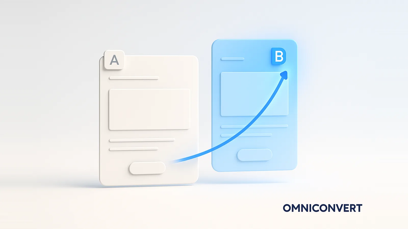
15 A/B Testing Examples That Lifted Conversion (2026)

- A/B testing examples are only useful when they include the hypothesis and the result, not just a screenshot of the winning variation.
- The biggest lifts here came from reducing friction and increasing relevance: simplified filtering (CLX Gaming, +123.4% mobile) and personalized category pages (Avon, +96.63%).
- Write every test as a falsifiable hypothesis: because of the data, changing one element will improve one metric. A test without one is just a redesign.
- Trust a result only at statistical significance (commonly 95%), an adequate sample size, and a full business cycle of runtime.
- Turn examples into a program: a prioritized backlog, one change per test, and surveys and heatmaps feeding the next idea, run in Omniconvert Explore.
A/B testing examples are documented experiments that split traffic between an original page, email, or ad and a variation, then measure which one converts better. The useful ones record three things: the hypothesis behind the change, the single element that was tested, and the result. Omniconvert has run experiments like these across 70,000+ tests and the CROBenchmark dataset of 7,000+ websites in 15+ industries, against 248+ audit criteria, over 13 years in eCommerce conversion rate optimization [CROBenchmark Report 2026, Omniconvert].
Omniconvert Explore is the conversion rate optimization platform behind the experiments below, pairing A/B tests with on-site surveys and heatmaps so every result comes with the reasoning, not just the number. This guide collects 15 real A/B testing examples with their measured lift, shows you how to write the hypothesis that makes a test worth running, gives you a results table to scan, and ends with how to turn one-off wins into a repeatable testing program.
What are A/B testing examples?
An example is only worth studying if you can answer three questions about it: what behavior or data prompted the change, what single thing changed, and what happened to the metric that mattered. A screenshot of a winning button tells you nothing transferable. A test that says "because only a fraction of visitors used search, and they converted far better, we made search prominent, and conversion rose 6.47%" gives you a pattern you can apply to your own store.
That distinction matters because most published A/B testing examples online are anecdotes without a hypothesis. The 15 below come from real eCommerce CRO programs, each with the element tested and the measured conversion and revenue lift, so you can borrow the thinking rather than the screenshot.
How to write a data-driven A/B test hypothesis
The best tests are born from data, not taste. The template that keeps a team honest is simple:
Because of [a behavior in your data], I will change [one specific element], in order to improve [one target metric].
Filled in, it reads like this: because only 5% of sessions use site search but those who do convert at three times the rate, making the search bar more visible will increase overall conversion rate. That hypothesis is testable, it points to one change, and it predicts a direction you can confirm or reject. The evidence behind it comes from three sources working together: analytics for the what, on-site surveys for the why, and heatmaps for where attention actually goes.
Framing the prediction this way also forces you to define success before you start, which is what separates a real experiment from a redesign. For the statistics that decide whether the result is real, see the null and alternative hypothesis behind every A/B test.
A/B testing examples for product and landing pages
1. Pelagic: a benefit-led create-account page (+25.45% conversion)
Hypothesis: visitors abandoned account creation because the page asked for commitment without explaining the payoff. Pelagic rewrote the create-account page around the benefits of having an account. The result was a 25.45% lift in conversion rate and a 21.43% lift in revenue per user. The lesson: a form converts better when it sells the reason to fill it in.
2. O'Donnell Moonshine: clearer product messaging on the detail page (+49.61% conversion)
Hypothesis: shoppers could not see the key product messaging that answered their objections. Making that messaging visible and well-positioned on the product detail page lifted conversion rate by 49.61% and revenue per user by 6.67%. Surfacing the one fact a buyer needs at the moment of decision is one of the highest-leverage changes on a PDP.
3. Nextbase: use-case categories on the homepage (+26.16% conversion)
Hypothesis: a homepage that did not connect products to real situations left visitors unsure which dash cam was for them. Presenting categories by use case lifted conversion rate by 26.16% and revenue per user by 23.7%. Helping people self-select into the right product reduces the cognitive load that quietly kills conversions.
4. PRISM+: a clearer TV category showcase (+40.74% conversion)
Hypothesis: the way the TV range was displayed buried subcategory navigation and slowed discovery. Improving the category showcase and subcategory navigation lifted conversion rate by 40.74% and revenue per user by 14.81%. When a catalog is large, the structure of how it is presented can matter more than the products themselves.
5. Bare Minerals: a more accessible search bar (+6.47% conversion)
Hypothesis: shoppers who relied on search struggled to find it, adding friction to product discovery. Making the search bar more accessible lifted conversion rate by 6.47% and revenue per user by 4.79%. A modest, reliable lift like this on a high-traffic element often beats a flashy change that only touches a fraction of visitors.
6. Pelagic: larger product-description typography (+13.05% conversion)
Hypothesis: small, hard-to-read product descriptions cost legibility and trust on mobile. Increasing the font size of the product description lifted conversion rate by 13.05% and revenue by 10.05%. Readability is an underrated conversion lever, and it is one of the cheapest tests you can run.
A/B testing examples for checkout, cart, and navigation
7. PRISM+: a visible cart order summary (+7.41% conversion)
Hypothesis: shoppers hesitated at the cart because the order summary was not clearly visible, creating uncertainty about what they were buying. Making the order summary accessible lifted conversion rate by 7.41% and revenue per user by 20.94%. The revenue lift far outpacing the conversion lift is a sign the change reassured higher-value carts in particular.
8. Orange Romania: urgency messaging in the cart (+7.65% conversion)
Hypothesis: visitors with items in the cart needed a reason to complete the purchase now rather than later. Adding well-placed urgency messaging on the cart page lifted conversion rate by 7.65% and revenue per user by 11.53%. Urgency works when it is honest and relevant to the decision, not when it is bolted on as a generic countdown.
9. CLX Gaming: simplified product filtering (+123.4% mobile conversion)
Hypothesis: technical filtering options overwhelmed non-technical shoppers trying to choose a gaming PC. Simplifying the filtering experience lifted desktop conversion by 38.96% and revenue per user by 20.51%, and on mobile the effect was dramatic: a 123.4% increase in conversion rate and a 102.97% increase in revenue per user. Reducing complexity for the least confident segment can unlock the largest gains. For the broader picture, see eCommerce checkout optimization.
A/B testing examples for personalization and targeting
10. Avon: category pages personalized by eye color (+96.63% conversion)
Hypothesis: shoppers browsing eye makeup would respond to product pages tailored to their own eye color. Avon used Omniconvert Explore widgets to personalize category pages by eye color, producing a 96.63% increase in conversion rate. Personalization built on a genuinely relevant attribute, rather than a cosmetic tweak, is what makes lifts of this scale possible.
11. AliveCor: a new-product badge (+25.17% conversion)
Hypothesis: visitors were not noticing a newly launched device among the existing range. Adding a visual badge to highlight the new KardiaMobile Card product lifted conversion rate by 25.17% and revenue per user by 29.58%. A small attention cue placed on the right product can redirect demand toward the item you want to grow.
12. Leroy Merlin: a redesigned image gallery pop-up (+18.00% mobile conversion)
Hypothesis: a clunky product image overlay made it hard to inspect products, especially on mobile. Redesigning the image gallery pop-up lifted desktop conversion by 14.34% and revenue per user by 30.14%, and on mobile lifted conversion by 18.00% and revenue per user by 37.76%. Letting people see the product clearly is a direct path to trust and purchase.
13. AliveCor: a rebalanced homepage content mix (+10.59% conversion)
Hypothesis: the homepage gave the wrong weight to its content blocks, slowing visitors toward the next step. Rebalancing the homepage content mix lifted conversion rate by 10.59% and revenue per user by 10.79%. Homepage tests are high-leverage because every visitor passes through, so even a steady lift applies to the whole audience.
14. F64: an optimized product-page CTA (+6% conversion)
Hypothesis: the call to action on product pages was not clear or compelling enough to drive the next step. Optimizing the CTA lifted conversion rate by 6% and revenue per visitor by 1.68%. Not every win is dramatic, and a reliable single-digit lift on a core element is exactly the kind of result a steady testing program is built on.
15. Ideall.ro: simplified category pages and information architecture (+22.26% conversion)
Hypothesis: category pages that displayed too many products at once overwhelmed visitors and obscured the path to purchase. Combining data analysis, A/B testing, surveys, and interaction tracking to simplify the information architecture produced a 22.26% boost in conversion rate and a 14.23% lift in revenue per visitor over six months. The biggest gains often come from removing complexity, not adding features.
The A/B test case library: 15 results at a glance
| # | Company | What was tested | Conversion lift | Revenue / visitor lift |
|---|---|---|---|---|
| 1 | Pelagic | Benefit-led create-account page | +25.45% | +21.43% |
| 2 | O'Donnell Moonshine | Clearer product messaging on PDP | +49.61% | +6.67% |
| 3 | Nextbase | Use-case categories on homepage | +26.16% | +23.7% |
| 4 | PRISM+ | TV category showcase and navigation | +40.74% | +14.81% |
| 5 | Bare Minerals | More accessible search bar | +6.47% | +4.79% |
| 6 | Pelagic | Larger product-description typography | +13.05% | +10.05% |
| 7 | PRISM+ | Visible cart order summary | +7.41% | +20.94% |
| 8 | Orange Romania | Urgency messaging in cart | +7.65% | +11.53% |
| 9 | CLX Gaming | Simplified product filtering (mobile) | +123.4% | +102.97% |
| 10 | Avon | Category pages personalized by eye color | +96.63% | Not disclosed |
| 11 | AliveCor | New-product badge highlight | +25.17% | +29.58% |
| 12 | Leroy Merlin | Redesigned image gallery pop-up (mobile) | +18.00% | +37.76% |
| 13 | AliveCor | Rebalanced homepage content mix | +10.59% | +10.79% |
| 14 | F64 | Optimized product-page CTA | +6% | +1.68% |
| 15 | Ideall.ro | Simplified category pages and IA | +22.26% | +14.23% |
Notice the pattern across the column of wins: almost none of them are color or wording tweaks in isolation. They are structural changes that either remove friction (simpler filtering, a visible summary, larger type) or add relevance (personalized pages, use-case categories, a badge on the right product). That is where durable lift lives.
What data you need to trust an A/B test result
A lift number means nothing without the conditions that make it trustworthy. Three guardrails separate a real result from a lucky one:
- Statistical significance: Reach a confidence level, usually 95%, before declaring a winner. This is the probability that the difference you saw is not just random variation. Calling a test early is the fastest way to ship a change that does nothing. See type 1 and type 2 errors for what goes wrong when you do.
- Adequate sample size: Calculate the visitors and conversions you need up front, based on your baseline rate and the minimum lift worth detecting. Lower baselines and smaller expected effects need more traffic. The discipline behind this is statistical sampling.
- Full business cycle: Run for at least one complete cycle, typically two to four weeks, so weekday, weekend, payday, and promotion effects all land inside the test window rather than skewing it.
These same rules are what let modern tooling speed tests up safely. For how machine learning is changing significance and allocation, see AI A/B testing.
How to build a repeatable A/B testing program
The companies in this library did not get one lucky win; they built a habit. The loop that compounds looks like this:
-
Build a prioritized backlogCollect hypotheses from analytics, surveys, heatmaps, and support tickets, then rank them by expected impact and effort. A backlog keeps testing continuous instead of reactive.
-
Test one isolated change at a timeChange a single element per experiment so you know what moved the number. Omniconvert Explore builds these variations in a visual editor, with no engineering required.
-
Pair every test with the whyAdd on-site surveys and read heatmaps alongside the result, so a win or loss comes with an explanation you can carry into the next hypothesis rather than a mystery.
-
Feed wins back into the roadmapDocument what you learned, retire the hypothesis, and let the insight seed the next test. A program is a loop, not a list of finished projects.
A winning test is the start of a bigger loop, not the finish. While Omniconvert Explore proves which version converts, Nexus by Omniconvert is the AI eCommerce growth engine that turns the customer and profit data behind those conversions into ranked actions, so each proven win feeds the next prioritized growth move rather than ending as a one-off result.
Frequently Asked Questions
An A/B testing example is a documented experiment that split traffic between an original version of a page, email, or ad and a variation, then measured which one converted better. A good example records three things: the hypothesis behind the change, the single element that was tested, and the measured result. For instance, Pelagic rewrote its create-account page around customer benefits and saw a 25.45% lift in conversion rate and a 21.43% lift in revenue per user.
Strong eCommerce A/B testing examples include simplifying product filtering, which more than doubled CLX Gaming's mobile conversion rate at 123.4%, making the cart order summary visible, which lifted PRISM+ conversion by 7.41% and revenue per user by 20.94%, and personalizing category pages, which raised Avon's conversion rate by 96.63%. The common thread is reducing friction or increasing relevance at a high-intent moment rather than changing surface details.
Test the elements closest to the buying decision and backed by data first: the value proposition and headline, the primary call to action, page layout and navigation, checkout and cart steps, and personalization for distinct segments. Use analytics, on-site surveys, and heatmaps to find where visitors hesitate, then prioritize the change that affects the most traffic or the highest-intent step. Cosmetic tests like button color rarely move the number on their own.
An A/B test should run for at least one full business cycle, usually two to four weeks, so it captures both weekday and weekend behavior and is not skewed by a single day. End the test only when it reaches your predetermined sample size and statistical significance, commonly 95% confidence. Stopping early because a variation looks like it is winning is one of the most common ways to record a false result.
There is no single number, because lift depends on your baseline conversion rate, traffic, and what you change. In Omniconvert experiments, validated lifts have ranged from around 6% on a single call-to-action change to more than 120% on a structural navigation fix. A modest, statistically significant lift on a high-traffic page is often worth more in absolute revenue than a large lift on a page few people see.
Write an A/B testing hypothesis in one sentence that links evidence, a change, and a metric: because of an observed behavior or data point, changing a specific element will improve a target metric. For example, because only 5% of sessions use site search but those who do convert at three times the rate, making the search bar more visible will increase overall conversion rate. A hypothesis framed this way is testable and tied to real behavior, not opinion.
The sample size you need depends on your baseline conversion rate, the minimum lift you want to detect, and your confidence level, so calculate it before launching rather than guessing. Lower baseline rates and smaller expected lifts require more visitors to reach significance. A practical rule is to wait for enough conversions, not just visits, and to let the test run a full business cycle so the sample reflects your normal traffic mix.
Omniconvert Explore is the conversion rate optimization platform that lets you build and run A/B tests without engineering: create a variation in a visual editor, split traffic, and measure the lift on conversion and revenue. You can pair each test with on-site surveys that capture why visitors hesitate and heatmaps that show where they look, so every experiment is grounded in real behavior across 70,000+ experiments. It offers free A/B testing for up to 50,000 visitors per month.
Pick one page where you already have a hunch about why visitors hesitate, and turn it into a sentence: because of what your data shows, changing one element will improve one metric. Then look at the closest example in this library, copy the reasoning rather than the exact design, and run it as a real A/B test with a sample size and a significance target set in advance. The 15 examples here did not win because someone had good taste; they won because someone tested a specific idea and let the data decide. Your first test does not need to be ambitious, it needs to be measured.
Turn these A/B testing examples into your own wins
Omniconvert Explore lets you build A/B tests in a visual editor, split traffic, and measure conversion and revenue lift, then capture the why with on-site surveys and heatmaps, all in one CRO platform. Stop guessing which version converts and test it. Free A/B testing for up to 50,000 visitors per month, trusted across 70,000+ experiments.