US Health & Wellness Ads, October 2026: Health Ads Suddenly Want to Explain How It Works. Does Yours?

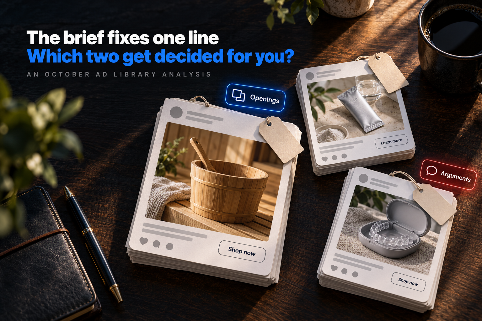
Scope: Health & Wellness ads in the US, as the eCommerceBenchmark Ad Library tracks them. 79 brands, 2,271 ads active in October 2026, compared with September 2026.
Most ad reports hand you a ranking. Then they walk off.
This one hands you the brief instead.
For each of October's top three hooks, top three angles and top three concepts in US Health & Wellness ads, you get the same five things: what it is, why it matters, what moved since September, which brands ran it, and one thing to steal. Then the smaller rows that grew, then one ad to brief this week. This cut is wider than supplements: it also tracks saunas, at-home aligners, oral care, sleep testing and a stethoscope brand.
- A brief decides three things, not one. Hook, angle and concept. Ask only for a stronger hook and you have left solution-aware and product demo close-up to whoever shoots the ad.
- The default opening is the one every shopper has already met. Bold claim sits at the top of this cut's hook ladder, which is where an ad risks sounding like the four next to it.
- The defaults differ on staying power. Of the nine rows here, problem-aware has the largest share of ads past sixty days and montage the smallest, and montage nearly doubled this month, so many of its ads are too new to get there.
But first, three words that most briefs mix up.
Hook, angle, concept: three different jobs
A brief that mixes these three up is the usual reason it goes wrong. Ask for "a stronger hook" and stop there, and whoever shoots the ad decides the other two from habit. Here, habit means bold claim at 17.7% of October's ads, solution-aware at 20.9% and product demo close-up at 13.8%. Nobody asked for that trio. It arrives anyway.
| Word | In one line | Plain example |
|---|---|---|
| Hook | The first move an ad makes to stop a scroll: its first line or first seconds. | “Nobody told me this about my knees.” |
| Angle | The reason the ad gives a shopper to buy. | “One scoop, and you stop forgetting the other four.” |
| Concept | The shape of the creative: how it is filmed, laid out or staged. | One pair of hands on a kitchen counter, filmed in one take. |
The plain examples are made up to show the idea.
How to read a rise or a fall
Every row comes with three numbers: its share of October's 2,271 US Health & Wellness ads, the September share to compare it with, and how many of the 79 brands ran it.
- Rising. A bigger share uses it, so the row is getting crowded: mechanism argued 16.2% of October's ads after 8.6% in September.
- Falling. A smaller share uses it. That isn't failure: problem-aware argued 16.7% after 21.5% in September.
- Flat. Its share held: a stable baseline.
- Small. A move under half a point is small, so check the brand count: bold claim's sits on 47 brands.
A bigger share doesn't mean a row works better. There is no sales or spend data here, so it shows what brands ran, not what earned. Each item also shows the share of its ads that ran sixty days or more, in a sample ranked by time on air. They read high: 54.1% for bold claim.
Ready? Start with how ads open.
The top 3 hooks: how ads open
Together, these three open about 4 in 10 of October's ads: bold claim at 17.7%, direct question at 13% and relatability at 10.5%. The first chart shows how crowded each opening is. The second shows how long its ads lasted in the long-running sample.
Source: eCommerceBenchmark Ad Library, 2026.
1. Bold Claim: it puts the whole promise in the first words
What it is. A bold claim opening says the largest thing the brand is willing to say, and says it first. sunhomesaunas.com starts on “The best investment is the one you use every single day.” and leaves the product to its headline.
Why it matters to you. It has the widest base of these three openings, 47 brands, and 54.1% of its sample ads passed sixty days. Safe and busy at once. Keep it funded as your control.
What moved. 17.7% in October, 17.5% in September. That is a small move, under half a point, so watch it again next month.
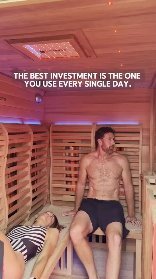
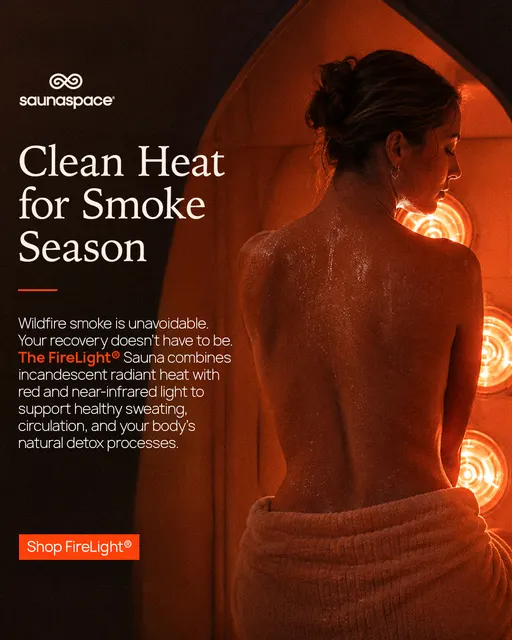

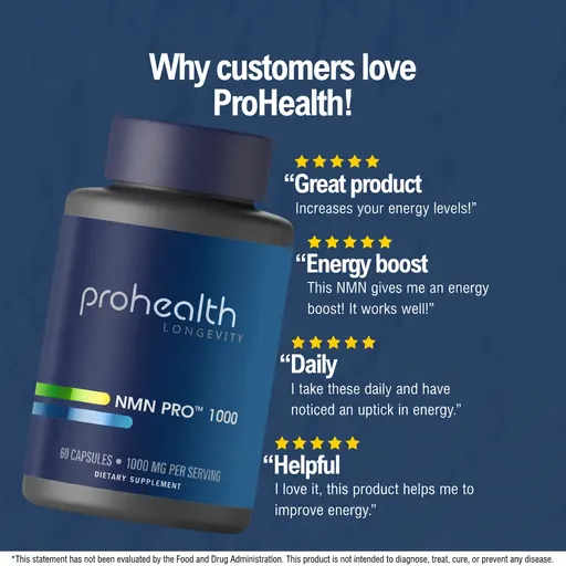
Four ads, four sizes of promise. The one worth copying is sunhomesaunas.com, because its first words are about the shopper's calendar and the thing being sold shows up second.
That's the crowded one. Next, the opening that makes the shopper answer something.
2. Direct Question: it asks the shopper something they have to answer
What it is. A direct question hands the shopper something to answer in the first line and keeps the promise for the headline. smileset.com starts on “Ever thought about fixing your smile?”
Why it matters to you. 32 brands ran it, a narrower base than bold claim's, and 53.4% of its sample ads passed sixty days, the lowest of these three hooks. Read it as the middle lane: common enough to brief with confidence, open enough to sound unlike the ad next to it.
What moved. 13% in October, 11.6% in September. It is one of the rows big enough to show in the movers chart further down.
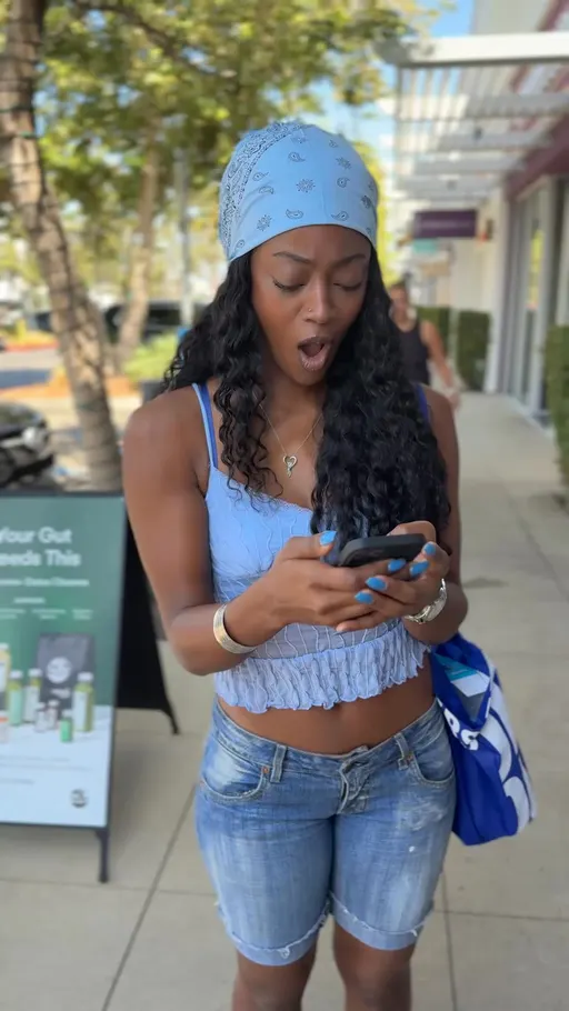
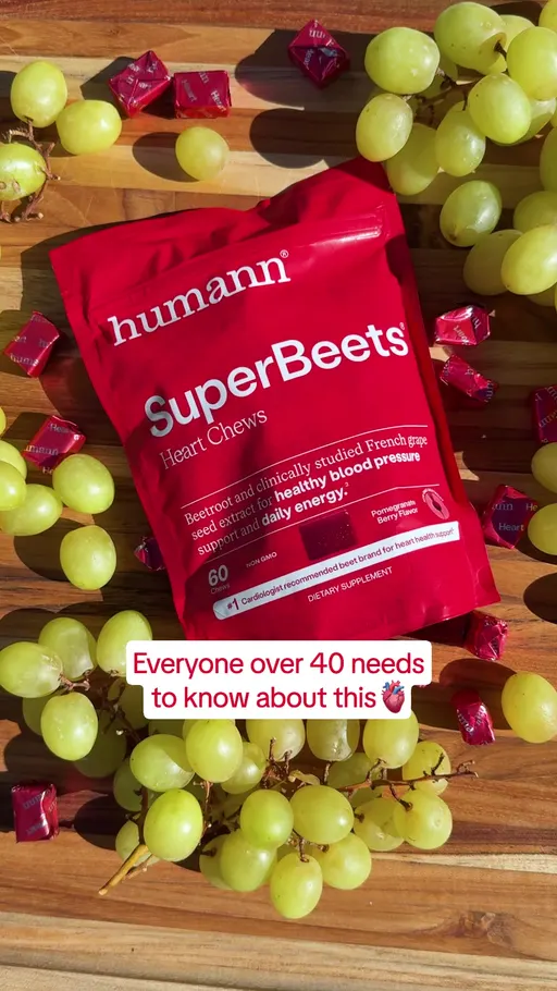
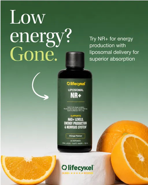

Four openings, four jobs. humann.com names the shopper before the problem, and it is the one to copy: its first few words sort the audience before any product arrives.
That's the one with room in the middle. Now the quietest of the three.
3. Relatability: it starts inside the shopper's own day
What it is. A relatability opening begins in the shopper's ordinary afternoon and lets the product arrive later. orgain.com starts on “Let me show you my favorite way to sneak more protein into the day.”
Why it matters to you. It has the narrowest base of these three, 26 brands, and the longest stay: 59.2% of its sample ads passed sixty days, the highest of the three hooks here. If any opening here has room left for your version, it is this one.
What moved. 10.5% in October, 10.5% in September. It held, which makes it the baseline the other two moved around.
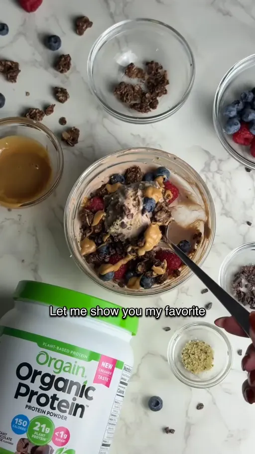
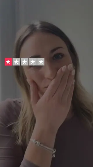
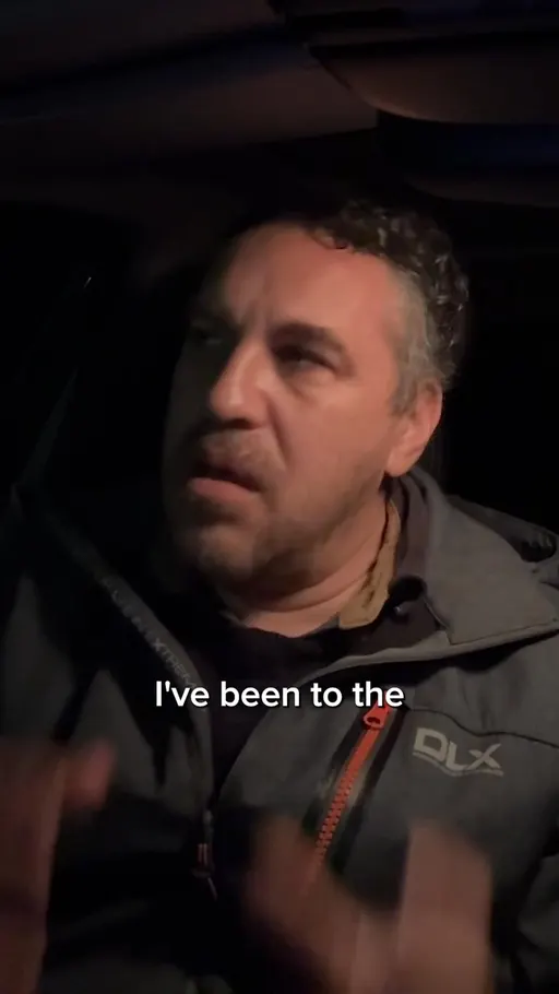
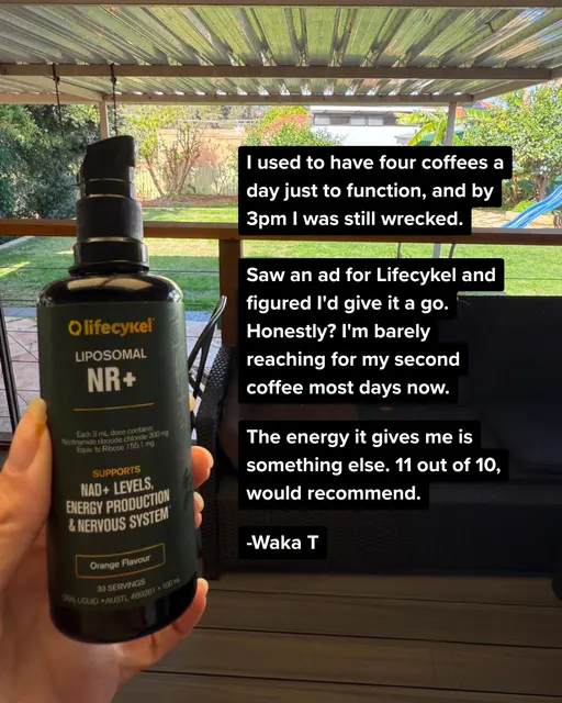
Four ads, four ordinary moments. orgain.com is the one to copy, because “let me show you” promises an action and nothing else, and the shopper stays to see it.
That's how ads open. But why would anyone buy?
The top 3 angles: why the shopper should buy
These three carry a little over half of October's arguments: solution-aware at 20.9%, problem-aware at 16.7% and mechanism at 16.2%. This is where the month actually moved, and the sixty-day chart splits the three wider than anything else on the page.
Source: eCommerceBenchmark Ad Library, 2026.
4. Solution-Aware: it puts the routine itself in front of the shopper
What it is. A solution-aware argument talks to someone already hunting for a fix and names the routine they would buy. us.lifecykel.com starts on “The Daily Stack For High Performers” and lets the headline carry the offer.
Why it matters to you. 52 brands ran it, the widest base of these three arguments, and 39.5% of its sample ads passed sixty days. Crowded, and in the middle on staying power.
What moved. 20.9% in October, 16.9% in September. It is also in the movers chart below, so the busiest argument in the cut got busier.
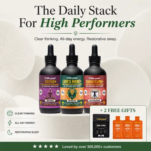
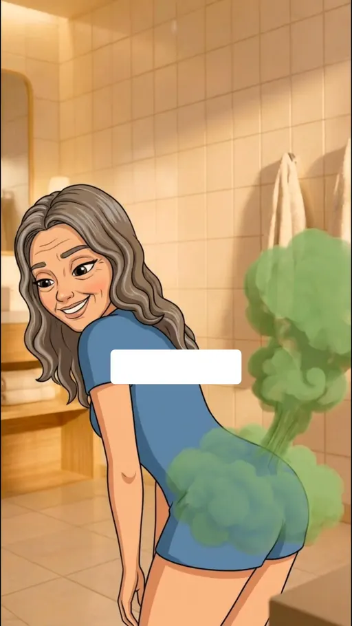
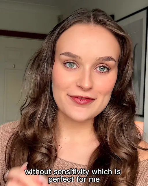
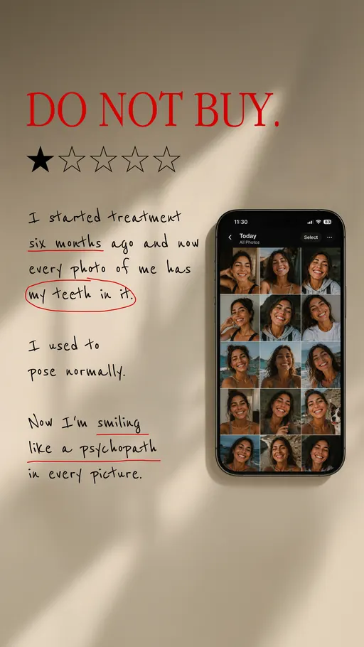
Four ads, four ways to describe a fix. us.lifecykel.com is the one to copy, because the routine and the buyer are both named before a single ingredient is.
That's the argument everyone is making. Now the one that eased while they were making it.
5. Problem-Aware: it opens on the trouble, not the product
What it is. A problem-aware argument starts from the thing the shopper lives with and gets to the product late. smileset.com opens on “Ever thought about fixing your smile?”
Why it matters to you. Only 22 brands ran it, the narrowest base of the three, and 94.5% of its ads in the long-running sample passed sixty days, the highest of the three. The ones writing it keep it on air.
What moved. 16.7% in October, 21.5% in September. It eased while solution-aware and mechanism climbed. Our reading: brands moved the explaining earlier in the ad. The data records the share, not the reason.
Three ads, three ways in. All three are also filed under a hook higher up the page, which is normal: one ad has an opening and an argument. smileset.com's line is the one to copy, because the trouble and the fix sit in one short question.
That's the one whose ads stay longest. Now the argument that climbed hardest.
6. Mechanism: it explains why the thing should work at all
What it is. A mechanism argument points at the part doing the job and names it. orgain.com opens on “Most milk has both A1 and A2 protein” before it gets anywhere near a shake.
Why it matters to you. 43 brands ran it, and 29.6% of its sample ads passed sixty days, the lowest of these three. So this is the busy new lane, not the empty one, and its ads are young.
What moved. 16.2% in October, 8.6% in September. It is the largest riser in the movers chart below. Our reading: a bigger share of ads are explaining the ingredient instead of the outcome. The data records the share, not the reason.
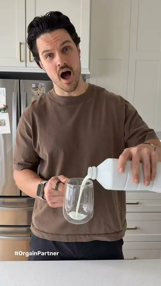
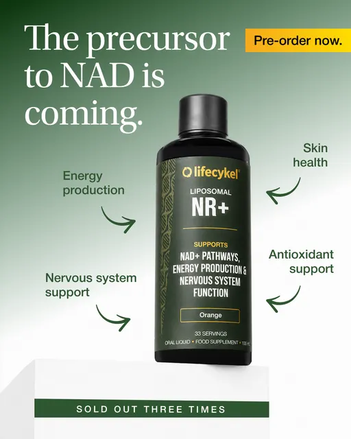
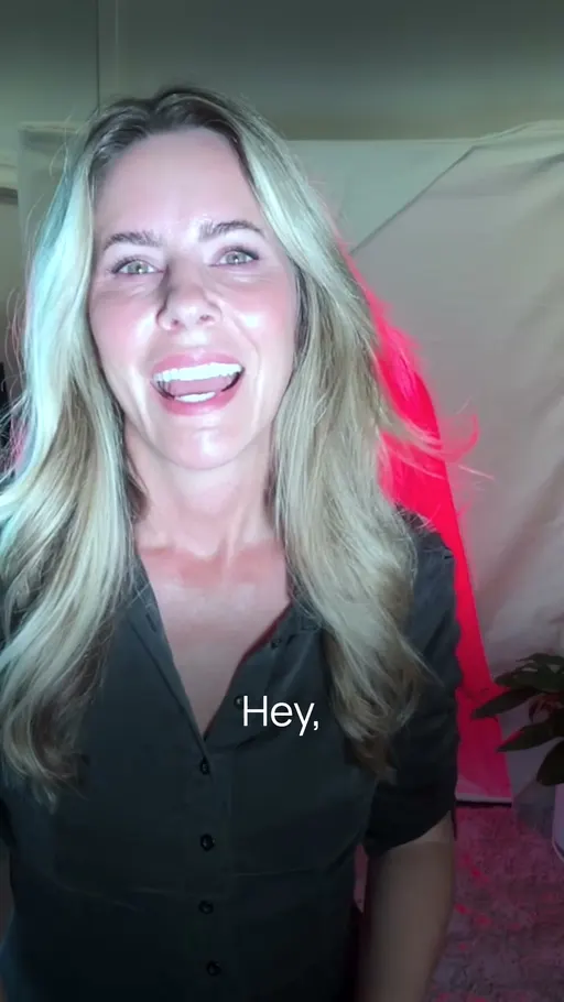
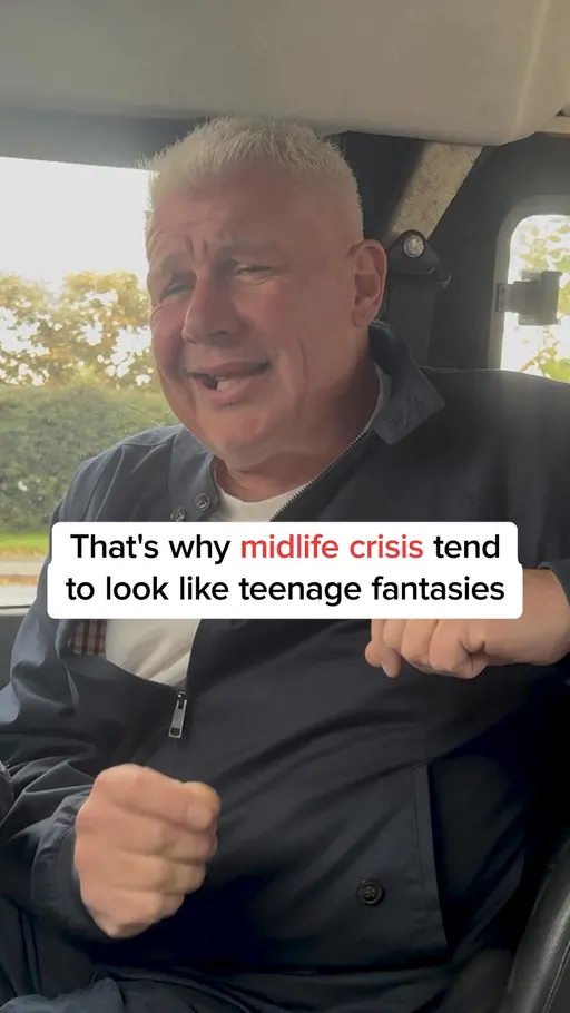
Four ads, four ways to explain. orgain.com is the one to copy, because the shopper agrees with its first sentence before the product changes anything.
That's the why. Now the shape it gets shot in.
The top 3 concepts: how the ad looks
A concept is the shape of the creative: how it is filmed, laid out or staged. Fewer ads carry a concept than carry a hook or an angle, so these shares look small, and the only fair comparison is concept against concept, never against a hook or an angle share. Product demo close-up staged 13.8% of October's ads, offer-first banner 8% and montage 7%, roughly 3 in 10 between them.
Source: eCommerceBenchmark Ad Library, 2026.
7. Product Demo Close-Up: it shows the thing being used, up close
What it is. This shape keeps the camera on the product in use and lets the words stay short. sunhomesaunas.com starts on “This is the 45 minutes I protect every single day.”
Why it matters to you. 25 brands ran it, and 47.9% of its sample ads passed sixty days. It is the default shape here, so treat it as your control shape, not your test.
What moved. 13.8% of October's ads.
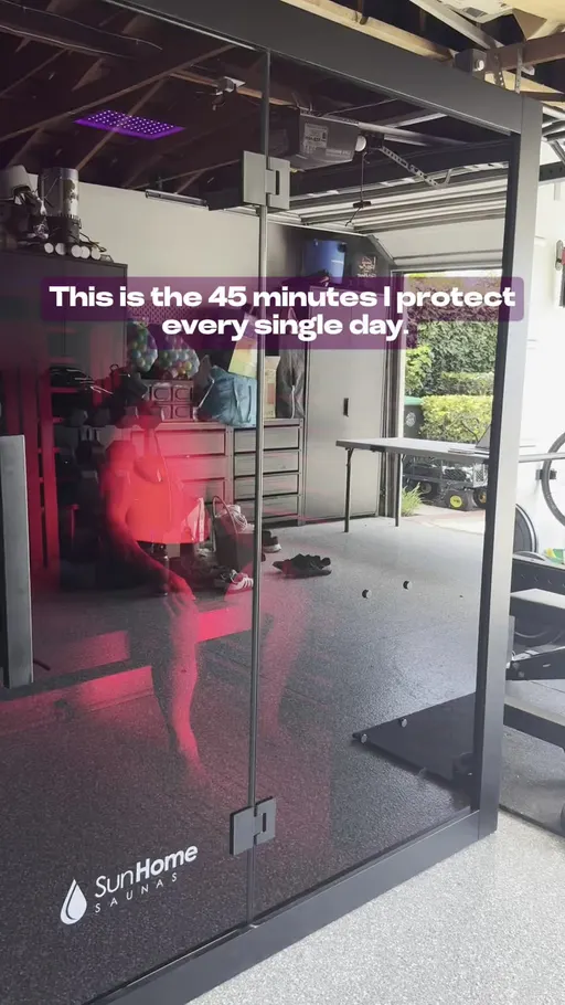

Four ads, four things held close. sunhomesaunas.com is the one to copy, because time comes before product and the demonstration answers the question the line raises.
That's the control shape. Now the widest base of the three.
8. Offer-First Banner: it leads with the deal and nothing else
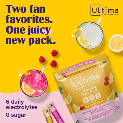
What it is. The deal is the layout: no scene, no demonstration, just the saving. ultimareplenisher.com runs “Your First Order, 20% Off”.
Why it matters to you. 38 brands ran it, the widest base of these three shapes, and 54.7% of its sample ads passed sixty days, the highest of the three. Keep it funded rather than reinvent it.
What moved. 8% of October's ads.
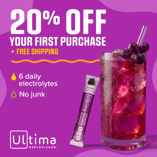
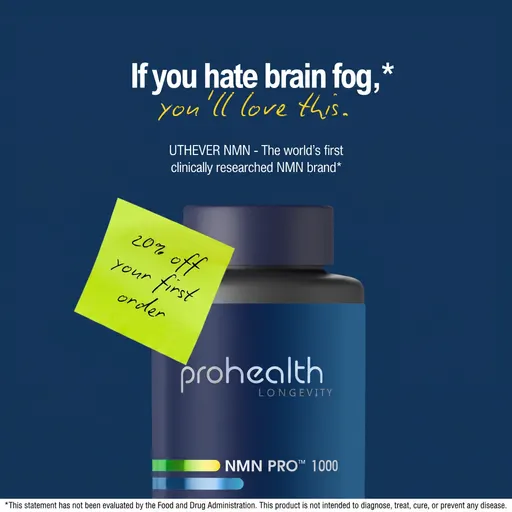
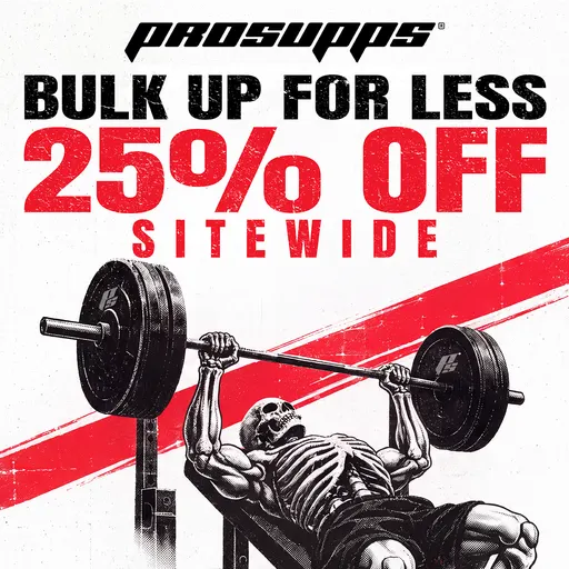
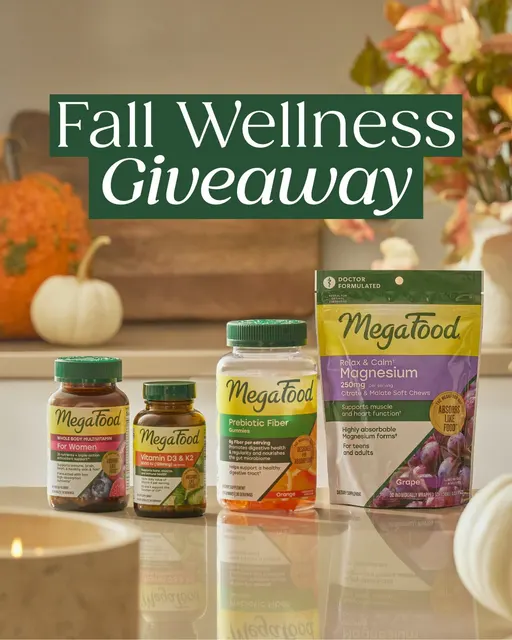
Four ads, four ways to lead with a number. ultimareplenisher.com is the one to copy, for the order of its words: it tells a new shopper the deal is theirs.
That's the shape that stays. Now the one with the fewest ads past sixty days.
9. Montage: it tells the whole story in quick cuts
What it is. Many short cuts on one thread, with the first line doing the sorting. smileset.com opens on “If you're embarrassed of your crooked teeth and always try to hide them in photos, this video is for you.”
Why it matters to you. 24 brands ran it, a narrow base, and only 23.8% of its sample ads passed sixty days, the lowest of these three shapes. It also grew the most of the three this month, so many of those ads have not had sixty days yet.
What moved. 7% in October, 3.9% in September. It is in the movers chart below.
Two ads, two ways to cut. smileset.com is the one to copy, because the sorting happens in words before the cutting happens on screen.
Those are the nine. Now the smaller rows that rose.
What actually moved: the small stuff
Several of the nine leaders shifted by more than half a point this month. Below them, rows across all three rankings rose by a fifth of a point or more since September. Here they are.
Rows of the three rankings that rose by a fifth of a point or more, October 2026 against September 2026, in points. The library labelled more of its ads in October than in September, and that lifts every share a little, so read a small rise with care. Source: eCommerceBenchmark Ad Library, 2026.
Of the nine leaders, relatability held exactly the share it had, 10.5% in both months, and problem-aware eased, while others rose by enough to show in the chart. Most of the other risers are small rows. The reason to care isn't any single row, it's that several rose in the same month. Let's look at three of them in real ads.
Cinematic B-Roll: it builds a mood before it builds a case
What it is. It films the product inside a wider scene and keeps the words out of the way, the way orgain.com does with “New! Orgain Clear Protein”.
Why people respond. A filmed scene asks nothing of the shopper for a second or two, and a scroll that stops for a second or two has already stopped. It reads like a programme rather than a pitch, the way a kitchen window with morning light in it reads like someone's actual morning. That is our reading of the attention, not a claim about sales.
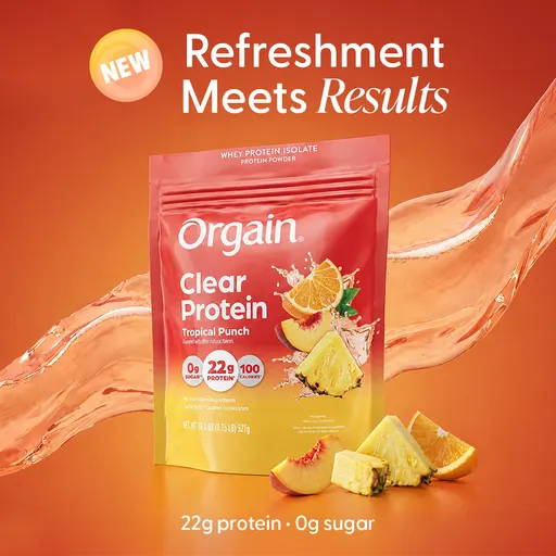
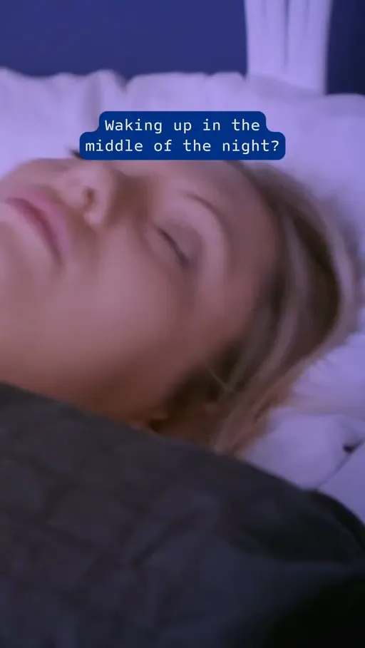
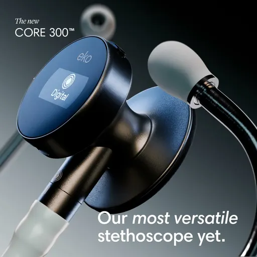
prohealth.com opens on the trouble instead of the scene with “Waking up in the middle of the night?” ekohealth.com names the device and nothing else: “The new CORE 300”. sauna.space uses the same line here that it runs as a bold claim opening, “You breathed it in. Now support your recovery.” Of the cut's 79 brands, 21 ran it.
Customer Testimonial Reel: it lets a buyer say the sentence for you
What it is. The shape hands the argument to a customer, the way ekohealth.com does with “The Stethoscope, Finally Reinvented.”
Why people respond. A sentence that sounds like a person is easier to believe than a sentence that sounds like a brand. It is the difference between a sign in a shop window and the neighbour telling you the place is good. That is our reading of the attention, not a claim about sales.
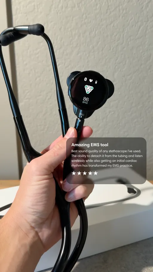
smileset.com opens on someone else noticing: “She wasn't supposed to get complimented.” us.lifecykel.com reuses its afternoon line, “Beat the 3pm slump.” prohealth.com keeps it to two words with “Real Results.” This row is the widest of the three risers at 33 brands, which is still under half the cut.
Newness: it makes the arrival the whole story
What it is. The opening leads on the thing being new, as orgain.com does: “New! Orgain Clear Protein”.
Why people respond. New is the one claim a shopper cannot have heard before, because last month it wasn't true. It works like a shelf tag in a shop you walk past every week: you look because something changed. That is our reading of the attention, not a claim about sales.
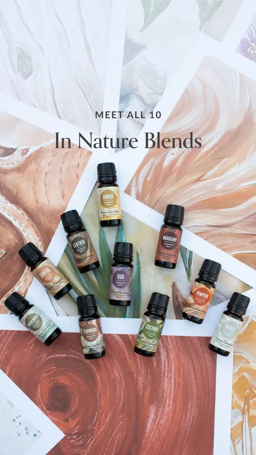
edensgarden.com introduces a whole set: “Meet All 10 In Nature Essential Oil Blends”. ekohealth.com names the model, “The new CORE 300”. ultimareplenisher.com puts the pack change first with “Two fan favorites. One juicy new pack.” 28 brands carry it.
Newness rose on 28 brands and listicle on 28, in the same month. Several small risers together are worth one test.
One ad to brief this week: the Three-Reason Arrival
Newness, listicle, customer testimonial reel and cinematic b-roll all climbed between September and October, and together they describe one ad: it opens on the thing being new, counts three reasons in order in the middle, and closes on one customer saying one sentence, filmed as a scene rather than laid out as a banner. This is our suggestion, built from the movers, not a finding. The library can't say it will work, which is exactly what the test is for.
The format. A four-clip video of about thirty seconds: clip one holds the new pack, clips two and three count off the three reasons on screen, and the last clip carries one customer line and the buy prompt.
The hook. Model the first clip on orgain.com's “New! Orgain Clear Protein”: the word new, then the product name, and nothing else on screen.
The middle. Model clips two and three on sauna.space's “Do you want a natural glow? You need two things.”: say how many reasons are coming, then give them in the order you promised.
The close. Model the last clip on smileset.com's “She wasn't supposed to get complimented.”: one buyer, one sentence about what someone else noticed.
The test. Run it against your best bold claim ad, on the same audience and the same budget split, for two full weeks, and judge it on cost per purchase.
Two smaller tests can ride along, each as its own whole ad against the ad it replaces, never a swap of the first line alone. First, an offer ad written in ultimareplenisher.com's order, “Your First Order, 20% Off”, but carrying a real calendar date where most lines say limited time. Second, an ad written for one named shopper, modelled on humann.com's “If you're over 40, you might be missing out on this one thing for blood pressure support.”, run against your broadest ad on solution-aware.
The eCommerceBenchmark Ad Library sorts your ads into the same hooks, angles, concepts and offers used in this report and shows your mix next to the market, so you can see which shapes you have never shipped.
Audit my creatives, freeOne catch before you run off. Everything above is the whole of US Health & Wellness. Your corner of it might look nothing like it.
Why you need to know the hooks in your niche
A row that is crowded across US Health & Wellness can be empty in your own corner of it. Your product line, your price point and your shopper decide that, not the vertical. The opening you think of as yours alone may be the one all five of your competitors used last week.
- A shopper tunes out an opening they meet over and over. Bold claim opened 17.7% of this cut's October ads across 47 brands, so a feed can hand the same kind of promise over several times in one scroll.
- When every ad sounds the same, price is all that is left to compare. Offer-first banner already has the widest base of the three shapes at 38 brands.
- A different opening costs the same to write into the brief. The brief is one line either way, whether it says bold claim or says relatability, which 26 brands carried.
- Different isn't the same as right. That is why you test one ad into an empty row rather than switching the account over: montage sat at 7% on 24 brands.
Your 30-minute check
- Collect. Pull twenty current ads from your five closest competitors in the free Meta Ad Library.
- Label. Write down each ad's hook, angle and concept, one line per ad.
- Count. The row that shows up most is your niche's crowded row; across US Health & Wellness, that's bold claim.
- Find the gap. The row that shows up least, or never; check it against the movers above.
- Brief one test. One ad for the empty row, run against your control for two full weeks.
Want every number? Here are the full rankings.
The full rankings: hooks, angles and concepts
Use these as worksheets, not scoreboards. This cut carries twelve hooks, eight angles and twelve concepts, and the useful column is the one you add yourself: write your own count beside each row, from your last month of ads or from your competitors' current ones. The rows where your count is highest are the ones you are actually competing in, whatever the share here says.
| Hook | October share | September share | Change |
|---|---|---|---|
| Bold claim | 17.7% | 17.5% | ▲ 0.2 |
| Direct question | 13% | 11.6% | ▲ 1.4 |
| Relatability | 10.5% | 10.5% | 0 |
| Curiosity gap | 8.7% | 10.4% | ▼ 1.7 |
| Authority | 7% | 7.7% | ▼ 0.7 |
| Newness | 4.4% | 2.7% | ▲ 1.7 |
| Price anchor | 3.2% | 2.1% | ▲ 1.1 |
| Urgency / FOMO | 2.8% | 2.7% | ▲ 0.1 |
| Contrarian | 2.6% | 1.1% | ▲ 1.5 |
| Shocking statement | 2.5% | 2.3% | ▲ 0.2 |
| Visual reveal | 2.5% | 1.4% | ▲ 1.1 |
| Confession | 1.8% | 0.7% | ▲ 1.1 |
| Angle | October share | September share | Change |
|---|---|---|---|
| Solution-aware | 20.9% | 16.9% | ▲ 4.0 |
| Problem-aware | 16.7% | 21.5% | ▼ 4.8 |
| Mechanism | 16.2% | 8.6% | ▲ 7.6 |
| Objection crusher | 10.6% | 11% | ▼ 0.4 |
| Social proof | 5.5% | 6.1% | ▼ 0.6 |
| Comparison | 5.5% | 4.2% | ▲ 1.3 |
| Identity | 3.2% | 3.6% | ▼ 0.4 |
| Named enemy | 0% | 0% | 0 |
| Concept | October share | September share | Change |
|---|---|---|---|
| Product Demo Close-Up | 13.8% | 11.3% | ▲ 2.5 |
| Offer-first banner | 8% | 7.5% | ▲ 0.5 |
| Montage | 7% | 3.9% | ▲ 3.1 |
| Cinematic B-roll | 6.1% | 4.2% | ▲ 1.9 |
| Customer Testimonial Reel | 4.6% | 2.7% | ▲ 1.9 |
| Selfie talking-head | 4.6% | 3.2% | ▲ 1.4 |
| Listicle | 4% | 2.3% | ▲ 1.7 |
| Problem agitation | 2.2% | 0.9% | ▲ 1.3 |
| Side-by-Side Comparison | 1.1% | 0.8% | ▲ 0.3 |
| UGC Unboxing | 0.7% | 0.2% | ▲ 0.5 |
| Us vs. Them | 0.7% | 0.9% | ▼ 0.2 |
| Behind-the-Scenes | 0.7% | 0.3% | ▲ 0.4 |
Your test card
Here is the Three-Reason Arrival set up the way a media buyer would run it, against your best bold claim ad.
| Hypothesis | A four-clip Three-Reason Arrival ad, opening on the new product, counting three reasons in order and closing on one customer's sentence, will hold or beat my cost per purchase against my best bold claim ad over two full weeks. |
| Change only this | The whole creative: the Three-Reason Arrival ad in place of the bold claim control's creative. |
| Keep the same | Product, offer, audience, placement and budget split. |
| Funnel stage | Say first whether this ad is for prospecting (cold) or retargeting (warm). A deal in the first line is often right for warm audiences and wrong for cold ones, so test it where the ad will really run. |
| Setup | One control and one variant, same audience, same placement, even budget split. Do not edit either ad while the test runs. |
| How long and how much | Until each version has about 50 purchases, or two full weeks, whichever comes later. This is general testing practice (Meta's own learning-phase guideline is about 50 results per ad set per week), not a library finding. |
| Success metric | Cost per purchase, not clicks. |
| Stop rule | Pause a variant that has spent about 3 times your target cost per purchase with no purchase. If it is close, keep it running. |
| What counts as a win | The variant beats the control on the metric by an amount you would act on, and still does in a second week. |
October 2026 US Health & Wellness ads: what to brief next
- Bold claim opened 17.7% of October's US Health & Wellness ads, direct question 13% and relatability 10.5% [eCommerceBenchmark Ad Library, 2026]: that is the lane every brief lands in by default.
- Solution-aware 20.9%, problem-aware 16.7% and mechanism 16.2% carry a little over half of the month's arguments between them, and mechanism was at 8.6% in September.
- Product demo close-up staged 13.8% of ads, offer-first banner 8% and montage 7%: compare these three with each other only, never with a hook or an angle share.
- Staying power splits the ladders: 59.2% of relatability's sample ads ran sixty days or more, the most of its three hooks, against montage's 23.8%, the least of its three concepts.
- Four risers outside the nine leaders are worth a test: cinematic b-roll 4.2% to 6.1%, customer testimonial reel 2.7% to 4.6%, newness 2.7% to 4.4% and listicle 2.3% to 4%, carried by 21, 33, 28 and 28 brands in that order.
- Run the thirty-minute check on your own five competitors before you copy any row here: this cut spans 79 brands of supplements, saunas, aligners and oral care, and your corner may be crowded somewhere else entirely.
US Health & Wellness ad benchmarks: common questions
Keep one ad on bold claim as your control, because at 17.7% of October's ads it is the opening your shoppers already know. Then brief exactly one new ad: the Three-Reason Arrival, opening on the thing being new, counting three reasons in the middle, closing on one customer's sentence. Run it against the control on the same audience and the same budget split for two full weeks, and judge it on cost per purchase. At the end of the fortnight you will have a decision you can defend, instead of another argument about first lines.