US Home & Furniture Ads, October 2026: A Different Angle Just Took the Lead. Is Your Brief Behind?

Scope: Home & Furniture ads in the US, as the eCommerceBenchmark Ad Library tracks them. 18 brands, 1,695 ads active in October 2026, compared with September 2026.
Most ad reports hand you a leaderboard. Then they wander off.
This one tells you which of three decisions to change.
For October's top three hooks, top three angles and top three concepts in US Home & Furniture, you get the same five things: what it is, why it matters, what moved since September, which brands ran it, and one thing to steal. Curiosity Gap still opens more of these ads than any other first line. Solution-aware now carries the argument underneath. After that, the small rows that grew, and one ad to brief this week.
- A brief decides three things, not one. "Give me a stronger hook" settles the opening and hands the argument and the shape to whoever shoots it. In this cut the ad then lands on Curiosity Gap, Solution-aware and Product Demo Close-Up with nobody choosing any of them.
- The default opening is the one every shopper here has already met. Curiosity Gap is the first line of US Home & Furniture, so your ad sits beside ads that sound like it.
- The defaults differ on staying power. Curiosity Gap has the largest share of ads past sixty days of its three hooks, and Montage the smallest of its three concepts.
But first, three words that most briefs mix up.
Hook, angle, concept: three different jobs
A hook is defined as the first move an ad makes to stop a scroll, an angle is defined as the reason the ad gives a shopper to buy, and a concept is defined as the shape of the creative. Ask for "a stronger hook" and you have settled one of the three.
| Word | In one line | Plain example |
|---|---|---|
| Hook | The first move an ad makes to stop a scroll: its first line or first seconds. | "Wait, that's the whole shelf?" |
| Angle | The reason the ad gives a shopper to buy. | "It fits the cupboard you already have." |
| Concept | The shape of the creative: how it is filmed, laid out or staged. | One pair of hands folding a blanket onto a bed, filmed from above. |
The plain examples are made up to show the idea.
How to read a rise or a fall
Every row here carries three numbers from this cut: its slice of October's 1,695 US Home & Furniture ads, the slice it held in September, and how many of the cut's brands ran it.
- Rising. A bigger slice of the month's ads uses it, so the row is filling up. Offer-first banner staged 6% of October's ads after 4.6% in September.
- Falling. A smaller slice uses it. That does not mean it failed. Curiosity Gap opened 17.1% of October's ads after 17.8% in September.
- Flat. Its slice held, so treat it as a steady baseline. Objection crusher argued 10.9% in both months.
- Small. A move under half a point is small, so check the brand count. Confession opened 0.5% of October's ads after 0.3% in September, on 5 brands.
One more rule. A bigger slice does not mean a row works better. This library holds no sales and no spend, so it shows what brands ran, not what earned, and the whole cut is 18 brands. Each row also shows how many of its ads have run sixty days or more. The library keeps long-running ads first, so the numbers read high: take them as a staying-power hint, nothing else.
The top 3 hooks: how ads open
Together, these three open about a third of October's US Home & Furniture ads.
Source: eCommerceBenchmark Ad Library, 2026.
1. Curiosity Gap: it opens a question the next line has to answer
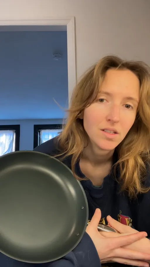
What it is. The first line hands the shopper a reaction or a part-told story and keeps the point for the next line. misen.com starts on "Yo, this pan is crazy!" and leaves the whole promise to its headline.
Why it matters to you. This is the busiest opening of the three by a wide margin, on 16 brands of the cut, and its sampled ads sat at 93.8% past sixty days, the highest of these three hooks. Keep an ad here, but do not expect it to make your next test look different from theirs.
What moved. 17.1% in October, 17.8% in September, so the busiest lane in the cut thinned very slightly and still led every other hook.
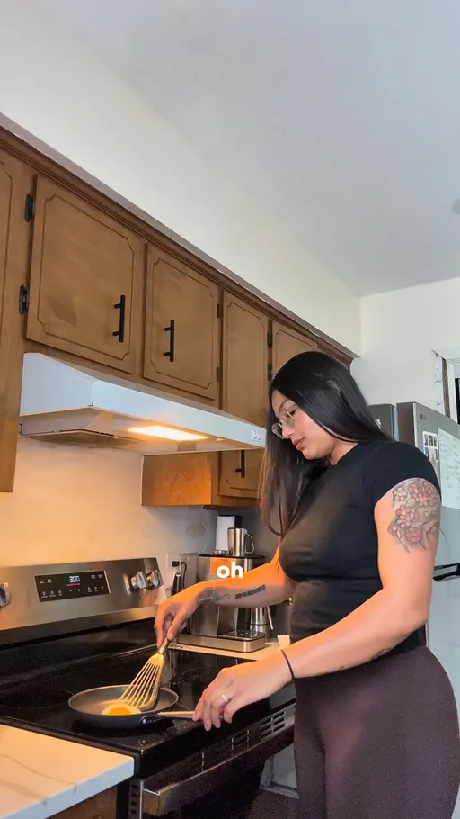
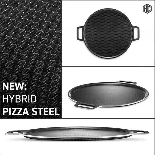
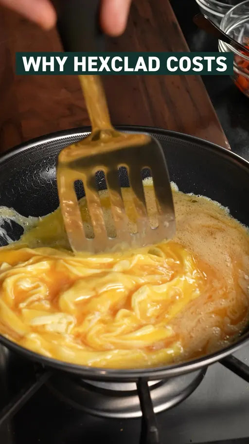
Four ads, four ways to hold something back. misen.com leads on a reaction before it names the pan. hexclad.com announces a thing and not what it does, in "NEW: HYBRID PIZZA STEEL 🍕". misen.com's is the one to copy, because the reaction arrives before any noun a shopper can scroll past.
That is the crowded one. Now the one that spends its first line on a promise.
2. Bold Claim: it stakes the whole sentence on one promise
What it is. The opening says the biggest thing the brand is willing to say, flat out, with no setup. hexclad.com runs "🔥 LIFETIME WARRANTY 🔥" and lets the guarantee do the work an adjective usually does.
Why it matters to you. Second to Curiosity Gap for crowd here, on 13 brands, and it has the fewest sampled ads past sixty days of these three, at 50.6%.
What moved. 10% in October, 9% in September.
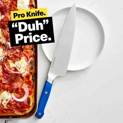
Four ads, four flat promises. hexclad.com puts the warranty where the adjective goes. misen.com prices itself in two beats with "Pro Knife. "Duh" Price." hexclad.com's is the one worth copying, because the promise is a thing a shopper can hold the brand to.
That is the promise lane. Now the one that starts in the shopper's own afternoon.
3. Relatability: it talks about the shopper's chores before the product
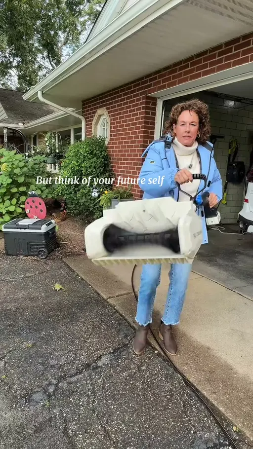
What it is. The opening describes the shopper's day and leaves the product out of the first sentence. snowjoe.com starts on "Yard work happens, but you've got places to go." and gets to the tool later.
Why it matters to you. The least crowded of these three, on 11 brands, with 77% of its sampled ads past sixty days, which puts it between the other two for staying power.
What moved. 8% in October, 7.5% in September.


Four ads, four everyday starts. snowjoe.com opens on the errand, not the saw. hexclad.com names the thing in the drawer with "Don't settle for a dull, crappy knife." snowjoe.com's is the one to copy, because the product is not in the sentence at all.
That is how ads open. But why would anyone buy?
The top 3 angles: why the shopper should buy
Together, these three carry about a third of October's ads, and this is the group where the lead changed hands.
Source: eCommerceBenchmark Ad Library, 2026.
4. Solution-Aware: it treats the shopper as someone already deciding
What it is. The argument skips the problem and talks to a person who has already decided to buy something. cabinetstogo.com runs "Buy One, Get One FREE on select in-stock cabinets.", which argues nothing except what the shopper gets for acting now.
Why it matters to you. It is now the busiest argument in the cut, on 13 brands, and its sampled ads sat at 32.1% past sixty days, the fewest of these three angles.
What moved. 12.7% in October, 10.7% in September. That is the largest rise of any row in these three rankings, and it put this row past Identity at the top of the angles.
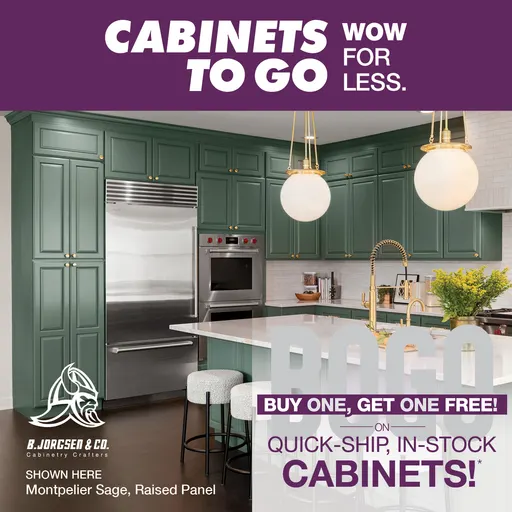

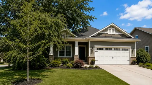
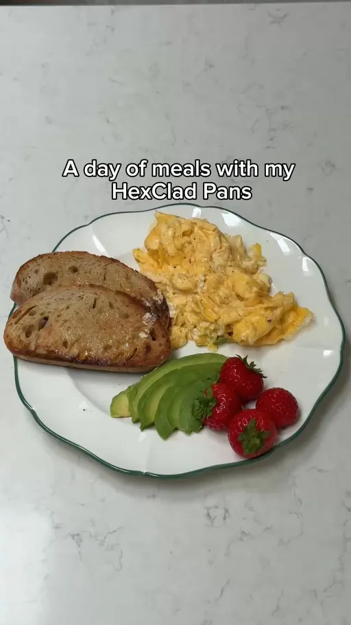
Four ads, four arguments aimed at a decided shopper. cabinetstogo.com states the deal and the stock. misen.com names the one step left: "Limited time left to back Misenware on Kickstarter." misen.com's is the one to copy, because the whole argument is one clause long.
That is the new leader. Here is the one it just passed.
5. Identity: it sells the kind of person who owns the thing
What it is. The argument offers the shopper a version of themselves and lets the product come with it. hexclad.com opens on "Some nights call for a little ceremony.", and the glassware arrives after the occasion.
Why it matters to you. Almost as crowded as Solution-aware, on 13 brands, with 81.1% of its sampled ads past sixty days, a long tail next to Solution-aware's short one.
What moved. 12.5% of October's ads, about level with September.
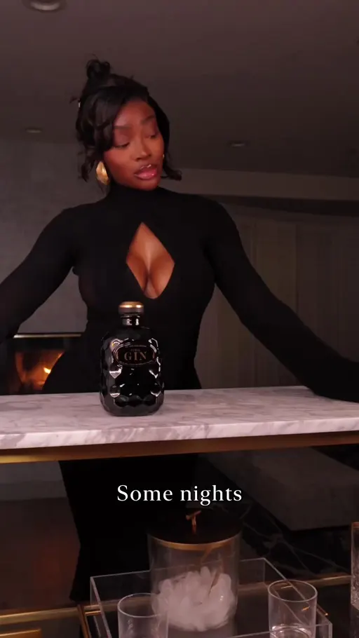
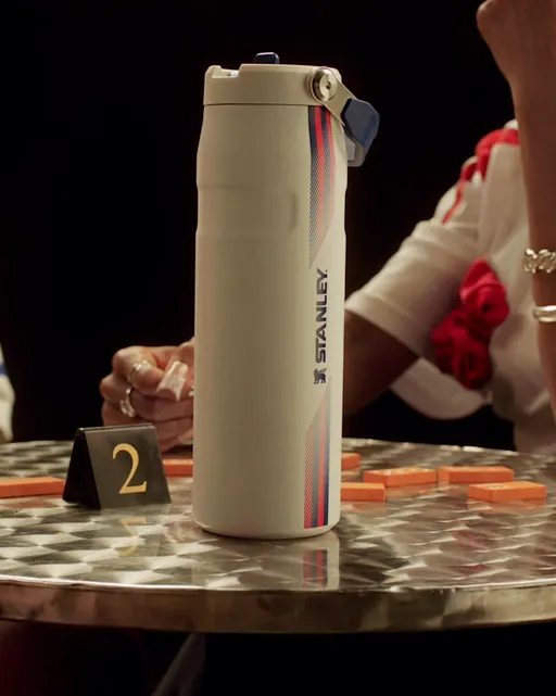
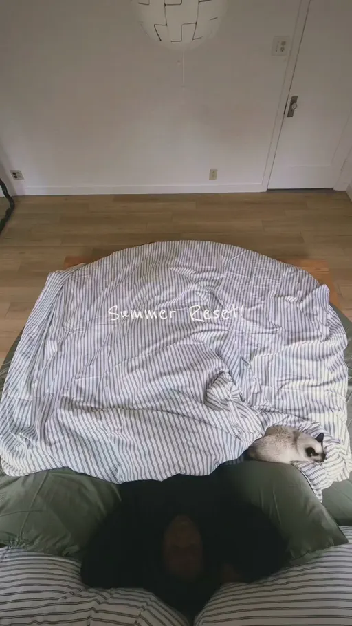
Four ads, four versions of a person. hexclad.com hands over the occasion. stanley1913.com lets the shopper pick a side with "Choose your colours". hexclad.com's is the one worth copying, because the shopper meets a version of their evening before they meet a product.
That is the long-tailed argument. Now the one that answers back.
6. Objection Crusher: it settles the worry that stops the order
What it is. The argument takes the doubt the shopper would raise and answers it in the ad, with reviews, a discount or a guarantee. hexclad.com runs "GET THE 12-PIECE SET" under its own review count, so the instruction arrives with the proof attached.
Why it matters to you. The widest base of these three, on 16 brands, with 81.5% of its sampled ads past sixty days, the longest tail of the three.
What moved. 10.9% in October and 10.9% in September, the one leader in this piece that held exactly.
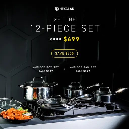
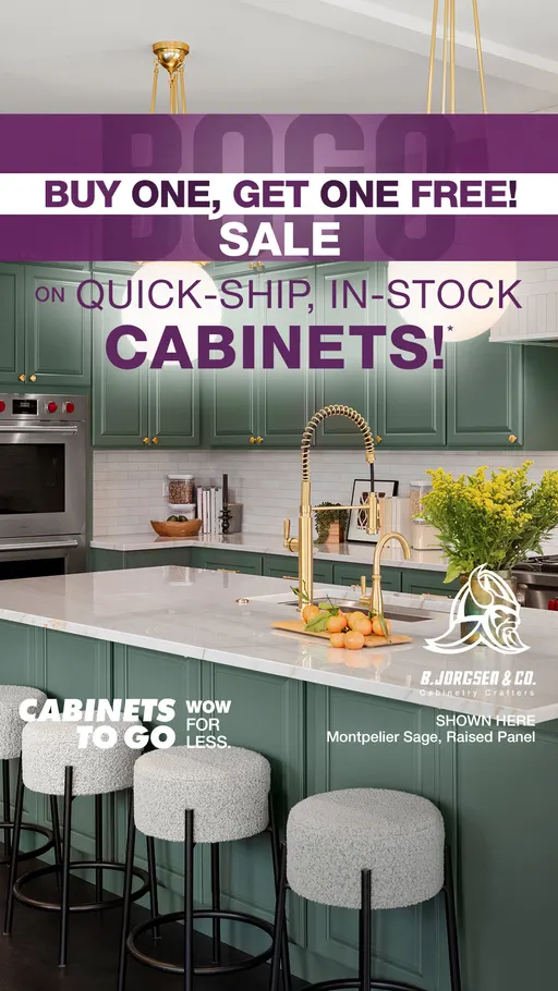
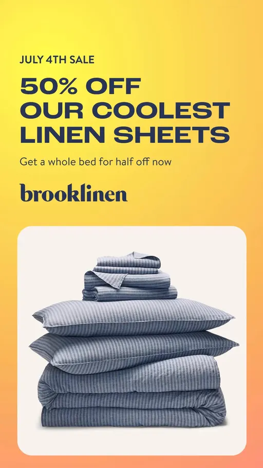
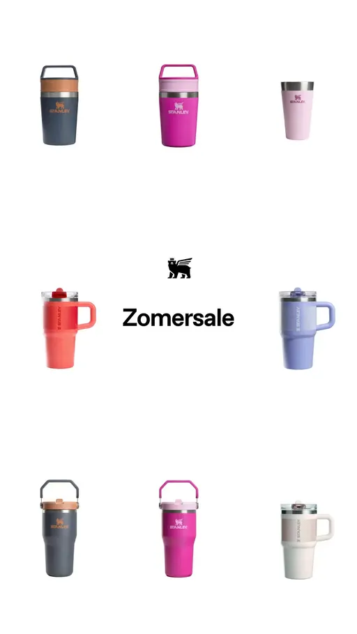
Four ads, four doubts settled. hexclad.com answers "is it any good" with its review count and tells you what to buy. brooklinen.com answers price flatly, in "50% OFF OUR COOLEST LINEN SHEETS". hexclad.com's is the one to copy, because the proof and the instruction sit in different places and neither crowds the other.
That is why a shopper should buy. Now the shape it arrives in.
The top 3 concepts: how the ad looks
A concept is the shape of the creative. Fewer ads carry a concept than a hook or an angle, so compare concepts only with each other.
Source: eCommerceBenchmark Ad Library, 2026.
7. Product Demo Close-Up: it puts the thing in frame and lets it work
What it is. The shape brings the product close enough for a shopper to judge it while it is being used. snowjoe.com opens on "Dealing with stubborn dirt and grime buildup on your car mats?" and then shows the washer doing it.
Why it matters to you. The widest shape in the cut, on 14 brands, and 73.4% of its sampled ads had run sixty days or more, the longest tail of these three concepts.
What moved. 15.1% of October's ads, about level with September.
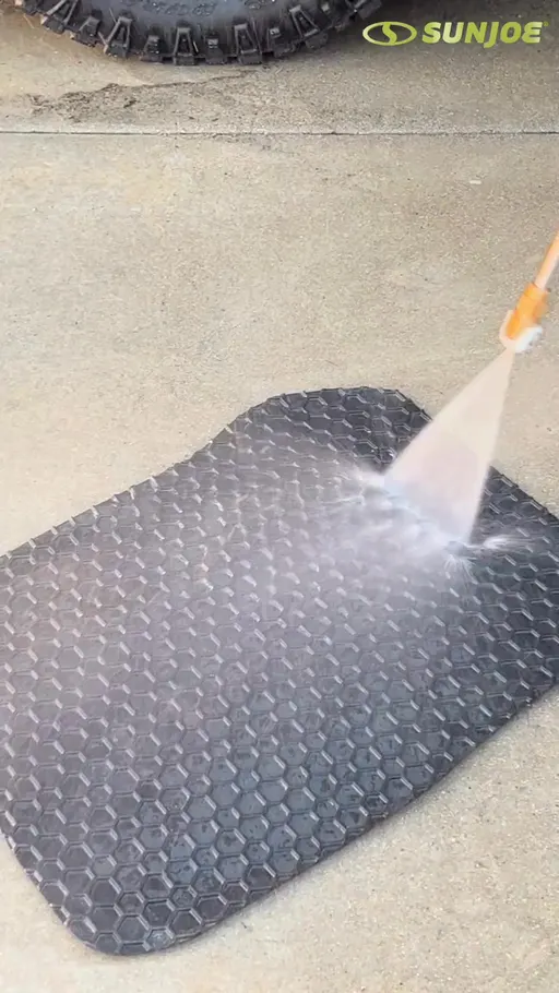
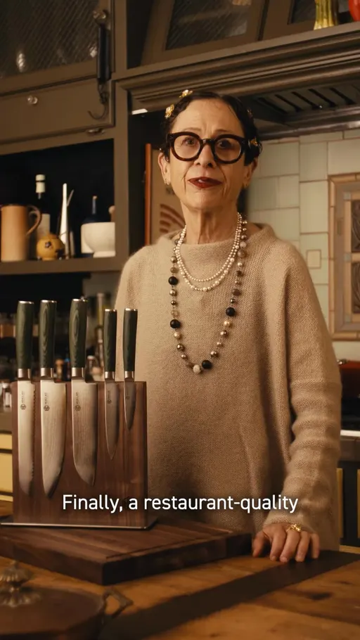
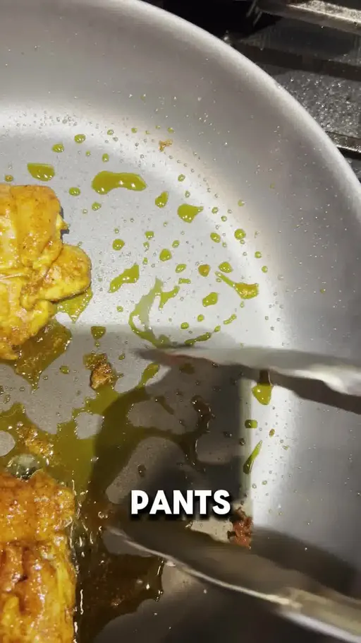
Three ads, three close looks. snowjoe.com names the mess, then shows the fix. hexclad.com frames the knife as the end of a search, in "Finally, a restaurant-quality knife for home." snowjoe.com's is the one to copy, because the close-up has a question waiting for it.
That is the control shape. Here is the one built around a deal.
8. Offer-First Banner: the deal is the whole design
What it is. The layout is the offer: the deal is the biggest thing on screen and the product sits behind it. cabinetstogo.com runs "Buy One, Get One FREE on select in-stock cabinets.", which is the ad and the design in one line.
Why it matters to you. Second of these three by share, on 12 brands, with 50.5% of its sampled ads past sixty days, between the other two.
What moved. 6% in October, 4.6% in September, the second largest rise in these rankings.

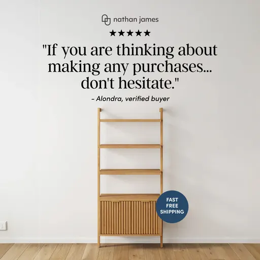
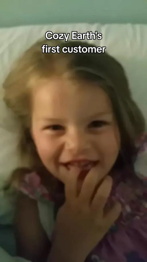
Four ads, four deals doing the designing. cabinetstogo.com puts offer, product and limit in one line. cozyearth.com opens on the excitement instead of the number, in "Girls this is not a drill!" cabinetstogo.com's is the one to copy for order of words, and only the order: a deal in the first line is only worth copying when the deal is real.
That is the shape with a deal in it. Last, the shape made of cuts.
9. Montage: it runs a stack of short clips at one idea
What it is. Several short clips are threaded onto a single idea, and the first line sets up what the cuts are answering. misen.com opens on "the knife that changed my steak nights for good", then lets the clips carry the nights.
Why it matters to you. On 13 brands, so it is not a quiet corner, but only 31.3% of its sampled ads had run sixty days or more, the fewest of these three shapes.
What moved. 5.7% in October, 4.5% in September.
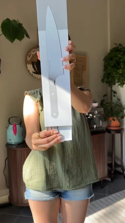
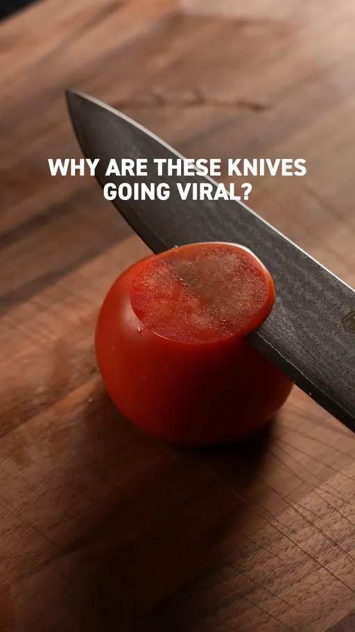
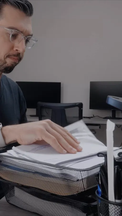
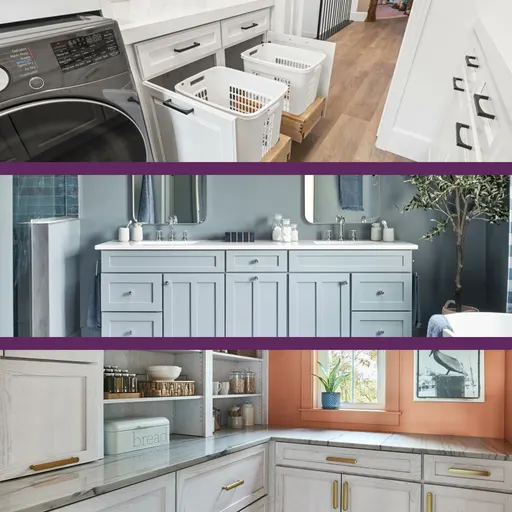
Four ads, four threads. misen.com hangs the cuts on one claim about steak nights. vegogarden.com gives the clips a mood to answer with "Sometimes, the world gets loud. Even at home." vegogarden.com's is the one to copy, because one sentence of setup gives every clip after it a job.
That is the shape. Now the smaller rows that rose.
What actually moved: the small stuff
Four of the nine leaders moved by more than half a point: Solution-aware, Offer-first banner, Montage and Bold Claim. Curiosity Gap, the busiest hook in the cut, eased by more than that as well, and the other four sat within half a point of September. Fifteen rows across the three rankings rose by a fifth of a point or more in the same month, which is the threshold this page uses for a mover. Here they are.
Rows of the three rankings that rose by a fifth of a point or more, October 2026 against September 2026, in points. The library labelled more of its ads in October than in September, and that lifts every share a little, so read a small rise with care. Source: eCommerceBenchmark Ad Library, 2026.
The reason to care is not any single one of them. It is that several rose in the same month, in a cut of 18 brands, while the top of the hook ladder gave you nothing new. Let's look at three of them in real ads.
Cinematic B-roll: it lets the room carry the product
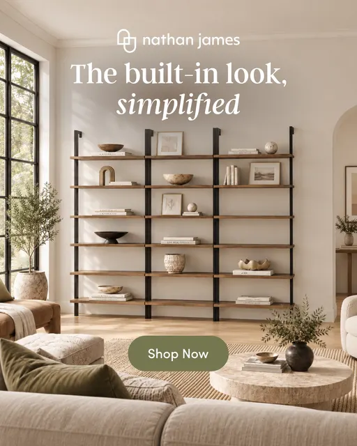
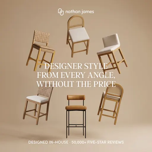
What it is. The shape films the product inside a scene that is already happening, so the room does the selling. nathanjames.com opens on "Every home starts beautiful."
Why people respond. A shopper who is picturing their own living room gets handed a living room. That is our reading of the attention, not a claim about sales.
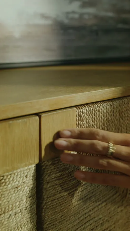
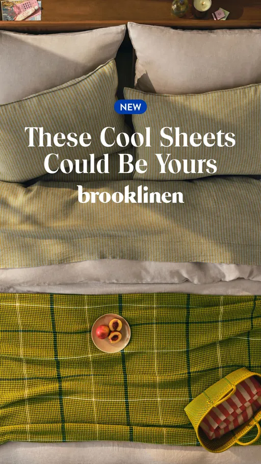


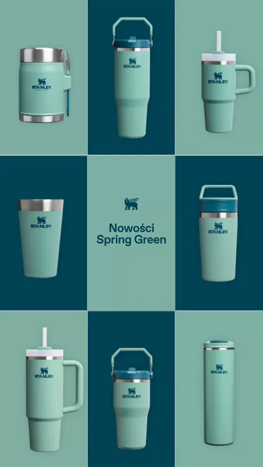
Four ads, four rooms. nathanjames.com starts with the home, not the cabinet. brooklinen.com makes the sheets a thing you could have: "These Cool Sheets Could Be Yours". stanley1913.com runs "Neu für den Frühling", German for new for spring. Eleven of the cut's 18 brands carry this row, against 76 ads in October.
Visual Reveal: the product arrives before the sentence does
What it is. The ad shows the thing first and explains second. ooni.com opens on "Restaurant-worthy has moved in".
Why people respond. Nothing has to be understood before the shopper sees what is being sold, the way a shop window needs no caption. That is our reading of the attention, not a claim about sales.
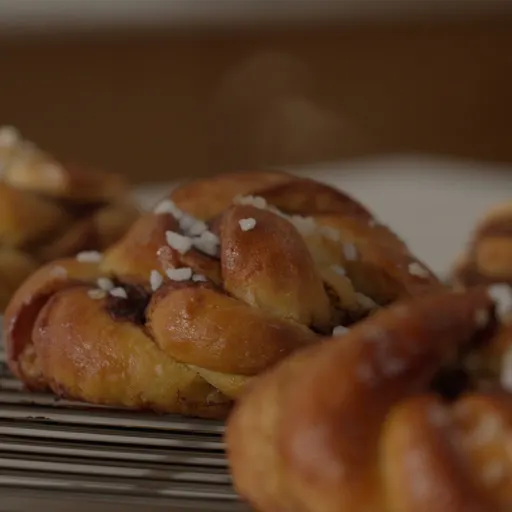
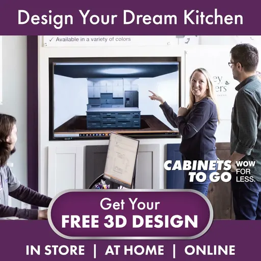

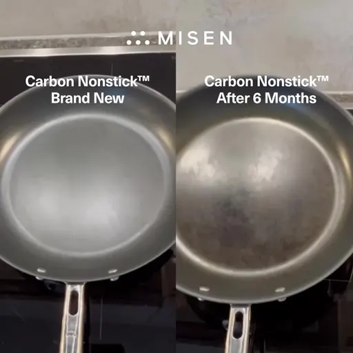
Four ads, four arrivals. ooni.com puts the oven in the house. cabinetstogo.com makes the reveal the shopper's own plan: "Design Your Dream Kitchen". misen.com simply names what is on screen: "This is the Misen Carbon Nonstick". The row opened 3.7% of October's ads on 63 ads, carried by 12 brands.
Price Anchor: it names the money first
What it is. The opening leads on what the shopper will pay or save, before any argument. casper.com runs "Pay for a Queen Sleep on a King".
Why people respond. A price is the one thing a shopper can compare without reading anything else, like a shelf tag you can read from the aisle. That is our reading of the attention, not a claim about sales.
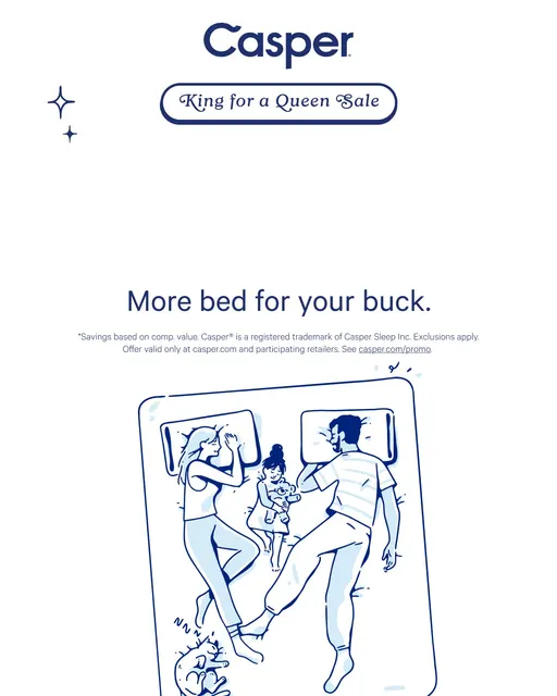
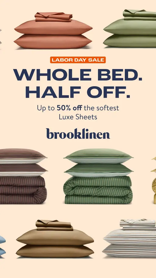

Four ads, four sums. casper.com trades size for price in one line. brooklinen.com splits the bed and the bill: "WHOLE BED. HALF OFF. Up to 50% off the softest Luxe Sheets". cozyearth.com names the amount flat, in "$50 Off Your First Purchase". Ten of the cut's 18 brands carry this row, against 59 ads in October.
Visual reveal and Price anchor rose in the same month in the same small cut. Several small risers together are worth one test.
One ad to brief this week: the Moved-In Spot
Visual reveal, Comparison, Price anchor and Cinematic B-roll all rose this month, and read together they describe one ad. It opens with the product already in the room. The middle sets it against the thing the shopper owns now, two columns, one point each. The close names the money. This is our suggestion built from the movers, not a finding in the data.
The format. Four clips, about fifteen seconds: one of the product in the room, two holding the two-column contrast, one on the price card.
The hook. Model the first clip on ooni.com's "Restaurant-worthy has moved in": the thing arriving in a real room, nothing else on screen.
The middle. Model the second and third clips on snowjoe.com's "American hose versus Japanese hose": two named options, one difference per clip.
The close. Model the last clip on cozyearth.com's "$50 Off Your First Purchase": the number large and alone.
The test. Run it against your best ad on Curiosity Gap, the same audience and the same budget split, for two full weeks, and read it on cost per purchase.
The eCommerceBenchmark Ad Library sorts your ads into the same hooks, angles, concepts and offers used in this report and shows your mix next to the market, so you can see which shapes you have never shipped.
Audit my creatives, freeOne thing before you brief it. Everything above is the whole of US Home & Furniture. Your own corner of it may look nothing like that.
Why you need to know the hooks in your niche
A row that is busy across all of US Home & Furniture can be empty in your corner of it. Cookware, bedding, cabinets and yard tools are not one feed, and your price point narrows it again. Curiosity Gap opens 17.1% of this cut's ads, and that says nothing about the five brands your shopper actually sees.
- Shoppers stop reading an opening they meet over and over. Sixteen of this cut's brands run the Curiosity Gap opening.
- When every ad sounds the same, price is the only thing left to compare. Price anchor opened 3.5% of October's ads and Objection crusher argued 10.9% of them, often with a discount attached.
- Writing a different opening is one line of the brief. Naming Visual reveal, at 3.7% of the month's ads, takes the same single line that "stronger hook" takes.
- Different is not the same as right. Newness opened 2.5% of October's ads on 11 brands, a reason to run one ad into it, not a reason to move the account over.
Your 30-minute check
- Collect. Pull twenty current ads from your five closest competitors in the free Meta Ad Library.
- Label. Write down each ad's hook, angle and concept, one line per ad.
- Count. The row that shows up most is your niche's crowded row; across US Home & Furniture, that's the Curiosity gap.
- Find the gap. The row that shows up least, or never; check it against the movers above.
- Brief one test. One ad for the empty row, run against your control for two full weeks.
Want every number? Here are the full rankings.
The full rankings: hooks, angles and concepts
Use these three as worksheets, not scoreboards. This cut's ladders carry twelve hooks, seven angles and twelve concepts, each with this month beside last. Write your own count next to each row, from your last month of ads or from your competitors' current ones. The rows where your count is highest are the ones you are actually competing in.
| Hook | October share | September share | Change |
|---|---|---|---|
| Curiosity gap | 17.1% | 17.8% | ▼ 0.7 |
| Bold claim | 10% | 9% | ▲ 1.0 |
| Relatability | 8% | 7.5% | ▲ 0.5 |
| Authority | 7.1% | 7.6% | ▼ 0.5 |
| Urgency / FOMO | 4.8% | 5% | ▼ 0.2 |
| Direct question | 4.7% | 4.5% | ▲ 0.2 |
| Visual reveal | 3.7% | 2.7% | ▲ 1.0 |
| Price anchor | 3.5% | 2.5% | ▲ 1.0 |
| Newness | 2.5% | 2% | ▲ 0.5 |
| Contrarian | 0.7% | 0.6% | ▲ 0.1 |
| Shocking statement | 0.7% | 0.7% | 0 |
| Confession | 0.5% | 0.3% | ▲ 0.2 |
| Angle | October share | September share | Change |
|---|---|---|---|
| Solution-aware | 12.7% | 10.7% | ▲ 2.0 |
| Identity | 12.5% | 12.1% | ▲ 0.4 |
| Objection crusher | 10.9% | 10.9% | 0 |
| Problem-aware | 10.6% | 11.4% | ▼ 0.8 |
| Social proof | 5.5% | 5.5% | 0 |
| Comparison | 5.4% | 4.7% | ▲ 0.7 |
| Mechanism | 2.7% | 2.3% | ▲ 0.4 |
| Concept | October share | September share | Change |
|---|---|---|---|
| Product Demo Close-Up | 15.1% | 14.7% | ▲ 0.4 |
| Offer-first banner | 6% | 4.6% | ▲ 1.4 |
| Montage | 5.7% | 4.5% | ▲ 1.2 |
| Cinematic B-roll | 4.5% | 3.2% | ▲ 1.3 |
| Customer Testimonial Reel | 1.9% | 1.5% | ▲ 0.4 |
| Side-by-Side Comparison | 1.9% | 2% | ▼ 0.1 |
| Selfie talking-head | 1.4% | 1.5% | ▼ 0.1 |
| Listicle | 1.1% | 1.1% | 0 |
| Grid swap | 0.8% | 0.9% | ▼ 0.1 |
| Problem agitation | 0.5% | 0.3% | ▲ 0.2 |
| Us vs. Them | 0.4% | 0.4% | 0 |
| UGC Unboxing | 0.4% | 0.2% | ▲ 0.2 |
Your test card
Here is the Moved-In Spot set up the way a media buyer would run it, against your best ad on Curiosity Gap, the opening that led this cut in October. Write your own numbers in before you launch, not after.
| Hypothesis | A Moved-In Spot, built on a product reveal, a two-column middle and a named price at the close, will hold my cost per purchase against my best Curiosity Gap ad on the same audience and budget split. |
| Change only this | The whole creative: the Moved-In Spot in place of the control ad. |
| Keep the same | Product, offer, audience, placement and budget split. |
| Funnel stage | Say first whether this ad is for prospecting (cold) or retargeting (warm). A deal in the first line is often right for warm audiences and wrong for cold ones, so test it where the ad will really run. |
| Setup | One control and one variant, same audience, same placement, even budget split. Do not edit either ad while the test runs. |
| How long and how much | Until each version has about 50 purchases, or two full weeks, whichever comes later. This is general testing practice (Meta's own learning-phase guideline is about 50 results per ad set per week), not a library finding. |
| Success metric | Cost per purchase, not clicks. |
| Stop rule | Pause a variant that has spent about 3 times your target cost per purchase with no purchase. If it is close, keep it running. |
| What counts as a win | The variant beats the control on the metric by an amount you would act on, and still does in a second week. |
October 2026 US Home & Furniture ads: what to brief next
- Curiosity Gap opened 17.1% of October's ads, Bold Claim 10% and Relatability 8% [eCommerceBenchmark Ad Library, 2026]: the lane every brief in this cut lands in by default.
- Solution-aware argued 12.7%, Identity 12.5% and Objection crusher 10.9%, about a third of October's ads between them.
- Product Demo Close-Up staged 15.1%, Offer-first banner 6% and Montage 5.7%, read against each other only, because fewer ads carry a concept.
- Staying power in the sixty-day sample: Curiosity Gap at 93.8% is the highest of its three hooks, Montage at 31.3% the lowest of its three concepts.
- Fifteen rows rose by a fifth of a point or more, and the three with their own section here are Visual reveal, on 12 brands, Cinematic B-roll on 11 and Price anchor on 10.
- Action: run the thirty-minute check on your five closest competitors before your next brief, because this cut is the whole of US Home & Furniture, not your corner of it.
US Home & Furniture ad benchmarks: common questions
Keep one Curiosity Gap ad funded as your control, because 17.1% of October's US Home & Furniture ads opened there and that is the lane your shopper already knows. Then brief exactly one ad: the Moved-In Spot, built from the rows that rose. Run it against the control on the same audience and the same budget split for two full weeks, and read it on cost per purchase. At the end of the fortnight you will have a decision you can defend, instead of another rewritten first line.