The History of Landing Pages and How They Evolved

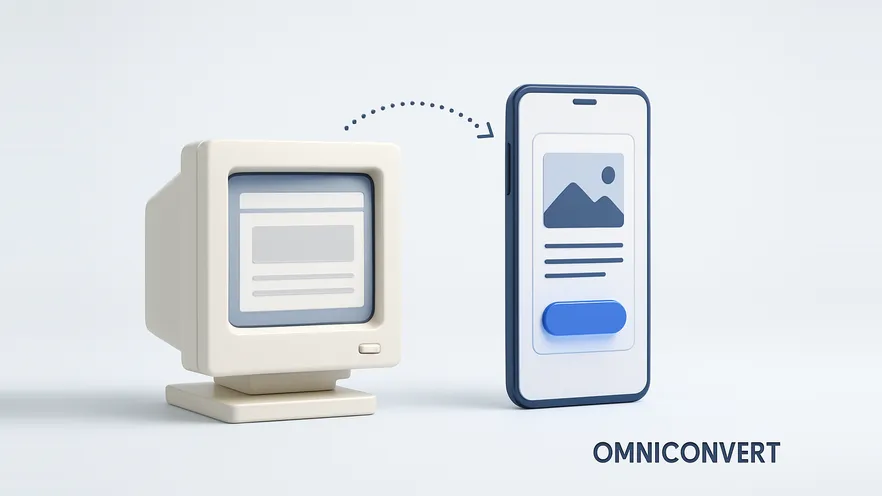
- Landing pages emerged in the early 2000s alongside pay-per-click advertising; Google launched AdWords in October 2000.
- The claim that Microsoft invented the landing page in late 2003 is widely repeated, but it is better read as an early documented use than as proven invention.
- Google introduced Quality Score in August 2005 and added landing page load time as a factor in June 2008, which made the page behind the ad a cost factor.
- Hosted landing page builders, such as Unbounce, founded in Vancouver in 2009, let marketers build and publish pages without developers.
- The core principles are unchanged: relevance, message match, helping visitors decide, supporting visuals, no distracting menus and one clear call to action.
Landing pages grew out of pay-per-click advertising in the early 2000s. Advertisers paying for every click needed a page built to convert that click, not a home page that tried to do everything. Over the next two decades, paid search rules, better design practice and hosted page builders turned the landing page from a clumsy, standalone sales page into the clean, tested, personalized page marketers use today.
In the past, the majority of landing pages looked awful and boring. Ever wish you could understand how they got better? In this article I'll walk you through the transition phases. We can't talk about lead generation and conversion optimization without a deep dive into landing pages. It's impossible. Smart marketers don't only create new landing pages, they optimize them: they study buyer behavior, split test form lengths and positions, test page load times, and keep improving conversion rates. As you read on, your perspective on one of the most popular ways to generate leads and sales may change.
But first, a quick definition.
What is a landing page?
Sounds like a common question, right? But can you define it clearly, in relation to your goal? Don't skip the essentials in the search for advanced techniques. For clarity, here's how Brian Massey, founder of Conversion Sciences, frames it. Look closely and you'll find three key phrases:
- Single-minded page: one topic, one offer, one audience.
- Keeping the promise: the page delivers what the ad, email or link said it would.
- Take action: the page exists to get one specific response.
When you're looking to improve conversions, your landing page must follow these three rules. You won't find all three in many landing pages of the past. Back then it was easy to find multi-purpose marketing pages that didn't keep the promise made. For a practical walkthrough of the three rules, see why your landing page isn't converting.
Where did landing pages come from?
Website design has come a long way, and direct response marketers used standalone web pages to sell products long before anyone called them landing pages. What changed in the early 2000s was paid search. On October 23, 2000, Google announced its self-service advertising program, AdWords. Advertisers now paid for each click, so a click that landed on a general home page and went nowhere was money lost.
The story most often told is that the landing page originated with Microsoft's IT departments in late 2003, in response to poor online sales of Office. Wikipedia's landing page entry repeats it, citing a November 2003 Wall Street Journal report on Microsoft's online sales strategy. Treat it with some caution: in a 2018 retrospective, Web Designer Depot called it "tech folklore" and doubted that nobody had used such a simple sales page before 2003.
Paid search then gave advertisers a financial reason to care about the page, not only the ad. According to PPC Hero's history of Quality Score, Google introduced Quality Score in August 2005 and added landing page load time as a factor in June 2008. Landing page experience is still one of the three Quality Score components today, and Google renamed AdWords to Google Ads in 2018.
Marketing writers also began to set down the principles of a good landing page. Dave Chaffey, co-founder of Smart Insights, published landing page examples and tips built on principles that remain relevant today, because the principles themselves have not changed.
| When | Milestone | Why it mattered for landing pages |
|---|---|---|
| October 2000 | Google launches AdWords | Paying per click made the page behind the ad worth optimizing |
| Late 2003 (widely repeated, disputed) | Microsoft credited with the landing page concept for Office sales | The best-known early example of a page built to fix online sales |
| August 2005 | Google introduces Quality Score | Relevance started to affect what advertisers paid |
| June 2008 | Landing page load time added to Quality Score | Page speed became a paid search cost factor |
| 2009 | Unbounce founded in Vancouver | Hosted builders let marketers publish pages without developers |
| 2018 | AdWords renamed Google Ads | Landing page experience remained one of three Quality Score components |
What did early landing pages look like?
Because of the tools available now, it's easy to launch a product and start generating sales quickly. In the early 2000s, the process was time-consuming, boring and often ineffective. Pages were long, crowded and designed to impress rather than to convert, and the call to action was usually a plain gray button that said "Submit" or "Click here".
Traditional landing pages were truly standalone in every sense. They didn't need third-party software to work, but they also couldn't pass a lead to anything. Modern landing pages are designed to integrate with email marketing tools, lead nurturing and customer relationship management systems. And, more important, they're built around the principles that make a page convert.
How did web design change landing pages?
A lot has happened in web design. In the past, web designers wanted to show off their creativity through animations and flashy illustrations. Unfortunately, those pages didn't help the user. Two terms changed the way people consume content and use products on the web:
- UI, user interface: how the page looks and how its controls behave.
- UX, user experience: how easy and satisfying it is for the visitor to reach their goal.
The focus on users, and on pages that truly help them, gave rise to flat design. Again, Microsoft was at the forefront of the trend, with the Metro design language of Windows 8, released in 2012. As smartphones took a growing share of traffic, the same thinking pushed landing pages toward mobile-first layouts: one column, large tap targets and a call to action within easy reach of the thumb. Our guides to hero sections and above-the-fold design cover what that first screen needs today.
How did landing page builders make them mainstream?
Around 2009, several startups set out to simplify how marketers build pages that sell. The rise of cloud computing and eCommerce gave them ideal conditions to grow. Unbounce, founded in Vancouver in 2009, launched its software in 2010. At the time, "landing page" was little more than a marketing buzzword. Since then, builders like it have pushed landing pages into the mainstream by letting marketers build and publish pages quickly, without developers.
Compare the landing pages of the past with those of today and you'll find that the principles remain the same, but a few things have changed:
| Aspect | Early landing pages | Modern landing pages |
|---|---|---|
| Focus | Multi-purpose pages with several offers | Single-minded: one purpose at a time, such as a free ebook download |
| Build and change | Coded by developers or IT; slow to change | Built by marketers in a hosted builder; changed in minutes |
| Integrations | Standalone; leads handled manually | Connected to email marketing, live chat, lead nurturing and CRM tools |
| Call to action | Generic "Submit" buttons | Clear, persuasive copy such as "Download now" or "Get instant access", tested for impact |
| Design | Flashy graphics, blurry images, desktop only | Clean layout, white space, real images or video, mobile-first |
| Improvement | Redesigned on opinion, if at all | A/B tested and personalized by segment |
What principles make a landing page convert?
1. Be relevant
People who visit a landing page have a definite purpose. If I visit an SEO tool's page, for example, it's obvious I want to improve some part of my SEO, such as local listings. Being relevant is how you prove your expertise and build trust with your audience. The headline is the first element that stands out, so make it clear and relevant to the offer. Where it fits, use strong words such as "free", "easy" or "generate" to draw people in and get them to scan down the page. Show the visitor that your product, information or expertise is what they've been looking for.
2. Keep the message congruent
Stay consistent with the key message of the referral source. Don't send visitors to a page with a different message from the one that brought them. Your visitors are coming from somewhere: if they came from Facebook, which topic did they engage with before they clicked? Match your ad copy and your landing page, and do the same for visitors from organic search or native advertising networks. The landing page diagnosis guide shows how to spot a broken match in your data.
3. Help people make decisions
Do you know your audience well? Do they know enough about your product or offer to decide quickly? It's hard to gauge each visitor's experience, but you can help them make smart decisions by addressing the gap, the pain points that led them to your page. Use bullet points to highlight the core benefits of your offer. That way you persuade visitors without sounding pushy.
4. Use compelling visuals
If you've been marketing online for a while, you'll agree that landing pages of the past didn't boast great visuals; blurry images would do. In modern landing pages, compelling visuals are vital. Make sure they're consistent with your campaign and create empathy with users. Stock graphics rarely work, so use real images of the offer. To be sure which visuals work for your business: test, test, test.
5. Get rid of menu options
If you want to increase your conversion rate, eliminate distractions. You don't want people to navigate away from your page. Remove the menu, and put the headline, the visuals and, above all, the call to action in the spotlight.
6. Have a clear call to action
The call to action is one of the essential principles of a landing page. People won't respond to your offer, however great it is, unless you tell them what to do. The wording of your call to action button matters. Don't assume "Add to cart" will outperform "Buy now": when you split test, you may be surprised by the results. Our guide to CTA optimization goes deeper.
What do modern landing pages look like?
Landing pages as we know them today are beautiful. They're clean and simple, with a friendly look. Most have very little text, lots of white space and irresistible images or videos, and in many cases a standalone page promotes a single offer. Two examples we featured when this article was first published:
Unbounce
I could go on and on about the features of Unbounce's landing page at the time, but three stood out:
- A catchy headline that stood out on the page.
- A call to action button in a color that contrasted with the rest of the page.
- Compelling, well-crafted information below the form.
WebDAM
At a glance, you could see how the form's background stood apart from the hero image behind it, which pulled the eye straight to the conversion point. WebDAM, a digital asset management company, was acquired by Bynder in 2018, so the page no longer exists in that form, but the pattern of a high-contrast form over a full-width image is still common.
Where are landing pages going next?
Do you think landing pages are static and boring? Well, think again. With the right tool, you can make your landing page adapt to each visitor and use personalization best practices to engage them. The more you understand your audience, the better your landing page conversions will be, because you'll know which elements to optimize.
-
Segment your trafficSplit landing page results by traffic source, campaign and device. Each brings visitors with different intent, and a blended conversion rate hides the segment that underperforms.
-
Ask why visitors don't convertUse on-site surveys, heatmaps and session recordings to find the objection behind the numbers before you change anything.
-
Test one principle at a timeTurn the objection into a hypothesis about one of the six principles, such as headline relevance or call to action copy, and A/B test it. See how to build an A/B testing plan.
-
Personalize what winsWhen a variation wins for one segment, show it to that segment. Keep the promise for each audience: personalized content must still match what brought the visitor in.
Frequently Asked Questions
Landing pages emerged in the early 2000s, with the rise of pay-per-click advertising. Google launched AdWords in October 2000, and advertisers soon learned that sending paid clicks to a page built for the ad converted better than sending them to a home page. A widely repeated story credits Microsoft with the concept in late 2003, when it looked for a way to improve weak online sales of Office, but single-purpose sales pages almost certainly existed before that.
Not provably. Wikipedia's landing page entry says landing pages originated with Microsoft's IT departments in late 2003, in response to poor online sales of Office, and cites a 2003 Wall Street Journal report on Microsoft's online sales strategy. Writers such as Web Designer Depot have called this tech folklore and doubted that nobody used a single-purpose sales page before 2003. Treat Microsoft as an early, well-known adopter rather than the proven inventor.
Early landing pages were simple, static and often cluttered, with flashy design, several offers and generic Submit buttons. Paid search rules such as Google's Quality Score pushed advertisers toward relevant pages. Better UI and UX practice brought cleaner, flatter design. Hosted page builders, from around 2009, let marketers publish pages without developers and connect them to email and CRM tools. Today landing pages are mobile-first, personalized and continuously A/B tested.
Landing pages gave digital marketing a focused and measurable place to convert traffic. By sending visitors from one campaign or offer to one dedicated page, businesses can raise conversion rates, attribute results to the campaign that produced them, and test one change at a time. They also made experimentation a routine part of marketing rather than a one-off project.
A home page serves every visitor and links to everything a business does. A landing page serves one stream of traffic and asks for one action, so it usually removes the main navigation and anything else that competes with that action. A home page informs and routes; a landing page converts.
Google introduced Quality Score in AdWords in August 2005, and in June 2008 it added landing page load time as a factor, according to PPC Hero's history of Quality Score. Today landing page experience is one of the three components of Quality Score. That made the page behind the ad a cost factor, not only a conversion factor, and gave advertisers a financial reason to build relevant, fast landing pages.
Tools and design styles changed, but the principles did not. A landing page must be relevant to the visitor, match the message of the ad or link that brought them, help them decide, use visuals that support the offer, remove distractions such as menus, and end with one clear call to action.
The direction is toward pages that adapt to each visitor and improve through evidence. Personalization changes headlines, offers and images by traffic source or segment, and A/B testing checks whether each change actually lifts conversions. The principles stay the same; the difference is that marketers can now prove which version of a page works best for which audience.
Landing pages started as a fix for a paid search problem: expensive clicks landing on pages that were never built to convert them. Over two decades the look changed completely, from cluttered, flashy pages with a Submit button to clean, mobile-first pages built in hours with a hosted builder. The principles did not change. A landing page still has to be single-minded, keep the promise that brought the visitor, and ask for one clear action. The real shift is in how marketers work: they no longer have to guess which headline, image or call to action wins, because they can personalize the page and test it. Do you think landing pages are static and boring? Think again.
Test and personalize your landing pages with Omniconvert Explore
Omniconvert Explore runs the A/B tests, personalization and on-site surveys that show which version of a landing page converts best for each audience. Across 70,000+ experiments on 7,000+ websites in 15+ industries, Explore averages a 23.2% conversion uplift.