How to Properly Conduct a Conversion Rate Analysis
Article last updated:
Article first published:
What is a Conversion Rate Analysis and Why It's Important?
Conversion analysis is the process of examining data from your website or app to track specific actions taken by users that you consider valuable.
These actions could include purchases, sign-ups, or downloads, representing critical points in the customer journey.
Conversion rate analysis gives you insight into whether your content and website optimization efforts are driving results effectively. It highlights both successful and underperforming areas, showing where optimization could enhance conversions. Instead of guessing why users might not convert—a potentially costly and ineffective approach—conversion analysis removes the uncertainty. By examining trends and data patterns, it uncovers key optimization opportunities, spotlighting drop-off points and successful elements, allowing you to refine strategies and maximize what's working for better overall impact.
Understanding Conversion Rates
The main aim of conversion analysis is to optimize conversion rates—refining a website or app to boost the number of visitors who become customers or to guide users toward completing a desired action that leads to conversion. This involves strategic adjustments designed to make the user journey more compelling, efficient, and ultimately more likely to result in conversions, driving growth and user engagement.
Different Types of Conversions
Conversions can take various forms, depending on your business goals. These are some of the most common types:
- Sales/purchases: The most straightforward conversion, where a visitor completes a purchase.
- Sign-ups: Users registering for newsletters, memberships, or trials.
- Downloads: Visitors downloading resources like eBooks, whitepapers, or software.
- Lead Generation: Users filling out contact forms or inquiries.
You can also divide conversion events into micro-conversions, which are small actions that lead toward a larger action. Two to three micro-conversions sometimes lead up to the conversion that results in new paying customers.
Factors Influencing Conversion Rates
Understanding the factors that affect conversion rates is crucial for effective analysis. The goal of conversion rate analysis is to identify the primary drivers that influence how well users complete desired actions. Here are several key elements that can significantly impact conversion rates:
- Value Proposition: A clear and compelling value proposition communicates the unique benefits of your product or service. It helps visitors understand why they should choose you over competitors.
- Clarity: The easier it is for users to understand what they need to do, the more likely they are to convert. Clear messaging, intuitive navigation, and straightforward instructions can enhance user experience.
- Relevance: Ensuring that your content and offers resonate with your target audience is vital. Relevant messaging tailored to the needs and interests of your visitors can drive higher conversion rates.
- Addressing Barriers (Fears, Uncertainties, and Doubts): Users often hesitate to convert due to fears, uncertainties, or doubts. Providing reassuring information, and testimonials, and addressing common objections can help alleviate these concerns.
- Distractors Within the Website: Elements that divert attention from the primary goal can hinder conversions. Reducing distractions, such as excessive pop-ups or cluttered layouts, can help maintain focus on the desired actions.
- Traffic Source and Quality: The origin of your visitors can influence their likelihood to convert. Different traffic sources may bring varying levels of intent and engagement, impacting overall conversion performance.
Setting Up for Conversion Rate Analysis
Before diving into the analysis, it's essential to lay a solid foundation by setting clear objectives and identifying key performance indicators (KPIs). Here’s how to effectively set up for conversion rate analysis:
Defining Clear Objectives for the Analysis
Establishing clear objectives is crucial for guiding your analysis. Consider what you want to achieve: Is it increasing sales, boosting sign-ups, or enhancing customer engagement? Clear objectives help you focus your efforts and measure success effectively.
Identifying Key Performance Indicators (KPIs)
Key performance indicators (KPIs) are specific metrics companies choose to quantify their performance and measure progress toward their unique goals.
KPIs offer an objective way to measure progress, helping ensure efforts are aligned with company goals. By tracking KPIs, you can pinpoint specific areas that may need improvement, like a sudden drop in website traffic, which could signal SEO or technical issues. KPIs also allow for informed, data-driven decision-making by revealing which marketing strategies and efforts work effectively. Additionally, they provide a common standard across teams, ensuring everyone stays on track with clear, measurable targets.
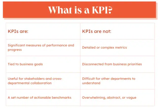
image source: Hubspot
Here are some of the most common KPIs for conversion rate analysis:
- Conversion Rate: The percentage of visitors who complete the desired action.
- Average Order Value (AOV): The average amount spent per transaction.
- Customer Acquisition Cost (CAC): The cost associated with acquiring a new customer.
- Bounce Rate: The percentage of visitors who leave your site after viewing only one page.
Selecting relevant KPIs tailored to your goals will provide meaningful insights into your conversion performance because you can't improve what you can not measure.
Tools and Software Required for Analysis
To effectively analyze conversion rates, it is essential to measure various aspects of your website or app performance accurately. Having the right tools allows you to gather and analyze data efficiently, providing insights that lead to informed decisions. These tools not only facilitate the tracking of user interactions but also help identify areas for improvement. Here are some valuable tools and software options that can enhance your conversion rate analysis process:
- Google Analytics: A comprehensive tool for tracking website traffic, conversions, and user behavior.
- Hotjar or Crazy Egg: Tools that provide heatmaps, mouse tracking, and session recordings to visualize user interactions on your site.
- Hotjar or Qualaroo: These tools are used to gather qualitative data on your website by launching onsite surveys and getting responses directly from your visitors.
- Omniconvert Explore: To implement and test your strategies based on the data you gathered.
Equipping yourself with these tools allows you to gather valuable data and conduct a thorough analysis.
Collecting and Preparing Data
Gathering the right data is essential for conducting a thorough conversion rate analysis. Here’s how to effectively collect and prepare your data for analysis:
Gathering Data for Analysis
To start, collect data from sources that capture user behavior and engagement, like website analytics, CRM systems, and advertising dashboards. Tools such as Google Analytics, Mixpanel, and CRM platforms (e.g., HubSpot) reveal where visitors come from, how they navigate, and where they convert or drop off. This comprehensive data forms the foundation of a meaningful conversion rate analysis.
It's also useful to get some qualitative data by launching an online survey to detect why your visitors are bouncing. This can help you determine which information is missing on your website and which are the main drivers that hold visitors back from converting.
Both quantitative (Google Analytics, CRM platforms, etc) and qualitative data are crucial to conducting a conversion analysis that results in helpful insights.
Cleaning and Organizing Data
Data cleaning is the essential process of identifying and correcting or removing inaccurate, corrupted, duplicated, or incomplete entries within a dataset. This stage becomes especially crucial when integrating multiple sources, as discrepancies or duplicate entries can arise, potentially leading to misleading results. Since each dataset has unique characteristics, the steps for cleaning vary but generally involve standardizing formats and ensuring that all data points are valid and consistent.
Clean and organize the data. Remove duplicates, correct any inconsistencies, and standardize formats to ensure accuracy. Organized data is crucial for trustworthy insights and smooth analysis, so it’s essential to be thorough at this stage.
image source: tableau.com
Here are 5 basic steps that can help you in this part:
- Remove Duplicates: Eliminate any repeated data entries to prevent skewing results.
- Handle Missing Values: Address gaps in data to maintain accuracy.
- Standardize Formats: Ensure all data fields are consistent in format for easier analysis.
- Address Outliers: Check for unusual data points and assess their validity.
- Validate Accuracy: Confirm the data's correctness to support reliable conclusions.
Segmenting Data for More Detailed Analysis
Data segmentation is the process of dividing a large dataset into smaller, more manageable segments based on specific criteria or characteristics.
When you divide the data into smaller relevant groups you have a better understanding of your customers and their behavior, you do better marketing and you can create more sales opportunities.
You can segment the data based on relevant criteria, such as demographics, firmographics, psychographics, traffic sources, or behavior patterns. By analyzing distinct user groups separately, you can identify specific trends or issues within each segment, leading to more targeted optimization strategies and a clearer understanding of what drives conversions for different user types.
Data segmentation is transformative for businesses, no matter their size. By dividing extensive datasets into clear, targeted groups, companies gain sharper insights that drive smarter decisions. This process reveals critical patterns related to operations, products, and customer preferences. Often, segmentation leads to optimized resource allocation and more effective engagement strategies with customers, fueling growth and enhancing overall business efficiency.
Techniques and Common Pitfalls
During a conversion analysis, certain techniques can help you identify trends and patterns that make the data more reliable and accurate. However, it's equally important to watch for common mistakes that can lead to invalid or biased results.
Techniques for Identifying Trends and Patterns
Trends represent consistent directional movements in data over time, while patterns are recurring themes or cycles in user behavior. Recognizing these helps you understand which areas need improvement and which strategies are successful, empowering them to make informed changes.
By identifying trends and patterns, you can also anticipate shifts in user behavior, proactively address potential issues, and better align conversion strategies with customer expectations.
Here are some techniques you can use to identify them:
- Trend Analysis: Examine how conversion rates change over time.
- Cohort Analysis: Compare the behavior of different groups over time to identify specific trends.
- Funnel Analysis: Analyze each step of the conversion process to pinpoint where users drop off.
Common Pitfalls to Avoid During Analysis
It’s easy to make mistakes during analysis, such as misinterpreting data or overlooking important metrics. Being aware of these pitfalls encourages a thorough review of all data, ensuring more reliable insights.
Some of the most common pitfalls people make while conducting this analysis are failing to account for seasonality or external factors that may influence conversion rates, ignoring small sample sizes that can skew results, and not comparing data against relevant benchmarks or industry standards.
With these steps in mind, you’ll be better equipped to conduct a thorough analysis that reveals actionable insights for improving conversion rates.
Interpreting the Results
Once data has been analyzed, interpreting the findings is crucial for understanding how conversion rates reflect the business’s overall health and performance. This step helps pinpoint strengths, weaknesses, and opportunities for growth. A comprehensive interpretation transforms raw data into actionable insights that guide strategic improvements and optimize conversion paths.
How to Read and Understand the Analysis Outcomes
Reading conversion analysis results starts by connecting data points back to business goals and customer behavior. For example, if conversions are lower on mobile, it could indicate that mobile users experience navigation issues or load times that deter purchases. Understanding results also involves noting correlations; for instance, a high bounce rate on specific pages might suggest that the page content doesn’t match customer expectations. The goal here is to view these data points not just as statistics, but as stories that indicate the customer journey’s effectiveness.
Identifying Areas of Strength and Weakness
A conversion rate analysis helps to delineate areas where the business is excelling versus where it might be falling short. High-conversion landing pages or effective email campaigns point to strengths that should be replicated across other areas. Conversely, low-conversion areas reveal potential weaknesses in messaging, user experience, or relevance. For example, if certain segments of traffic (such as first-time visitors) convert at a lower rate than others, it might suggest that initial brand perception or trust needs improvement.
Benchmarking Against Industry Standards
Comparing conversion metrics against industry standards provides a clearer sense of where the business stands competitively. Benchmarks vary by industry, so it’s important to research relevant data to set realistic expectations. For instance, while a 2% conversion rate might be typical for retail, other industries like SaaS or B2B may have different standards. Benchmarking against these helps contextualize performance, showing whether the business is exceeding expectations, on par, or needs improvement.
For effective benchmarking, you can follow these steps to contextualize your conversion rates against industry standards:
- Select What to Benchmark: Define which conversion metrics or processes you’re evaluating (e.g., checkout rates, email sign-ups).
- Identify Competitors/Industry Leaders: Choose relevant businesses for comparison.
- Define Data Collection Methods: Decide on primary data (surveys, CRM data) and secondary data (industry reports, studies).
- Collect Data: Gather conversion data from your sources.
- Analyze: Compare your results against industry figures.
- Identify Gaps: Locate areas where your conversions fall short or exceed benchmarks.
- Set Improvement Goals: Based on findings, establish conversion goals.
- Continuously Monitor: Revisit benchmarks periodically to track progress.
Taking Action Based on Insights
With insights in hand, it’s time to develop strategies to enhance conversion rates.
Developing Strategies to Improve Conversion Rates
After analyzing conversion data, the next step is to develop targeted strategies that address the identified weaknesses. This process begins by brainstorming actionable changes that could enhance user experience and encourage conversions.
Here are some strategies that deliver more impact on conversion rate:
- Simplify the User Experience: Ensure your website or app is easy to navigate, with a clear layout and intuitive interface.
- Enhance Call-to-Actions: Use compelling CTAs that communicate the desired action, making them visually distinct.
- Leverage Social Proof: Incorporate customer testimonials, reviews, and case studies to build trust with potential customers.
- Utilize Urgency and Scarcity: Create a sense of urgency with limited-time offers or low-stock alerts to encourage immediate action.
- Optimize for Mobile: Ensure your site is fully responsive and provides a seamless experience for mobile users.
- Personalize Content: Tailor user experiences based on past behavior, preferences, or demographic information to increase relevance.
A/B Testing for Testing Changes
A common misconception about A/B testing is that it’s simply about putting two variations of an element on your site and seeing which one performs better.
In reality, it goes much deeper. You need to understand what you’re testing, why you’re testing it, and how it will impact your users.
It’s about analyzing data to understand what’s happening on your page and uncovering your users’ motivations, pain points, and barriers preventing them from converting. That's why you need to take this step seriously and use the best tool to conduct each test properly .
You can test different headlines, CTAs, and layouts and measure user engagement for both variations.
You can find some A/B testing examples to inspire your experiments and boost your conversions here.
Implementing Changes and Monitoring Their Impact
Once you developed and tested the strategies, the next step is to implement the changes on a broader scale. This implementation should be carefully planned to minimize disruption and ensure a smooth transition. After changes are made, monitoring their impact becomes critical.
Utilize the analytics tools that I mentioned earlier to track conversion rates and other relevant KPIs closely. This ongoing monitoring not only assesses the effectiveness of the changes but also helps identify any unforeseen issues or opportunities for further optimization. Adapting strategies based on real-time data ensures that the business remains agile and responsive to user needs.
Continuous Improvement and Optimization
Conversion rate analysis is not a one-time process but an ongoing effort.
Setting Up a System for Ongoing Conversion Rate Analysis
To ensure continuous improvement in conversion rates, establishing a systematic approach to ongoing analysis is crucial. This involves setting specific intervals for reviewing your conversion metrics, such as monthly or quarterly assessments. Implementing dashboard tools can help visualize trends over time, making it easier to identify areas needing attention.
For example, a SaaS company might track free trial sign-ups versus conversions to paid plans monthly, allowing them to quickly adapt their onboarding process if sign-ups drop.
Using Feedback Loops to Refine Strategies
Incorporating feedback loops is essential for refining conversion strategies. They involve collecting, analyzing, and utilizing customer feedback to enhance your strategies. They play a critical role in pinpointing customer satisfaction issues, improving retention, fostering innovation, and building loyalty. A positive feedback loop leads to improvements based on customer input, which in turn boosts satisfaction. Conversely, neglecting customer feedback can lead to decreased user engagement.
An effective feedback system includes collecting feedback, analyzing it—either manually or using analytics software—implementing changes based on insights, and communicating those changes back to customers. For instance, a company might analyze customer reviews to identify common issues with a product. After implementing improvements, it's crucial to follow up with customers to inform them of the changes made based on their feedback. This continuous cycle of improvement helps cultivate strong customer relationships and drives long-term business success.
By utilizing feedback loops, organizations can ensure their strategies are not only effective but also aligned with customer needs and expectations.
Keeping Up with Industry Trends and Adapting Accordingly
Staying updated with industry trends is vital for maintaining competitive advantage and optimizing conversion rates. This means regularly consuming industry reports, attending webinars, and participating in forums or communities related to your niche.
Keeping abreast of industry trends is essential for sustaining competitiveness, encouraging innovation, and addressing changing customer needs. It empowers organizations to foresee market changes, embrace new technologies, and make data-driven decisions, ensuring ongoing growth and maintaining their relevance within the industry.
For example, if an e-commerce platform notices a growing trend in social commerce, it may consider integrating social media shopping features into its website to cater to this demand. Adapting to trends ensures that businesses remain relevant and responsive to changing consumer expectations.
To Recap
Conducting a thorough conversion rate analysis is essential for any business aiming to improve its marketing effectiveness. By understanding the factors that impact conversion rates, setting clear objectives, and utilizing the right tools, you can gain valuable insights into user behavior and craft the best strategies to increase your conversions.
Through ongoing analysis and optimization, companies can adapt to changing market dynamics and enhance their strategies for better results. Embrace conversion rate analysis as a strategic approach to foster growth and drive success in your marketing efforts.


If you liked this article, make it shine on your page :)