Above the Fold: Examples, Elements & Best Practices

- Above the fold is the screen a visitor sees before scrolling. It carries the first impression and the heaviest attention on the page.
- Put one headline, one subheadline, a relevant hero visual, one primary CTA, and light trust signals above the fold. Focus beats cramming.
- It still matters in the scroll era: users spend most of their viewing time on the first screen, and it sets whether they scroll at all.
- Above the fold drives both CRO and SEO: it moves bounce rate, dwell time, Core Web Vitals, and conversion, and Google evaluates the mobile fold first.
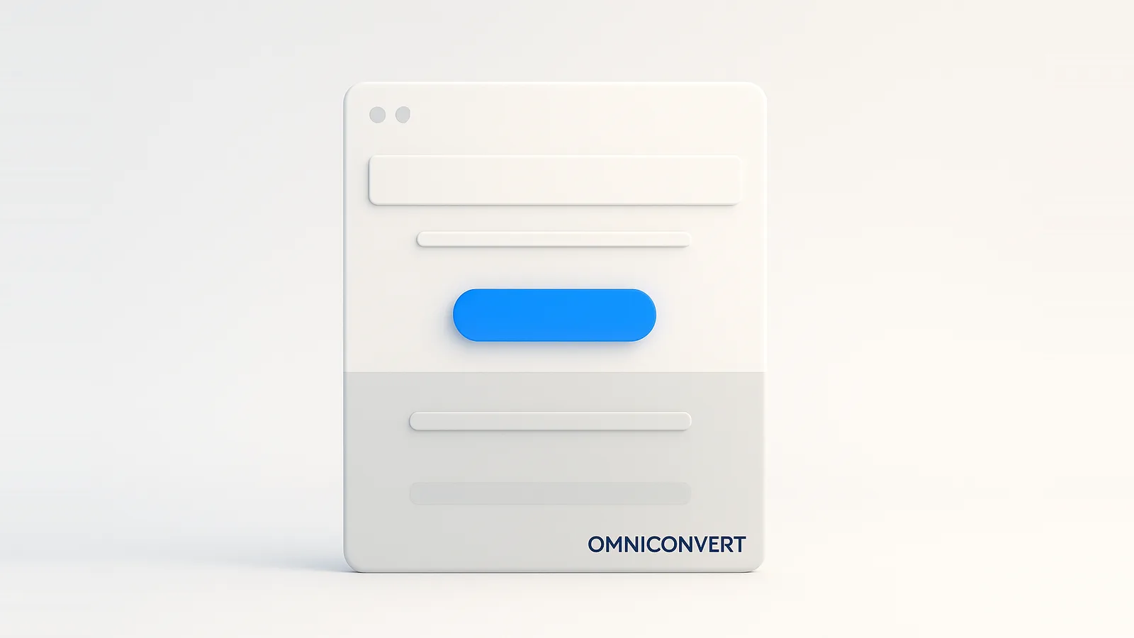
- Optimize it by A/B testing one element at a time. Omniconvert Explore runs the tests and pairs them with heatmaps and surveys.
Above the fold is the part of a webpage visible on screen before any scrolling, the first thing a visitor sees when the page loads. The term comes from newspapers, where the most important stories ran above the physical fold, and in web design it holds the logo, navigation, headline, hero visual, and primary call to action. Omniconvert has tested first-screen layouts across the CROBenchmark dataset of 7,000+ websites in 15+ industries, against 248+ audit criteria, drawing on 13 years in eCommerce conversion rate optimization [CROBenchmark Report 2026, Omniconvert].
Omniconvert Explore is the conversion rate optimization platform that lets you A/B test above-the-fold elements and capture the why behind visitor behavior with heatmaps, scroll-depth tracking, and on-site surveys. This guide covers what above the fold means, how it differs on mobile and desktop, what belongs there, ten examples worth studying, and how it drives both conversion and SEO. Every section answers the question directly, then goes deeper.
What does above the fold mean in web design?
The fold is not a fixed pixel line; it is wherever the bottom of the browser viewport falls, which changes with screen size, resolution, and device. What stays constant is its role: this is the screen that earns or loses the visitor's attention before they invest any effort in scrolling.
Above the fold is the close cousin of the hero section. The hero is the designed block at the top of the page; above the fold is everything visible in that first viewport, hero included. Optimizing one almost always means optimizing the other.
Above the fold on mobile vs desktop
The same page has a very different fold on each device, which is why a layout that works on a desktop monitor can bury the call to action on a phone:
- Viewport: Desktop is wide and short; mobile is narrow and tall, fitting far less content before the fold.
- Scroll behavior: Desktop users dwell on the top before deciding; mobile users scroll sooner and faster, so the first impression has to land instantly.
- Layout: Desktop can show multiple columns and full navigation; mobile needs a single column with the essential action in reach of a thumb.
- Priority: On mobile there is room for one headline, one visual, and one CTA. Everything else waits.
Because most traffic and Google's index are mobile-first, design the mobile fold first and treat the desktop version as the one with room to spare, not the other way around.
Why above the fold matters
Three forces make the first screen disproportionately important:
- First impressions: Visitors judge relevance in seconds. A confusing or slow fold loses them before the page has made its case.
- Attention and engagement: The first screen receives the majority of viewing time, so the value proposition and CTA belong where the eyes already are.
- Reduced interaction cost: When the next step is visible without scrolling, taking it is effortless. Every extra scroll or click is friction that costs conversions.
Key elements to include above the fold
- Headline: States the main benefit in plain, specific language, the one line that answers "what is this and why care."
- Subheadline: Adds context (who it is for, how it works) without repeating the headline.
- Hero visual: A relevant image or short video that shows the product or outcome, not generic stock.
- Primary CTA: One action-driven button with strong contrast, placed where it is impossible to miss.
- Trust signals: Ratings, recognizable logos, or a brief proof point, present but not competing with the CTA.
- Speed and responsiveness: A fast, stable first paint on every device, since a slow fold is an empty one.
10 examples of excellent above-the-fold design
Different industries, one shared discipline. The table maps what each brand does well on the first screen.
| Company | What its above-the-fold nails |
|---|---|
| Apple | Large, high-quality product visual with a clean layout and prominent CTA |
| Airbnb | A simple search bar over engaging destination imagery |
| Linear | Minimal layout, sharp headline, and one clear action button |
| Asana | Bold product visuals with a free-trial CTA |
| Zoom | "Sign Up Free" and "Host a Meeting" actions placed front and center |
| WWF | High-impact wildlife imagery with an urgent donation call |
| Fitbit | Product visuals tied to clear fitness-tracking benefits |
| Gymshark | Featured apparel, promotions, and CTAs given priority |
| Zalando | Seasonal collections led by striking visuals |
| Peloton | Product imagery paired with a subscription offer and clear CTA |
Above the fold, UX, and CRO
The first screen is where most conversion decisions begin. The table below ranks the above-the-fold elements by their typical leverage, so you know what to test first. The impact is relative and based on Omniconvert's CRO work; the exact lift for your page only comes from running the test.
| Above-the-fold element | What to test | Relative impact on conversion |
|---|---|---|
| Headline / value proposition | Specificity, benefit vs feature, clarity in 5 seconds | Very high |
| Primary CTA above the fold | Whether it is visible without scrolling, copy, contrast | Very high |
| Hero visual | Relevant product or outcome vs generic image | High |
| Load speed of the first paint | Image weight, format, layout stability (LCP, CLS) | High |
| Trust signals | Presence and placement near the CTA | Medium to high |
A well-known CRO move is to lift a buried element into the visible area: A/B testing repeatedly shows that making a value proposition or CTA visible without scrolling can improve conversions. The same logic runs the other way, too. What you choose to push below the fold is just as deliberate a decision, since not everything earns a place on the first screen.
See what visitors actually notice above the fold, then test the change that lifts conversion.
Test your above-the-fold design with Omniconvert Explore →Above the fold and SEO
Above the fold is not only a conversion concern; it sends signals search engines act on:
- Engagement signals: A relevant first screen lowers bounce rate and lifts dwell time, both proxies for satisfying intent.
- Page layout algorithm: Google penalizes layouts that push real content below a wall of ads or clutter.
- Core Web Vitals: The hero image usually determines Largest Contentful Paint, and an unstable fold hurts Cumulative Layout Shift.
- Keyword prominence: Primary terms in the headline and opening line strengthen relevance, as long as they read naturally.
How to measure and test above the fold
-
Check performance firstUse PageSpeed Insights to measure Largest Contentful Paint and Cumulative Layout Shift. A slow or shifting fold loses visitors before design matters.
-
Read engagement and attentionHeatmaps, scroll depth, and session recordings show whether visitors see the CTA and where they stall, the behavior behind the engagement metrics.
-
A/B test one element at a timeIsolate the headline, hero, or CTA so you know what moved the number. Omniconvert Explore runs these tests through a visual editor, no engineering required.
-
Ask why with surveysAn on-site survey ("what were you looking for?") explains why a variant won or lost, the context A/B numbers alone cannot give.
The pattern that compounds: measure performance, read behavior, test one change, learn why it worked, then feed that into the next test. Pairing experiment results with conversion rate analysis is what turns the first screen from a design opinion into a proven, higher-converting asset.
Optimizing the fold lifts one page; connecting it to the customer picture compounds across all of them. Omniconvert Explore runs the on-page tests, while Nexus by Omniconvert is the AI eCommerce growth engine that turns the customer and profit data behind those visits into ranked actions, so a stronger first screen feeds a bigger growth loop instead of a single win.
Frequently Asked Questions
Above the fold is the part of a webpage visible on screen before any scrolling, the first thing a visitor sees when the page loads. The term comes from newspapers, where the most important stories sat above the physical fold. In web design it usually holds the logo, navigation, headline, a hero visual, and the primary call to action, the elements that decide whether a visitor stays or leaves.
Above the fold is important because visitors decide within seconds whether a page is relevant, and that judgment happens before they scroll. A clear above-the-fold area lowers bounce rate, frames the rest of the page, and places the value proposition and call to action where attention is highest. Since every visitor sees it, a small improvement there applies to the entire audience, not a segment.
Above the fold you should put a clear headline stating the main benefit, a short supporting subheadline, a relevant hero image or video, one prominent call to action, and light trust signals such as ratings or recognizable logos. Keep it fast-loading and focused on a single message and action. Anything that does not help the visitor understand the offer or take the next step belongs below the fold.
Yes. People scroll more than they used to, but the above-the-fold area still carries the heaviest attention and sets the first impression that decides whether they scroll at all. Research consistently shows users spend the majority of their viewing time on the first screen. The goal is not to cram everything above the fold, but to make the core message and next step visible without scrolling.
Above the fold is the screen a visitor sees before scrolling; below the fold is everything revealed as they scroll down. Above the fold carries the first impression and primary call to action, so it earns the most attention. Below the fold is where supporting detail, proof, and secondary actions live, and it converts the visitors the hero has already persuaded to keep reading.
The fold sits at the bottom of the visible viewport, which differs by device: desktop shows a wider, shorter area with room for navigation and multiple columns, while mobile shows a narrow, taller slice of a single column. Mobile visitors also scroll sooner and faster. Because most traffic is mobile, design the mobile fold first, prioritizing one headline, one visual, and one action.
Omniconvert Explore is the conversion rate optimization platform that lets you A/B test above-the-fold elements without engineering: change the headline, hero visual, or CTA in a visual editor, split traffic, and measure the lift on conversion. Pair the test with heatmaps and scroll-depth data to see what visitors notice above the fold, and on-site surveys to learn why, across 70,000+ experiments.
Above the fold affects SEO through engagement and performance. A clear, relevant first screen lowers bounce rate and raises dwell time, which signal relevance, while Google's page layout algorithm penalizes pages that bury content under ads. Core Web Vitals (especially Largest Contentful Paint and Cumulative Layout Shift) are largely determined by the hero, and mobile-first indexing means the mobile fold is what Google evaluates.
Open your top landing page on a phone, not a desktop, and look only at what shows before you scroll. Can a first-time visitor tell what you offer and what to do next? If the headline is vague, the CTA is below the fold, or the hero image is slow, you have your first three tests. Fix the headline first, since it moves attention the most, and run it as an A/B test rather than shipping it on instinct. The above-the-fold area is the highest-leverage block you own, so it deserves a test, not a guess.

Test your above-the-fold design with Explore
Omniconvert Explore lets you A/B test the headline, hero visual, and CTA above the fold in a visual editor, then capture the why with heatmaps, scroll-depth tracking, and on-site surveys, all in one CRO platform. Stop guessing what belongs on the first screen and measure it. Free A/B testing for up to 50,000 visitors per month, trusted across 70,000+ experiments.