Below the Fold: Meaning, Best Practices and Examples (2026)

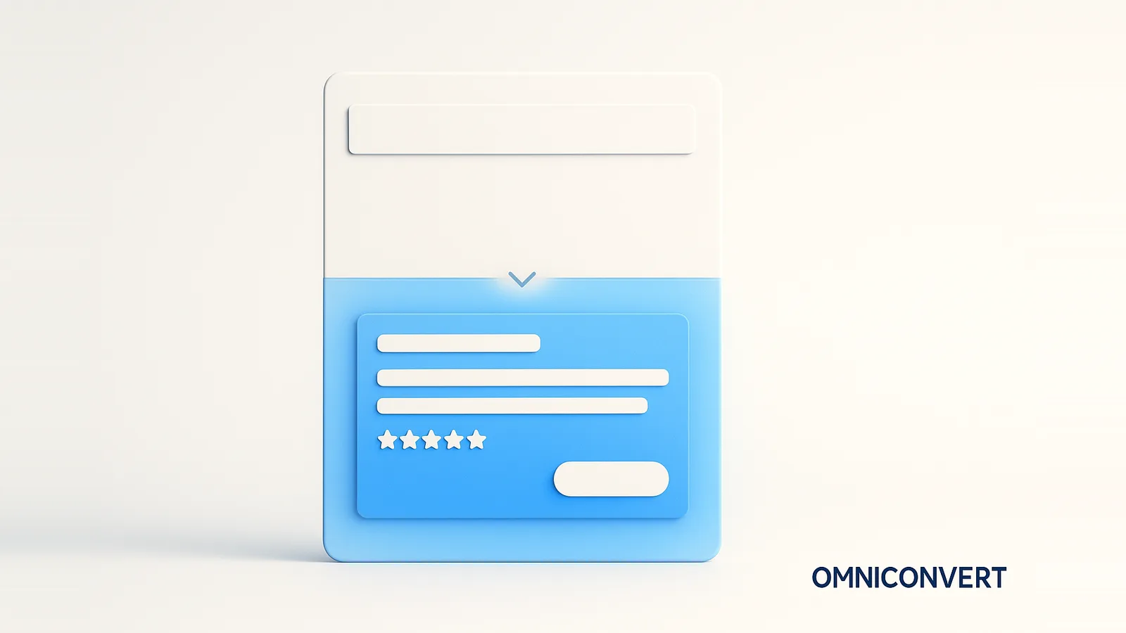
- Below the fold is everything revealed as a visitor scrolls, beneath the bottom edge of the browser viewport. It carries the depth the first screen cannot fit.
- It still matters: people scroll by habit, and a large share of viewing time and most of the persuasion happen below the first screen.
- Put expanded benefits, detailed product information with visuals, social proof, objection handling, and a repeated CTA below the fold, ordered to answer the visitor's questions.
- Encourage scrolling by letting content peek above the fold, avoiding a false bottom, and keeping a strong hierarchy, not by relying on an arrow alone.
- Optimize it by A/B testing content and order one change at a time. Omniconvert Explore runs the tests and reads scroll depth with heatmaps and surveys.
Below the fold is the part of a webpage that is not visible until the visitor scrolls down, everything beneath the bottom edge of the browser viewport. The term comes from newspapers, where the stories below the physical fold stayed hidden until the paper was unfolded, and it moved to web design in the mid-1990s with graphical browsers. Omniconvert has tested how content below the first screen affects conversion across the CROBenchmark dataset of 7,000+ websites in 15+ industries, against 248+ audit criteria, drawing on 13 years in eCommerce conversion rate optimization [CROBenchmark Report 2026, Omniconvert].
Omniconvert Explore is the conversion rate optimization platform that lets you A/B test below-the-fold content and read how visitors behave with heatmaps, scroll-depth tracking, and on-site surveys. This guide covers what below the fold means, why it still matters in the scroll era, what belongs there, the best practices for designing it, real examples worth studying, and how to test it. Every section answers the question directly, then goes deeper.
What does below the fold mean in web design?
The fold is not a fixed pixel line; it is wherever the bottom of the browser viewport falls, which changes with screen size, resolution, and device. Everything under that line is below the fold, and it makes up the majority of most pages, especially on mobile, where a single narrow column pushes far more content out of the first view.
Below the fold is the counterpart to the above-the-fold area. The first screen wins attention and states the promise; the space below it delivers the evidence and the depth that promise needs. Designing one without the other leaves either a hook with nothing behind it or a case no one scrolls to read.
Why does below the fold content still matter?
The old fear that "nobody scrolls" is long gone. Scrolling is a reflex now, and the content below the fold does most of the heavy lifting:
- Attention is not all at the top: The Nielsen Norman Group found roughly 57% of viewing time is spent above the fold, which means close to 43% happens below it, a large share of the page's total attention.
- Persuasion needs room: A hero can state a benefit, but the proof, the detail, and the objection handling that actually convince a visitor need space the first screen cannot spare.
- Engaged visitors go deep: The people who scroll are the ones considering the offer. What they find below the fold decides whether interest becomes action.
- Mobile pushes more down: On a phone, the fold sits high and most of the page is below it, so below-the-fold design is not an afterthought, it is most of the experience.
What should you include below the fold?
Think of the space below the fold as the place to answer the questions the hero raised. The essentials:
- Value-expanding benefits and features: Go beyond the headline promise and explain how the product delivers it, tying each feature back to an outcome the visitor cares about.
- Detailed information with visual proof: Specifications, dimensions, materials, shipping and returns, and use cases, paired with product shots from multiple angles, short demos, or workflow diagrams that show rather than tell.
- Social proof: Reviews and ratings, testimonials with names and photos, user-generated content, case-study snippets, client and partner logos, and media mentions or awards.
- Objection handling: The reasons people hesitate, addressed directly through an FAQ, a guarantee, or reassurance copy near the decision point.
- A repeated call to action: A visitor persuaded halfway down the page should not have to scroll back up to act, so the primary action reappears where the case is made.
The customer intelligence behind these blocks matters as much as the blocks themselves. Nexus by Omniconvert is the AI eCommerce growth engine that turns customer and profit data into the segments and messages that tell you which objections and proof points actually move each audience, so what you place below the fold reflects real buyer behavior, not guesswork.
What are the best practices for below the fold design?
-
Encourage scrolling with visual cuesLet the next section peek above the fold line and use a clear hierarchy so the page signals there is more worth reading. A partial image or heading at the edge pulls the eye down more reliably than a lone arrow.
-
Do not create a false bottomA full-width band, a large block of whitespace, or a self-contained hero section can read as the end of the page, and visitors stop. Keep the layout visually continuous so nothing looks like a stopping point before the content is done.
-
Keep the content hierarchy strongOrder sections by the questions a visitor asks as they scroll, from what it is to why it is credible to what to do next, so each block leads naturally into the one below it.
-
Use transitions and continue the storyCarry a single narrative down the page instead of stacking unrelated blocks. A connecting line of copy at each section break keeps momentum and gives the visitor a reason to keep going.
-
Optimize loading and lazy load imagesLazy load below-the-fold images and media so they load only as the visitor approaches them. This speeds the initial paint, protects Core Web Vitals, and keeps the first screen fast without sacrificing depth below it.
What are examples of effective below the fold design?
Different industries, one shared discipline: the content below the fold builds the case the hero opened. The table maps what each brand does well.
| Company | What its below-the-fold nails |
|---|---|
| Bloomreach | Scroll-triggered animation reveals detail as you go, with customer logos building credibility below the hero |
| Caraway | Expanded product features, eco-credentials, and user-generated photos that prove the promise made up top |
| Airtable | Use-case cards, demo videos, and testimonials that show the product in context for different visitors |
None of these pages front-load everything. They earn each scroll, then reward it with the proof and detail that turn a curious visitor into a convinced one. What you choose to move above the fold versus below it is a deliberate decision, and the reliable way to get it right is to test it.
How do you test and optimize below the fold content?
The content below the fold is where a lot of conversion is won or lost, and it is easy to get the order wrong. The table below maps the below-the-fold blocks worth testing to real Omniconvert Explore experiments, so you know the kind of lift each can move. The exact result for your page only comes from running the test.
| Below-the-fold block | What Explore tested | Result |
|---|---|---|
| Product detail and messaging | Rewrote the product-page messaging below the hero (O'Donnell Moonshine) | +49.61% conversion rate, +6.67% revenue per visitor |
| Use-case content | Added use-case categories to the page below the fold (Nextbase) | +26.16% conversion rate, +23.7% revenue per visitor |
| Objection handling | Surfaced and answered objections with on-site surveys (GetMaineLobster) | +51% conversion rate |
| Reassurance copy | Added reassurance near the decision point (Tripsta) | +25.18% conversion rate, +26.55% revenue |
| Readability and typography | Improved typography of the below-the-fold detail (Pelagic) | +13.05% conversion rate, +10.05% revenue |
Read the behavior first, then test the change. The workflow that compounds:
-
Map scroll depth with heatmapsA scroll-depth heatmap shows how far visitors get and where they abandon the page, the behavior behind the engagement metrics. If most never reach your social proof, that is the problem to fix.
-
Watch what stalls the scrollSession recordings reveal false bottoms and sections where visitors hesitate or bounce, the context a drop-off number alone cannot give.
-
A/B test one change at a timeReorder sections, rewrite the product detail, or move social proof higher, one change per test, so you know what moved the number. Omniconvert Explore runs these tests through a visual editor, no engineering required.
-
Ask why with surveysAn on-site survey ("what almost stopped you from buying?") explains why a variant won or lost, turning a scroll-depth chart into a reason you can act on.
The pattern compounds: read scroll behavior, test one change, learn why it worked, then feed that into the next test. Pairing experiment results with conversion rate analysis is what turns the space below the fold from a design opinion into a proven, higher-converting asset instead of the part of the page everyone forgets.
Below the fold FAQ
Below the fold is the part of a webpage that is not visible until the visitor scrolls down, everything beneath the bottom edge of the browser viewport. The term comes from newspapers, where stories below the physical fold were hidden until the paper was unfolded, and it moved to web design in the mid-1990s. Below the fold is where supporting detail lives: expanded benefits, product information, social proof, and secondary calls to action that persuade the visitors the first screen has already hooked.
Below the fold still matters because people scroll far more than they used to, and the content below the first screen carries most of the persuasion that turns interest into action. The above-the-fold area wins the first few seconds of attention, but the space below it is where you build credibility, answer objections, and reinforce the offer with proof. Treating everything below the fold as unimportant wastes the majority of the page that engaged visitors actually read.
Below the fold you should put the content that deepens and proves the promise made above it: expanded benefits and features, detailed product or service information with supporting visuals, social proof such as reviews, ratings, testimonials, and logos, answers to common objections, and a repeated call to action. The order should follow the visitor's questions as they scroll, moving from what it is, to why it is credible, to what to do next, so each section earns the next scroll.
Yes. Research from the Nielsen Norman Group found that about 57% of viewing time is spent above the fold, which means a large share of attention, closer to 43%, happens below it, and engaged visitors scroll deep when the content signals there is more worth reading. Scrolling is now an ingrained habit, especially on mobile. The real question is not whether people scroll but whether each section gives them a reason to keep going, which is what heatmaps and scroll-depth data reveal.
Above the fold is the screen a visitor sees before scrolling; below the fold is everything revealed as they scroll down. Above the fold carries the first impression, the core value proposition, and the primary call to action, so it earns the heaviest attention. Below the fold carries the supporting detail, proof, and secondary actions that convert the visitors the hero has already persuaded to keep reading. Both work together: the first screen earns the scroll, and the content below it closes the case.
You encourage scrolling by signaling that more content exists and by making the first screen worth continuing past. Let a section peek above the fold line so the page does not look finished, avoid a false bottom where a full-width band or large whitespace reads as the end, keep a strong content hierarchy, and use transitions that carry the story forward. A compelling headline and a clear next question at the fold line pull the visitor down far more reliably than an arrow alone.
Omniconvert Explore is the conversion rate optimization platform that lets you A/B test below-the-fold content without engineering: reorder sections, rewrite product detail, change where social proof appears, or add a second call to action in a visual editor, split traffic, and measure the lift on conversion. Pair the test with heatmaps and scroll-depth tracking to see how far visitors get and where they drop off, and on-site surveys to learn why, across 70,000+ experiments.
Yes. Below-the-fold content holds much of a page's depth and keyword context, which helps search engines understand relevance, and content buried too deep or hidden behind interactions can be discounted. Engagement signals such as scroll depth and dwell time improve when the content below the first screen keeps visitors reading, and lazy loading below-the-fold images protects Core Web Vitals by speeding the initial paint. Mobile-first indexing means Google evaluates the mobile version, where far more content sits below the fold.
Open your top landing page and scroll slowly, watching where you lose interest. That drop-off point is your first test. Then pull up a scroll-depth heatmap: if most visitors never reach your social proof or your second CTA, the problem is not the content, it is the order. Move your strongest proof higher, tighten the section that stalls scrolling, and run it as an A/B test rather than shipping it on instinct. The space below the fold is most of your page, so it deserves the same rigor as the first screen, not a guess.
Test your below-the-fold content with Explore
Omniconvert Explore lets you A/B test what sits below the fold, the section order, the product detail, where social proof appears, and the second CTA, in a visual editor, then read scroll depth with heatmaps and on-site surveys, all in one CRO platform. Stop guessing what engaged visitors read and measure it. Free A/B testing for up to 50,000 visitors per month, trusted across 70,000+ experiments.