24 Product Page Optimization Tactics to Increase Conversions

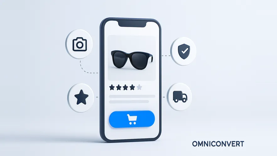
- Product page optimization improves the elements shoppers use to decide whether to buy: visuals, copy, trust signals, pricing, calls to action and the mobile experience.
- High-quality images from multiple angles, plus video where it helps, reduce uncertainty for shoppers who cannot touch the product.
- Unexpected shipping costs are a common reason for cart abandonment, so show free shipping or shipping thresholds on the product page.
- Reviews, security signals, clear policies and live chat reassure hesitant visitors close to the purchase decision.
- Every tactic is a hypothesis for your store: measure the baseline, A/B test one change at a time, and roll out only the winners.
Product page optimization is the ongoing work of improving your eCommerce product pages so that more visitors add products to the cart and buy. The effectiveness of your product pages can make or break your online sales: this is where shoppers look at the product, check the price and shipping, decide whether they trust you, and click (or do not click) "Add to Cart".
This guide gives you 24 product page optimization tactics, grouped by the job they do: visuals, copy, trust, pricing and urgency, UX and mobile, and measurement and testing. Use them to enhance the user experience, build customer trust and increase conversion rates. Then test them, because a tactic that works for one store is only a hypothesis for yours.
This article is the tactics checklist. For the principles and the process behind a high-converting page, read our guide to product details page optimization. For real brand pages to learn from, see our sports apparel product page examples.
What is product page optimization?
A product page has one main job: to help a shopper make a confident decision. Every element either supports that decision or gets in its way. Good optimization removes uncertainty (What exactly am I buying? Will it fit? What will it cost to ship?), removes risk (Is this site safe? Can I return it?) and removes friction (Where is the button? Does this work on my phone?).
The tactics below are not a to-do list to apply all at once. Some will already be in place on your store, and some will not suit your products. Read them as a checklist to audit your pages against, and use the prioritization steps at the end to decide what to test first.
Visuals and first impressions (tactics 1-2)
1. Use high-quality product images
High-quality images let customers see the product clearly and accurately. When you provide detailed images from multiple angles, and videos that demonstrate the product in use, customers gain a complete understanding of what they are purchasing.
This level of detail reduces uncertainty and builds confidence in the quality of the product, so shoppers are more likely to complete the purchase. It also reduces returns caused by products that look different from what customers expected. Invest in professional photography, add zoom, and combine plain-background shots that show details with lifestyle shots that show the product in context.
Best for: every store, and especially products where look, texture or scale drives the decision.
2. Grab visitors' attention quickly
First impressions are crucial, and the main image is often the first thing potential customers notice. A clear, well-lit, professionally shot hero image draws visitors in and encourages them to explore further.
Make sure the first screen, without scrolling, shows the essentials: the main image, the product name, the price and the add-to-cart button. Showing the product in various contexts helps customers visualize how it will look and function in real life. For more on what belongs in that first screen, see our guide to above-the-fold design.
Best for: pages with high bounce rates, and traffic from ads where visitors decide within seconds whether to stay.
Product content and copy (tactics 3-7)
3. Provide detailed product descriptions
Comprehensive product descriptions give customers the information they need to make informed purchasing decisions, which reduces uncertainty and the likelihood of returns. A well-crafted description highlights the key features and benefits, lists specifications such as dimensions, weight, materials and colors, and includes relevant usage instructions.
Lead with benefits, then use bullet points for specs so shoppers can scan. Product videos or demonstrations can support the description by showing the product in action. For copy ideas, see our eCommerce copywriting examples.
4. Clearly state your unique selling proposition
Explain why customers should buy from you and what sets you apart from competitors. Your unique selling proposition (USP) could be superior product quality, exceptional customer service, exclusive product features, competitive pricing or a strong brand reputation.
For instance, if your products are made from high-quality, sustainable materials, make that commitment visible. If you offer a satisfaction guarantee or strong post-purchase support, make sure customers know about it. Awards and industry certifications can add credibility. A clear USP gives shoppers a reason to choose your store and to come back. Our article on creating an effective value proposition shows how to write one.
5. Spell check your copy
Spelling and grammar errors make a site look unprofessional and can make customers question the reliability of your products and services. Error-free copy reflects attention to detail and a commitment to quality.
Proofread all product descriptions and other text on your pages. Use spell checkers and grammar checkers, and have a second team member review the content before it goes live.
6. Provide a size guide
For apparel and accessories, a detailed size guide helps customers choose the right size and reduces returns. Clear size charts with measurements for each size let customers make informed decisions and get a better fit.
Interactive size tools that recommend a size based on the shopper's input, such as height, weight and body measurements, can go further. They personalize the sizing process, give customers confidence in their choice, and reduce returns caused by incorrect sizing.
Best for: fashion, footwear and any category where fit is the main purchase worry.
7. Enable product comparisons
Letting customers compare similar products side by side helps them decide faster. This is particularly useful for shoppers who are undecided between several options, because it gives a clear way to evaluate key features, specifications and prices.
A comparison saves shoppers from navigating back and forth between product pages to weigh the pros and cons of each option. That convenience makes it more likely they will complete a purchase instead of leaving to think it over.
Best for: electronics, appliances and other ranges with several similar models.
Trust and support (tactics 8-10)
8. Allow customer reviews and testimonials
Customer reviews build trust and provide social proof. When potential buyers see reviews and testimonials from other customers, it influences their purchasing decisions.
Reviews offer firsthand insights into the product's quality, performance and overall satisfaction, which can reassure hesitant shoppers. A mix of ratings and detailed feedback, including some critical reviews, makes the page feel transparent and authentic. Encourage customers to leave reviews after delivery, and show the star rating near the product name and the add-to-cart button.
9. Build trust with security measures
Trust signals reassure customers that their personal and payment information is secure, which is crucial in converting hesitant visitors into buyers. Use HTTPS across the whole site with a valid SSL/TLS certificate, so shoppers see a secure connection in the browser.
Show recognized security or trust seals where they are relevant to your market, and display the logos of accepted payment methods, such as Visa, Mastercard, PayPal and other familiar options. Customers are more likely to trust a website that supports their preferred payment methods, and payment providers that offer buyer protection add further reassurance.
Place these signals near the add-to-cart button and in the checkout and payment areas, together with clear links to your shipping and return policies.
10. Implement live chat and chatbots
Live chat and chatbots give customers immediate support during the buying process. Live chat offers personalized, real-time help from a customer service representative, which resolves complex questions quickly. Chatbots handle straightforward, frequently asked questions and give instant answers, even outside business hours.
Together, they make sure customers never feel stranded. Immediate support removes obstacles to purchase, such as questions about product details, shipping policies or return procedures, and reduces the chance of cart abandonment. The chat transcripts are also a useful source of test ideas: the questions shoppers ask show what your page does not answer.
Pricing, shipping and urgency (tactics 11-15)
11. Offer free shipping
Free shipping has become a standard expectation among online shoppers. Customers often abandon their carts when they discover unexpected shipping costs at checkout. If free shipping on all orders is not feasible for your business, consider including the shipping cost in the product price.
You can also offer free shipping on orders above a certain amount, which encourages customers to add more items to qualify. Whichever model you choose, show it clearly on the product page, near the price, so there is no surprise later. Test the threshold, because it affects both conversion rate and average order value.
12. Be competitively priced
Competitive prices attract and retain price-sensitive shoppers. Review your prices regularly against market trends and competitors so you stay relevant.
Competitive pricing does not always mean the lowest price. Clear communication of value, professional visuals and persuasive copy can justify a higher price when shoppers understand why the product is worth it. For advanced approaches, see our guide to dynamic pricing in eCommerce.
13. Provide limited-time coupon codes
Time-sensitive coupons or discount codes introduce a sense of urgency that encourages customers to act. The fear of missing out on a good deal reduces the time shoppers spend thinking about a purchase.
State the expiration date clearly on the product page and in your promotional materials, and show what the shopper saves. Regularly updated offers keep your pages dynamic and give customers a reason to come back. Use real deadlines only: offers that never expire teach shoppers to ignore them.
14. Show real-time stock levels
Showing how many items are left creates urgency, because customers want to buy before the product runs out. It also builds trust: shoppers feel informed about availability, and they are not disappointed by a product that becomes unavailable after they add it to the cart.
Place stock information near the price or the "Add to Cart" button. Highlight low stock with visual cues, such as bold text or a color change, and messages like "Only a few left". Show accurate numbers only; fake scarcity damages trust when shoppers notice it.
15. Highlight limited-time offers and bestsellers
Featuring time-limited deals and bestsellers on product pages captures attention and influences purchasing decisions. A time-limited deal gives a reason to act now. A bestseller label adds social proof: it tells customers they are making a popular, well-regarded choice.
Show bestseller badges on products that really are top sellers, and recommend popular items in related categories to guide undecided shoppers.
UX, CTAs and mobile (tactics 16-20)
16. Highlight "Add to Cart" and "Checkout" buttons
Your "Add to Cart" and "Checkout" buttons should stand out visually, with a contrasting color, clear text and a position that catches the eye. Use direct language, such as "Add to Cart" or "Buy Now", and make the buttons large enough to tap easily on mobile devices.
Confirm immediately when an item is added to the cart. Clear, visible calls to action guide customers through the purchase process and reduce friction. For button elements worth testing, see 3 elements to test on your eCommerce product page.
17. Use calls to action sparingly
Too many calls to action (CTAs) on one page confuse and overwhelm customers and distract from the main goal. Direct users toward a single, clear action at each stage of the shopping journey.
On product pages, make "Add to Cart" the main CTA. Once items are in the cart, make "Proceed to Checkout" the next logical step. Secondary actions, such as "Add to wishlist", should look clearly secondary. This focus reduces decision fatigue and keeps customers on a straightforward path to purchase.
18. Always show shopping cart contents
A visible shopping cart icon, usually in the upper right corner of the page, lets customers keep track of their intended purchases while they browse. Show the number of items on the icon and update it in real time as customers add or remove products.
One click on the icon should open a summary of the selected items, with product images, quantities and prices, options to edit or remove items, and the total cost including taxes and shipping. A mini-cart dropdown lets shoppers check their cart without leaving the current page, so their browsing is not interrupted.
19. Optimize for mobile devices
Many shoppers browse and buy on their phones, so a strong mobile experience is essential. A mobile-friendly product page uses a responsive layout, loads fast and has touch controls that are easy to use.
Check that images, buttons and text are sized correctly on small screens, that size and color selectors are easy to tap, and that the checkout process is short on mobile. Test on real devices, not only in a desktop browser. Our guide to CRO for mobile covers this in detail.
20. Streamline product navigation
A well-structured site helps customers find products quickly. Group similar products into intuitive categories and subcategories. For example, a clothing store can categorize items by type (shirts, pants, dresses) and then let shoppers filter by size, color and material.
Features such as "Shop by Color" or "Shop by Product Type" help shoppers narrow their choices, which is especially useful for stores with large ranges. A strong site search with autocomplete suggestions and filters helps customers who already know what they want. Breadcrumbs and related-product links on the product page let shoppers move sideways without starting over.
Measure, test and personalize (tactics 21-24)
21. Measure CRO success
Regularly track your conversion rates to see whether your product page changes work. Use an analytics tool such as Google Analytics to measure key performance indicators (KPIs) such as conversion rate, add-to-cart rate, bounce rate, average session duration and cart abandonment rate.
Set up conversion tracking so you have precise data on customer actions, and analyze trends over time. When you implement a new design element or promotion, compare its effect on conversion. This data tells you which tactics to keep, change or discard. See our overview of CRO metrics for what to track.
22. Always be testing
A/B testing compares two or more versions of a page element to find out which one performs better. It is how you turn the tactics in this article into proven improvements for your own store.
Select key elements of your product pages to test, such as headlines, product images, call-to-action buttons, descriptions, layout and trust signals. Change one element at a time to isolate its effect. For example, test different sizes and colors of the "Add to Cart" button to find the version that leads to more conversions. Monitor conversion rate and related metrics for each variant, run the test until it reaches statistical significance, and implement the winner as the new standard. For inspiration, see our A/B testing case studies.
23. Personalize the user experience
Personalization tailors content and offers to the preferences and behavior of different customers. Start by collecting data on how customers interact with your website: browsing history, past purchases, search queries and location. Use it to segment your audience into groups based on interests, buying habits and other relevant criteria.
Then deliver content and offers that fit each group. A customer who often browses one category can see recommendations or offers for that category. Returning visitors can see banners and messages that reflect their previous visits. On-site personalization with a tool such as Omniconvert Explore lets you test these experiences by segment. If you also want to act on customer value, Nexus by Omniconvert builds RFM segments from your order data and pushes them to Meta Ads, Google Ads and Klaviyo.
24. Implement browse abandonment campaigns
Browse abandonment emails remind customers who viewed a product but did not buy. Email platforms such as Klaviyo can send these emails automatically, with the items the customer viewed.
Personalized subject lines and content that references the specific products the customer browsed make these emails more engaging. You can add an incentive, such as a discount or free shipping, but test whether it is needed, because frequent discounts can train customers to wait. Browse abandonment campaigns recover potentially lost sales and give you another touchpoint to address lingering hesitations.
What does the product page optimization checklist look like at a glance?
| Group | Tactics | Shopper question it answers | How to read the result |
|---|---|---|---|
| Visuals and first impressions | 1-2: images, first screen | "What does it really look like?" | Bounce rate, image engagement, add-to-cart rate |
| Product content and copy | 3-7: descriptions, USP, spell check, size guide, comparisons | "Is this the right product for me?" | Add-to-cart rate, return rate, product questions to support |
| Trust and support | 8-10: reviews, security, live chat | "Is it good, and is it safe to buy here?" | Conversion rate, checkout abandonment, chat questions |
| Pricing, shipping and urgency | 11-15: free shipping, price, coupons, stock, bestsellers | "What will it cost, and why buy now?" | Cart abandonment, average order value, time to purchase |
| UX, CTAs and mobile | 16-20: buttons, CTA focus, cart, mobile, navigation | "How do I buy it, on this device?" | Add-to-cart rate by device, CTA click rate, search use |
| Measure, test and personalize | 21-24: KPIs, A/B tests, personalization, browse abandonment | "Is this still relevant to me?" (and for you: "Did it work?") | Test uplift at statistical significance, recovered revenue |
How do you prioritize and test these tactics?
-
Audit your pages against the checklistGo through a few top-selling product pages on desktop and mobile, and mark which of the 24 tactics are missing or weak.
-
Find the pages that lose shoppersIn your analytics, look for product pages with high traffic and a low add-to-cart rate, or a high cart abandonment rate. These give the most value from a test.
-
Ask shoppers what stops themRun a short on-site survey on those pages, and read reviews and chat transcripts. Common answers are shipping cost, fit or sizing doubts, missing details and trust concerns.
-
Write a hypothesis and A/B test one changeMatch the most common objection to a tactic from the table above, for example "Showing free shipping next to the price will increase add-to-cart rate". Test it against the original until the result is statistically significant.
-
Roll out the winner and repeatApply the winning version, record what you learned, and move to the next objection. To build the skills behind this process, explore the CVO Academy.
Frequently Asked Questions
Product page optimization is the ongoing work of improving an eCommerce product page so that more visitors add the product to the cart and buy. It covers the images, the copy, trust signals, pricing and shipping information, the calls to action, the mobile experience and the measurement and A/B testing that confirm which changes work.
Customer feedback shows you where your product pages fall short. Reviews, on-site surveys and support questions point to missing details, unclear images or checkout friction. Use that feedback to write test hypotheses, then A/B test the changes before you roll them out.
Show customer reviews, star ratings and testimonials close to the add-to-cart button. User-generated content, such as photos of customers using the product, adds credibility. Bestseller labels, the number of products sold and endorsements from recognized experts can also build trust, as long as they are true.
Slow product pages frustrate shoppers and increase bounce rates, which costs conversions. Compress and correctly size images, remove scripts you do not need, and use a content delivery network (CDN) so pages load quickly, especially on mobile connections.
Use a web analytics tool such as Google Analytics to monitor conversion rate, add-to-cart rate, bounce rate, average session duration and cart abandonment for your product pages. Compare the numbers before and after each change, and use A/B tests to prove that a change caused the result.
Start with the pages that get the most traffic and have a low add-to-cart rate, and with the elements closest to the purchase decision: images, the add-to-cart button, price and shipping information, and trust signals. Ask shoppers what stops them from buying, and test the tactic that answers their most common objection.
Urgency can speed up decisions when it is real. Show true stock levels and real deadlines for offers. Fake scarcity or countdowns that reset damage trust once shoppers notice, and misleading urgency claims can also create legal risk. Test urgency messages like any other change.
Conversion rate optimization (CRO) covers the whole site and funnel, from landing pages to checkout. Product page optimization is the part of CRO that focuses on product pages, where shoppers make the decision to add an item to the cart. It uses the same method: research, hypotheses, A/B tests and roll-out of the winners.
Optimizing your product pages is crucial for eCommerce success. Strong visuals, clear copy, visible trust signals, transparent pricing and shipping, and an easy path to purchase on every device all help visitors decide to buy. Use the 24 tactics as a checklist, measure where your pages lose shoppers, and A/B test the changes so you keep only what works for your customers.
Turn this checklist into tests
Omniconvert Explore lets you A/B test images, copy, trust signals, pricing displays and CTAs on your product pages, personalize them by segment, and ask shoppers what stops them from buying.