9 Ad Moves Are Leading eCommerce Ads in September 2026 (and the One Thing to Steal From Each)

Scope: every industry and country the eCommerceBenchmark Ad Library tracks. 2,573 brands, 68,341 ads active in September 2026, compared with August 2026. No split by industry or country.
Most ad reports tell you what's popular. Then they leave you standing there.
This one tells you what to do about it.
For each of September's top three hooks, top three angles and top three concepts, you get the same five things: what it is, why it matters to you, what moved since August, which real brands ran it, and one thing to steal. Nine moves, nine things to steal. Then the small rows that actually grew, and one ad to brief this week.
- A brief decides three things, not one. Hook, angle and concept. If you only choose one, the person making the ad chooses the other two for you.
- The market's defaults are easy to spot. The most common choice in each group is the one every shopper has already seen. That's where your ad risks blending in.
- Each default has a shelf life. Some last for months, some for a couple of weeks. That tells you where to spend creative time.
But first, three words that most briefs mix up.
Hook, angle, concept: three different jobs
Mixing these up is the most common reason an ad brief goes wrong. A brief that asks for “a stronger hook” and stops there has decided one thing and left two to chance. The person who shoots it fills in the gaps for you.
| Word | In one line | Plain example |
|---|---|---|
| Hook | The first move an ad makes to stop a scroll: its first line or first seconds. | “Last day!!” |
| Angle | The reason the ad gives a shopper to buy. | “This is for people like you.” |
| Concept | The shape of the creative: how it is filmed, laid out or staged. | A tight close-up of the product in use. |
The plain examples are made up to show the idea.
How to read a rise or a fall
Every item below shows its share of September's ads, how it compared with August, and how many brands ran it.
- Rising. A bigger share of ads uses it. Brands may be copying each other, or testing a gap. Either way, it's getting more crowded.
- Falling. A smaller share uses it. That doesn't mean it failed. Nothing here records a brand stopping an ad.
- Flat. Its share held. Treat it as a stable baseline.
- Small. A move under half a point is small. Check the brand count: a rise carried by few brands can be a handful of advertisers launching many ads.
One more rule. A bigger share doesn't mean a row works better. The library has no sales, spend or profit data, so it shows what brands ran, not what earned. Each item also shows how many of its ads in a sample of long-running ads were still live after 60 days. That sample is ranked by time on air, so the numbers read high. Read them as a staying-power hint.
Ready? Start with how ads open.
The top 3 hooks: how ads open
Together, these three open about 4 in 10 of September's ads. Here is how crowded each is, and how long its ads stayed live.
Share of September 2026 ads by hook. Source: eCommerceBenchmark Ad Library, 2026.
Share of each hook's ads that ran 60+ days, in a sample of long-running ads. Reads high: a staying-power hint, not a result. Source: eCommerceBenchmark Ad Library, 2026.
1. Curiosity Gap: it keeps the payoff for the next line
What it is. An opening that names something worth knowing and holds the payoff back. signaturepopcorn.com starts on “ASMR sound on” and leaves the promise to its headline, “Flavor Obsession Awaits”.
Why it matters to you. It is the most crowded opening in the market by a wide margin, so a shopper in any category has already met the shape. Writing here is safe and busy at once: you're up against the most practised version of the same move. Its ads lasted long in the sample, second only to Authority.
What moved. Nothing. 28.1% in September, 28.5% in August. Under half a point is noise, so treat the top of the hook ranking as unchanged and watch it again next month.
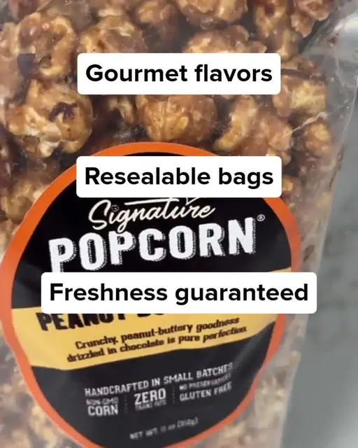
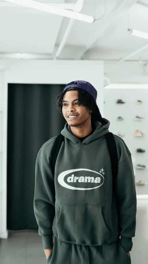
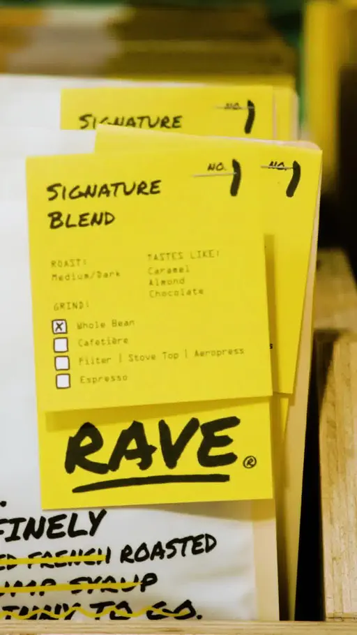
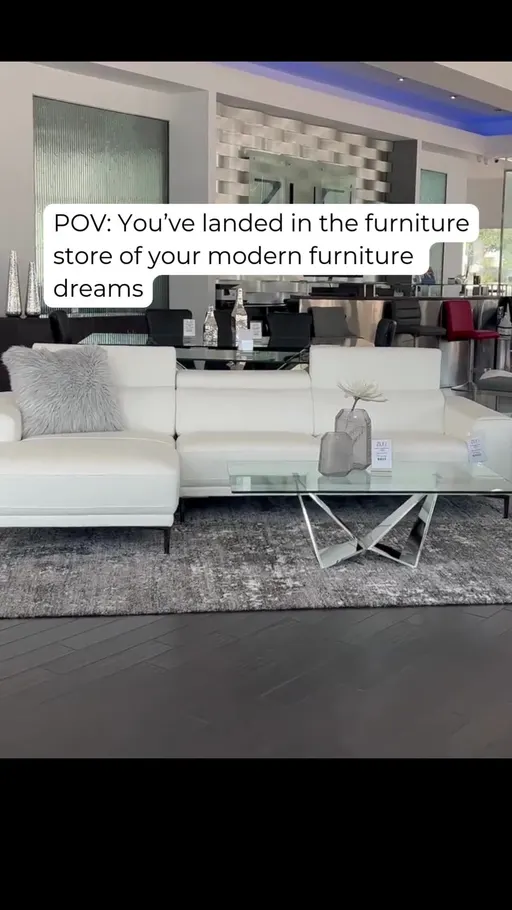
Four ads, four ways to hold something back. signaturepopcorn.com says only “ASMR sound on”. kickgame.co.uk asks a half-question. zurifurniture.com writes a shopper's moment. And ravecoffee.co.uk goes flat and plain: “No jargon, no BS, just great coffee, made simple.” That last one has been live for over 1,000 days. It's the one to copy if your category is noisy, because it promises nothing a shopper has to decode.
That's the crowded one. Now the one that runs on a clock.
2. Urgency / FOMO: it tells the shopper the chance runs out
What it is. An opening that says the chance to buy is closing. theessencevault.co.uk warns “WARNING: SCENT PRICES HIKE INCOMING”.
Why it matters to you. Lots of brands use it, but the ads are short-lived. Expect to rewrite the line often, like milk, not canned beans.
What moved. Flat. 7.9% in September and 7.9% in August. A share that holds twice is the most useful kind of baseline, because any change in your own account is yours and not the market's.
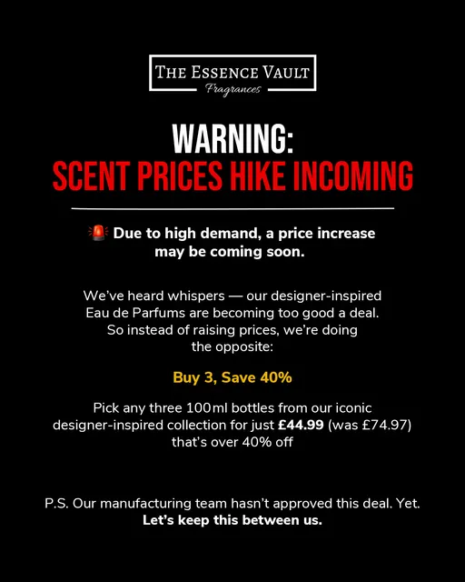

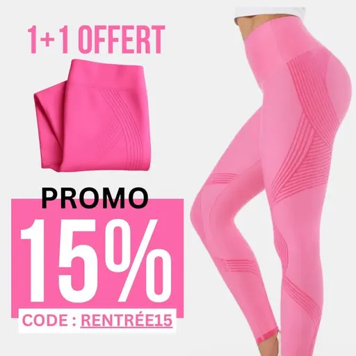
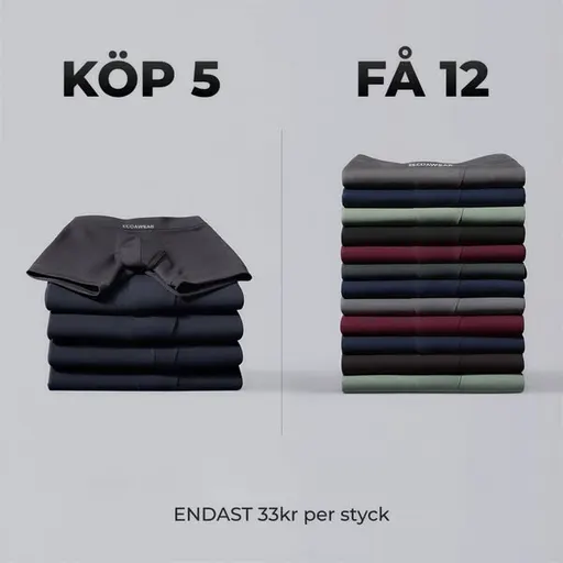
Four advertisers, four ways of saying the same thing. theessencevault.co.uk warns about a price rise. tineco.com says “Ultimo giorno!!”, Italian for last day. luveon.com uses the deal itself: “1+1 offert”, one free with one bought. ecoawear.dk pushes the season. theessencevault.co.uk is the one worth copying, because it gives the shopper a reason the window is closing instead of just saying so.
Last of the three: the hook that leans on other people's words.
3. Authority: it leads with who says so
What it is. An opening that leads with standing: a review count or a stockist. purebulk.com does it with “46,000+ 5-Star Reviews. Find Out Why.” That is the brand's own claim about itself.
Why it matters to you. It is the least crowded of the three leading hooks, and its ads stayed up longest in the sample. If you have a number or a stockist to name, start here.
What moved. Steady. 6.4% against 6.7% in August. Our reading: the pool of brands with a number to quote doesn't change much month to month. The data records the share, not the reason.
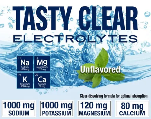

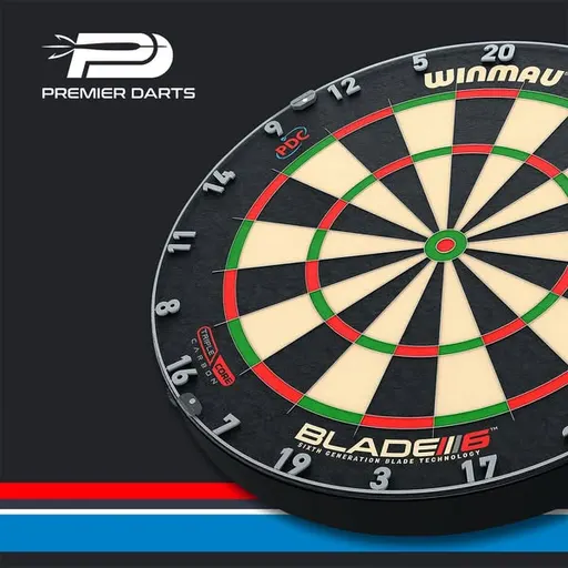
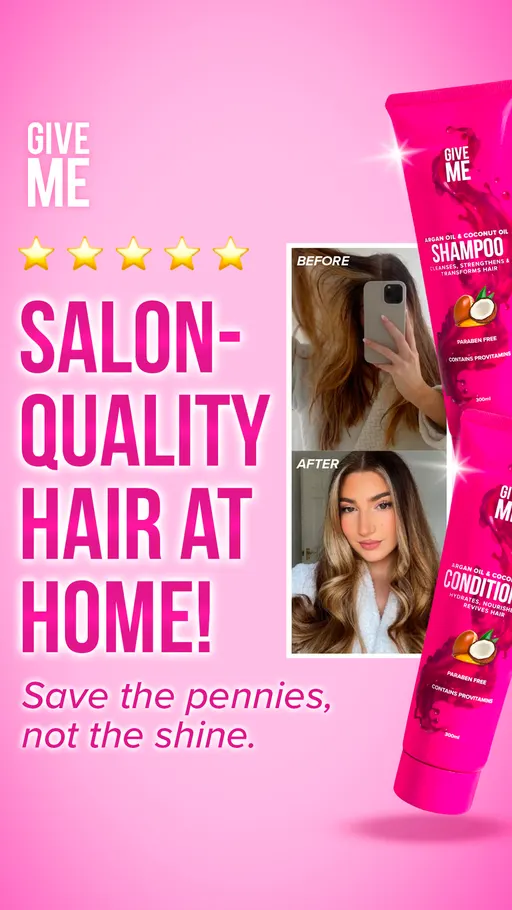
purebulk.com puts the count first. morjas.com borrows a shop: “Now available at Nordstrom”. premierdarts.co.uk points at the brands it carries. givemecosmetics.com puts the standard in the middle of the sentence. What purebulk.com does is simple: the proof comes first and the invitation second.
That's how ads open. But why would anyone buy? That's the angle, and it has its own top three.
The top 3 angles: why the shopper should buy
Together these three carry nearly half of September's ads. Identity is the giant.
Share of September 2026 ads by angle. Source: eCommerceBenchmark Ad Library, 2026.
Share of each angle's ads that ran 60+ days, in a sample of long-running ads. Source: eCommerceBenchmark Ad Library, 2026.
4. Identity: it tells the shopper this is for people like them
What it is. An argument that the product suits who the shopper already is. houseofisabella.com says it outright: “Your home should reflect your own personal style.”
Why it matters to you. About 1 in 4 ads makes this argument. A shopper in any category has heard it before.
What moved. It nudged up, from 25.4% to 25.7%. It's the one leader that also shows in the movers chart later. Our reading: so many brands already write here that small additions show up in the share. The data can't say more.
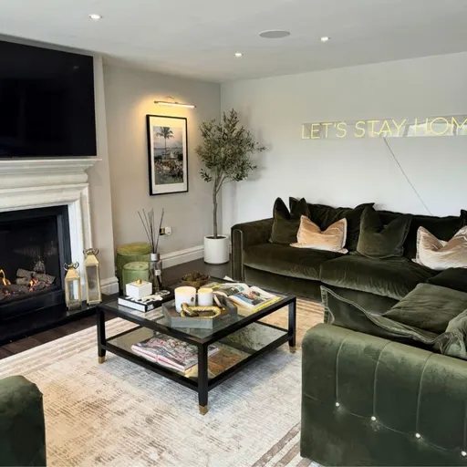
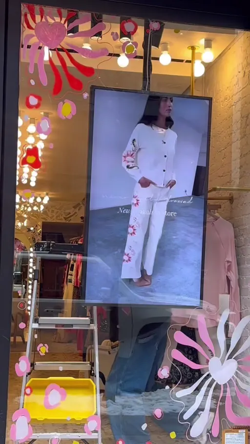
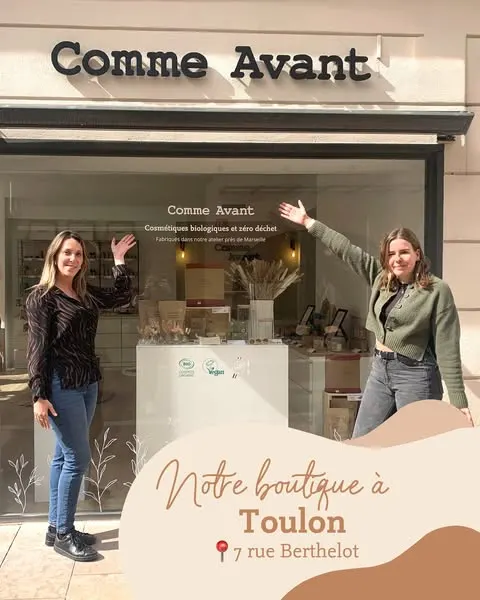
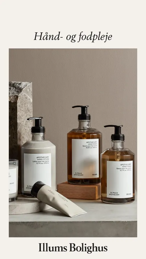
Four registers of the same idea. houseofisabella.com makes it a principle. neverfullydressed.com makes it a specification: “INCLUSIVE SIZING US 2-24”. comme-avant.bio names a place, its shop in Toulon. illumsbolighus.dk keeps it to a care instruction. The useful one to copy is neverfullydressed.com, because a size range is a fact a shopper can check, not a feeling.
Identity talks about the shopper. The next angle talks about the shopper's headache.
5. Problem-aware: it names the thing already annoying the shopper
What it is. An argument that opens on a problem the shopper already has. nomatic.com does it with “Take water through TSA?? 😲🧊”.
Why it matters to you. Fewer brands write here than in Identity, and the ads in the sample stayed up longer. A well-named problem is the better place to start, if you have one.
What moved. Flat, at 11.9% in both months. The problem lane is neither opening up nor closing, so your competition in it is the same size as last month.
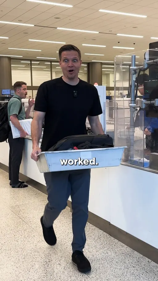
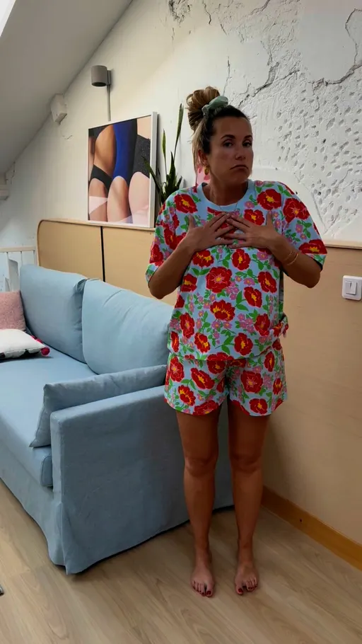

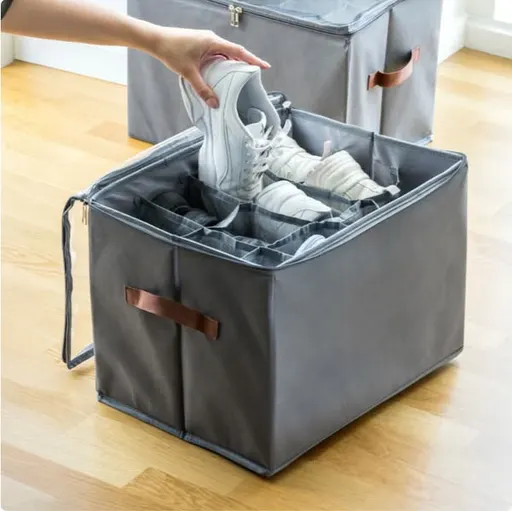
nomatic.com asks one question and stops. wearejolies.com does the same in French, asking if its pyjamas are comfortable when pregnant. ambientlounge.eu names the strain of a big dog, in Japanese. viamaja.dk names the mess and the price in one breath: shoe storage boxes, two for only 99 kr. nomatic.com shows the move to copy: one question, no setup.
And the third angle? It answers the voice in your head that says “but is it worth it?”
6. Objection crusher: it answers the doubt before the shopper raises it
What it is. An argument that answers the doubt that stops the sale, most often price. decoratingcentreonline.co.uk puts it as “PAINT COLOURS FOR LESS...”.
Why it matters to you. Plenty of brands write in this lane, and their ads turned over faster in the sample, so plan on more than one version of the line.
What moved. Flat, at 9.4% in both months. Use it as a baseline to compare your own count against.
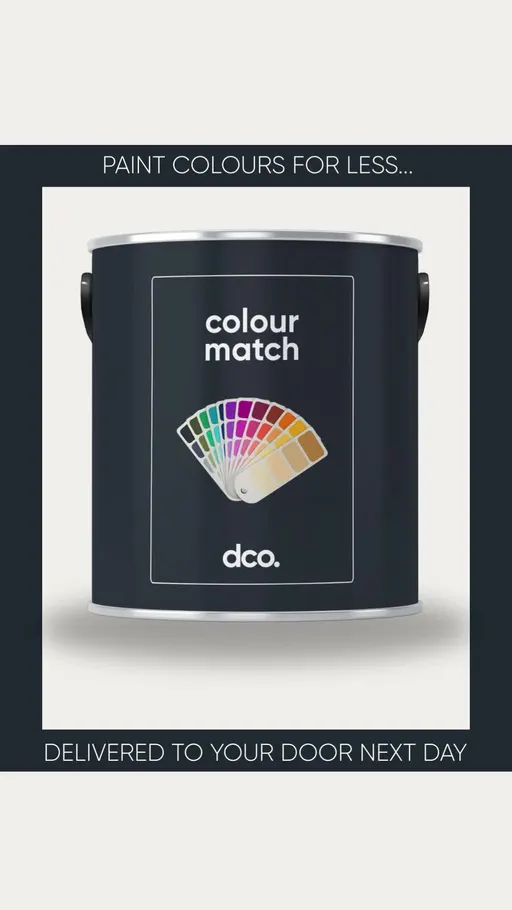
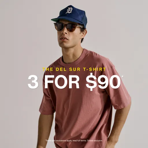
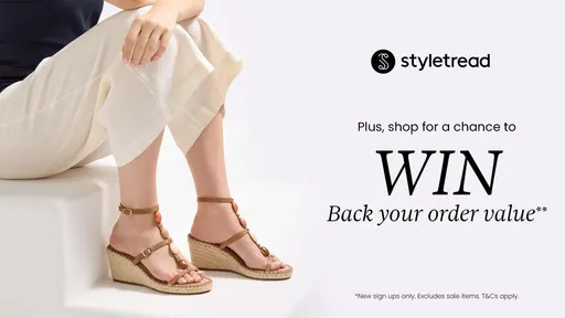
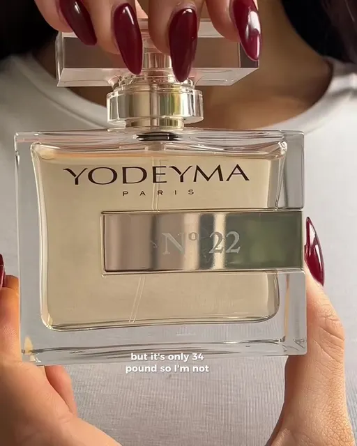
Three of these four put a number in the shopper's way. industrie.com.au prices the doubt out: “3 For $90”. styletread.com.au trades an email for a discount. decoratingcentreonline.co.uk names the saving and lets its headline say what you get. yodeyma.com takes the other road and opens on a story, with the price argument in its headline. The move to copy is decoratingcentreonline.co.uk's: price first, product second.
Hook and angle done. Now the look of the thing.
The top 3 concepts: how the ad looks
A concept is the shape of the creative. Together the three leading concepts shape about 15% of ads. Fewer ads carry a concept than a hook or angle, so these shares look small. Compare concepts only with each other, never with a hook or angle share.
Share of September 2026 ads by concept. Source: eCommerceBenchmark Ad Library, 2026.
Share of each concept's ads that ran 60+ days, in a sample of long-running ads. Source: eCommerceBenchmark Ad Library, 2026.
7. Product Demo Close-Up: it stays on the thing doing its job
What it is. A creative shape that stays tight on the product in use. staresso.com frames the promise in words: “Enjoy Barista's Brew Anywhere, Anytime”.
Why it matters to you. Of the three shapes here, it's the busiest and the one whose ads last longest in the sample.
What moved. Flat, at 9.1% in both months. The biggest concept in the market didn't budge, which makes it the obvious control to run a new shape against.
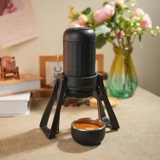
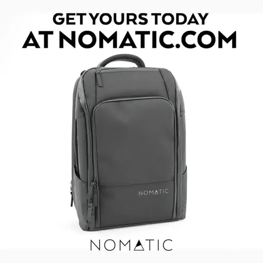
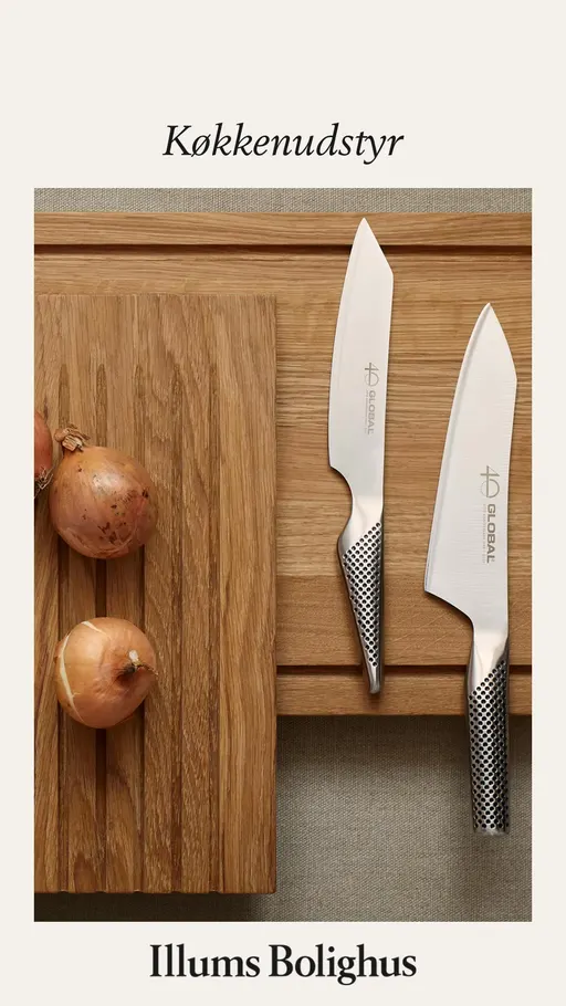
staresso.com promises one use anywhere. nomatic.com makes its own claim in capitals. zurifurniture.com writes a shopper's moment. illumsbolighus.dk says two words and stops: “Get cooking”. staresso.com and illumsbolighus.dk show the same discipline: the line describes one use, not the whole range.
8. Cinematic B-roll: it stages the product as a scene
What it is. A creative shape staged as a scene around the product, not a plain demo. voyagemaison.com frames it as “Spotlight On Cushions & Throws”.
Why it matters to you. Fewer brands write here, and the sampled ads turned over faster. It's a shape to test, not a shape to settle into.
What moved. A small rise, from 4.6% to 4.9%. It's one of the leaders in the movers chart, but the move is under half a point, so watch it again next month.




voyagemaison.com and plumplay.co.uk both name the product in the line, and plumplay.co.uk adds one promise. peakdesign.com talks straight to the shopper: “Hey you. You uh... you looking for that iPhone 17 case?” florislondon.com writes a slogan. plumplay.co.uk is the template to lift: product name, colon, one promise.
9. Offer-first banner: it puts the deal in the first words
What it is. A creative shape built around the deal in the first words. gymbeam.cz does it with “LIMITED OFFER”.
Why it matters to you. It is the smallest of the three, so it has the most room if your offer is worth leading on.
What moved. A small rise, from 0.9% to 1.1%. Both shares are tiny, and the row shows in the movers chart.
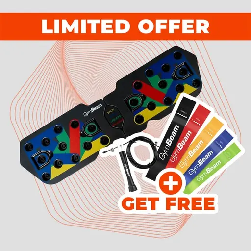
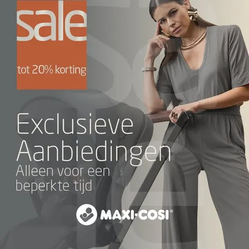
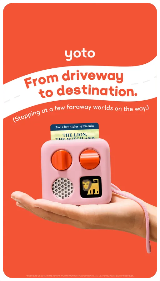

gymbeam.cz leads on the words, not the goods. maxi-cosi.co.uk names the sale and the discount, in Dutch. pccomponentes.com keeps the week in it. yotoplay.com argues value without a figure. gymbeam.cz shows the move: two words, then the headline does the detail.
Nine moves down. Now the twist: none of the leaders moved. So where did the action go?
What actually moved: the small stuff
None of the nine leaders moved by more than half a point. Eight rows rose by a fifth of a point or more. Here they are. The brand count tells you how many advertisers sit behind each one.
Rows that rose by 0.2 of a point or more, September vs August 2026, in percentage points. Source: eCommerceBenchmark Ad Library, 2026.
Four of the nine leaders held the exact share they had in August, two eased, and three rose enough to show here. Most of the other movers are small rows that few brands write for. The reason to care isn't any single row. It's that several rose in the same month. Let's look at four of them in real ads. (Solution-aware rose too, but we have no ad to show for it.)
Bold Claim: one big promise, said flat
What it is. An opening that makes one broad promise with nothing attached to check. ninjakitchen.co.nz does it with “One machine for every coffee craving”.
Why people respond. A short, whole promise is easy to hold in your head. No number to compare, no condition to read, so a person can take it in while scrolling. That is our reading of the attention, not a claim about sales.
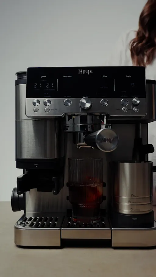
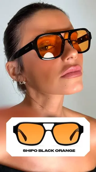
Many ads from few advertisers: a handful of brands carry this row. staresso.com and mellerbrand.com show the same flat build as ninjakitchen.co.nz: one claim, no qualifier, no figure.
Newness: it says this one just landed
What it is. An opening that says the thing has only just arrived. brompton.com puts it as “All-new Brompton Electric”.
Why people respond. New things get a second look because there's nothing to compare them to yet. It's the same reason a “just in” tag gets picked up in a supermarket. That is our reading of the attention, not a claim about sales.
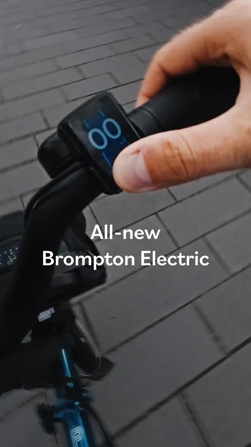
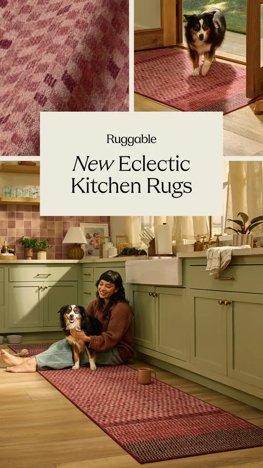
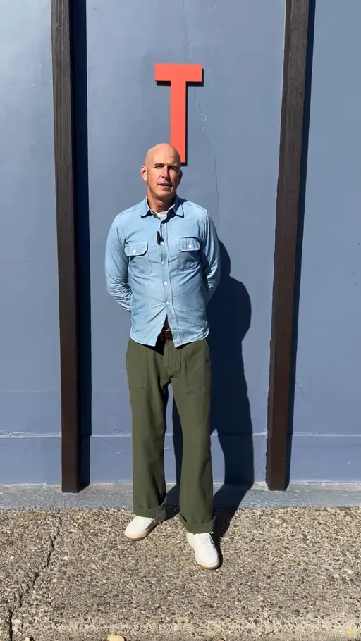
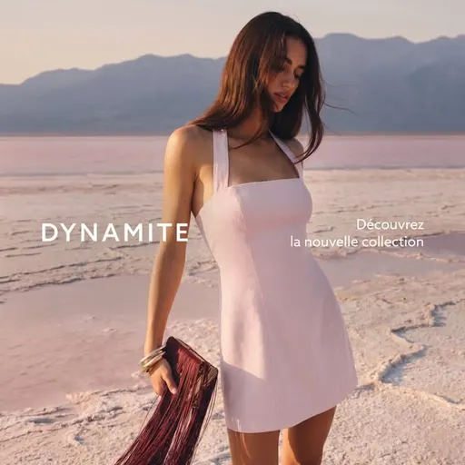
ruggable.com states it as a product name. tellason.com says it like a person would. dynamiteclothing.com keeps it to three words: “our latest collection”.
Montage: several short looks in one ad
What it is. A creative shape that strings several short pieces together instead of staying with one. homebodii.com labels it “Bridal Looks to Love 🤍”.
Why people respond. Several short looks answer several small doubts in a row, without making the shopper wait for any of them. It's like flicking through a rail in a shop. That is our reading of the attention, not a claim about sales.
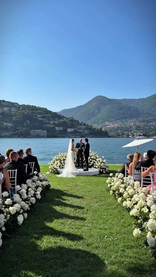
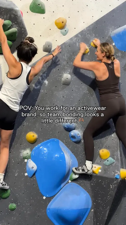
nimbleactivewear.com frames the run as a day at work. yeti.com says two words, “Commit to fit.” feelreformed.com opens on a question and then answers it.
Price Anchor: the number does the opening
What it is. An opening that leads with the amount. prolonlife.com does it with “Buy 2 5-Day Kits & Get $160 Free”.
Why people respond. A figure is the one thing in an ad a shopper doesn't have to interpret. It gives them something to measure against the last price they saw. That is our reading of the attention, not a claim about sales.
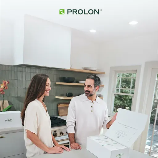
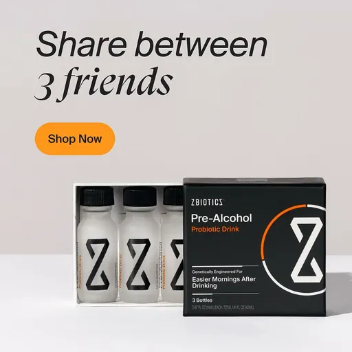
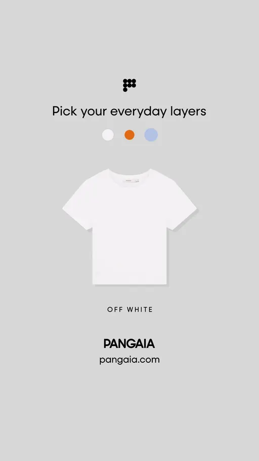
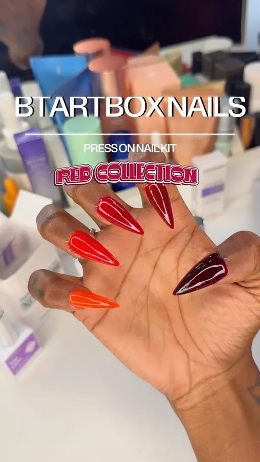
Again, a few brands carry this row. zbiotics.com ties the figure to a subscription. pangaia.com skips the figure and keeps the frame. btartboxnails.com hands over a code.
Four small risers in the same month. Together they hint at one ad nobody has built yet.
One ad to brief this week: the Just-Landed Kit
Bold Claim, Newness, Price Anchor and Montage all rose in the same month. Together they point at one ad that uses all four: a short run of quick looks that opens on something just arrived, makes one broad promise in the middle, and puts the amount in the close. This is our suggestion built from the movers, not a finding. The library can't say it will work. That's what the test is for.
The format. A 15-second vertical video of four or five clips, one line of text on each, no voice-over needed.
The hook. Model the first clip on brompton.com's “All-new Brompton Electric”: the word new, then the product, and nothing else on screen.
The middle. Model the second and third clips on ninjakitchen.co.nz's “One machine for every coffee craving”: one broad promise, said flat, with no figure in it.
The close. Model the last clip on prolonlife.com's “Buy 2 5-Day Kits & Get $160 Free”: the amount, in the final line, where the shopper is already deciding.
The test. Run it against your best Curiosity Gap ad, same audience and same budget split, for two weeks, judged on cost per purchase.
Two smaller tests can ride along. Each is its own ad against the ad it replaces, never folded into the brief above, and never a swap of the first line alone. First, write one whole ad whose offer line carries a real calendar date instead of “limited time”, and take it down the day the date passes. Second, write one whole ad for one named shopper, modelled on neverfullydressed.com's size range, and run it against your broadest Identity ad.
Skip the spreadsheet
The eCommerceBenchmark Ad Library sorts your ads into the same hooks, angles, concepts and offers used in this report, and shows your mix next to the market, so you can see which shapes you have never shipped.
Audit my creatives, freeOne catch before you run off. Everything above mixes every industry together. Yours might look nothing like it.
Why you need to know the hooks in your niche
A row that is crowded market-wide can be empty in your category. And the row you think is yours alone can be the one all five of your competitors opened with last week.
- Shoppers tune out an opening they meet over and over. The tenth ad that opens the same way is the one nobody finishes.
- When every ad sounds the same, price is all that is left to compare. Sameness in the first line pushes the decision onto the discount.
- A different opening costs the same to write. The brief is one line either way. The choice is free. The crowding is not.
- Different isn't the same as right. An empty row may be empty because it doesn't suit the category. That's why you test one ad into it instead of switching the account over.
Your 30-minute check
- Collect. Pull twenty current ads from your five closest competitors in the free Meta Ad Library.
- Label. Write down each ad's hook, angle and concept, one line per ad.
- Count. The row that shows up most is your niche's crowded row. Market-wide, that's the Curiosity Gap.
- Find the gap. The row that shows up least, or never. Check it against the movers above.
- Brief one test. One ad for the empty row, run against your control for two full weeks.
Want every number? Here are the full rankings.
The full rankings: hooks, angles and concepts
Use these as worksheets, not scoreboards. Write your own count beside each row, from your last month of ads or your competitors' current ones. The rows where your count is highest are the ones you're actually competing in.
| Hook | September | August | Change |
|---|---|---|---|
| Curiosity Gap | 28.1% | 28.5% | ▼ 0.4 |
| Urgency / FOMO | 7.9% | 7.9% | 0 |
| Authority | 6.4% | 6.7% | ▼ 0.3 |
| Relatability | 4.2% | 4.1% | ▲ 0.1 |
| Direct Question | 3.5% | 3.5% | 0 |
| Shocking Statement | 1.8% | 1.9% | ▼ 0.1 |
| Bold Claim | 1.2% | 0.8% | ▲ 0.4 |
| Newness | 1.1% | 0.7% | ▲ 0.4 |
| Price Anchor | 0.4% | 0.2% | ▲ 0.2 |
| Visual Reveal | 0.3% | 0.2% | ▲ 0.1 |
| Storytelling | <0.1% | <0.1% | 0 |
| Contrarian | <0.1% | <0.1% | 0 |
| Angle | September | August | Change |
|---|---|---|---|
| Identity | 25.7% | 25.4% | ▲ 0.3 |
| Problem-aware | 11.9% | 11.9% | 0 |
| Objection crusher | 9.4% | 9.4% | 0 |
| Social proof | 4.3% | 4.3% | 0 |
| Mechanism | 3.4% | 3.3% | ▲ 0.1 |
| Solution-aware | 2.8% | 2.4% | ▲ 0.4 |
| Comparison | 0.9% | 0.8% | ▲ 0.1 |
| Concept | September | August | Change |
|---|---|---|---|
| Product Demo Close-Up | 9.1% | 9.1% | 0 |
| Cinematic B-roll | 4.9% | 4.6% | ▲ 0.3 |
| Offer-first banner | 1.1% | 0.9% | ▲ 0.2 |
| Customer Testimonial Reel | 1% | 0.9% | ▲ 0.1 |
| Montage | 0.9% | 0.6% | ▲ 0.3 |
| Side-by-Side Comparison | 0.7% | 0.7% | 0 |
| Selfie talking-head | 0.4% | 0.4% | 0 |
| UGC Unboxing | 0.4% | 0.4% | 0 |
| Grid swap | 0.3% | 0.3% | 0 |
| Problem agitation | 0.2% | 0.1% | ▲ 0.1 |
| Listicle | 0.2% | 0.1% | ▲ 0.1 |
| Before/After Transformation | 0.1% | 0.1% | 0 |
Your test card
Here is the Just-Landed Kit from this article, set up the way a media buyer would run it. Fill in the blanks with your own numbers, and write them down before you launch.
| Hypothesis | A short quick-cut ad (something just arrived, one broad promise, the amount at the close) will match or beat my best Curiosity Gap ad on cost per purchase. |
| Change only this | The whole creative: the Just-Landed Kit, a 15-second vertical video of four or five clips. |
| Keep the same | Product, offer, audience, placement and budget split. |
| Funnel stage | Say first whether this ad is for prospecting (cold) or retargeting (warm). A deal in the first line is often right for warm audiences and wrong for cold ones, so test it where the ad will really run. |
| Setup | One control and one variant, same audience, same placement, even budget split. Do not edit either ad while the test runs. |
| How long and how much | Until each version has about 50 purchases, or two full weeks, whichever comes later. This is general testing practice (Meta's own learning-phase guideline is about 50 results per ad set per week), not a library finding. |
| Success metric | Cost per purchase, not clicks. |
| Stop rule | Pause a variant that has spent about 3 times your target cost per purchase with no purchase. If it is close, keep it running. |
| What counts as a win | The variant beats the control on the metric by an amount you would act on, and still does in a second week. |
Key takeaways
- The Curiosity Gap opened 28.1% of September's ads, Urgency / FOMO 7.9% and Authority 6.4% [eCommerceBenchmark Ad Library, 2026]. That's the lane every brief lands in by default.
- Identity, Problem-aware and Objection crusher carry nearly half the market. Nearly half of all ads make one of three arguments.
- Product Demo Close-Up, Cinematic B-roll and Offer-first banner: compare them with each other only, because fewer ads carry a concept.
- Authority has the most staying power of the three hooks. Among the three concepts, Cinematic B-roll and Offer-first banner share the lowest.
- Eight rows rose by a fifth of a point or more. Bold Claim, Newness, Solution-aware, Montage and Price Anchor are the small risers, on few brands.
- Run the niche check before your next brief: label twenty competitor ads by hook, angle and concept, then brief one ad for the row that never shows up.
Questions
Keep one ad on the leading hook as your control, because 28.1% of September's ads opened that way and a baseline everyone writes against is a useful thing to measure from. Then brief exactly one ad from the rows that rose: a just-landed opening, one broad promise in the middle, the amount in the close. Run it against the control on the same audience and the same budget split for two full weeks, and judge it on cost per purchase. One control, one test, and a decision you can defend at the end of the fortnight instead of a hunch about what looks new.