How to Optimize Website Messaging to Enhance Conversions
Article last updated:
Article first published:
Most websites fail because the message doesn’t connect.
You only have a few seconds to grab a visitor’s attention. If they don’t immediately understand what your business does, how it helps them, and why they should care, they will bounce.
That’s why optimizing your website messaging is one of the highest-leverage changes you can make to increase conversions. In this guide, we’ll break down what messaging really means, the four essential components you need to get right, and how to test and personalize your copy using data, not guesswork.
What Is Website Messaging?
Website messaging is how your business communicates its value, personality, and promise through every piece of text your visitors read, from your homepage headline to your call-to-action buttons.
The messaging must answers three key questions:
- What is this?
- Is it for me?
- Can I trust it?
Great messaging isn’t just about clever copy, it’s about clarity and relevance. It tells the visitor exactly what you offer, why it matters, and what to do next.
Because visitors make decisions in seconds, your messaging needs to work hard immediately. If it’s vague, generic, or trying to say too many things at once, you lose people before they even scroll.
Website messaging shows up across multiple touchpoints:
- Hero sections (headline, subheadline, CTA)
- Landing pages (for paid ads, specific campaigns)
- Product pages (descriptions, benefits, microcopy)
- Popups and modals
- Navigation menus and CTAs
- Onboarding flows or empty states
Every one of these moments is a chance to either build trust and guide the visitor, or lose them with noise and confusion.
The 4 Components of Website Messaging
When someone lands on your site, their brain is doing a quick scan:
“What is this? Does it help me? Why this and not someone else?”
Your messaging needs to answer those questions in seconds. That’s why strong website messaging is built around four key components. Let’s start with the first two:
1. What is your business about?
Articulate the value proposition clearly, and fast.
This is your one-sentence pitch. It should sit above the fold on your homepage or landing page, usually as a headline and subheadline combo.
Your goal? Make it instantly clear:
- What your business offers
- Who it’s for
- Why it matters
Forget cleverness, clarity converts. The best messaging gets straight to the point and focuses on benefits over features.
Discover the best practices to build your Value Proposition.
Example:
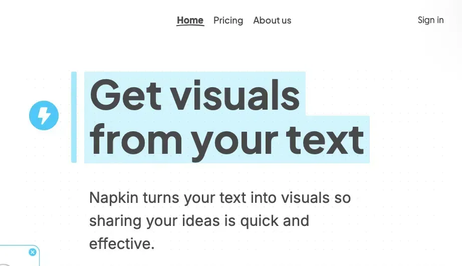
Napkin’s UVP is clear and customer-focused, addressing a common pain point for designers and developers, translating text into visuals. It emphasizes AI-powered automation, making it stand out from traditional design-to-code tools. The subheadline emphasizes the UVP and matches with user motivations.
If someone has to scroll or read paragraphs to figure out what your business does, you’ve already lost them.
2. What makes you different?
Answer the question: “Why you and not the other guy?”
Once your visitor understands what you do, the next instinct is comparison. There are likely dozens of tools, brands, or stores offering something similar, so what sets you apart?
Your differentiation can come from a number of places:
- Your positioning: Who you serve and how you frame your offer
- Your product: Features, integrations, or outcomes others can’t match
- Your pricing: Simpler, more flexible, or value-packed options
- Your tone of voice: Friendly? Bold? Data-driven? Your vibe matters too
Example:

Harry’s differentiator is short, memorable, and benefit-driven. It conveys affordability, quality, and ease of use in just a few words. The simplicity of the statement reinforces the brand’s commitment to making shaving easy and accessible without over-complicating the message.
3. Setting the right expectations
Effective messaging doesn't just attract attention, it builds trust. One of the most reliable ways to earn that trust is by setting clear expectations about what users will get and what will happen next. When visitors arrive on your site, they’re often asking themselves, “What am I signing up for?” or “How long will this take?”
For instance, instead of a vague “Get Started” button, consider saying “Start your free 7-day trial, no credit card required.” That small change immediately communicates what to expect and lowers friction. Similarly, if you’re shipping a physical product, include specifics like “Delivered in 48 hours” or “Free returns within 30 days.”
The more upfront and transparent you are, the more confident your visitor will feel in moving forward. A lack of clarity can create hesitation, and hesitation kills conversions.
Example:

Kit immediately states its audience and offer: “Email marketing for creators.” Then, “Build your audience. Make a living.” Clear, benefit-driven, and audience-specific.
They also mention: “Start for free — no credit card required.” Again, this sets a low-risk expectation for new users.
4. Addressing the barriers
Every potential customer comes with questions and concerns that can prevent them from converting. Maybe they’re unsure if your product really works, worried about the cost, or skeptical because they've never heard of you. Strong website messaging anticipates these objections and answers them before the user even asks.
You can address these doubts in a number of ways: by including testimonials from happy customers, offering a money-back guarantee, showing logos of well-known brands that trust you, or simply making your pricing model easy to understand. If your product requires setup, explain how long it takes or how easy it is. If your solution is new or unfamiliar, walk people through how it works in plain language.
Think of this part of your messaging as a preemptive strike. Instead of waiting for someone to bounce because they’re unsure, give them the confidence to stay and act. The more friction you can remove from their thought process, the higher your chances of converting them.
Example:

Copyhackers pricing page do it really well, they address several uncertainties and barriers that hold the visitors back to convert in a just few sentences:
"Money-back guarantee (for Copy School). Secure checkout. Ongoing email support. All prices in USD."
That simple line of text answers 4 real user's doubts at the same time.
Website Messaging Best Practices
Great website messaging doesn’t happen by accident. It’s crafted with intention, based on how people arrive on your site, what they expect to see, and what persuades them to stay.
Where Your Visitors Are Coming From?
Visitors come from ads, search engines, emails, or social posts, each carrying its own promise. If your messaging doesn’t match the expectations set by the source, bounce rates go up and trust goes down. That’s why it’s crucial to align your landing page messaging with the traffic source.
For example, if your ad promotes a “30-day free trial,” your landing page should greet users with that same offer right away. The tighter the message match, the better the conversion rate.
Talk Like Your Audience
The way you speak to your visitors has a huge impact on how they perceive your brand. If your tone or language feels out of sync with theirs, they’ll either feel confused or disconnected. Messaging should feel like a continuation of the conversation they’re already having in their heads.
To do this effectively:
- Mirror their vocabulary. Use words your audience actually uses when talking about their problems or goals. If your audience says “get more clients,” don’t say “maximize customer acquisition efficiency.”
- Match their tone. A legal software company might benefit from a formal, authoritative tone. A lifestyle e-commerce brand targeting Gen Z? Conversational and cheeky might work better.
- Use familiar phrases. If you notice your customers describing your product as “simple” or “a lifesaver” in reviews or interviews, use that phrasing.
Be Benefit-Driven, Not Just Feature-Based
Features describe what your product does. Benefits explain why it matters to the customer. Most visitors care less about how something works and more about how it helps them solve a problem, save time, or feel better.
This is especially important above the fold and in key sections like product pages, CTAs, or comparison tables. If you only list specs or tools, you’re asking your visitors to do the mental work of figuring out how it applies to them.
To shift from features to benefits:
- Ask “So what?” after each feature.
- Tie features to real-life outcomes.
- Highlight the emotional or practical relief your solution offers.
Example:
- Feature-first: “Real-time analytics dashboard with 10+ data filters.”
- Benefit-driven: “Know what’s working instantly - so you can make smarter decisions without digging through reports.”
Reinforce Messaging Consistency Across Channels
The story users see in your ads, social posts, emails, and landing pages should all feel connected. If someone clicks an Instagram ad with playful, bold language and ends up on a stiff, corporate-looking page, they’ll feel lost.
Consistent messaging builds familiarity, and familiarity builds trust. From first click to final conversion, every touchpoint should feel like part of one cohesive narrative.
Ecommerce Messaging Best Practices
Ecommerce messaging isn’t just about describing products, it’s about building trust, reducing friction, and motivating action in a short amount of time. Since online shoppers can't touch or try your product, your words need to do all the heavy lifting.
Here’s how to get it right:
Focus on Emotional Hooks + Product Benefits
Shoppers often make decisions emotionally first, and then justify them logically. That’s why great ecommerce messaging taps into feelings, convenience, status, happiness, safety, and clearly states how the product will improve their life.
Example:
- Instead of: “Wireless earbuds with 10 hours of battery life.”
- Try: “Block out the world and stay in your flow—all day long.”
Make your customer the hero in the story. Whether you’re selling yoga mats or skincare products, highlight how your product helps them feel better, look better, or save time.
Write Clear and Persuasive Product Descriptions
The goal is to describe what the product is and help the shopper imagine themselves using it. Focus on clarity over cleverness, and structure your copy so it's easy to scan:
- Use short paragraphs or bullet points.
- Lead with the main benefit.
- Mention size, fit, materials, or key features, especially if they impact decision-making.
Example:
“This soft, oversized hoodie is perfect for cozy nights or casual errands. Made with 100% organic cotton and front kangaroo pockets. Runs large, size down if you prefer a tighter fit.”
Clarity builds confidence. Confidence drives conversions.
Address Delivery Times, Returns, and Payment Options
Nothing kills a potential sale like uncertainty. Your messaging should answer key logistical questions before they become objections:
- When will I receive it?
- What happens if I want to return it?
- Can I pay in installments?
Make these details easy to find, either in product pages, checkout flow, or a persistent banner across your site.
Bonus tip: Use microcopy (small bits of copy near forms, buttons, etc.) to proactively address concerns. For example:
“Free returns within 30 days—no questions asked.”
Discover the 10 Best Copywriting Tips for Ecommerce.
Use Trust Elements: Reviews, Badges, Guarantees
Trust is one of the biggest decision factors in ecommerce. Reinforce credibility by embedding trust signals throughout your site and product pages:
- Verified buyer reviews or testimonials
- Security badges (e.g., Norton Secured, SSL)
- Money-back guarantees
- “Trusted by 10,000+ customers” or press logos
- User-generated content (photos of real buyers)
Trust elements reduce hesitation, especially for first-time buyers or higher-ticket items.
The checkout page is one of the most crucial and with the highest bounce rate. It is right there the place to implement and show trust with the best practices for ecommerce checkout page.
Messaging Best Practices for B2B & SaaS
Website messaging in B2B and SaaS needs to quickly convey value while addressing the specific pains of buyers and users alike. Unlike ecommerce, the sales cycle is longer, the stakes are higher, and multiple people are involved in the decision.
Your message must cut through complexity, build trust fast, and guide prospects toward a solution.
Lead with the problem + solution framework
The most effective SaaS sites don’t start by explaining what they do, they start by showing they understand the customer’s problem. Once the pain point is clear, they immediately offer a solution that feels tailored.
For example:
Problem: “Managing multiple SDKs across languages wastes engineering time.”
Solution: “Temper lets you define your logic once and deploy clean, secure code across languages in seconds.”
This approach validates the visitor’s pain and positions your tool as the answer, before they even scroll.
Speak to Different Personas (DMs vs. Users)
In B2B and SaaS, your website is rarely speaking to just one type of person. There are Decision Makers (DMs), like executives, founders, or team leads, who control the budget and sign off on new tools. Then there are end users, the people who will actually use your product day-to-day.
These two audiences care about very different things:
DMs want to know: For them, your messaging should focus on business value: ROI, operational efficiency, risk reduction, and strategic advantages.
- Is this a smart investment?
- Will this reduce costs or increase revenue?
- Does it integrate well into our existing workflow or stack?
- Can it scale with our business?
Users want to know: Messaging for users should emphasize usability, productivity gains, time saved, and quality-of-life improvements.
- Will this make my job easier?
- Is it faster or more intuitive than what I’m using now?
- Can I trust it not to break things?
Use Proof: Logos, Metrics, and Use Cases
When your product is unfamiliar or complex, social proof acts as a shortcut to trust. It says, “Others have taken the leap, and it worked.”
There are a few powerful ways to show proof:
Client logos
Show logos of respected or well-known companies that use your product. Even a few trusted names can provide powerful credibility. Bonus if you can segment them by industry.
Quantifiable results
Numbers draw attention and stick. Use clear metrics that show impact: Just be sure the numbers are real and tied to specific use cases or outcomes.
- “Cut customer support tickets by 43%”
- “Reduced churn by 21% in 3 months”
- “Saved 12 hours/week per developer”
Use cases / testimonials / mini stories
A short paragraph or quote showing how a real person or company benefited from your product can be even more persuasive than numbers. These work best when they focus on a challenge-solution-result structure.
How to Test Website Messaging

No matter how confident you are in your copy, the only way to know if your messaging truly resonates is to test it with real users.
Messaging isn't just about sounding good, it's about moving people to take action. That’s why testing different versions of your website copy is a must for improving conversions.
A/B Testing: Headlines, Value Propositions, and CTAs
A/B testing allows you to compare two or more variations of the same message to see which performs better. You can test:
Headline variations
Example:
A: “Manage Your Projects Smarter”
B: “Cut Project Time by 32% With One Tool”
Different value propositions
Test how different benefits or angles impact user behavior.
Call-to-action (CTA) phrasing
Even small changes like “Start Your Free Trial” vs. “Try It Now—No Credit Card Needed” can lead to meaningful lifts.
The key is to test one change at a time, measure results over a statistically significant period, and prioritize pages with the highest traffic or drop-off rates.
Behavioral Tracking to Measure Engagement
Even before running A/B tests, tools like scroll maps, click heatmaps, and session recordings can tell you a lot about how users interact with your messaging:
- Are they scrolling past your hero section without clicking?
- Are they hesitating near your pricing table?
- Are CTAs getting ignored?
This kind of qualitative data helps you spot friction, refine your hypothesis, and optimize message placement or clarity.
Use Omniconvert Explore to Test Messaging Quickly
If you want to speed up this process and avoid the heavy lifting of manual testing, Explore by Omniconvert lets you run fast, effective message experiments directly on your site.
You can:
- Launch headline or CTA tests in minutes, without developer support
- See how real traffic responds to different messages
- Get actionable insights backed by behavioral and conversion data
Whether you’re optimizing a homepage hero, a landing page, or a product page, Explore helps you validate what works and ditch what doesn’t, so your website messaging converts more, faster.
How to Implement Personalized Website Messaging

Why Personalization Improves Conversions
When your website speaks directly to a visitor’s needs, behavior, or location, they’re more likely to feel understood, and take action.
That’s the core of personalized messaging. Instead of showing the same generic headline to everyone, you deliver copy tailored to who they are, where they are, or what they’ve done. This specificity builds trust, relevance, and often leads to higher conversion rates.
Personalization Tactics That Work
Here are a few ways to personalize messaging effectively:
- Dynamic text replacement
Automatically swap out words in your headlines based on user attributes like industry, campaign source, or device type.
Example: “The Best CRM for Startups” vs. “The Best CRM for Agencies.” - Geo-targeted messages
Tailor offers or messages based on location.
Example: “Shipping to Auckland? Get free delivery this week only!” - Behavior-based messaging
Show different messages to new vs. returning visitors, cart abandoners, or loyal customers.
Example: A returning visitor might see, “Welcome back! Ready to complete your order?”
The goal is to match your messaging to the user’s intent or status in the customer journey, making them feel like the website was built just for them.
Use Omniconvert Explore to Deliver Personalized Messages at Scale
With Explore by Omniconvert, you can implement personalized messaging without a dev team or complex setup.
Explore allows you to:
- Create behavior- or attribute-based segments
- Show personalized content, CTAs, or headlines to each audience
- Test different personalization rules and measure impact
Whether you want to welcome back loyal customers, highlight a local promotion, or adjust tone for B2B vs. B2C visitors, Explore makes personalization scalable, and impactful.
How to Use Surveys to Test and Refine Messaging

Why Qualitative Feedback Matters for Messaging
Most analytics will tell you what is happening, where users bounce, which page they land on, how long they stay. But they don’t explain why visitors don’t convert.
That’s where surveys become essential. They give you direct insights from real users, helping you understand whether your messaging:
- Resonates with your audience
- Clearly communicates your offer
- Overcomes doubts or objections
- Motivates action
When you’re working on website messaging, quantitative data shows friction, but qualitative data tells you how to fix it.
What to Ask: Clarity, Motivation, and Objections
To truly improve your messaging, your survey questions should focus on three areas:
Clarity
Are visitors understanding your message as intended? Are they confused about what your product or service does?
Sample questions:
- “What’s your impression of this page in one sentence?”
- “Is anything unclear or confusing?”
Motivation
Are you speaking to their goals, pains, or triggers? Messaging that doesn’t motivate action often fails to connect emotionally.
Sample questions:
- “What would convince you to take the next step?”
- “Does this page explain how it helps you solve your problem?”
Objections
Messaging should preempt and address hesitations. Use surveys to discover friction points that prevent conversions.
Sample questions:
- “What’s stopping you from signing up/buying right now?”
- “Did anything make you hesitate or feel unsure?”
Each of these areas helps you assess whether your copy is aligned with your visitors’ real thoughts, concerns, and desires.
Where to Place Messaging Surveys
The placement of your surveys determines both the quality and context of the responses. Here are smart places to use them:
Exit-intent popups
Trigger a short survey when users are about to leave. Ask what stopped them from converting or what they were looking for but didn’t find.
Best for: Understanding objections or gaps in clarity.
Post-purchase surveys
After someone completes a purchase or conversion, ask what persuaded them. You’ll uncover which parts of your message were most convincing.
Best for: Discovering what works so you can amplify it.
Scroll-triggered surveys
Show a feedback prompt once users reach a certain point (e.g., 75%) down the page. This ensures they’ve seen enough context before answering.
Best for: Evaluating long-form or storytelling pages.
On-click or hover surveys
Embed small feedback prompts next to key sections (like the value proposition or pricing). These can ask micro-questions like “Was this helpful?” or “Did this answer your question?”
Best for: Testing individual message blocks or FAQs.
Using Explore to Deploy Surveys Where They Matter Most
With Explore by Omniconvert, you can trigger branching logic surveys approach the right visitor, at the right moment and generate actionable insights from the answers:
- Create tailored survey prompts based on behavior (e.g., scroll depth, time on page, exit intent)
- Run A/B tests on message variants
- Collect qualitative insights and segment responses
Instead of guessing whether your copy is doing its job, Explore helps you hear it directly from your visitors, so you can optimize with confidence.
To Wrap Things Up
Great design and smooth UX matter, but messaging is what turns interest into action. The words you use on your website influence how people feel, what they understand, and whether they trust you enough to convert.
By clarifying your value, addressing objections, and aligning your copy with visitor intent, you create a narrative that guides people toward saying yes.
Whether you're running an ecommerce brand or a SaaS company, refining your messaging is one of the highest-leverage activities for increasing conversions.
Remember: if you're not constantly refining your message, you're leaving conversions on the table.
FAQs
What is website messaging?
Website messaging is the strategic use of language across your site to communicate your value proposition, engage visitors, and guide them toward conversion. It includes headlines, subheadings, product descriptions, calls to action, and overall site copy.
Why does website messaging matter for conversion rates?
Clear, benefit-driven messaging helps visitors quickly understand what you offer, why it’s relevant, and why they should choose you over competitors. If your message is vague, confusing, or too generic, people are far more likely to bounce without converting.
How do I know if my website messaging is working?
You can assess messaging effectiveness through A/B tests, bounce rates, conversion rates, and on-site surveys. If users engage, convert, and report clarity in your messaging, you’re on the right track. Tools like Explore can help you run these experiments and gather feedback.
Should I personalize my website messaging?
Yes. Personalized messaging, based on user behavior, location, or past interactions, can significantly increase engagement and conversion. Even small adjustments (like using someone’s name or referencing their last purchase) can build trust and boost relevance.
How often should I update or test my messaging?
Continuously. As your product evolves and your audience changes, so should your messaging. Regular testing ensures your site copy stays aligned with what your visitors care about now, not what they cared about last year.


If you liked this article, make it shine on your page :)